Blog

Lettuce a bigger environmental threat than beef?

On Monday a press release began making the rounds claiming that "Vegetarian and 'healthy' diets are more harmful to the environment" and the story has generated provocative headlines like, "Lettuce three times worse than bacon for the environment."  The results are based on this paper published in Environment Systems and Decisions by Michelle Tom , Paul Fischbeck, and Chris Hendrickson.

Here's a portion of the abstract:

This article measures the changes in energy use, blue water footprint, and greenhouse gas (GHG) emissions associated with shifting from current US food consumption patterns to three dietary scenarios, which are based, in part, on the 2010 USDA Dietary Guidelines . . . . This study finds that shifting from the current US diet to dietary Scenario 1 [same mix of foods but fewer calories] decreases energy use, blue water footprint, and GHG emissions by around 9%, while shifting to dietary Scenario 2 [holding calories consumed constant but shifting away from meat to fruit and veg] increases energy use by 43%, blue water footprint by 16%, and GHG emissions by 11 %. Shifting to dietary Scenario 3, which accounts for both reduced Caloric intake and a shift to the USDA recommended food mix, increases energy use by 38 %, blue water footprint by 10 %, and GHG emissions by 6 %. These perhaps counterintuitive results are primarily due to USDA recommendations for greater Caloric intake of fruits, vegetables, dairy, and fish/seafood, which have relatively high resource use and emissions per Calorie.

So, what's going on here?  Didn't the authors of the latest (proposed) Nutritional Guidelines suggest less meat eating due to "sustainability" concerns?  Haven't we repeatedly read things like this quote from a story in Time in  2008? 

It’s true that giving up that average 176 lb. of meat a year is one of the greenest lifestyle changes you can make as an individual.

A few comments about this latest study and how it relates to the "received wisdom."

First, meat eating often looks bad in aggregate because the industry is so big.  In the US, we eat a lot of meat.  As a group, animal products probably represent the largest share of food expenditures of any food category.  As a result, we need to put the outcomes on some kind of units where foods can be compared on an even playing field.  There are a lot of options: lbs of food produced, dollars spent, acres used, or as the current study uses, calories.  As I've discussed before:

. . . meat is relatively (relative to many fruits and vegetables) inexpensive on a per calorie or per gram of protein basis, although meat looks more expensive when placed on a per pound basis. If you want really inexpensive calories eat vegetable oil or crackers or sugar; if you want real expensive calories, eat zucchini or lettuce or tomatoes.

For what it's worth, this discussion is related to the debate on whether eating healthy is more or less expensive.  As it turns out: the answer depends how you measure it ($/lb or $/calorie) .

Second, it is important to think on the margin, or think in terms of changes.  Meat is bad.  Compared to what?  As I discussed in the Food Police,  many fruits and vegetables are big users of water and pesticides.  So, if we eat less meat, what will we eat more of instead, and what are the impacts of the items we switch to?  This recent study produces results that look a bit different because it looks not just at aggregates but at marginal changes.  

Third, as this study makes clear, "the environment" is not a single thing.  It is multidimensional.  Here's a graph from the paper.

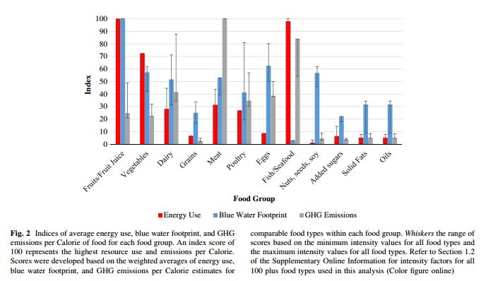
Some foods are better water users, others worse in terms of GHS emission, others produce more calories/acre and spare more land, and so on.  Very rarely are there "have your cake and eat it too" moments, and there are typically tough tradeoffs between health, environment, and taste (and even tradeoffs within each of those categories).  One problem with studies like this is that they don't count the consumer welfare cost from eating a different mix of foods or different number of calories from what they normally consume, so we don't have any sense for the tradeoff between taste and cost on the one hand and health and the environment on the other.  

The last comment is that it's tough for me to evaluate the "quality" of this paper, and one should probably be a bit careful of suffering from confirmation bias.  A lot of the assumptions driving the result actually come from other papers and analyses.  Moreover, the work was published in a relatively new journal (started in 2012) and I know nothing about it. [update: a follower on Twitter informed me that the journal has been around since the 1980's but recently changed its name]  However, it does appear that the authors' results are similar to those in another paper that the Nutritional Guidelines Committee actually discussed in their report.  The committee writes: 


a report from Heller and Keoleian suggests that an isocaloric shift from the average U.S. diet (at current U.S. per capita intake of 2,534 kcals/day from Loss-Adjusted Food Availability (LAFA) data) to a pattern that adheres to the 2010 Dietary Guidelines for Americans would result in a 12 percent increase in diet-related GHG emissions. This result was modified, however, by their finding that if Americans consumed the recommended pattern within the recommended calorie intake level of 2,000 kcal/day, there would be a 1 percent decrease in GHG emissions.

But, of course, people don't just follow the guidelines to a tee.  That's one reason why these sorts of guidelines and recommendations should consider consumers' behavioral responses to the policies in question.

Food Demand Survey (FooDS) - November 2015

The November 2015 edition of the Food Demand Survey (FooDS) is now out.

A few highlights from the tracking portion of the survey:

  • After a dip last month, WTPs for all products are back up in November.
  • There was a BIG increase in awareness of E. Coli in the news in the past two weeks, perhaps due to the discussion surrounding the Chipotle. 
  • Despite the increase in awareness of E. Coli in the news, there was not a big change in concern about the issue.
  • Consumers expect higher meat prices and expect to consume less meat in the next two weeks as compared to October.

Three ad hoc questions were added in response to the news a couple weeks ago that the International Agency for Research on Cancer, IARC) for the World Health Organization classified red meat as probably carcinogenic.  

First, were a few questions meant to determine the tradeoffs people make between the taste of food, how long they live, cost, and food safety.   

This was done by posing the following scenario: “Imagine you could live anywhere in the world. Suppose there were eight different locations you could choose from that were similar in all respects except for the types of food available. For each of the following eight locations, please rank how desirable it would be to live there.”

Then, eight options were presented (in random order) that varied food cost (at 10% to 20% of after tax income), taste (either better or worse tasting than you're used to), chance of foodborne illness (either 1 or 3 foodborne illnesses per lifetime), and life expectancy (either 75 or 85 years old) of different hypothetical locations.  There are 2^4=16 possible different locations, and I showed people 8 of these such that none of the characteristics were correlated with the others.

Statistical analysis indicates the following formula (all coefficients except the intercept are statistically significant at the 0.01 level) implied by respondents' rankings:

(9-ranking)=desirability of location=0.10-0.035*Cost+1.31*BetterTaste-0.52*#Sicknesses+0.066*Age.

So people dislike higher food costs and foodborne illnesses, and they like better tasting food and living to older ages.  No surprise there.  The interesting questions relate to the magnitudes.

The results reveal people would be willing to pay about 38% higher food prices for better vs. worst tasting food (1.31/.035) and would give up 20 years of life expectancy to live with better tasting food (1.31/0.066). An extra case of foodborne illness is equivalent to about 15% higher food prices in terms of satisfaction with a location (0.52/0.035).

Looking at how rankings can change by moving from the lowest to the highest level of each characteristic suggests taste is the most important issue followed by safety, then life expectancy, then cost.  The results reinforce what we already know: some people will continue to eat bacon even if the IARC says it increases the risk of cancer because they like how it tastes.

The next set of questions focused more specifically on whether people thought different issues could cause cancer, and then how many cancers the issues caused.  In short, I tried to separate out (as the IARC does) the certainty with which we know whether something causes cancer from the size of the effect: that is, how much does a substance increase your cancer risk (see my previous discussion on this).

More humorously, Ted Underwood put it this way on Twitter: 

In any event, I asked “How much evidence do scientists have that each of the following items causes cancer?” Using the classification scheme used by the International Agency for Research on Cancer (IARC), respondents were asked whether they believed each item to be carcinogenic to humans (5), probably carcinogenic to humans (4), possibly carcinogenic to humans (3), carcinogenicity not classifiable (2),  or probably not carcinogenic (1).

Most issues, including red and processed meat, were most rated as “possibly carcinogenic” (The FooDS report has the % in each category; here's a nice figure of how the IARC actually classifies different substances).  Here how the different issues I asked about lined up in terms of respondents' perceptions.

While the above was meant to measure certainty of evidence (i.e., the p-value), the last question was meant to measure effect size.  Respondents told: “According to the American Cancer Society, there will be about 1.6 million new cancer cases in the United States this year. What percentage of those new cancer cases do you believe are caused by the following items?”

On average, respondents stated that approximately 30% of new cancer cases each year are due to smoking. Respondents stated that 14% of new cancer cases were due to other factors not listed. Processed meat was thought to be the cause of 6.5% of new cancer cases, while red meat was stated to be the cause of 5.8% of new cancer cases and tea ranked the lowest for causes of new cancer cases at 1.7%. 

Despite the fact that the two questions are meant to measure different things, people probably conflate the two things in their minds (which is why this piece in the Atlantic said the IARC's classification is “confusogenic to humans.”).  Here are the mean answers from the 1st question plotted against the mean answers to the 2nd question.

The correlation between the two is 0.62.  Even removing smoking, the correlation is 0.33.  That is, people tend to conflate the certainty of the evidence with the size of the effect.   

Meat and Cancer

If you paid attention at all to the news yesterday, you surely saw the headlines proclaiming that bacon causes cancer.  The news came out of the ruling of a committee (the International Agency for Research on Cancer, IARC) for the World Health Organization.  (By the way, this is the same committee a couple months ago that made news when they announced glyphosate - aka Roundup - was carcinogenic). 

What follows is a pointer to two of best analyses of the announcement I saw followed by my own thoughts.  

Here's Ed Yong at the Atlantic.

Here’s the thing: These classifications are based on strength of evidence not degree of risk.

Two risk factors could be slotted in the same category if one tripled the risk of cancer and the other increased it by a small fraction. They could also be classified similarly even if one causes many more types of cancers than the other, if it affects a greater swath of the population, and if it actually causes more cancers.

So these classifications are not meant to convey how dangerous something is, just how certain we are that something is dangerous.

But they’re presented with language that completely obfuscates that distinction.

Then, in what is sure to become a classic line, Yong wrote:

Perhaps we need a separate classification scheme for scientific organizations that are “confusogenic to humans.”

Over at Grist, Nathanael Johnson wrote the following

What if you just want a sausage once every other week or so? The thing to keep in mind here is that IARC’s job is to figure out if substances can cause cancer, not if they’re likely to. It’s findings aren’t that useful to normal people looking for advice on how to live their lives.

So, we need to keep in mind that the old adage that the dose makes the poison.  And, we need to look at relative risks.  Such as this one offered by Johnson:

If today you start eating 50 grams a day (about three strips of bacon) more processed meat than usual, your risk of cancer increases 18 percent. For comparison, if you are a nonsmoker who starts smoking three cigarettes a day, your risk of lung cancer increases 600 percent.

One thing rarely communicated in these sorts of reports is the baseline level of risk.  Let's use Johnson's example and suppose that eating three pieces of bacon everyday causes cancer risk to increases 18%.  From what baseline?  To illustrate, let's say the baseline risk of dying from colon cancer (which processed meat is supposed to cause) is 2% so that 2 out of every 100 die from colon cancer over their lifetime (this reference suggests that's roughly the baseline lifetime risk for everyone including those who eat bacon).  An 18% increase means your risk is now 2.36% for a 0.36 percentage point increase in risk.  I suspect a lot of people that would accept a less-than-half-a-percentage point increase in risk for the pleasure of eating bacon.

Now, let's suppose instead that the baseline risk was 10% (10 out of 100 die from cancer).  In this case, an 18% increase means your risk of cancer is now 11.8% for a 1.8 percentage point increase in chance of dying of colon cancer.  Thus, the same percentage increase in risk (18%) results in very different changes in absolute likelihoods of dying (an increase of either 0.36 percentage points or 1.18 percentage points) depending on the baseline starting point.  In a population of 1000 people who started eating 3 pieces of bacon, in one case we'd have about 3.6 extra people die and 11.8 extra people die in the other.  That's more than three times as many people dying in the high-baseline risk case than in the low-baseline risk case. In short, studies that say that eating X causes a Y% increase in cancer are unhelpful unless I know something about my underlying, baseline probably of cancer is without eating X.

Animal-less Burgers

In my forthcoming book, Unnaturally Delicious, I've got a chapter on the promises and challenges of efforts underway to produce lab-grown meat.  My chapter focuses mainly on the efforts of a Dutch scientists, Mark Post.

This article in Tech Crunch discusses related efforts by a different group of scientists and investors.  

Impossible Foods, a four-year-old, Redwood City, Ca.-based company at work on a new generation of meats and cheeses made entirely from plants, has raised $108 million in new funding from a powerful group of backers.

Investors in the round, which was led by UBS, include Viking Global Investors and earlier backers Khosla Ventures; Microsoft co-founder Bill Gates; and Horizons Ventures, which invests on behalf of Hong Kong business magnate Li Ka-shing.

Those are some heavy hitters.  It will be interesting to see where it all goes.

Food Demand Survey (FooDS) - September 2015

The September 2015 edition of the Food Demand Survey (FooDS) is now out.

Compared to last month, consumer willingness-to-pay (WTP) fell for all the products (meat and non-meat alike) on our survey.  Among meat products, WTP for deli ham witnessed the highest percentage decrease of approximately 21%.  Steak only saw a slight decrease from last month at approximately -2.5%.  

These reductions in WTP might seem problematic for meat industry participants but it is useful to put these in a longer context.  WTP for steak, chicken breast, deli ham, and chicken wing are all higher relative to this time last year. Here is a graph of the WTP values since the beginning of FooDS.  While there are ups and downs, the overall trends are positive for each of the meat cuts shown below, and in fact, last month was the highest WTP observed for several meat products since we started the survey over two years ago.   

We observed a noticeable uptick in consumer awareness of Salmonella in the news this month - likely a result of widely publicized Salmonella outbreaks.  Interestingly, however, concern for Salmonella did not increase this month compared to last.  Concern for GMOs was down a bit this month.  

Several new ad hoc questions were added to the survey this month.


One set of questions related to food waste.  These will be reported separately at a later date.


Another set of questions dealt with consumers’ satisfaction with farmers and agriculture, and the survey was designed to see how the framing affected satisfaction.  The questions came about after a conversation with Mary Ahearn at USDA-ERS. 

Respondents were randomly allocated to one of three conditions.   In the 1st condition, participants were asked: “How satisfied are you with the decisions and manage practices of farmers these days?" Respondents in the 2nd condition were asked the same question but the words “of farmers” were replaced with “of agricultural producers”.  Respondents randomly allocated to the 3rd condition were asked the same question but the words “of farmers” were replaced with “in agriculture”.  

All responses were on a 1 to 10 slider scale where 1 was “completely dissatisfied” and 10 was “completely satisfied.”


Overall, respondents were more satisfied than dissatisfied with farmers, producers, and agriculture, with means higher than 5 our of 10 for all three.  However, respondents were affected by framing.   On average (on the 1 to 10 scale), there was greater satisfaction with “farmers” at 6.63 than for “producers” at 6.29 and than for “agriculture” at 5.93.  

Whereas almost 10% expressed 10=completely satisfied for “farmers”, only 5.8% said the same of “agricultural producers”, and only 5.5% of “agriculture.”  Here's the entire distribution of responses.