Blog

How Much Does Your State Rely on Other States for Food?

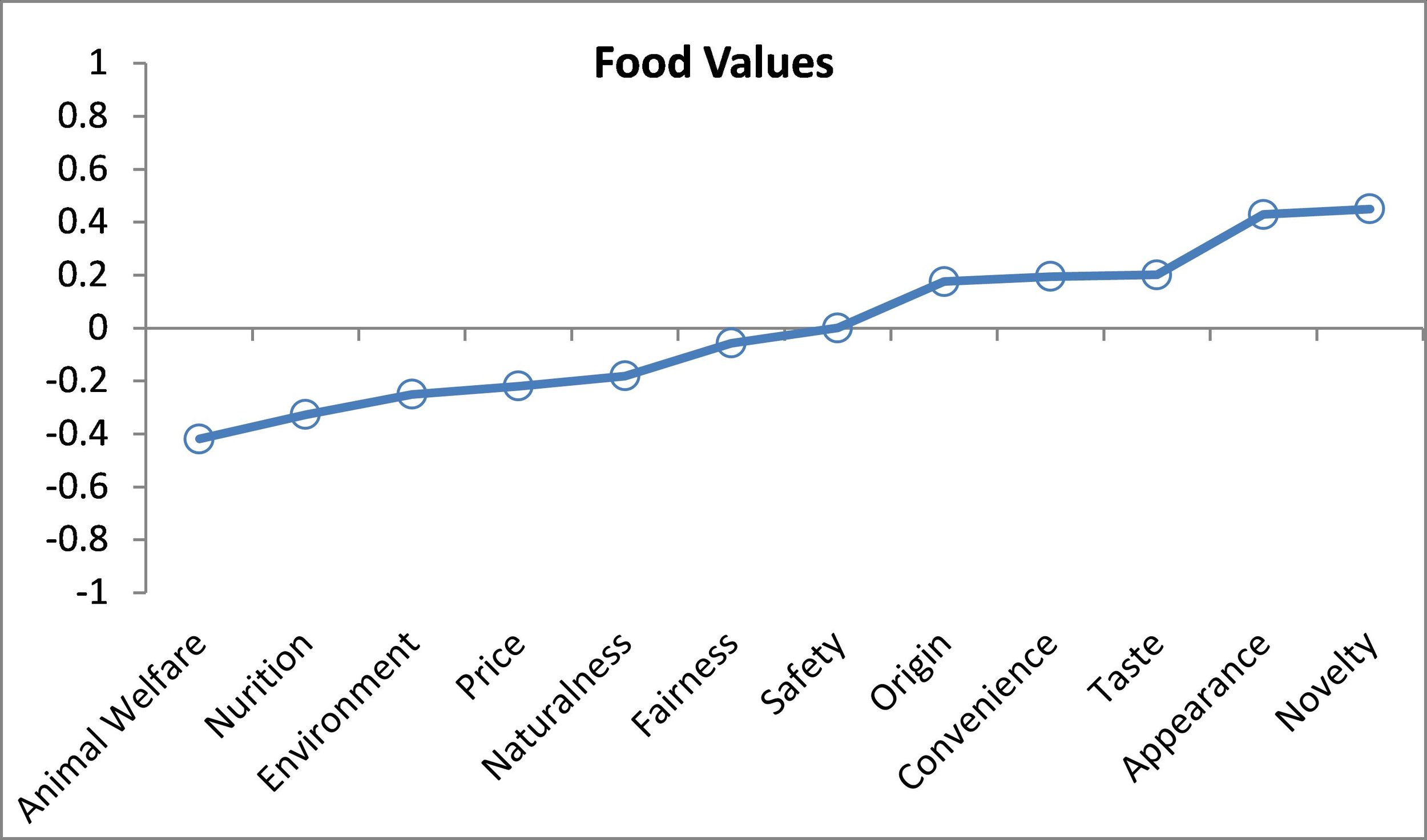
With all the ongoing discussion of benefits and costs of trade and NAFTA, I thought it might be useful to look at some agricultural trade within the United States.  We don't usually think of sending corn from Iowa to Louisiana as "trade" but it's hard to see how it is much different than sending corn, for example, from Iowa to Alberta, except of course for crossing national rather than state boarders.  These sorts of discussions also relate to efforts to move toward local and regional food systems.  How feasible is it, really, for a state to "feed itself"?  

Unfortunately, there simply isn't good data on how much states trade with each other. Thus, I thought I'd make some very crude calculations based on a variety of tenuous assumptions.  First, I'll report what I found and then discuss the details and assumptions I had to make below.  

importexport.JPG

The table above shows my crude calculation of how much a state imports or exports for various food products on a per-capita basis.  For example, for every Iowan, 3,896 lbs of hogs leave the state for every pound that comes in.  Iowa is thus a net exporter of hogs/pork.  By contrast, for every New Jerseyan, 111 lbs of hogs enter the state for every lb that leaves New Jersey.  New Jersey is a net importer of hogs.  By these calculations, 11 states "feed" the other 39 states pork. 

For eggs (this includes both table eggs and hatching eggs because these were the most complete data available at the state level), in Iowa, 3,747 eggs per person leave the state for every egg that enters the state.  These calculations suggest Massachusetts and the District of Columbia are the largest net importers of eggs with more than 300 eggs entering the state/district per person for every egg that leaves.     

For cattle, 18 states "export" lbs of cattle on a per capita basis and the other 32 states import lbs of cattle.  Rice is the most extreme case shown.  Only six US states produce meaningful quantities of rice according to USDA; people in the rest of the US have to import from these locations.

A state like Massachusetts, for example, heavily relies on other states for these four agricultural products.  The average Bostonian imports 110 lbs of hogs, 302 eggs, 130 lbs of cattle, and 62 lbs of rice from other states.  California is a big producer of agricultural products, but it is also a populous state, and as a result, it is also a net importer of hogs, eggs, and cattle.  

***

On the details of the calculations -  I'll admit up front that the figures in the above table leave a lot to be desired.  I'll describe what I've done and leave it to the reader to decide whether there is more information than noise.  

I went to USDA-NASS data and obtained production by state. The USDA doesn't always report production for all states, and in many cases, it withholds reporting for some states due to confidentiality issues.  In these cases, I "fudged" and simply divided the total production that was unaccounted for equally among states for which the USDA did not report data.  

These USDA data yield crude estimates of production by state.  We do NOT have good data on consumption by state, but we do have data on population by state.  Making the assumption that per-capita consumption of various food products is the same in every state, we can then make an inference as to how much of any food product is consumed in a state.  It is simply the share of the US population in a given state multiplied by the total US production of a given agricultural commodity.  The difference in the state production and the inferred state consumption is a crude estimate of net exports/imports into a state.  I then divided the total pounds (or eggs) of net exports/imports by a state's population to put the figures in per capita terms.  

There are some shortcomings with these calculations.  First, I've ignored trade with other countries.  For example, if eggs leave Iowa for Mexico, then the above figures over-state how many eggs are consumed within a given state in the US.  I similarly ignore imports, which will instead under-state how much is imported into certain states.  Also, the figures above suggest per-capita consumption numbers that are substantially higher than that reported by the USDA-Economic Research Service.  The main reason, for beef and pork, is that the USDA production data report farm-level lbs produced by a state not the amount of retail meat lbs.  There is some double counting in these figures.  If an Indiana farmer raises a hog to 20 lbs and then sells it to a finishing operation in Illinois that raises the hog to 200 lbs, then the USDA statistics will say Indian had 20 lbs of production and Illinois had 200 lbs of production, which added together is 220 lbs.  But, there aren't 220 lbs of pork, only 220. The way around this would be to only count retail lbs produced, but the USDA doesn't report this on a state level for pork or beef.  Also, there are a lot of other foods, like vegetables or table eggs, that we might desire to create statistics like those in the above table; however, there is very sparse reporting at the state-level by the USDA, and often the "other states" category has more quantity produced than the total of the quantity specified for named states.   

Technology and evolving supply chains in the beef and pork industries

That's the title of a new article in Food Policy written by Josh Maples, Darrell Peel, and me.  The paper will ultimately be part of a special issue on technology and supply chains. 

Here is part of the lead in.

The structural shifts in the beef and pork industries have occurred alongside (and perhaps because of) technological innovation and its effect on the flow of these meats through their respective supply chains. Technology innovations have been a major factor in the changing economics of the beef and pork industries. Improved nutrition, growth promotion technologies, better genetics, and economic conditions have all played a role in livestock becoming more efficient (Lusk, 2013). The values of improved technologies between 1977 and 2012 in the beef and pork sectors have been estimated at $11 billion annually and $7.6 billion annually, respectively (Lusk, 2013).

We discuss the nature and causes of different market structure in the beef and pork industries.

Even with the presence of marketing agreements, the beef industry is easily the least vertically integrated of the big three protein industries (Ward, 1997). The key reasons for this revolve around the aforementioned asset specificity as well as the biological makeup of cattle. There is a greater incentive to vertically integrate or engage in contracting in livestock industries in which genetic changes can be made more rapidly (Ward, 1997). The biological production cycle is about two years for cattle, which is twice as long as that of hogs and the genetic base of cattle is relatively diverse and is not narrowing (Ward, 1997). Alternatively, market coordination has allowed the pork industry genetic base to narrow toward the most efficient hogs for production. The number of hogs marketed today is 29 percent greater than in 1959 from a breeding stock that is 39 percent smaller (Boyd and Cady, 2012). Geographical concentration also plays an important role. During the cow-calf stage, cattle are scattered throughout the U.S. due to the required land and forage needed while hog production is centered in the Midwest (and more recently the Southeast) near the heaviest corn-producing states. These factors create significant barriers to integration in the beef industry.

And, we discuss the impacts of various technologies on the industries.  Here's a segment on effects of pharmaceutical innovations in the cattle industry.

Vaccinations, parasite control, ionophores, antibiotics, growth promotant implants (often referred to as growth-promoting hormones), and beta-agonists have been the most widely-used of these innovations (Arita et al., 2014 ; APHIS, 2013). The productivity and economic impacts of these technologies are large. Lawrence and Ibarburu (2007) estimated that the cumulative direct cost savings of the technologies was over $360 per head for cattle over the lifetime of an animal while Capper and Hayes (2012) estimated that the increased cost of U.S. beef production without growth enhancing technologies would be the equivalent of an 8.2 percent tax on beef. Elam and Preston (2004) discussed each of these technologies at length in their summary of the technological impact in the beef industry. They found that growth implants increase rate of gain by 15–20 percent and improve feed efficiency 8–12 percent. Growth-promoting hormone implants are believed to be used on approximately 90 percent of cattle in U.S. feedlots (Johnson, 2015). Elam and Preston (2004) also found ionophores increase average daily gain by 1–6 percent and improve feed efficiency by 6–8 percent. Lawrence and Ibarburu (2007) used a meta-analysis approach to find estimates for the farm level economic value of these five technologies in the beef industry. They estimated that beta agonists improve feedlot average daily gain by 14 percent and that the combination of implants, ionophores, antibiotics and beta-agonists account for a 37 percent increase in average daily gain in feedlots. These increases in feed and gain efficiency have direct effects on the profitability per animal. Lawrence and Ibarburu (2007) estimated that sub-therapeutic antibiotics impact cattle profitability by $5.86 per head, ionophores have an $11–$13 impact, and the use beta-agonists impacts per head profitability by $13.02 per head. The use of growth promoting implants has the largest impact on cattle profitability at between $68 and $77 per head ( Lawrence and Ibarburu, 2007; Wileman et al., 2009).

Trends in Animal Welfare Concerns and Meat Demand

I'm preparing a talk at next week's annual meeting of the Agricultural and Applied Economics Association (AAEA) on trends in consumer concerns about animal welfare, and I thought while I'm at it I'd share a few of the results here.  All the results below come from the Food Demand Survey (FooDS), a monthly survey of over 1,000 consumers that has been ongoing for over four years (each of the graphs below contains information obtained from more than 48,000 survey responses).

One of the first things we ask in the FooDS relates to "food values".  A list of 12 items is presented to respondents and they are asked which are most/least important when buying food.  Respondents have to click and drag four of the items into a "most important" box and also put four in a "least important" box, leaving four in neither box.  The nice thing about this questioning approach is that it requires a tradeoff - respondents can't say all issues are important and they have to indicate some as least important.  To create a scale of importance, I simply calculate the percent of times an issue is placed in the most important box and subtract it from the percent of times it is in the least important box, creating a measure that ranges from 100% to -100%.  

So, where does animal welfare fall in importance?  As the graph shows, it is 7th in the middle of the pack (this graph combines all the data from the last four years).  Animal welfare is much less important than taste, safety, nutrition and price but more important than origin, fairness, or novelty.  About 18% of consumers place animal welfare in the most important box and 31% place it in the least important box, creating a score of 18%-31%=-14%

The importance of animal welfare has increased a bit over time.  Here are the month-by-month averages going back more than four years.  Animal welfare importance has remained fairly stable for the past year, hovering around -10%, but this is higher than in 2013, when it was as low as -20%.

One question that might arise is "so what"?  Do these statements of importance on animal welfare and other food values have any relation to meat demand?  The answer is "yes" - there are some strong correlations.  In FooDS, we also ask people to make nine choices between different cuts of meat (and two non-meat items) at different prices.  A crude index of demand can be calculated as the number of times (out of nine) a meat product, say beef steak, is selected minus the number of times (out of nine) a non-meat item is selected (this produces a measure that ranges from -9 to +9).  Here are estimated relationships between food values and demand for steak and ground beef (controlling for demographics and other factors). 

Relationship between food values and steak demand

Relationship between food values and steak demand

Relationship between food values and ground beef

Relationship between food values and ground beef

The above graphs show that people who have higher concern for animal welfare have lower demand for steak and ground beef (recall the vertical axis is a demand index that ranges from -9 to +9; for reference the mean demand index for steak is 0.9 and the mean for ground beef is 1.32).

Results indicate that if an individual who indicated animal welfare as the most important food value (a score of +1) instead indicated animal welfare as a least important food value (a score of -1), steak would be chosen -0.42 fewer times on average. Similarly for nutrition, results indicate that if an individual who indicated nutrition as the most important food value (a score of +1) instead indicated nutrition as a least important food value (a score of -1), steak would be chosen -0.33 fewer times on average.  Conversely, people who think taste and appearance are relatively important food values have higher demand for steak and ground beef.  Not surprisingly, importance on price is a positive contributor for ground beef demand but a negative contributor for steak demand.   If an individual with the four most favorable food values for steak demand were replaced with an individual with the four least favorable food values, then steak demand would increase by 2.49 (given that the mean is 0.9, this is a very large change). The take-home: to the extent animal welfare increases in importance over time, these results suggest demand for beef will fall (I find similar results for pork and chicken products too).  

By, the way, I can place these food values in the context of other correlates with demand.  Here is a comparison of different determinants of steak demand (the upper left-hand image is the food values graph that was already shown but rescaled so comparisons are made to the lowest impact).  Next to food values, household income, political ideology, and gender have the biggest impacts on steak demand.  Steak demand is higher for higher income and more conservative individuals and for males.  

Correlates with Steak Demand

Correlates with Steak Demand

In FooDS, we also ask, for more than 16 different issues,  “Overall, how much have you heard or read about each of the following topics in the past two weeks” and we classify responses as 1=nothing; 2=a little; 3=a moderate amount; 4=quite a bit; 5=a great deal.  Below are the results pertaining to animal welfare related issues.

Awareness of issues in the news over time

Awareness of issues in the news over time

Result seem to suggest an up-tick in awareness of animal-welfare related issues during 2016, which subsequently declined.  However, this increase in awareness also occurred for ALL the issues we track (the solid black line), many of which (like E. Coli, pink slime, etc) have nothing to do with animal welfare.  

A similar pattern emerges in relation to "concern" for the same set of 16 or so issues over time.  We ask, “How concerned are you that the following pose a health hazard in the food that you eat in the next two weeks”, where 1=very unconcerned; 2= somewhat unconcerned; 3=neither concerned nor unconcerned; 4=somewhat concerned; 5=very concerned.  (Yes, I realize, asking whether animal welfare is a "health hazard" is strange, but that's what data I have).  The graph below slows a slight uptick in concern for animal welfare related issues, but this is also true for ALL the issues we track (the solid black line).  In other words, people don't seem to be discriminating much between animal welfare and other food issues.  

Concern for various issues over time

Concern for various issues over time

Finally, one of the questions we ask every month is whether respondents are vegetarian or vegan.  There has been an increase in this self-reported measure over time (see here or here for my previous discussions of these data).  In early 2014, the figure was between 3% and 4% of respondents.  This has roughly doubled and we now routinely see values between 7% and 8% of respondents self-identifying as vegetarian or vegan.  

Are you a vegetarian of vegan?  (% saying "yes")

Are you a vegetarian of vegan?  (% saying "yes")

Redefining Agricultural Yields

I saw some recent discussion on Twittter of this post by Emily Cassidy in which she discusses her 2013 paper in Environmental Research Letters coauthored with Paul West, James Gerber, and Jonathan Foley.  The subtitle of her post and paper is: "from tonnes to people nourished per hectare."

It's an interesting and thought provoking piece, and at the heart of it are figures like this one Cassidy posted on her blog:

She writes:

And as you can see from the map above, a lot of farmland in the United States is not used to grow food, it is used to grow animal feed and biofuels. Over two-thirds of the calories grown in the U.S. are fed to livestock. And for every eight calories of corn and soybean fed to livestock, only one of those calories ends up on our plates.

In the published paper, the authors argue they, "illustrate where tremendous inefficiencies in the global food system exist today" and reach the normative judgement that, "shifting the use of crops as animal feed and biofuels would have tremendous benefits to global food security and the environment."  

There are some methodological issues that I think are important in this discussion, some of which the authors themselves acknowledge and discuss, but I'll get to those in a minute.  

First, I want to make the case that this state of affairs is not as "inefficient" or "irrational" as is often portrayed.  

For one, take a look at the above figure.  Is there some commonality between the locations with more green (more production for "food" - supposedly the "good" outcome)?  These locations tend to be the spots that are relatively poorer, hungrier, and more malnourished.  That ought to give us pause - that the locations with the supposedly "good" farming practices have some of the biggest challenges with under-nourishment.  

Now, we shouldn't mistake correlation with causation (i.e., production for "food" probably isn't causing food security problems), rather I suspect this pattern is largely explained by income effects.  What we're probably seeing in the above graphs relates not to production practices per se but to preferences of relatively rich people vs. relatively poor people.  Our production practices are constrained by what people want to buy.  In the same way one can argue it's "inefficient" for a relatively wealthy person to have a bigger car or bigger house or private jet, one can also point out that this sort of person has the means to pay for enjoyable things that are somewhat less efficient.  If all we cared about was caloric/protein efficiency, we humans should eaten a spartan, undiversified diet of beans and rice. So, that's the first answer: people in relatively richer countries eat more meat because they like it and they can afford it.  Maybe we shouldn't like or want to eat animal products, but as economists are fond of saying, de gustibus non est disputandum.

Beyond "preferences", why do we grow so much corn, soy, and wheat in the U.S.?  A primary answer is that these plants are incredibly efficient at converting solar energy and soil nutrients into calories (they're the best, really the best).  Moreover, these calories are packaged in a form (seeds) that are highly storeable and easily transportable - allowing the calories to be relatively easily transported to different times and to different geographic locations.  Contrast these crops with directly-human-edible fruits/vegetables like kale, broccoli, or tomatoes.  These plants are poor converters of solar energy to plant-stored energy (i.e., they're not very calorie dense), and they are not easily storeable or transportable without processing (mainly canning or freezing), which requires energy.

This gets to some of the methodological issues in these sorts of calculations.  As I've discussed before using various analogies, there are two ways to view livestock.  One is that they are inefficient - using up a lot of energy to make food.  Another is that they are good at converting one form of energy that is highly storeable/transportable but untasty (field corn, soy, sorghum) to another form (eggs, meat, dairy) that we like to eat.  Rarely do these sorts of research papers include the the calories (or energy) used in food processing.  It is a mistake to compare the calories in steak to the calories in a wheat kernel.  The wheat kernel requires energy/processing to convert to flour and then more energy to get pasta or bread.  In the developing world (largely the green countries in the above graph), I suspect a lot of this processing isn't measured because it occurs in the household.  The cowpeas, cassava, or beans require grinding and cooking to be human-edible, and the energy used to accomplish this isn't measured.  The historian Rachel Laudan has written eloquently on this in a number of places (see her blog or book), and it is a feature of our modern food system that is vastly under-appreciated.

The other two issues the authors mention in their journal article as worthy of additional research are food waste and the ability of livestock like cattle to convert human-inedible calories from grasses into human-edible meat/dairy.  On that last topic, there is a nice report by the Council for Science and Technology written Jude Capper and others.  To those issues, I'd also add that we need to think about water use (the corn/soy/wheat in the U.S. is largely un-irrigated whereas fruits/veggies require comparatively large amounts of water often supplied by irrigation; of course, livestock consume water too) along with use of other inputs like pesticides and fertilizer (again, fruits/veggies can be relatively heavy users of pesticides).

Where does that leave us?  I'm not going to say it's perfectly rational for the U.S. to devote the majority of it's cropland to corn/soy/wheat, but I think this discussion suggests it's not irrational either.  

P.S.  In terms of tonnes of production USDA data suggest in the 2016-2017 marketing year, 40% of the corn/sorghum/barley/oats produced and imported in the U.S. went to "food, alcohol, and industrial use", 32% went to "feed and residual use",  14% was in "ending stocks" (i.e., it was stored for future use), 14% was exported, and the small remaining amount was "seed use".                     

Personal Choices to Reduce Greenhouse Gas Emissions

This article in Environmental Research Letters by Seth Wynes and Kimberly Nicholas calculates the ways various personal choices affect greenhouse gasses. The paper has received a lot of attention in the media (e.g., see here or here).   At the heart of the issue are the results from this figure in the original paper showing the relative effect of different actions on greenhouse gas emissions.


The findings led to headlines like this one in The Guardian, "Want to fight climate change? Have fewer children."  The findings are interesting on a number of fronts.  For example, I regularly see stories suggesting that the most impactful thing one can do to fight climate change is eat less meat.  That strategy shows up as a mere 7th on this chart, and way, way behind having children (not having a child has more than 60 times the emissions impact as moving to a more plant based diet).  

The implication that we should have fewer children raises a number of thorny issues that have long been debated.  Since at least Malthus, folks have been worried about a growing world population.  Stanford biologist Paul Ehrlich has raised alarm since the 1960s about the dire consequences of a "population bomb."  At the heart of this thinking is the premise that an extra person is a kind of threat: a threat to food security, a threat to the climate, a threat to the environment.  There's even a bit of a hint of this thinking in the common mantra of many agricultural organizations that we need to do what we can so that we can feed nine billion people by 2050.  The extra people that will arrive in the next 30 years or so are placing a burden on us today to increasing productivity.  

An alternative perspective, one often attributed to Julian Simon, is that an extra person is a blessing rather than a curse.  People aren't just consumers of resources but are are sources of ideas, creativity, and ultimately new resources.  An extra person isn't a threat but an opportunity.

Regardless of where one falls in this debate, it should be noted the above graph looks at just one side of the equation: the cost of an extra human in terms of extra greenhouse gasses.  What is ignored is the potential benefit of an extra human.  What is the opportunity cost of a foregone Einstein, Edison, or Jobs?  Going further, who are the folks most likely to heed the advice to forego children for the climate, and what would their would-be kids have been like?

It is also worthwhile mentioning that there is no guarantee that population will continue to grow, particularly if the world continues to develop and incomes rise.  Even the UN projections place some probability on a population decline in 30 years time.  One writer of Wired magazine, Kevin Kelly, when asked what we should be worried about (but presumable are not), fretted about about an underpopulation bomb.  Here's what he writes:

Here is the challenge: This is a world where every year there is a smaller audience than the year before, a smaller market for your goods or services, fewer workers to choose from, and a ballooning elder population that must be cared for. We’ve never seen this in modern times; our progress has always paralleled rising populations, bigger audiences, larger markets and bigger pools of workers. It’s hard to see how a declining yet aging population functions as an engine for increasing the standard of living every year. To do so would require a completely different economic system, one that we are not prepared for at all right now. The challenges of a peak human population are real, but we know what we have to do; the challenges of a dwindling human population tending toward zero in a developed world are scarier because we’ve never been there before. It’s something to worry about.

 A couple final thoughts.  The above graphs shows several possible mitigation options, but I haven't heard much discussion of tradeoffs.  Surely the end goal in life isn't to focus all our individual energies on activities to reduce carbon emissions.  So, given my preferences for driving, eating meat, or being a parent, the figures above suggest useful ways of thinking about this problem.  Maybe I don't want to have a more plant-based diet, but at least in terms of greenhouse gas impacts, I can "offset" that and more by foregoing my trip to Paris this year.  

More broadly, we don't normally worry about impacts of our various consumption choices on availability of other resources like steel or fertilizer or labor.  Why?  Because the market price for the goods should reflect the relative scarcity of these items.  One upside to a carbon tax is that we could forego all the moralizing and all these sorts of "consumption advice" types of papers and simply allow consumers to make choices they want given the relative prices of different goods.  But what about children?  The above graph would seem to justify a large carbon tax on having kids.  I'd guess that is a highly unpopular idea, which suggests to me that most of us are more likely to be in the Simon camp than the Ehrlich one when thinking about our own offspring.