Blog

The Economic of Packing Plant Fires and Cattle Prices

About two weeks ago, a fire at a Tyson meat packing plant destroyed about 5 to 6% of the nation’s beef processing capacity. The fire caused a significant drop in the price of cattle and a significant rise in the price of wholesale beef, increasing the packing margin (the difference between cattle prices and beef prices). This has caused a lot of consternation. Here’s an excerpt from a recent article in the LA Times:

Beef-packer margins rose to $378.25 per animal on Monday, an all-time high in HedgersEdge data. That’s more than double the levels reported just a week ago. Wholesale prices surged to $2.3869 a pound Friday, the highest in two years. Meanwhile, cattle prices on cash markets crashed to $1.0865 a pound on Friday, the lowest for this time of year in nearly a decade.

“These guys are making more money than they ever have,” Gary Morrison, vice president at commodity researcher Urner Barry, said of meatpackers.

The packers may well be making more money, but these economic effects are exactly what one would expect even in a perfectly competitive market. It’s the first week of school here at Purdue, so I thought I’d get a little wonky and walk through some basic supply-demand graphs related to the so-called marketing margin.

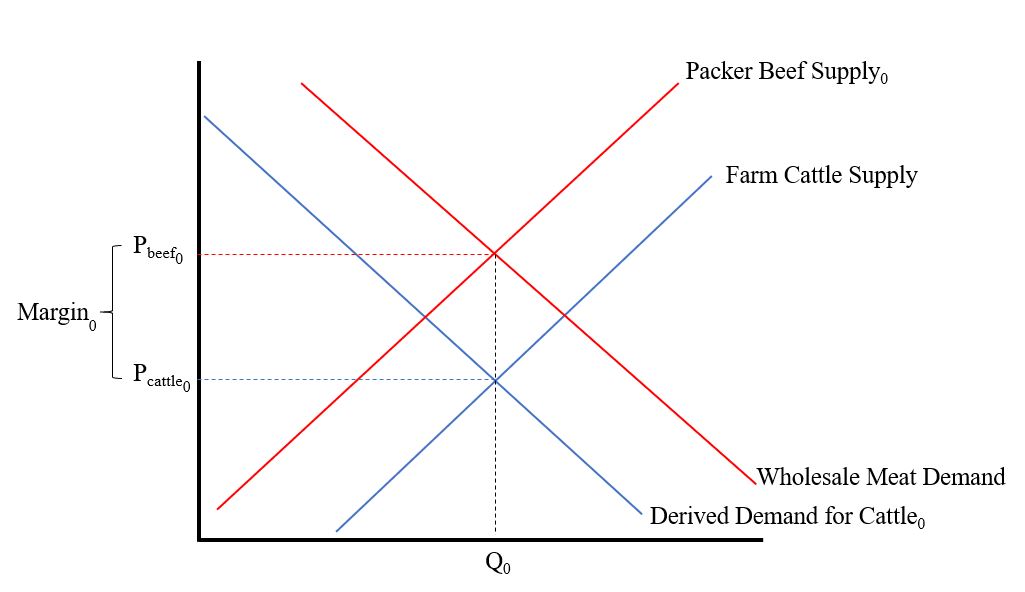
First, consider the situation before the fire, as shown in the figure below. Restaurants and grocery stores want beef to feed their customers, and this results in a demand for wholesale beef (this is given by the red downward sloping line labeled “Wholesale Meat Demand”). Packer’s acquire cattle, process them, and supply beef to the wholesale market, and this relationship is given by the red upward sloped line labeled “Packer Beef Supply0”. The intersection of these two lines determines the wholesale price of beef, Pbeef0.

Because packers need cattle to supply beef to the retail market, they have a “derived demand” for cattle given by the downward sloping blue line labeled “Derived Demand for Cattle0.” Cattle producers supply cattle to the market (as described the upward sloping blue line marked “Farm Cattle Supply”). The intersection of these last two lines determines the price of cattle, Pcattle0.

The difference in the wholesale price of beef, Pbeef0, and the price of cattle Pcattle0, is the marketing margin, Margin0. The way I’ve drawn the graph, there is 1 lb of wholesale beef for every 1 lb of cattle (something economist call “fixed proportions”), and this quantity is Q0.

cattlemargin1.JPG

Ok., now the fire happens and reduces the ability of packers to supply beef. This shifts the packer supply curve upward and to the left. As we can see in the figure below, the result is that wholesale beef prices will rise from Pbeef0 to Pbeef1.

cattlemargin2.JPG

But, that’s only part of the story. In addition to packer’s supply curve shifting, they also don’t need as many cattle (because they no longer have the capacity to process them). As a result, the derived demand for cattle by the packers also falls as shown in the following figure.

The result is that cattle prices fall from Pcattle0 to Pcattle1. As a result, the quantity of cattle/beef sold falls from Q0 to Q1, and the marketing margin increases from Margin0 to Margin1.

cattlemargin3.JPG

In short, the effects we’re seeing right now in the beef and cattle markets are exactly what we’d expect from a textbook treatment of a reduction in wholesale supply in a vertically linked market.

By the way, I’ll note that it is also possible to use this unexpected reduction in packer supply to estimate the elasticity of wholesale demand for meat. Why? The demand for wholesale meat hasn’t shifted, and so any price changes must be occurring because of movements along this curve, which gives us an estimate of the slope of the curve.

The formula for the elasticity of demand is (% change in quantity)/(%change in price). Assuming the supply curve is perfectly inelastic in the short run (unlike what I’ve draw above), the (% change in quantity) = -6% according to most news accounts. The current boxed beef price is about $2.42/lb for choice beef, up about 13% from $2.14/lb before the fire. Putting it together, the elasticity of wholesale demand for beef is = (% change in quantity)/(%change in price) = -6%/13% = -0.46, which seems imminently reasonable.

Addendum. After posting the above information yesterday, I’ve had a number of emails and comments. Some have pointed out that cattle slaughter numbers are actually up a bit since the fire. Doesn’t that contradict the above model? Here are a few thoughts.

  1. There may have been some underutilized capacity in other plants that ramped up given the change in economic incentives. If so, this will ultimately push prices back closer to pre-fire levels when the dust settles. Still, we wouldn’t expect a complete reversion to “normal” (whatever that is) because this extra slaughter is now occurring in areas that presumably weren’t as efficient as was the case pre-fire.

  2. It’s hard to know the counter-factual. Maybe there were already seasonal or economic issues that would have led to the an increase commercial slaughter during this time period anyway. So, yes slaughter numbers may have increased in the days following the fire, but the numbers may be still less than what was expected given current inventory and other factors.

  3. There may be regional shifts and effects going on. Even if total industry capacity wasn’t affected, all those cattle that were geared up to go to the plant in Garden City need to be shipped elsewhere (presumably at higher transportation costs, which reduces their value).

No doubt, there are other factors too. The above model is a very simplified depiction of reality. There may be market power issues (but as the model above shows, the prices changes observed don’t require this explanation but they don’t rule it out either) or other dynamics occurring on top of these underlying forces. For example, a lot of cattle are sold based on some formula or contract price, which is likely to create frictions in price discovery that aren’t reflected in the above graph.
Consumer Preferences for Labgrown and Plant-Based Meat

With all the news about Beyond Meat’s stock price and the rolling out of the Impossible Burger at Burger King, there has been a lot of speculation about how consumers might response and about the ultimate size of this market. In a new paper with Ellen Van Loo and Vincenzina Caputo, I’m pleased to bring some hard data to the these debates.

What did we do? We surveyed about 1,800 U.S. food consumers earlier this year and asked them to make a number of simulated shopping choices. In each choice, consumers had five options: conventional farm-raised beef, a plant-based burger made with pea protein (i.e., Beyond Meat), a plant-based burger made with animal-like protein (i.e., Impossible Foods), labgrown meat (i.e., Memphis meats), or they could choose not to buy any of the products (i.e., “none”). Respondents were randomly allocated to different treatments that varied the use of brand names (present/absent) and the information that was provided (none, environment information, or technology information). Here is an example of one of the choices consumers were given (in the treatment that included brands).

meatCEpic.JPG

So, what did we find? Here is the abstract:

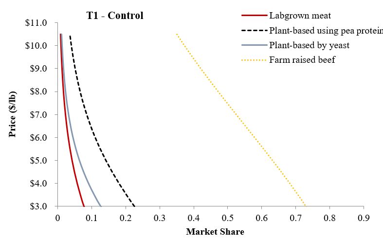
Despite rising interest in innovative non-animal-based protein sources, there remains a lack of information about consumer demand for these new foods and their ultimate market potential. This study reports the results of a nationwide survey of more than 1,800 U.S. consumers who completed a choice experiment in which they selected among conventional beef and three alternative meat products (lab-based, plant-based with pea protein, and plant-based with animal-like protein) at different prices. Respondents were randomly allocated to treatments that varied the presence/absence of brands and information about the competing alternatives. Results from mixed logit models indicate that, holding prices constant and conditional on choosing a food product, 72% chose farm raised beef, 16% plant-based (pea protein) meat alternative, 7% plant-based (animal-like protein) meat alternative, and 5% labgrown meat. Adding brand names (Certified Angus Beef, Beyond Meat, Impossible Foods, and Memphis Meats) actually increased the share choosing farm raised beef to 80%. Environment and technology information had minor effects on conditional market shares but reduced the share of people not buying any meat (alternative) options, indicating information pulled more people into the market. Even if plant- and lab-based alternatives experienced significant (e.g., 50%) price reductions, farm raised beef maintains majority market share. Vegetarians, males, and younger, more highly educated individuals tend to have relatively stronger preferences for the plant- and lab-based alternatives relative to farm-raised beef. Respondents are strongly opposed to taxing conventional beef and to allowing the plant- and lab-based alternatives to use the label “beef.”

We show that even at significant discounts, most people prefer conventional beef. The following demand curves for each of the products illustrates.

Beef_share.JPG

A couple weeks ago, I weighed in on the debate about whether these new products can or should be labeled “beef” or “meat.” It seems the U.S. public is far more certain on this than I was.

policyprefs.JPG

More details are in the paper.

Because these are new products just hitting the market, it is possible that these preferences can and will change, particularly when more consumers are able to taste them. However, at present, the future market potential for these products appears to fit more in the “niche” category, even at significant price discounts. What will happen in the future? Only time will tell.

Potential Economic Impacts of African Swine Fever (ASF)

African Swine Fever (ASF) is a viral disease that affects domestic and wild pigs. ASF is highly infectious and is fatal for pigs. Unfortunately, ASF has been ravaging the Chinese pork industry, which is by far the largest in the world. Some estimates suggest more pigs in China have died from ASF than exist in all of the United States. ASF does not cause illness in humans, but border security has been ramped up in the U.S. to make sure the virus doesn’t enter and hit our producers.

The other day I was asked about the potential economic impacts if ASF hit the United States. To answer the question, I constructed a fairly simply model of the U.S. pork industry (see details here). The basic idea is this that if ASF hit the U.S., the quantity of pork supplied would fall. This would, of course, result in less pork on the market and would result in an increase in price of hogs and pork for consumers. I considered three possible scenarios: a 10%, 25%, and 50% reduction in the quantity of U.S. pork supplied as potential outcomes of ASF. Of course, there are other possible impacts. It is likely that foreign buyers of U.S. pork might shut off imports from the U.S. to protect their own domestic herds. Thus, I also considered what happens if all foreign buyers of U.S. pork stopped importing. Finally, even though the disease does not affect humans, domestic consumers may choose to cut back if ASF hit the domestic herd; I thus considered a 10% reduction in consumer willingness-to-pay for pork.

Here are the possible impacts I calculate.

First, consider the impacts if only U.S. domestic supply is affected but foreign and U.S. consumers do not change their preferences. In the mildest scenario (a 10% supply reduction), both U.S. consumers and U.S. hog producers would lose about $1 billion/year. In the worst-case scenario considered (a 50% supply reduction), both U.S. producers and consumers would be worse off by almost $5 billion/year.

ASF1.JPG

Now, what happens if foreign buyers of U.S. pork decide to stop buying? Over 20% of U.S. domestic production is exported, so the effects aren’t trivial. The estimates under the three supply reduction scenarios and a 100% reduction in foreign quantity demanded are shown below. Now, the worst-case scenario (a 50% supply reduction) results in an almost $7 billion/year loss for U.S. producers. The impacts on U.S. consumers are somewhat muted because there is now more supply on the U.S. market for U.S. consumers since foreign buyers are no longer buying, and as a result their losses aren’t as severe as in the above table.

ASF2.JPG

Finally, consider the worst of all impacts. Supply in the U.S. falls (by either 10%, 25% or 50%), foreign buyers reduce their quantity demanded by 100%, and U.S. consumers also reduce their willingness-to-pay by 10%. Now, both U.S. producer and consumer impacts vary from about $4 to about $8 billion/year.

ASF3.JPG

Don’t like my estimates or assumptions? Feel free to modify my model or mess around with the spreadsheet I used to create these results.

Can You Call it Meat?

NPR recently ran a story, in which I was quoted, about the rise of state laws limiting the use of words like “beef”, “meat” and even “rice” on plant-base alternatives. The American Civil Liberties Union (ACLU) has just filed suit against the state of Arkansas over the state’s enactment of a law that would fine “plant-based and cell-based meat product, such as “veggie burgers” and “tofu dogs,” marketed or packaged with a “meat” label.”

What to make of all this? One one hand, these sorts of new laws originate from some of the same motivation of older “standards of identity” laws. These laws define how certain words can be used on food labels and in marketing. The stated purpose of the laws are to protect consumers and to prevent consumers from being misled. For example, in the past, some unscrupulous millers added wood shavings to flour. If consumers can’t tell before buying whether it’s the real or adulterated version, we can wind up a markets-for-lemons problem, which would drive the high quality products out of the market and leave consumers worse off.

However, here’s what I wrote about this a while back (I also included a few illustrative pictures of labels):

In the case of beef, I am a bit skeptical that consumers will be mislead by the start-up meat alternatives. Why? These aren’t generic products being sold by companies trying to water down or adulterate a product with cheaper inputs. These are branded products created by firms whose whole marketing strategy is to tell people their product is NOT beef. ... Even without the identity standards, it is not as if consumers are totally unprotected. If they are, in fact, misled, the legal system offers possible remedy. As witnessed by the numerous lawsuits over the use of the word “natural,” I suspect there are plenty of lawyers out there willing to help a consumer who can show they’ve experienced damages.

The counter response is that people might associate words like “beef”, "meat”, or “milk” with other product attributes such as nutritional content, which might (sometimes inappropriately) carry over to the plant- or lab-based products. Nutritional facts panels may serve to mitigate some of these concerns, but there is little doubt that labels create various taste and health halos that extend beyond the objective facts.

At the same time, words are needed to convey meaning to consumers beyond just animal content. Using the word ground “meat” tells me something about how the food is expected to be cooked and served and which condiments are appropriate. In this instance, using “meat” with “plant-based” is helpful to the consumer insofar as quickly conveying key information about how the product is to be cooked and consumed.

Thus, there are pros and cons and costs and benefits to these types of labeling laws. I’ve seen a few polls on what consumers think about these labeling laws. However, It would be useful to see more empirical research over whether consumers are, in fact, mislead or perhaps more informed by meat/milk labels on plant-based products.

Spending on Beef over Time

Meat demand has been a frequent topic on this blog (e.g., see here, here, here, or here). As some of the previous posts indicate, “demand” is a hard thing to measure. A slightly easier thing to measure is spending. As it turns out, the Bureau of Labor Statistics (BLS) has been tracking consumer spending at the household level on food at home in a number of categories, including beef, pork, and poultry, in their annual Consumer Expenditure Survey.

Using these data, I constructed the following animation showing the relationship between spending on beef and total household expenditures by quintiles of income.

The figure shows, at any point in time, higher income households (or those with greater total spending) spend more on beef than lower income households (or those with less total spending). In econ-speak, beef is a “normal” good. However, for any given income (or total spending) level, spending on beef has fallen precipitously since 1984 (all figures are in inflation-adjusted 2017 dollars). The change over time is most dramatic for the higher income/spending households. In 1984, the lowest and highest quintile income households spent $265 and $681 per year (in 2017 dollars), respectively, on beef for consumption at home. By 2017, these figures had fallen to $158 and 352, respectively.

These data could be reflective of downward demand shift - i.e., consumers willing to pay less for each pound of beef than they were in the past. Other possible explanations for the downward decline in spending include changing beef prices over this period, changing household demographics (the average number of people in today’s households is slightly smaller today than in the mid 1980s; fewer people normally means less spending), other protein sources, such as poultry, becoming relatively less expensive or more attractive, a shift toward more food spending away from home (the BLS only tracks spending for individual food categories for food eaten at home), and more.

How do the data in the above figure square with measures of demand (such as these constructed by Glynn Tonsor), which show no clear trend in beef demand since the early 1990s? Well, as I mentioned above, spending isn’t “demand” because while the figure controls for income, it doesn’t control for prices. Another possible explanation is that the data in the figure above are for households, while aggregate demand statistics like those created by Tonsor are calculated nationally. It is possible for total aggregate demand to rise even if each individual household’s demand is falling if population is increasing and more households are being added. That is, in fact, what has happened. There were about 86 million households in the US in 1984. Today there are about 128 million households.