Blog

Trends in Farm Land Acreage

I hear a lot of talk about the impacts of federal farm policy on our food system. It is sometimes suggested that farm policy is to blame for “cheap food” and thus obesity (see this nice twitter response by Tamar Haspel) or that many of our purported modern day farm and food ills can be traced back to Earl Butz, who as Secretary of Agriculture in the early 1970’s encouraged producers to plant “fence row to fence row.”

One way to evaluate these sorts of claims is to look at how much (or little) crop acreage in the U.S. has changed over time. Here is data according from the USDA, National Agricultural Statistics Service on the amount of land planted to nine major commodity crops over time (note: vegetable acreage, which comprises only about 1% of all acreage is not included; nor is fruit or nut acreage, which is also a very small share of the total).

The figure below shows the cumulative acreage in the U.S. planted to nine major commodity crops over 93 year time period from 1926 to 2018. Over the entire time period, there was an average of 246 million acres planted to these nine crops each year. Seven out of the 10 highest planting years were prior to 1937 with the remaining three being in 1980, 1981, and 1982.

The coefficient of variation (the standard deviation divided by the mean) is only about 7.5%, implying relatively low variation over time (usually a figure less than 100% would be considered low variation). Since 1990, there have been relatively small year-to-year changes. Over the most recent 28 year time period, about 225.7 million acres are planted each year to these nine commodity crops, with a coefficient of variation of only 1.8%. This lower variation in recent years is interesting because farm policy has been much more market-oriented since 1996, and this is precisely the period over which there has been more stability in planted acreage.

Total land devoted to farming (or crop acreage) today is about 12% lower than the highs of the 1930’s and the early 1980’s. This is amazing in many ways given that the U.S. population is now 130% higher than it was in the 1930’s. Stated differently, twice as many people are now being fed on fewer crop acres.

cum_acres.JPG

Moving away from total acreage, it is instructive to look at the mix of acreage (see the two following figures). Here, we can see some significant changes in which crops are planted in the U.S. over time. For example, in 1926, there were only 1.9 million soybean acres but in 2018, for the first year in history, more acreage (89 million acres) was planted to soybeans than any other crop. Prior to that corn had been king every year except 1981-1983, when more acres were devoted to wheat than corn.

Another big change was a reduction in the number of acres planted to oats. Prior to the 1960’s, more than 40 million acres of oats were routinely planted each year. In 2018, only 2.7 million acres were in oats. Why the change? One big reason is that there aren’t as many mules and horses that need to be fed. Cotton also experienced a precipitous reduction in acreage from the late 1920’s to the early 1960s, stabilizing a bit thereafter.

acres_bycrop.JPG

The following figure shows the same data, but with acreage dedicated to each crop expressed as a percentage of total acreage in a given year.

Taken together, these three figures suggests the big change hasn’t been the total farmland planted but rather the change in which crops are planted to the acres. Moreover, this crop mix issue (the rise of soy and the decline of oats) probably had little to do with farm policy.

acres_composition.JPG

Given all the concerns expressed these days about mono-cropping, it might be interesting to look at the variation in planted acreage (in terms of the mix of crops planted) today than in the past. To see this, I calculated the coefficient of variation across the number of acreages planted to each of the nine crops in each year. This gives a feel for how much crop variation there in a given year. Here are the results plotted over time.

cropvariation.JPG

The coefficient of variation ranges from about 87% to 138%. Comparing this to the coefficient of variation for total acreage planted (which was 7.5%), implies there is more variation in which crops are planted to which acreages in a given year than there is variation in the total planted acreage over time.

The figure above shows that the crop-mix variation (at least among these nine crops) has been increasing since the 1960s, and the variation is higher in the past decade than at any point in the preceding 80 years.

Reducing Meat Consumption?

A couple weeks ago, The Economist ran this story about people’s stated efforts to reduce meat consumption. Here is their key graph, which shows demographic breakdowns in how people responded to this question.

meat_politics.JPG

These demographic results are largely consistent with many of the survey results I’ve generated over the past few years. For example, here are demographic breakdowns of people who self declare as vegetarian/vegan vs. meat eater. Like the study mentioned in The Economist, we find politically liberal individuals are much more likely to be vegetarians/vegans as compared to politically conservative individuals.

Also, see this study where I estimated beef demand. Again, demand for steak and ground beef increases the more conservative the respondent.

More broadly, the study mentioned by The Economist suggests:

Twenty-seven per cent of respondents in our survey say they have made an effort to reduce their consumption of meat in the past year.

That’s a bit of a strange framing because if you look at USDA data on consumption (or “disappearance”), over the past four to five years it has been increasing. As for measures of meat demand, such as these complied by Glynn Tonsor at K-State, demand today for beef and pork is quite a bit higher than in 2010 or 2011.

Maybe, this is a way of saying that I’m skeptical of questions like that in The Economist that ask, in a somewhat leading way, how much are one trying to reduce consumption of X. A more balanced question shows much different results.

For example, see the results of this study on pork I conducted with Glynn Tonsor, Ted Schroeder, and Dermot Hayes for the Pork Board. We report:

One of the initial questions asked respondents, “Over the past five years, has your consumption of pork chops increased or decreased?” 32.9% indicated consumption had increased, 57.5% responded “stayed the same,” and the remaining 9.6% indicated consumption had decreased.

For the 9.6% who said “decrease”, we asked why, and the most common response was, “Other meat options have become more attractive.” So, in this case, even among people who said they were eating less pork, it’s because they’re eating more of other types of meat.

Or, here are the results of a survey I conducted last year, where I asked the same question but this time about chicken consumption. The result?

One of the initial questions asked respondents, “Over the past five years, has your consumption of chicken increased or decreased?” 47.4% indicated consumption had increased, 48.5% responded “stayed the same,” and the remaining 4.1% indicated consumption had decreased.

The most commonly stated reason among the 4.1% who said “decrease” was “Chicken has become less tasty.”

It’s interesting that when given the option of “increase or decrease”, I only find 9.6% of pork consumers and 4.1% of chicken consumers say they’re decreasing consumption, both of which are far lower than the 27% suggested by The Economist.

Turkey Prices

It’s almost Thanksgiving. That means its time for the annual news stories on trends in turkey prices. I put out a story a week or so ago that has been picked up in a number of print, radio, and TV spots. The headline is that this November’s turkey prices are expected to be at a 10 year low.

For a bit of background and context, this claim is based on average price data reported by the Bureau of Labor Statistics (BLS). These data are collected as a part of the BLS’s effort to construct the consumer price index (CPI) and monitor inflation. Here is a graph of inflation-adjusted retail prices for frozen turkey for the past eleven years in the months of October, November, and December.

turkeyprice.JPG

The blue line represents November prices (we don’t yet know the 2018 November’s price, so it is foretasted based on past price movements). This year’s November price is expected to be around $1.45/lb, which is about 22% lower than the peak in 2013 and about 6% lower than back in 2008.

A couple comments based on the above graph. Interestingly, prices tend to fall from October to November. On average during the past 10 years, November prices are about 8% lower than October prices. At first blush, this might seem a bit strange. Doesn’t demand for turkey increase during thanksgiving, which should drive up turkey prices? Yes, but other factors are also at play. For one, retailers may strategically cut the price of turkey to get people in the door to buy the rest of their thanksgiving meal - i.e., turkey is potentially a “loss leader.” Second, producers expect the demand shift and produce more birds around the holiday. Here is a figure from the Livestock Marketing Information Center (LMIC) based on USDA data. As you can see, turkey production tends to peak each year in November.

turkeyproduction.JPG

I should note that the American Farm Bureau puts out an annual cost of Thanksgiving, and their estimates are for prices to be down this year as well. The USDA Economic Research Service estimates overall food price inflation and they’re also projecting historically low price increases. For 2018, they forecast prices for food at home to only rise only between 0 and 1% for the year; the 20 year average is about 2.1%. Why the low food prices?

One answer is that food production in general, and turkey production in particular, has become much more productive. We get more using less. Here is data again from the LIMC and USDA showing the number of turkeys slaughtered in federally inspected facilities since 1960 alongside the calculated number of pounds produced per turkey.

turkeyproduction2.JPG

Prior to the 1970s, turkeys averaged about 15 lbs/bird, a figure that’s increased almost linearly since the 1980s up to the point now where we are over 30 lbs/bird. In fact, compared to the mid 1990’s we now have about 5 million fewer turkeys slaughtered every month even though we’re actually producing more total lbs of turkey today than in the early 1990s. Here’s total lbs of production over time.

turkeyproduction3.JPG

The other big factor driving the recent affordability of turkey and other foodstuffs is that commodity (e.g., corn, soy, wheat) prices are low and have been low for the past couple years. Of course, this can’t be the only explanation because the price of retail foodstuffs is comprised of much more than just commodities, so it must mean that the prices of other inputs like labor, energy, and packaging have also remained relatively affordable.

Arbitraging the Market for Food Fears

A couple weeks ago, the best selling author Michael Lewis was on campus, and I went to listen to him talk. I’ve read several of Lewis’ books, and it was interesting to hear him talk about some of the underlying themes that united them.

In his 2017 book, the Undoing Project, Lewis writes the history of Kahneman and Tversky and the development of behavioral economics, a field that posits people do not always make rational decisions. In an earlier book, Moneyball (published in 2004), a few stat/econ types realized baseball teams were leaving money on the table by ignoring data on what really drives team wins. One team manager, Billy Beane, attempted to arbitrage the market for players by buying “undervalued” players and putting them to higher-valued use. In another earlier book, the Big Short (published in 2010), Lewis talks about the people who made big bucks on the financial crisis by recognizing that markets were “mispricing” the risks of systemic mortgage failures. In some ways the books are out of order because Lewis’s earlier books described how various people made serious money from the sorts of behavioral biases that Kahneman, Tversky, and others uncovered.

What’s this got to do with food?

Many of the systematic biases that lead people to mis-price baseball players and mortgage-backed securities are likely leading people to mis-price foods made with new technologies. Take GMOs. A Pew study found 88% of scientists but only 37% of the public thought GMOs are safe to eat. Is it possible scientists are wrong and the public is right? Sure, but if you had to place a bet, where would you put your money?

Or, let’s take at a widely studied behavioral bias - the tendency for people to exaggerate the importance of low-probability risks. The propensity to overweight low probability events was one of the cornerstones of prospect theory, which was introduced by Kahneman and Tversky. This theory is sometimes credited as herding the birth of modern-day behavioral economics, and the paper was a key contributor to Kahneman later winning a Nobel Prize. If there is a 1% chance of an outcome occurring, when making decisions, people will often “irrationally” treat it as a 5% or 10% chance. There are many, many studies demonstrating this phenomenon.

Oddly, I have never seen a behavioral economists use this insights to argue that fears over growth hormones, GMOs, pesticides, preservatives, etc. are overblown. However, there are many food and agricultural scientists who argue that many of our food fears are, in fact, irrational in the sense that public perceptions of risk exceed the scientific consensus.

Now, getting back to Michael Lewis’s books on the people who figured out how to profit from behavioral biases in fields as divergent as baseball players and mortgage-backed securities, if we really think people are irrationally afraid of new food technologies, is it possible to put our money where our mouth is? Or, buy fears low and sell them high?

Here are a few half-baked thoughts:

  • If people are worried about the safety of food ingredients and technologies, shouldn’t they be willing to buy insurance to protect against the perceived harms? And if consumers are overly worried, they should be willing to pay more for insurance than it actually costs to protect against such harms. If we believe this is the case, then creating insurance markets for highly unlikely outcomes should be a money-making opportunity. On the plus side, such markets might also take some of the fear out of buying foods with such technologies since people can hedge their perceived risks.

  • Let’s say your Monsanto (now Bayer), Syngenta, BASF, or another seed/chemical company. What can you do to assuage consumers’ fears of your technologies, particularly if you believe the perceive risks are exaggerated? Why not offer up a widely publicized bond that will be held in trust in case some adverse event happens within a certain period of time? (This is like when contractors or other service suppliers attempt to gain trust by being bonded). If it is really true that consumers’ fears are exaggerated, the bond won’t be paid out (at least not in full), and will revert back to the company.

  • Did you know that it is possible to invest in lawsuits? Investors, whose money is used to front the legal bills, earn a portion of the payout if a plaintiff wins a settlement against a corporation or other entity responsible for some harm. The “price” of such investments is likely to rise the greater the public’s perceived odds of winning the case, which presumably related to perceptions of underlying risks. I can imagine institutions or markets arising that would enable investors to short such investments - to make money if the plaintiff losses the case. The current Monsanto-glyphosate verdict not withstanding, shouldn’t it be the case that one could profitability short lawsuits surrounding the safety of food and farm technologies if the fears around them are indeed overblown?

Other ideas?

The Cost and Market Impacts of Slow Growth Broilers

I just finished up a new working paper (available here) with my Purdue ag econ colleague Nathan Thompson and Shawna Weimer, a soon-to-be assistant professor of poultry science at the University of Maryland.

Readers may recall my post from a couple months ago on consumer demand for slow-growth chickens. This new paper focuses on producer costs of switching to slow-growth broiler chicken. Here’s the motivation from the paper (references removed for readability):

While modern broilers only live about six weeks, there are concerns that the bird’s legs are unable to adequately support the larger bodyweights, leading to pain and an inability to exhibit natural behaviors. As a result of such findings, animal advocacy organizations have begun to pressure food retailers to use slower growing breeds, European regulators have encouraged slow growth broilers, national media attention has begun to focus on the issue, and some animal welfare standards and labels have begun to require slower growing broiler breeds. There has been some consumer research on demand for this attribute, but little is known about the added production costs associated with slow growth chickens.

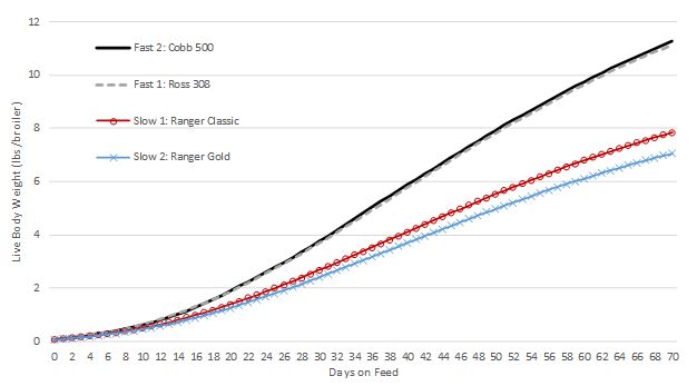
We obtained data from commercial breeding companies on two slow growth broiler breeds (called Ranger Classic and Ranger Gold) and data on two modern fast growing breeds (called Ross 308 and Cobb 500). Here are the growth curves for the four broiler breeds:

slow_growth3.JPG

The two slow growth breeds are, well, slower growing. The slower-growing breeds take 54 and 59 days, respectively to reach 6 lbs, whereas the faster growing breeds both hit this target weight in about 41 days.

These growth data are combined with data on feed intake, prices, assumptions about stocking density, and more, and we calculate costs and returns under a number of different scenarios. Here are the main results for the most likely scenario where producers choose the number of days to feed broilers so as to maximize net returns and where slow growth broilers have a more generous stocking density than fast growth broilers, as dictated in many animal welfare guidelines.

slow_growth4.JPG

About 17.45 lbs/ft2/year (or 73%) more chicken on a dressed weight basis is provided by the two fast vs. two slow growth productions systems, on average. Thus, substantially more barn space, or square footage, would be required to produce the same volume of chicken from slow as compared to fast growth breeds. Costs of production average $0.54/lb for the two slow growth breeds and average $0.47/lb for the two fast growth breeds, implying costs are 14% higher per pound for the slower growth breeds. Fast growth breeds are substantially more profitable - generating returns about twice as high per square foot than the slower growth breeds. We calculate that the slower growth broilers would need to obtain wholesale price premiums of $0.285/lb and $0.363/lb to achieve the same profitability as the best performing fast growth breed.

We also use these estimates to calculate potential market impacts that would occur if the entire industry transitioned from fast to slow growth broiler breeds. Under the most likely scenario, we calculate that converting to slow growth breeds would increase retail chicken prices by 1.17% and reduce the amount of retail chicken sold by 0.91%, resulting in losses in producer profits of $3.5 billion/year. We also calculate that consumers would be worse off by $630 million/year, assuming their demand for chicken doesn’t change in response to the switch from slow to fast growth. Increases in consumer willingness-to-pay of 8.5% would be needed to offset the adverse effect on producer profits.