Blog

My State is Better than Yours: Competition between State Food Branding Programs

The journal Agribusiness just released a new paper I co-authored with Clint Neill and Rodney Holcomb. The work was motivated by the observation that every state in the U.S. has an agricultural marketing program aimed at promoting foods from their state. Examples include the “Taste NY” and “Pride of New York” programs as well as “Go Texan” and “California Grown.”

Our questions were two fold: 1) How much do consumers value products labeled with their state’s logo relative to other states’ products, and 2) what are the implications for state marketing programs?

We surveyed 6,900 consumers in an eight‐state contiguous region. For our application, we chose milk, and asked people which of several milk products with different state logos (and a regional or national brand) they preferred at different prices.

Not surprisingly, we find that consumers prefer products with their own state’s logo. For example, Texans’ average willingness-to-pay (WTP) for Texas milk is $4.14/gallon, but Texans’ value for milk from bordering states, New Mexico, Oklahoma, and Arkansas only averaged $1.82, $2.65, and $2.72/gallon, respectively. There are a number of interesting patterns. Here’s an excerpt from the text:

While each state’s consumers tend to prefer their own label and have a distinct order of preference for other states, the asymmetry between states is less clear. For example, Oklahoma consumers are willing to pay $2.84 for the Texas label but Texas consumers are only willing to pay $2.65 for the Oklahoma label, so there is an asymmetry of $2.84−$2.65 = $0.19. Thus, Oklahomans value the Texas label $0.19 more than Texans value the Oklahoma label.

Table 5 shows this type of asymmetry for all combinations. Interestingly, every other state’s consumers value the Colorado label more than Colorado consumers value other states’ labels. Alternatively, New Mexico consumers value all other state brands more than the other states’ consumers value the New Mexico label.

While it is perhaps obvious that people in a state will tend to prefer their own products, it is also important to note that people have some value from agricultural products from other states (and, in fact, some small share of people prefer products from another state). The result is that state branding programs “steal” consumers from other states (the effect is a bit like the prisoner’s dilemma problem). The state branding program looks great if your the only state that has the program, but if all states have their own programs, the effects partially serve to cancel each other out. Here’s what we write about this so-called “beggar thy neighbor” effects:

In the case of market shares, we were able to illustrate the large decreases as a group of producers from one state starts with having no state branded competitors to competing against several other brands within a region. Producers, ideally, would have a higher return if they were the only ones with a state label, but the optimal strategy for all agents in the region is to utilize a state label. Thus, the potential beggar‐thy‐neighbor scenario is possibly a Nash equilibrium. Furthermore, states who market their brand outside their borders are shown to have increased total market share

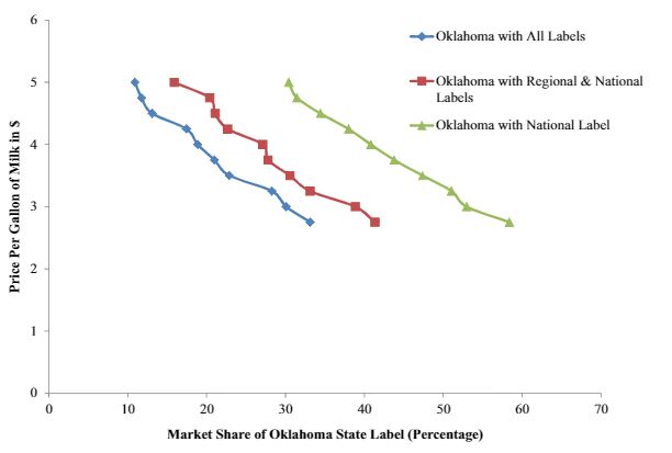
For example, below is a graph showing what happens to demand for milk with a “Made in Oklahoma” label when no other states label their product (the green line with triangle markers) relative to what happens to demand for “Make in Oklahoma” milk when other states introduce their own labels (the red and blue lines). As the figure below shows, the market share more than halves when one state’s label has to compete with all the others in a region.

beggarneighbor.JPG

One potential solution (at least from the producer’s perspective) we discuss is for groups of states to band together and use a regional label.

The Economic of Packing Plant Fires and Cattle Prices

About two weeks ago, a fire at a Tyson meat packing plant destroyed about 5 to 6% of the nation’s beef processing capacity. The fire caused a significant drop in the price of cattle and a significant rise in the price of wholesale beef, increasing the packing margin (the difference between cattle prices and beef prices). This has caused a lot of consternation. Here’s an excerpt from a recent article in the LA Times:

Beef-packer margins rose to $378.25 per animal on Monday, an all-time high in HedgersEdge data. That’s more than double the levels reported just a week ago. Wholesale prices surged to $2.3869 a pound Friday, the highest in two years. Meanwhile, cattle prices on cash markets crashed to $1.0865 a pound on Friday, the lowest for this time of year in nearly a decade.

“These guys are making more money than they ever have,” Gary Morrison, vice president at commodity researcher Urner Barry, said of meatpackers.

The packers may well be making more money, but these economic effects are exactly what one would expect even in a perfectly competitive market. It’s the first week of school here at Purdue, so I thought I’d get a little wonky and walk through some basic supply-demand graphs related to the so-called marketing margin.

First, consider the situation before the fire, as shown in the figure below. Restaurants and grocery stores want beef to feed their customers, and this results in a demand for wholesale beef (this is given by the red downward sloping line labeled “Wholesale Meat Demand”). Packer’s acquire cattle, process them, and supply beef to the wholesale market, and this relationship is given by the red upward sloped line labeled “Packer Beef Supply0”. The intersection of these two lines determines the wholesale price of beef, Pbeef0.

Because packers need cattle to supply beef to the retail market, they have a “derived demand” for cattle given by the downward sloping blue line labeled “Derived Demand for Cattle0.” Cattle producers supply cattle to the market (as described the upward sloping blue line marked “Farm Cattle Supply”). The intersection of these last two lines determines the price of cattle, Pcattle0.

The difference in the wholesale price of beef, Pbeef0, and the price of cattle Pcattle0, is the marketing margin, Margin0. The way I’ve drawn the graph, there is 1 lb of wholesale beef for every 1 lb of cattle (something economist call “fixed proportions”), and this quantity is Q0.

cattlemargin1.JPG

Ok., now the fire happens and reduces the ability of packers to supply beef. This shifts the packer supply curve upward and to the left. As we can see in the figure below, the result is that wholesale beef prices will rise from Pbeef0 to Pbeef1.

cattlemargin2.JPG

But, that’s only part of the story. In addition to packer’s supply curve shifting, they also don’t need as many cattle (because they no longer have the capacity to process them). As a result, the derived demand for cattle by the packers also falls as shown in the following figure.

The result is that cattle prices fall from Pcattle0 to Pcattle1. As a result, the quantity of cattle/beef sold falls from Q0 to Q1, and the marketing margin increases from Margin0 to Margin1.

cattlemargin3.JPG

In short, the effects we’re seeing right now in the beef and cattle markets are exactly what we’d expect from a textbook treatment of a reduction in wholesale supply in a vertically linked market.

By the way, I’ll note that it is also possible to use this unexpected reduction in packer supply to estimate the elasticity of wholesale demand for meat. Why? The demand for wholesale meat hasn’t shifted, and so any price changes must be occurring because of movements along this curve, which gives us an estimate of the slope of the curve.

The formula for the elasticity of demand is (% change in quantity)/(%change in price). Assuming the supply curve is perfectly inelastic in the short run (unlike what I’ve draw above), the (% change in quantity) = -6% according to most news accounts. The current boxed beef price is about $2.42/lb for choice beef, up about 13% from $2.14/lb before the fire. Putting it together, the elasticity of wholesale demand for beef is = (% change in quantity)/(%change in price) = -6%/13% = -0.46, which seems imminently reasonable.

Addendum. After posting the above information yesterday, I’ve had a number of emails and comments. Some have pointed out that cattle slaughter numbers are actually up a bit since the fire. Doesn’t that contradict the above model? Here are a few thoughts.

  1. There may have been some underutilized capacity in other plants that ramped up given the change in economic incentives. If so, this will ultimately push prices back closer to pre-fire levels when the dust settles. Still, we wouldn’t expect a complete reversion to “normal” (whatever that is) because this extra slaughter is now occurring in areas that presumably weren’t as efficient as was the case pre-fire.

  2. It’s hard to know the counter-factual. Maybe there were already seasonal or economic issues that would have led to the an increase commercial slaughter during this time period anyway. So, yes slaughter numbers may have increased in the days following the fire, but the numbers may be still less than what was expected given current inventory and other factors.

  3. There may be regional shifts and effects going on. Even if total industry capacity wasn’t affected, all those cattle that were geared up to go to the plant in Garden City need to be shipped elsewhere (presumably at higher transportation costs, which reduces their value).

No doubt, there are other factors too. The above model is a very simplified depiction of reality. There may be market power issues (but as the model above shows, the prices changes observed don’t require this explanation but they don’t rule it out either) or other dynamics occurring on top of these underlying forces. For example, a lot of cattle are sold based on some formula or contract price, which is likely to create frictions in price discovery that aren’t reflected in the above graph.

Income and (Ir)rational food choice

That’s the title of a new paper I have forthcoming in the Journal of Economic Behavior and Organization.

In short, I find the more one spends on food, the less consistent are their choices. In the economic way of thinking, inconsistency is typically associated with irrationality. First saying I prefer A to B, but then later saying B is preferred to A is an inconsistency, which is often referred to as a preference reversal. It’s hard to square such preference reversals with any model of rational choice.

Why might preference reversals increase with a consumer’s income? Here’s a bit from the paper (omitting references):

This paper sought to determine the relationship between consumers’ incomes and food expenditures on the one hand and preference consistency on the other. Previous literature has suggested at least two channels through which increasing income or expenditure might have deleterious effects on preference stability. The first operates through increasing demand for novelty and variety as incomes rise and the second operates via the relative incentive to behave rationally as the stakes fall.

In an empirical application involving almost 540,000 food choices made by almost 60,000 people, I find that 47% of respondents committed at least one preference reversal. How do preference inconsistencies relate to income and food spending?

Results show that the likelihood of a reversal [or preference inconsistency] and the number of reversals are significantly increasing in expenditures on food at home and away from home, and to a somewhat lesser extent, total household income. The magnitudes of these effects are large; larger than that associated with any other demographic or study design variables explored. For example, that the odds of committing a preference reversal [or preference inconsistency] are about 1.8 times (2.5 times) higher for individuals who spend $160/week or more on food at home (away from home) compared to individuals who spend less than $20/week. Exploring responses to three different “trap questions” that measure respondent attentiveness indicates that results cannot be explained by higher income households generally being more careless in their responses to questionnaires.

To explore the extent to which income and preference stability is related to variety or novelty seeking, the relationship between preference reversals and food values is also explored. As hypothesized, of the 12 food values studied, the relationships with preference reversals are strongest for the food values of price and novelty. Consumers for whom food price is a more important food value tend to commit fewer preference reversals. By contrast, consumers who rate novelty as a more important food value are more likely to exhibit unstable preferences.

Why does it matter whether rationality falls as incomes and food spending rises? As I’ve argued previously, increasing affluence likely allows us to indulge “higher” needs related to self actualization and self expression. Here’s a last bit from the paper, which is more speculative, and hopefully will spur some additional research (again, omitting references for readability).

There is a view among many food and agricultural scientists that many new food products marketed to higher income consumers are “unscientific” insofar as they make absence claims about ingredients and processes scientists have deemed safe. The preference instability observed among consumers with greater food expenditures in this study need not necessarily relate to beliefs about food that diverge from scientific consensus. Nonetheless, rising incomes might better enable people to seek out and identify sources of information that conform to their beliefs and cultural identities. It has also been argued that consumers might directly obtain utility from holding certain beliefs, which might lead to information avoidance. Whether certain food and agricultural beliefs are normal or inferior goods, in this framework, is an open question.

Consumer Preferences for Labgrown and Plant-Based Meat

With all the news about Beyond Meat’s stock price and the rolling out of the Impossible Burger at Burger King, there has been a lot of speculation about how consumers might response and about the ultimate size of this market. In a new paper with Ellen Van Loo and Vincenzina Caputo, I’m pleased to bring some hard data to the these debates.

What did we do? We surveyed about 1,800 U.S. food consumers earlier this year and asked them to make a number of simulated shopping choices. In each choice, consumers had five options: conventional farm-raised beef, a plant-based burger made with pea protein (i.e., Beyond Meat), a plant-based burger made with animal-like protein (i.e., Impossible Foods), labgrown meat (i.e., Memphis meats), or they could choose not to buy any of the products (i.e., “none”). Respondents were randomly allocated to different treatments that varied the use of brand names (present/absent) and the information that was provided (none, environment information, or technology information). Here is an example of one of the choices consumers were given (in the treatment that included brands).

meatCEpic.JPG

So, what did we find? Here is the abstract:

Despite rising interest in innovative non-animal-based protein sources, there remains a lack of information about consumer demand for these new foods and their ultimate market potential. This study reports the results of a nationwide survey of more than 1,800 U.S. consumers who completed a choice experiment in which they selected among conventional beef and three alternative meat products (lab-based, plant-based with pea protein, and plant-based with animal-like protein) at different prices. Respondents were randomly allocated to treatments that varied the presence/absence of brands and information about the competing alternatives. Results from mixed logit models indicate that, holding prices constant and conditional on choosing a food product, 72% chose farm raised beef, 16% plant-based (pea protein) meat alternative, 7% plant-based (animal-like protein) meat alternative, and 5% labgrown meat. Adding brand names (Certified Angus Beef, Beyond Meat, Impossible Foods, and Memphis Meats) actually increased the share choosing farm raised beef to 80%. Environment and technology information had minor effects on conditional market shares but reduced the share of people not buying any meat (alternative) options, indicating information pulled more people into the market. Even if plant- and lab-based alternatives experienced significant (e.g., 50%) price reductions, farm raised beef maintains majority market share. Vegetarians, males, and younger, more highly educated individuals tend to have relatively stronger preferences for the plant- and lab-based alternatives relative to farm-raised beef. Respondents are strongly opposed to taxing conventional beef and to allowing the plant- and lab-based alternatives to use the label “beef.”

We show that even at significant discounts, most people prefer conventional beef. The following demand curves for each of the products illustrates.

Beef_share.JPG

A couple weeks ago, I weighed in on the debate about whether these new products can or should be labeled “beef” or “meat.” It seems the U.S. public is far more certain on this than I was.

policyprefs.JPG

More details are in the paper.

Because these are new products just hitting the market, it is possible that these preferences can and will change, particularly when more consumers are able to taste them. However, at present, the future market potential for these products appears to fit more in the “niche” category, even at significant price discounts. What will happen in the future? Only time will tell.

Potential Economic Impacts of African Swine Fever (ASF)

African Swine Fever (ASF) is a viral disease that affects domestic and wild pigs. ASF is highly infectious and is fatal for pigs. Unfortunately, ASF has been ravaging the Chinese pork industry, which is by far the largest in the world. Some estimates suggest more pigs in China have died from ASF than exist in all of the United States. ASF does not cause illness in humans, but border security has been ramped up in the U.S. to make sure the virus doesn’t enter and hit our producers.

The other day I was asked about the potential economic impacts if ASF hit the United States. To answer the question, I constructed a fairly simply model of the U.S. pork industry (see details here). The basic idea is this that if ASF hit the U.S., the quantity of pork supplied would fall. This would, of course, result in less pork on the market and would result in an increase in price of hogs and pork for consumers. I considered three possible scenarios: a 10%, 25%, and 50% reduction in the quantity of U.S. pork supplied as potential outcomes of ASF. Of course, there are other possible impacts. It is likely that foreign buyers of U.S. pork might shut off imports from the U.S. to protect their own domestic herds. Thus, I also considered what happens if all foreign buyers of U.S. pork stopped importing. Finally, even though the disease does not affect humans, domestic consumers may choose to cut back if ASF hit the domestic herd; I thus considered a 10% reduction in consumer willingness-to-pay for pork.

Here are the possible impacts I calculate.

First, consider the impacts if only U.S. domestic supply is affected but foreign and U.S. consumers do not change their preferences. In the mildest scenario (a 10% supply reduction), both U.S. consumers and U.S. hog producers would lose about $1 billion/year. In the worst-case scenario considered (a 50% supply reduction), both U.S. producers and consumers would be worse off by almost $5 billion/year.

ASF1.JPG

Now, what happens if foreign buyers of U.S. pork decide to stop buying? Over 20% of U.S. domestic production is exported, so the effects aren’t trivial. The estimates under the three supply reduction scenarios and a 100% reduction in foreign quantity demanded are shown below. Now, the worst-case scenario (a 50% supply reduction) results in an almost $7 billion/year loss for U.S. producers. The impacts on U.S. consumers are somewhat muted because there is now more supply on the U.S. market for U.S. consumers since foreign buyers are no longer buying, and as a result their losses aren’t as severe as in the above table.

ASF2.JPG

Finally, consider the worst of all impacts. Supply in the U.S. falls (by either 10%, 25% or 50%), foreign buyers reduce their quantity demanded by 100%, and U.S. consumers also reduce their willingness-to-pay by 10%. Now, both U.S. producer and consumer impacts vary from about $4 to about $8 billion/year.

ASF3.JPG

Don’t like my estimates or assumptions? Feel free to modify my model or mess around with the spreadsheet I used to create these results.