Blog

How bad, really, is meat eating?

Last week, Scientific American published a piece on how to get people to eat less meat.  Apparently, the science is settled and we now only need to come up  with the right "messages." 

There are an awful lot of apocalyptic pronouncements about the adverse effects of meat eating on the environment.  In a widely viewed TED talk, Mark Bittman likens meat production to a nuclear explosion and says it is leading to a "holocaust of a different kind," pointing directly to impacts on climate change.  As another example, Bill Maher, comedian and host of an HBO talk show, has written, “But when it comes to bad for the environment, nothing—literally—compares with eating meat. . . . If you care about the planet, it’s actually better to eat a salad in a Hummer than a cheeseburger in a Prius.”   I could, quite literally, provide dozens of these sorts of quotes from well known journals, writers, actors, etc, but I think you get the point.  The overall message is pretty clear: we should become increasingly more vegetarian.  

Let's take a look at one of the outcomes people are most worried about and where externality is relatively clear: climate change.   I went to the EPA's calculations, and surmise the following carbon equivalent impacts for the US attributable to beef cattle, swine, and poultry production during the year 2014 (MMT is million metric tons):

  • beef cattle: 116.7 MMT C02 (from digestion) + 4 MMT C02 (from waste management) = 119.7 MMT C02;
  • swine: 1 MMT C02 (from digestion) + 22.4 MMT C02 (from waste management) = 23.4 MMT C02; and
  • poultry: 0 MMT C02 (from digestion) + 3.2 MMT C02 (from waste management) = 3.2 MMT C02.

Elsewhere, the EPA suggests using using a social cost of carbon of $36/metric ton of C02 (assuming a discount rate of 3%) for cost benefit analysis and rule making.  Multiplying the C02 impacts above by the price tag of $36 implies the following total carbon costs in 2014.

  • beef cattle: $4.3 billion;
  • swine: $842 million; and
  • poultry: $115 million.

That seem like a lot, but keep in mind that we also eat a lot of meat.  Data from the USDA suggests that in 2014, farmers/ranchers in the US produced 24.32 billion pounds of beef, 22.86 billion lbs of pork, and 44.98 billion lbs of poultry.  Putting the carbon costs on a per-pound basis (i.e., dividing total carbon cost by pounds produced), suggests the following.

  • beef: $0.177/lb;
  • pork: $0.037/lb; and
  • poultry: $0.002/lb.

I don't know about you, but those don't seem like enormous costs.  Let's think about it a different way.  Suppose you wanted to "internalize" the the impacts you're having on climate change by altering how much beef, pork, and poultry you buy.  To do this, take the price you see at the grocery store and add about $0.18/lb to the price of beef, $0.04/lb to the price of pork, and less than a penny to the price of poultry, and act as if these were the prices actually being charged.  Would you change your behavior much based on such price increase?  If not, we'd could say the climate impacts are relatively small.

I saw the following from the economist Bob Lawson on twitter this weekend.

The key isn't to have zero greenhouse gas impacts, but rather to to make sure you're taking into account the cost of those impacts.  For the case of beef, that means acting as if the price were about $0.17/lb higher.  Do that and you can shop away, guilt free (well, at least the guilt of carbon impacts).

P.S.  USDA data suggests the retail price of beef in 2014 was around $5.60/lb.  An $0.18/lb price increase would represent about a 3% increase in the price of beef.  Assuming the own-price elasticity of demand is, say, -0.6, this price increase would lead to a 1.9% reduction in the quantity of beef demanded. So, to internalize the carbon impacts of beef eating, Americans would reduce beef consumption by 1.9%.   It's not zero but its a far cry from vegetarianism.  


Food Demand Survey (FooDS) - April 2016

The latest edition of the Food Demand Survey is now out.

From the regular tracking portion of the survey:

  • Willingness-to-pay for all food products was down this month, with the largest drop occurring for hamburger;
  • The was a sizable uptick in consumers' anticipation of price increases for beef, pork, and chicken and a slight reduction in planned purchases of these items;
  • Expenditures on food away from home were up about 5%; and
  • We added "cancer and meat consumption" to the list of, now, 18 times for which we track awareness and concern.

Three new ad hoc questions were added this month.

The first set of questions was meant as follow-up to a survey Politico recently conducted of "food experts" (I was a participant in their survey).  Politico asked the following question to the experts: "Are the presidential candidates doing a sufficient job in the campaign discussing the future of food policy?" A whopping 97% said "no".  

I posed a related question to the respondents of FooDS.  Rather than just asking about the issue as a stand alone question, I put food an agricultural policy in the context of other issues candidates spend their time talking about.  In particular, participants were asked: “Are the presidential candidates spending too much or too little time discussing each of the following issues?”  

A list of nine issues was provided, which included “food policy” and “agricultural policy.”  Only about 6% of respondents thought too much time was being spent on the two issues.  44% and 46% thought about the right amount of time was being spent on agricultural and food policy, and 50% and 47% thought too little time was spent on agriculture and food, respectively.  

Immigration policy was the only issue for which more respondents thought candidates were spending too much vs. too little time.  Except for food and agricultural policy, the largest fraction of respondents thought the candidates were spending the right amount of time on the other issues.  


Secondly, we asked another question - this time exactly as it was asked in the Politico food-expert survey.  In particular, participants were asked “Should the government’s role in regulating the US food system be more active, less active, or the same?”  Here, our respondents lined up closely with Politico's food experts:  

Over half of the participants (59%) believe that the government should become more active in regulating the US food system, while less than 13% of participants believe the government should be less active in regulating the US food system.  This is consistent with other research that suggests consumers tend to be rather "statist" when it comes to food policy.

Finally, based on a suggestion from Jason Winfree at University of Idaho, who passed along an article about the (sometimes unjustified) negative perceptions of frozen food,  respondents were asked whether they agreed or disagreed with a list of nine statements related to the tastiness, affordability, and health of fruits and vegetables that are either fresh, frozen, or canned.  

In terms of taste, fresh rated higher than frozen, which was rated higher than canned.  All three had a mean score above 3, meaning respondents were more likely than not to agree that all three types of fruits and vegetables were tasty.  In terms of affordability, the ranking was exactly reversed with canned being perceived as most affordable and fresh least affordable (although all three were far about the mean of 3, implying most consumers though all three were affordable.  Finally, perceived health lined up almost exactly with perceived tasted: fresh was perceived as healthier than frozen which was perceived healthier than canned.

Farm subsidies by state

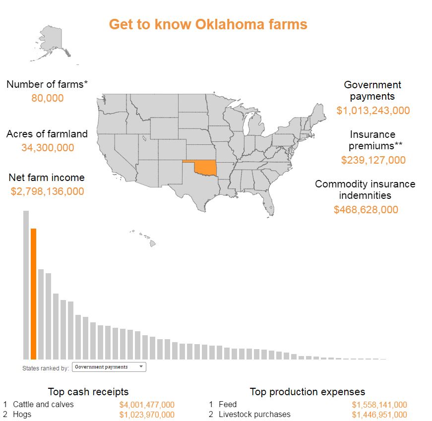
This post by Kevin Patrick at farmdocdaily alerted me to an interesting data visualization tool created by the USDA Economic Research Service (see the bottom of this web page for a three different tools).  

I used the "get to know your state" tool and pulled up Oklahoma.  I was a bit surprised to see that in 2014, total government payments to the state were over $1 billion while at the same time net farm income was $2.8 billion.  If I'm reading this right, it implies 36% of net farm income in OK in 2014 was government payments, and Oklahoma ranked 2nd in government payments while ranking only 23rd in sales.  Thinking this might be an aberration, I pulled up 2013, and then "only" 19% of net farm income in Oklahoma was government payments.  

Looking at the supposed "big government", California (which has the most ag sales of any state), only 1.5% of its net farm income was from government payments in 2014.  

The "farm income atlas" tool lets you plot government payments (and other components of income) for each state. Here's total government payments for 2014. 

There's a lot more available in the tools.  Check it out yourself.

Farm-to-Table Baloney

This is a story we are all being fed. A story about overalls, rich soil and John Deere tractors scattering broods of busy chickens. A story about healthy animals living happy lives, heirloom tomatoes hanging heavy and earnest artisans rolling wheels of cheese into aging caves nearby.

More often than not, those things are fairy tales. A long list of Tampa Bay restaurants are willing to capitalize on our hunger for the story.

That's from a story by Laura Reiley in the Tampa Bay Times.  After some investigation, she finds most farm-to-table restaurant claims are anything but.  The whole article is worth a read - the ubiquity of the lies is truly astounding.  

It goes to show that show much of what we taste comes from what happens in our heads and not what happens on our tongues.  It also goes to show that whatever restaurateurs say they want to sell, they too recognize that if you want affordable, high quality, consistent products all year round, it makes sense to trade with others who aren't necessarily living 100 miles from you. 

Where have all the cows gone?

Over past the half century or so, there has been a dramatic shift in where most of the cattle in the U.S. are feed just prior to slaughter.  Using data from USDA-NASS, I calculated the percentage of all U.S. cattle on feed that were in 6 selected states at the beginning of January each year from 1965 to 2005.

The story is familiar to industry analysts.  Over this time period, cattle largely moved from the upper Midwest (Iowa and Illinois) to drier climates in Texas, Oklahoma, and Kansas.  Whereas 19% of cattle on feed were in Iowa in 1965, the figure was only 8% by 2005; by contrast only about 5% of cattle on feed were in Texas in 1965, but around 20% were in the state by 2005.  Whereas only 47% of all US cattle on feed were in these six states in 1965, concentration had increased as 67% of all cattle were being fed out in these six states by 2005. Stated differently, if you eat a steak today, there's a roughly two-thirds chance it came from a cow that was fed in Iowa, Nebraska, Illinois, Kansas, Oklahoma, or Texas.  

The trends in the above figure might appear to be something of a paradox because Iowa, Illinois, and Nebraska grow a lot more corn (i.e., cattle food) than Kansas, Oklahoma, and Texas.  But apparently the economics were such that it made more sense to ship to corn (and the cattle) to drier climates and locations where large packing plants could be situated far away from population centers.  

I'm wondering if this trend is starting to change, even if just by a little bit.  Beginning in the early to mid 2000s, US policy started to encourage corn-ethanol production in a big way.  Now, all that corn didn't need to travel to cows, it could go to all those ethanol plants which began popping up around the upper Midwest.  Here's a graph of the percentage of U.S. corn use that went to ethanol production from 2000 to 2012 (data are from the Feed grains yearbook, USDA-ERS).

Such a dramatic shift in the use of corn must have had some effect on cattle feeding.  Perhaps even in the geographic location of cattle.  According to a least one source, the largest producers of ethanol in 2015 were Iowa (at 3,820 million gallons/year capacity), Nebraska (1,976 gallons), and Illinois (1,525 gallons).  Much further down the list were Kansas (529), Texas (381 gallons), and Oklahoma (no capacity reported).  

Often lost in the discussions of food waste is the acknowledgement that cattle (and other livestock) are often big consumers of what would otherwise be waste products.  In this case, cattle can eat so-called distillers grains that are byproducts of ethanol production.  However, this distillers grain is not as easy or cheap to transport.  Thus, the economics might have shifted a bit toward bringing the cattle back closer to their finishing food.  

Here's the same graph as the one above but for the more recent time period from 2005-2016.  

There aren't dramatic geographic shifts, but the trends are consistent with the idea that ethanol has altered the geographic location of cattle finishing. Fitting a linear trend line through each state's data over this time period indicates that the states heavy with ethanol production have gained cattle and states with relatively little ethanol production have lost cattle.  Iowa, Nebraska, and Illinois have increased their share of the US cattle on feed inventory by an average of 0.11%, 0.11%, and 0.05% per year over the last 11 years.  By contrast, Kansas, Oklahoma, and Texas have decreased their share of the US cattle on feed inventory by an average of -0.13%, -0.04%, and -0.09% per year over the last 11 years.

Obviously a lot has changed during the past 10 years other than ethanol production (drought and lower overall cattle inventories come to mind), but this might be a factor contributing to the spatial location of cattle in the US.