Blog

Farm Subsidies - Magnitudes and Comparisons

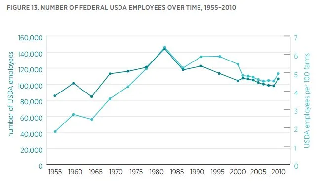
Continuing the discussion of the paper I wrote entitled "The Evolving Role of the USDA in
the Food and Agricultural Economy", today I'll discuss some USDA farm support programs (in another post, I'll discuss the academic research on effects of these and other USDA programs). 

In 2012 (the last date of the Census of Ag), the average government payment per farm receiving payments was $9,925. However, a large percentage of farms receive no government payments . In particular, farms that sell less than $50,000 worth of products tend not to receive payments, while the opposite is true for farms with sales greater than $50,000. For the 3.9 percent of farms with sales of $1 million or more, 71.2 percent receive payments averaging $40,559. Whereas the smallest farms receive the smallest average payments in total dollars, they receive the largest payments when expressed relative to value of production. Farms with sales of less than $1,000 that receive payments tend to get 9.36 cents for every dollar of output produced, but farms with sales of more than $1 million that receive payments tend to get only about 2 cents for every dollar of output produced.

Although government payments represent a small fraction of the value of output (i.e., gross revenue), they are certain to represent a much higher fraction of farmers’ net income. In fact, USDA Census of Agriculture data show that in 2012, the average net cash income for each category of farm with sales of less than $24,999 was negative. Those farms operate at a loss; because of this, whatever government payment they receive is infinitely greater than what they
make from farming. The average payment as a percentage of net income (for those receiving payments) is 31 percent, 18 percent, 13 percent, and 7 percent for farms with total sales in the categories $100,000 to $249,999, $250,000 to $499,999, $500,000 to $999,999, and $1 million or more, respectively.

It is interesting to compare all this with SNAP payments.  As indicated, of the farms receiving payments in 2012, the average payment was $9,925. By contrast, USDA data indicate that the average payment per individual receiving SNAP in 2012 was $133 per month, which amounts to $1,596 annually. SNAP payments increase at a decreasing rate with the size of the household. For a four-person household receiving SNAP benefits, the average payment was $440 per month, or $5,280 per year, in 2012. Food assistance programs represent a larger share of the USDA budget than do farm support programs because SNAP recipients far outnumber the recipients of farm program payments, not because each SNAP recipient receives a higher payout than does each recipient of farm supports.

It is also useful to compare US farm support payments with those in other countries.  For this, we can turn to data from a World Bank project led by the Kym Anderson and colleagues. 

The nominal rate of assistance (NRA) is defined as the percentage increase or decrease in gross returns to farmers caused by government policies. A positive number means a country’s
policies are pushing up agricultural prices and returns, and a negative number implies the opposite. The gross rate of assistance (GRA) is the NRA expressed in absolute dollar terms (in the year 2000) instead of in percentage terms. The GRA is the NRA multiplied by the value of agricultural production in a country divided by the number of farmers.

Figure 14 shows the average NRA, and figure 15 shows the average GRA of 53 different countries from 2000 to 2010. The figures contain a selection of developed and developing countries to provide insight into the diversity of agricultural policies around the world. The United States had an average NRA of 11.2 percent and a GRA of $3,576 per farmer over this period. That means that the gross returns of US farmers are 11.2 percent (or $3,576 per farmer) higher than would have been the case were it not for various government policies. Some countries, such as Norway, Iceland, Switzerland, and the Republic of Korea, have NRAs higher than 100 percent. Thus, US agricultural policies push farmer prices and returns higher than would be the case in the absence of such policies, but by an amount far less than is the case in some other countries and far more than in others.

Whereas figure 15 shows a snapshot of the GRA at a point in time, figure 16 shows changes in the GRA per farmer over time in eight selected locations (all in 2000 dollars). The GRA per farmer in the United States increased sharply from the 1970s to the 1980s and has subsequently stayed around $3,000 per farmer per year. The GRA per farmer in Japan has risen over the entire period considered from only $536 per farmer per year in the 1960s to $8,653 per farmer per year from 2000 to 2009. New Zealand dramatically lowered the GRA per farmer from the 1980s to the 1990s. Brazil and China have policies that are relatively neutral with regard to farmer gross returns. Until recently, countries in the European Union had highly distorting policies equivalent to taxes in excess of 100 percent.

In most locations (except eastern Europe and central Asia), agricultural policies have distorted the overall economy less since the 1980s. From 2000 to 2010, the United States had a welfare reduction index (WRI) of 17; the only locations that had less distorting policies were Australia and New Zealand, which had an average index of only 3.8 over this period (figure 17).

The welfare reduction index (WRI)  accounts not only for transfers but also for trade policies that affect the food and agricultural economy. According to Anderson, Rausser, and Swinnen, the WRI is calculated as “the percentage uniform trade tax which, if applied equally to all agricultural tradables, would generate the same reduction in national economic welfare as the actual intrasectoral structure of distortions to domestic prices of these tradable goods.”

The previous graphs aggregate the effects of agricultural and trade policies across all commodities. Figure 18 shows the average NRA for 11 different commodities in the United States from 2000 to 2010. During that period, sugar, cotton, and milk producers benefited most, with NRAs of 75 percent, 56 percent, and 39 percent, respectively. Barley and wheat had relatively low NRAs. Other commodities like beef and pork (not shown in the graph) had NRAs near zero.

To put these figures in perspective, it is useful to compare them with other distortions in the economy. In a remarkable statement, Anderson, Rausser, and Swinnen write,

In 2004, existing agricultural and trade policies accounted for an estimated 70 percent of the global welfare cost of all merchandise trade distortions, even though the agricultural sector contributes only 6 percent of global trade and 3 percent of global GDP.

In short, despite the small contribution of agriculture to global GDP, agricultural policies are responsible for the lion’s share of welfare losses that result from trade distorting policies.


In the paper I also talked about the fact that USDA impacts on the economy likely extend beyond those caused by explicit farm-commodity policies. To get a sense of such impacts, I utilized the RegData database.  You can read the paper for more details on that data set, or look at some of the work by Levi Russel who blogs at FarmerHayek.com.

Assorted Links

The Food Rush Magazine reviewed Unnaturally Delicious

Study of dietary trends from 1999-2012 in the US reveals generally positive improvements

Trends in obesity rates essentially flat for the past decade

Jane Kolodinsky and I are interviewed in a NPR Marketplace story about Vermont's impending GMO labels

The Restaurant Performance Index falls again - something I predicted last month (well, my little model got the direction right if not the magnitude)

Cool article about the various ways robots are starting to affect our kitchens

The USDA by the Numbers

I previously posted on a paper I wrote entitled "The Evolving Role of the USDA in the Food and Agricultural Economy."  Today I'll cover some of the figures and tables that describe the USDA and how it has changed.   

Today, the USDA engages in numerous activities. The department has 17 different agencies, 18 different offices, and the agencies are organized under seven politically appointed under-secretaries (see here for a description the agencies and offices and here for an organizational chart).  Many (but not all) USDA activities are authorized by the farm bill, the most recent of which is the Agricultural Act of 2014. The 2014 Farm Bill has 12 major sections (or titles). 

Since the 1960s there has been a sharp increase in USDA spending. Most of that increase has been driven by spending on food and nutrition assistance (primarily "food stamps"). Of total USDA outlays in 2014, over 70 percent went toward food and nutrition assistance. Real spending on agricultural research slowly increased from the 1960s and experienced a sharp jump in the first few years of the 21st century. Since that time, research funding has declined in real terms and fell back in 2014 to the pre-2000 levels (full disclosure, some of my research and salary is funded by these USDA research expenditures). Spending on farm income stabilization varies from year to year, but it has hovered around $20 billion in recent years.

Below is the same data expressed as a percent of the total federal budget (note that the copy editors got the scale of the axis wrong - there is an extra "0" where there shouldn't be; the scale should range from 0% to 7%).

From 1980 until 2009, total federal spending increased at a faster rate than did USDA spending, leading to a fall in the share of spending attributable to the USDA. Since that time, USDA spending has outpaced total federal spending because of increases in food and nutrition assistance. In 2014, the USDA was responsible for about 4% of total federal spending.

Figure 10 shows a breakdown of the USDA budgetary authority for 2014. The department was authorized to spend $161 billion, with 66.6 percent allocated to the Food and Nutrition Service, which is responsible for administering the Supplemental Nutrition Assistance Program. The next-largest spending categories in 2014 were the Risk Management Agency (i.e., crop insurance) and the Commodity Credit Corporation.  The Commodity Credit Corporation is the mechanism through which the USDA pays out farm subsidies associated with price and income support programs, Conservation Reserve Program payments, and payments for export promotion programs. The Agricultural Marketing Service Section 32 funds (representing customs receipts allocated to support the farm sector; in recent years, most of those funds have been transferred to the childhood nutrition account) and the Forest Service account for 5.5 percent and 3.3 percent of the USDA budget, respectively. All other agencies individually account for 2 percent or less of total USDA spending.

As a basis for comparison, and to illustrate how the USDA has changed over time, figure 11 shows a breakdown of the USDA budgetary authority in 2006, when the department was authorized to spend only $100 billion (that's in 2006 dollars despite what the title says; covered to 2014 dollars its about $117 billion). The Food and Nutrition Service accounted for only 53.7 percent in 2006 compared with 66.6 percent in 2014. The Commodity Credit Corporation played a much larger role in the USDA budget in 2006 than in 2014, with the opposite being true of the Risk Management Agency.

In 2010, the USDA had 106,867 employees. If one disregards employment by the Defense Department (and Veterans Affairs) and the US Postal Service, USDA employees account for just under 10 percent of all federal employees.

In 1955, there were about 85,500 USDA employees and 4.78 million farms, implying about 1.8 USDA employees for every 100 farms in the United States. The number of USDA employees per farm grew sharply until the 1980s, when there were 6.4 employees per 100 farms. Since that time, the number of USDA employees has fallen slightly, with an uptick in 2010, the last year for which data are available. In 2010, there were 5 USDA employees for every 100 farms in the United States (of course not all USDA employees work on farm issues).

The evolution of American agriculture

The Mercatus center just released a paper I wrote entitled "The Evolving Role of the USDA in
the Food and Agricultural Economy."  I decided to write the paper after having a number of conversations with folks who held a variety of beliefs (some correct, some incorrect) about how agriculture has changed and were curious about the role of the USDA and how it has evolved over time.  In the next few posts, I'll share some of the data and figures I pulled together for the paper (most of which comes perhaps ironically from the USDA).  

Here is a bit on the evolution of American agriculture.  Future posts will cover changes in the USDA.

In 1900, just under 40 percent of the total US population lived on farms, and 60 percent lived in rural areas. Today, the respective figures are only about 1 percent and 20 percent. 

The United States had between six and seven million farms from 1910 to 1940 (figure 1). A sharp decline in the number of farms occurred from the 1940s to the 1980s. At the same time, the average farm size more than doubled, from about 150 acres to around 450 acres. 

Whereas farm households earned lower incomes than other households before the 1970s, since the mid- 1990s, farm households have consistently earned more than other US households.  In addition to earning higher incomes, farm households today tend to have substantially higher net worth than the average US household. Census data indicate that the mean (median) net worth of all US households in 2012 was $338,950 ($68,800). By contrast, the mean (median) net worth of farm households in 2014 was $915,210 ($802,000). In 2012 (the last ag census date), 98 percent of farm households had a net worth that exceeded the net worth of the median US household. (The average income for farm households in 2015-2016 is likely to come down somewhat given the fall in commodity prices.)

Farm household incomes have become more diversified over time in the sense that the percentage of household income from farming has steadily declined (aside from the increase in 2011–2012 from higher commodity prices). So while farms have become more specialized (growing fewer commodities than they did in the past), the household income of farmers has become more diversified and less reliant on farm income

Small farms account for only a small share of the value of agricultural output. In fact, farms with total sales of less than $25,000 (more than half of all farms) account for less than 1 percent of the value of agricultural output while farming 20.7 percent of the acreage. By contrast, 7.5 percent of the larger farms (those with more than $500,000 in sales) account for 80 percent of the value of agricultural output while farming only 38.4 percent of the land. These data suggest that much of the information the USDA reports on farms fails to correspond with businesses that have any substantive level of output.

The changes in the number and composition of farms over time are partly attributable to changes in technology and market conditions. The figure above shows an index of yields for corn, wheat, and cotton. Corn yields in 1900 were only 18 percent of what they were in 2014. In 1900, wheat yields were only about 30 percent of what they were in 2014. With the adoption of tractors, synthetic fertilizers, and improved seeds, yields began climbing after World War II. Yield growth has continued until today, although the rate of growth has slowed somewhat in recent decades.

It is possible to achieve higher output by increasing the volume of the inputs used. However, total agricultural output has more than doubled since 1948, while key agricultural inputs have fallen. More output with fewer inputs implies increased productivity. According to USDA-ERS data, in 1948, the amount of labor used in agriculture was four times what it is today. As the above figure shows, the United States produces more agricultural output today, despite using less land and substantially less labor.

Increasing productivity leads to falling prices. The figure above shows an index of real prices from 1910 to 2014 for corn, wheat, and cotton. Before the 1950s, prices for those commodities were routinely three to six times higher than they are today.  The beneficiaries of falling agricultural prices have been food and fiber consumers. Farmers face lower prices today than in the past, but as the preceding figures reveal, they have more output to sell, resulting in higher net incomes. 

In short, today there are fewer but larger farms than there were in the past.  The farms that remain tend to earn higher incomes and have higher net worth than average US households.  Farm production is today heavily concentrated among a small share of about 160,000 producers.

The Future of Food

In the last chapter of Unnaturally Delicious, I contrasted two issues of National Geographic about food and agriculture that appeared roughly 44 years apart.  The first story, written in 1970 by Jules Billard, was titled "The Revolution in American Agriculture."

Here's what I had to say:

Yes, some futurists teeter on the edge of technological utopianism (where is that flying car we were promised in the 1950s?), and today’s farms may not have the modern architectural flare depicted by the artist. But the reality is not that far off. Soil sensors, drones, satellite images, soy burgers, contour plowing, efficient irrigation, chicken cages, and mechanical harvesters all
were discussed as the future of food nearly five decades ago, and they are now a regular part of farm and food practices on what are larger, more specialized, but still family-owned farms. GPS signals drive today’s tractors, and fertilizer applicators and planters distribute their payloads based on digital input from soil sensors and crop consultants. Farmers watch the evolution of crop prices and thunderstorms on their smartphones. Farmers apply livestock waste as fertilizer or use it in anaerobic digesters to create energy for the farm. Drones track crop yields, cattle location, and animal health. Farming innovators are moving high-value crops indoors under blue and red light-emitting diodes (LEDs) that give off precisely the wavelengths the plants need in environments that use recycled water, reduce water losses from evaporation, and prevent pests and thus the need for pesticides.
U.S. agriculture largely delivered on the hopes of the 1970s to satisfy the growling stomachs of a growing world, primarily through innovation and technological development. Yet, it seems
Americans are hardly content. While an abundant food supply sufficient for an expanding population remains a top concern, the 1970 and 2014 stories in National Geographic also reveal shifts in the food problems that occupy our attention as well as changes in how we envisions addressing them. The 2014 special edition of National Geographic argued that “agriculture is among the greatest contributors to global warming” and the “environmental challenges posed by agriculture are huge, and they’ll only become more pressing as we try to meet the growing need for food worldwide.” Other articles in that issue worried about corporate control, hunger, deforestation, nutrition, food deserts, waste, and more. Yet it’s not clear whether our cultural food pessimism is warranted.

and

Technological advancement and industrialization have been great food equalizers—freeing peasants and serfs from the demands of the land and letting them eat like the royalty they once served. [Rachel] Laudan correctly observes that “were we able to turn back the clock, as they urge, most of us would be toiling all day in the fields or the kitchen; many of us would be starving. Nostalgia is not what we need.” What we need is a recognition of the ability of technology to help solve our food problems along with wisdom about how to ensure against
the risks that technology can create.

I conclude the book by saying:

I have no idea whether the particular products and technologies will ever make it to our farms and kitchens. But that’s not really the point. The point is the process. Experimentation and innovation are what will ultimately help address our food problems. If we’ll let them.