Blog

Why large scale organic requires large scale non-organic

The NPR Planet Money podcast just ran an interesting episode about the challenges a farmer started having with bald eagles when he went organic and started raising chickens outdoors.  It's a nice story, but I want to take a minute to correct a subtle (but important) message about organic production promoted in the podcast that is widely mis-understood.  It has to do with the nitrogen cycle.  Here is Planet Money:

He went organic. He started making changes. To replace the chemical fertilizer, he brought in chickens and let them roam free. Free-range chickens would fertilize the grass; the grass would nurture the cattle, and shoppers at Whole Foods would love Harris’s organic beef.

Here is the problem - the "chemical fertilizer" wasn't actually replaced (at least not fully).  

All farms, if they want to be productive, need fertilizer, and they need nitrogen in particular.  There is ample nitrogen in the air, but it is not in a form that is available to most plants or animals.  Up until about a hundred years ago, we had to get the bulk of our nitrogen from microbes that grew alongside legumes that "fix" the nitrogen in the air and make it available to plants.  Animals would then eat the plants, use some of the nitrogen, and then excrete some of the nitrogen in their manure.  This is why manure is a great fertilizer - it contains residual nitrogen. But, here's the main point: the nitrogen didn't come from the cow, pig, or chicken.  It came from the microbes in the soil and made it into the animal via the plant. 

Then, along came Haber and Bosch.  They figured out a way to get nitrogen from the air.  This greatly increased the amount of nitrogen available, increased crop yields, the number of animals we could feed, and ultimately the human population.  Here is Thomas Hager in the fantastic book The Alchemy of Air on the effects of this extra nitrogen:

As a species we long ago passed the natural ability of the planet to support us with food.
Even using the best organic farming practices available, even cutting back our diets to
minimal, vegetarian levels, only about four billion of us could live on what the earth and
traditional farming supply. Yet we now number more than six billion, and growing, and
around the world we are eating more calories on average than people did in [the late
1800s]

So, what does any of this have to do with the NPR podcast?  The farmer (and the reporters) apparently believe they have escaped the use of "synthetic" fertilizer brought about by the Haber-Bosch process because the farmer's fertilization now relies on manure from chickens.  But, where did the nitrogen in the chicken manure come from?  The answer is that it came in via the feed the farm bought and brought in from another farm.  

Maybe the farmer bought organic corn to feed his chickens.  That solves the problem, right? Not exactly.  Your see, the organic corn farmer who sold our organic chicken farmer corn undoubtedly used fertilizer.  There is a very good chance that this fertilizer was some form of manure.  Yet (and this is a very important point), organic rules don't discriminate whether manure comes from an organic or non-organic fed animal.  Because there are many, many more non-organic animals, chances are that the manure came from an animal fed non-organic grain.  Where did the nitrogen in that non-organic grain and then manure come from?  Haber and Bosch.

Thus, even assuming that organic chicken feed was used, there is a very high probability that the nitrogen in the chicken manure that was used on our organic farm featured in the NPR story came from corn that was fertilized with manure that came from a cow or pig or chicken that was fed corn that was fertilized using nitrogen made available via Haber and Bosch.  

So, despite what is implied by the journalists (and perhaps even believed by the farmer), we haven't returned to some kind of "natural" nitrogen cycle.  We've simply found ways of importing "synthetic" nitrogen into a system that makes it look "natural."  This academic paper looking at French farms, for example, calculated that organic farms strongly rely on non-organic farms for their nutrient flows finding on average, 73% of phosphorus, 53% of potassium, and 23% of the nitrogen used in the organic farms in their studies was imported from conventional, non-organic farms via processes like the one I described above.  As one writer put it:

However much nitrogen exists in manure today, much of it has been fixed industrially before being taken up by corn plants and laundered through the guts of conventionally-farmed animals.

Now, one could avoid all this by requiring organic producers to use only manures from organic animals fed organic feed.  However, I seriously doubt there is enough available nitrogen from this "natural" system to support the present size of the organic market.  As the organic market grows, this likelihood becomes even more remote.  Indeed, if one wants large scale organic, it almost certainly implies (given the current population) the need for large scale non-organic.  All that life-supporting nitrogen has to come from somewhere.  Until we find a better way, right now it is coming from Haber and Bosch and is smuggled into organic agriculture via animal manure.  

The Great Bacon Freak Out of 2017

By now, you've probably all seed the headlines: Now It’s Getting Serious: 2017 Could See a Bacon ShortageNation's bacon reserves hit 50-year low, and The Looming Disaster Of A US Bacon Shortage

As quickly as those headlines hit came another round of headlines proclaiming the original stories "fake news".  From the New York Times:  Bacon Shortage? Calm Down. It’s Fake News and USA Today: Bacon lovers, rest easy. You do not need to fear a shortage (coincidental, USA today also ran one of the initial stories hyping the issue before subsequently telling readers to "rest easy").  

Like so many issues, the truth is somewhere in the middle.  No, we're not going to run out of bacon.  However, it is true that bacon stocks (the amount of frozen bacon in storage) hit a 50 year low.  All the focus on storage is misplaced in my opinion.  What you really want to look at are prices.  Prices reflect scarcity relative to demand.  If bacon were really scarce, we'd expect bacon prices to rise because people would bid up the price to get their hands on the fewer supplies that remain.

Let's take a look at USDA data on wholesale pork prices (these are the so-called primal cutout values).  Below, I've plotted daily prices (cents per lb) for pork belly, and for comparison sake, the ratio of belly prices to pork loin prices from the first of 2014 to January 30, 2017.  

There has, indeed, been a dramatic increase in pork belly prices.  Prices increased from about $0.98/lb in November 2016 to now about $1.64/lb (a 67% increase).  However, as the graph also shows, this price point for bellies isn't unusual even in recent history.  Belly prices were at the same point or higher in the spring and then summer of 2014 and again in the summer of 2015.  The price swing in April and May of 2015 was much more dramatic than what we're currently seeing.  

Pork belly prices may rise and fall not because of scarcity of bellies per se but rather because of increases or decreases in overall pork supply.  As such, it is also useful to look at price ratios (i.e., are bellies in more demand than loins).  On this measure (the red dashed line in the above graph), bellies prices are higher than they've been in the past couple years: today pork belly prices are about 2.1 times higher than pork loin prices; back in late August, early September of 2015, the ratio was also high but only reached 2.07.

But, there is no fear that we'll run out of bacon in the short term. The pork industry is actually on pace to produce more pigs over the next year than it did last year.  Still, a hog can't be produced overnight.  So, how do we allocate a fixed supply of bacon in the short run?  That's the magic of the market.  Prices will adjust to ration out the supply that exists.  As such, the entire question that made he headlines was silly.  We shouldn't ask: will we run out?   But, rather: how high will prices go?  


Journal Articles and Journal Reviewing

Readers might recall my AAEA president's column from a couple weeks ago, where I highlighted some potentially worrying trends in the academic publishing world associated with agricultural economics.  Since then, I've run across at least two other papers that touch on related themes and problems.  

The first is a paper in the Journal of Economic Perspectives by Jonathan Berk, Campbell Harvey and David Hirshleifer.  The main purpose of the article is to provide some advice to academics on how to referee journal articles.  Their main message, with which I completely agree, is that referees often pay too much attention to minor technical issues and too little attention to the importance of the problem.  Their advice:

Do not dismiss papers that attack larger issues merely because flaws can be found. The important question that you need to assess is whether the flaws actually invalidate the contribution. If the flaws do not rise to this level and you judge the contribution to be important enough to warrant publication, then you should recommend publication. All papers have flaws, and no amount of revision removes all uncertainties. There is always need for further research to provide deeper perspectives. Try to ask yourself the following question: Flaws and all, would I have been pleased to have written such a paper? If yes, that gives a strong hint that it should be strongly considered for publication, flaws and all.

At the beginning, the authors highlight what they see as the main problem:

The review process for academic journals in economics has grown vastly more extensive over time. Journals demand more revisions, and papers have become bloated with numerous robustness checks and extensions . . . Even if the extra resulting revisions do on average lead to improved papers—a claim that is debatable—the cost is enormous. We argue that much of the time involved in these revisions is a waste of research effort.

It seems that my colleague, Wade Brorsen, agrees (at lest with some of these points).  Wade's Western Agricultural Economics Association presidential address was recently published. After documenting the increase in paper and complexity, in his usual frank fashion, Brorsen has the following to say:

One thing that stands out in table 1 is the increase in the length of manuscripts. The increased length is not all bad—since it can sometimes mean more robustness checks and more detail that will help a few readers—but the increased length can also be costly. Not necessarily to authors; as the saying attributed to Blaise Pascal goes: “I didn’t have time to write a short letter so I wrote a long one instead.” The cost is on the reader because it takes more time to read the paper. The cost can also be on the science since the paper may not be read if it is too long. I advocate twenty manuscript pages of text as a target. I select this length because it is roughly my own attention span. Anything much longer and I am not going to read it.

Brorsen also takes issues with the use of impact factors, the pursuit of the interesting over the important, the use of certain statistical techniques, the lack of simplicity, and more.  He ends as follows:

I have suggested several changes that our profession needs to make, such as reducing the length of manuscripts and reducing complexity. I am not the first to make such suggestions. The reviewers and editors are us. If we want to change what we value, we can.

TASTE TRUMPS HEALTH AND SAFETY: INCORPORATING CONSUMER PERCEPTIONS INTO A DISCRETE CHOICE EXPERIMENT FOR MEAT

That is the title of a paper I just published with Trey Malone in the Journal of Agricultural and Applied Economics.  

Here are some of the key results:

Our participants also indicate that they perceive chicken breast to be the healthiest option in our sample. Both beef products would generate substantial changes in WTP by increasing their perceived healthiness to that of chicken. For example, if hamburger had the same average health perceptions as chicken breast, WTP for hamburger would increase by $0.69. Deli ham, however, would experience an $0.83 increase in WTP if consumers were to believe it was as healthy as chicken breast. Even chicken wings would experience a $0.52 increase in WTP through a perception change.

and

The nonmeat options are actually perceived as safer than the meat options. As such, if the average participant perceived hamburger to be as safe as beans and rice,WTP would increase $0.34. Of all products, deli ham would benefit the most by an increase in perceived safety to the level of beans and rice. In fact, our sample indicates that pork products are not very highly appreciated. As noted, deli ham is perceived to be the worst tasting, least healthy, and least safe alternative in the choice set. Those negative perceptions are costly. If participants were to perceive deli ham as equal to chicken breast in taste and health, and equal to the perceived
safety of beans and rice, WTP for deli ham would increase by more than $2.

You can read the whole thing here.

Where do people eat the most meat?

It seems a fairly simple question: In which U.S. states do people eat the most meat?  Yet, there is surprisingly little good, publicly available data on this question.  Yes, there are fun maps like this one at Slate, but they are far from scientific or data driven.  

I thought I'd try to partially fill this void by turning to data from my Food Demand Survey (FooDS) that has been running now for almost four years.  Because I've surveyed over 1,000 people in the U.S. for about 44 months, that means I have responses from over 44,000 people spread all across the country that I can use to help look for geographic differences.  

In FooDS, each person is told "Imagine you are at the grocery store buying the ingredients to prepare a meal for you or your household.  For each of the following nine questions that follow, please indicate which meal you would be most likely to buy."  Then, they are presented with nine questions that look like the one below.  The only differences across the questions are the prices assigned to each item and the order of the items.      

For sake of simplicity, I counted the number of times each person chose steak, how many times they chose chicken breast, etc.  Thus, the maximum possible "score" a person could have for each item is 9 and the lowest is 0.  To be clear, this isn't a measure of consumption, but rather it is an index of demand.  It is a measure of how much people "like" each of the choice options relative to all the other choice options.  For point of reference, across all the people in my sample, the most frequently chosen option was chicken breast (chosen on average 2.43 times out of 9) followed by ground beef/hamburger (chosen on average 1.33 times out of 9).  The least popular meat items were pork chop and ham, chosen on average 0.80 and 0.68 times, respectively, out of 9.

I won't go into all the hairy details here (email if you want to know more), but I then estimated some statistical models to infer how often, on average, consumers in each state chose each of the meat options.  Then, I calculated how different (in percentage terms) each state was from the mean number of choices, and I created maps.

I'll start with one that has a very obvious regional pattern: chicken wings.

Chicken Wing Demand by State

Chicken Wing Demand by State

Demand for chicken wings is highest in the southeast US, where people chose this option 15% to 44% more often than in the average person in the US.  Consumers in western states like Oregon, Idaho, and Arizona chose wings 15% to 27% less often than the average consumer nationwide.

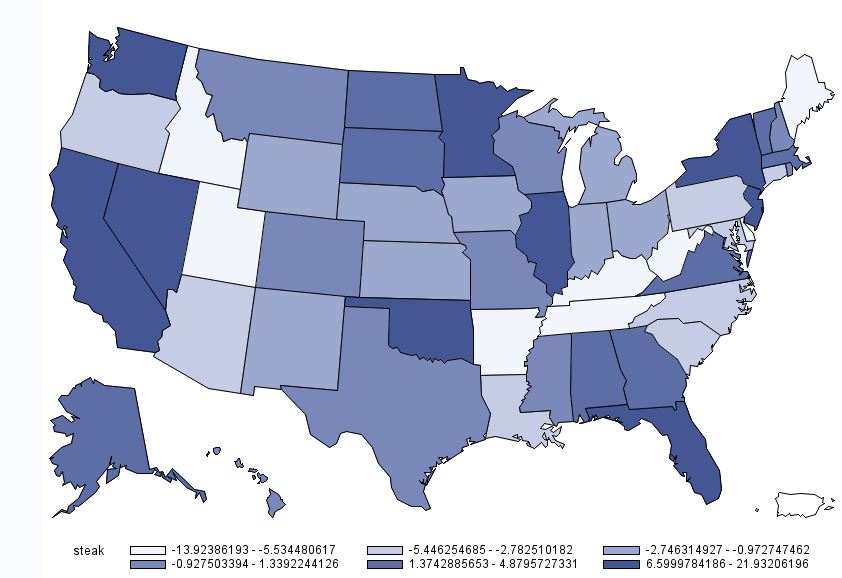
For other products, there is less of a regional pattern.  Below is the map for beef steak.  Demand for steak is highest in California, Nevada, Washington, Oklahoma, Minnesota, Illinois, Florida, and New York.  Steak demand is lowest in Idaho, Utah, Missouri,  and the Appalachian regions, Tennessee, Kentucky, and West Virginia.

Beef Steak Demand by State

Beef Steak Demand by State

While we are on beef, here is the map for hamburger/ground beef.  For ground beef, demand is generally highest in the upper midwest and is lower on the coasts.

Demand for Ground Beef by State

Demand for Ground Beef by State

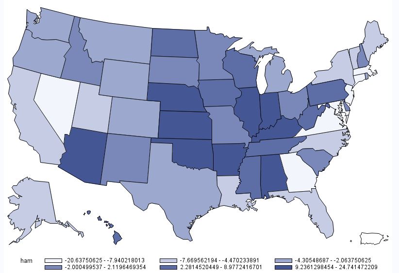
A somewhat similar pattern emerges for deli ham (shown below), although the location of heaviest demand moves a bit south and east relative to that for hamburger.  

Deli Ham Demand by State

Deli Ham Demand by State

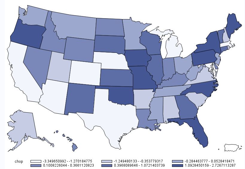
Below is the map for pork chops.  This map is interesting in the sense that there are several instances where some of the highest demand states are situated adjacent to some of the lowest demand states (e.g., Oregon next to California; Oklahoma next to Texas; etc.)  However, one thing to note in the case of pork chops is the scaling: there isn't much difference across any of the states.  Consumers in Missouri have the highest pork chop demand, but only chose pork chops 2.7% more than the average consumer.  Consumers in California have the lowest pork chop demand, but only chose pork chops 3.3% less than the average consumer nationwide.  

Pork Chop Demand by State

Pork Chop Demand by State

The last individual meat product is chicken breast.  As shown in the map below, chicken breast demand is generally highest in the west and the northeast.  I'm not at all surprised to learn that chicken breast demand is near the lowest in my home state of Oklahoma (at -4.5%), trailing only North Carolina, Missouri, and Mississippi.  

Chicken Breast Demand by State

Chicken Breast Demand by State

Finally, to round things out, here is a map associated with overall meat demand.  This figure was calculated by determining how many times a person chose any of the six aforementioned meat products (recall there were nine total options, three of which were non-meat).  On average people chose a meat option 7.03 times out of 9 total choices.  However, as the map below shows, there is some heterogeneity across states.  Overall meat demand is highest in the Midwest: consumers in Illinois, Indiana, and Iowa chose any meat option 1%+ more often than the average consumer.  Lowest overall meat demand was in places like California, Arizona, Maryland, Utah, New Jersey, and Massachusetts, where consumers chose a meat options at least 1% less often than the average consumer.  

Overall Meat Demand by State

Overall Meat Demand by State