Blog

Origins and Evolution of Food

I've seen a number of stories on the research of a team of people at International Center for Tropical Agriculture, the USDA, and elsewhere, some of which was published in a paper in the Proceedings of the Royal Society B and in another paper in the Proceedings of the National Academies of Science (PNAS).  The team aimed to identified where many of our crops originated and how our eating patterns have changed over time. 

Their website has a number of fantastic, interactive visualizations.  Here's one.  

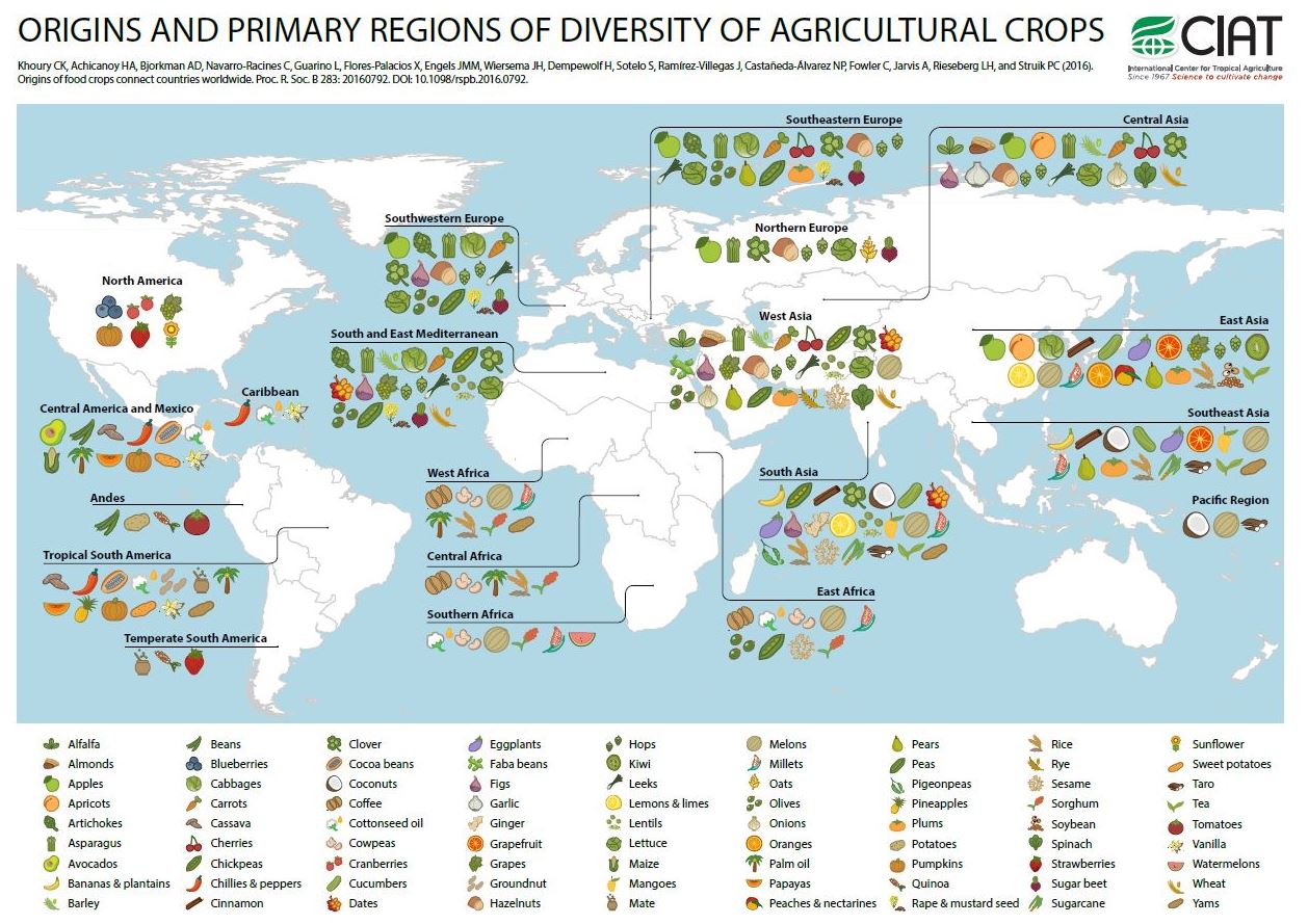
What I like about the figure above is how it challenges our idea of what is "local" or "authentic."  It also illustrates how much we've gained from trading with people in different parts of the world.  

The folks at Scientific American put together this graph based on data in the PNAS article, showing the convergence of dietary patterns worldwide.  

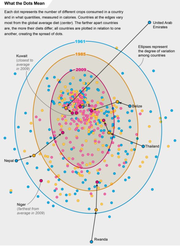
While there might be a temptation to decry the "sameness" brought about by globalism and the loss of cultural foods, the reality is much cheerier.  First, as the initial figure showed, what we think of as "our" cultural foods are probably relatively recent historical constructs.  Second, one of the reasons people eat more similarly to each other across the world is that we are now all eating each other's foodstuffs.  We've taken the best from each country and culture and exported it everywhere, and as a result have more diverse diets.  Finally, this trade has forestalled the doom-and-gloom Malthusian concern, as there has been a near universal increase in calorie availability worldwide.

Here's from the abstract of the PNAS article.

We assess trends over the past 50 y in the richness, abundance, and composition of crop species in national food supplies worldwide. Over this period, national per capita food supplies expanded in total quantities of food calories, protein, fat, and weight, with increased proportions of those quantities sourcing from energy-dense foods. At the same time the
number of measured crop commodities contributing to national food supplies increased, the relative contribution of these commodities within these supplies became more even, and the dominance of the most significant commodities decreased. As a consequence, national food supplies worldwide became more similar in composition, correlated particularly with an increased supply of a number of globally important cereal and oil crops, and a decline of other cereal, oil, and starchy root species. The increase in homogeneity worldwide portends the establishment of a global standard food supply, which is relatively species-rich in regard to measured crops at the national level, but species-poor globally. These changes in food supplies heighten interdependence among countries in regard to availability and access to these food sources and the genetic resources supporting their production, and give further urgency to nutrition development priorities aimed at bolstering food security

Farm-to-Table Baloney

This is a story we are all being fed. A story about overalls, rich soil and John Deere tractors scattering broods of busy chickens. A story about healthy animals living happy lives, heirloom tomatoes hanging heavy and earnest artisans rolling wheels of cheese into aging caves nearby.

More often than not, those things are fairy tales. A long list of Tampa Bay restaurants are willing to capitalize on our hunger for the story.

That's from a story by Laura Reiley in the Tampa Bay Times.  After some investigation, she finds most farm-to-table restaurant claims are anything but.  The whole article is worth a read - the ubiquity of the lies is truly astounding.  

It goes to show that show much of what we taste comes from what happens in our heads and not what happens on our tongues.  It also goes to show that whatever restaurateurs say they want to sell, they too recognize that if you want affordable, high quality, consistent products all year round, it makes sense to trade with others who aren't necessarily living 100 miles from you. 

Where do we like to shop?

I thoroughly enjoyed reading this paper by Rebecca Taylor and Sofia Villas-Boas, which was just published in the American Journal of Agricultural Economics.  The research makes use of a new data set - the National Household Food Acquisition and Purchase Survey (FoodAPS) - initiated by the USDA to study where people of different income levels prefer to shop for food.  This question is relevant to the debate on so-called food deserts.  Are poorer households eating less healthily because of the lack of "good" food outlets in their area, or are there no "good" food outlets in an area because people there don't want that kind of food?  To sort this out, you need to know where people of different incomes prefer to shop, and that's precisely what Taylor and Villas-Boas estimate.

Their data suggest that, if anything, lower income households tend to have more stores near them, and at least one store closer to them, than higher income households.  For example, in a 1 mile radius, low income households have, on average, 1 superstore near them, whereas higher income households have, on average, only 0.58.  Using the USDA's definition of a food desert, the authors calculate that only 5%, 8%, and 3% of low, medium, and high income households live in a so-called food desert.  Whereas low income households live, on average, closer to the nearest farmers market than high income households (10.7 miles vs 11.93 miles), high income households are more likely to actually visit a farmers market.  

The authors go on to estimate a consumer demand model.  Where do consumers prefer to shop given the distances they have to travel?  When economists say "prefer" - they don't mean how one feels about a location or the images it conjures up, but rather what is actually chosen.  The authors find that people prefer going to locations that are closer to home.  That is, people don't like to travel too far to shop.  This estimate, then, lets them calculate how far one is willing to travel to shop at one type of store vs. another.  The authors consider 9 types of stores (including restaurants and fast food outlets), and find farmers markets are the least preferable shopping outlet in that people are willing to travel the least distance to get to a farmers market.  

Using the authors estimates, I calculated how much people would be willing to pay ($/week) to shop at each of the 8 other types of food outlets instead of the (least preferable) farmers market.

Both low and high income households would be willing to pay around $25/week to shop at a superstore instead of a farmer's market.  The data also suggests that higher income households prefer farmers markets more than do lower income households.  Across all the outlet types, low income household are willing to pay $18.67 to shops somewhere other than a farmers market, but for higher income households, the figure is only $13.95.  The figure also shows that higher income households are more willing to pay to eat at restaurants than are low income households.  This suggests that farmers markets and restaurants are normal goods - the more income you get the more you want to shop in these kinds of outlets. 

The authors write in the conclusions:

the households in this sample have low WTP for Farmers Markets to be closer to home, and high WTP to pay for Fast Food to be closer to home. This implies that simply building Farmers Markets will not induce households to shop there.

The authors interpret this finding to mean, "low-income households may need to be compensated to shop at Farmers Markets."  But, why?  Why would we use tax payer dollars to encourage shopping in food outlets people least prefer?  Perhaps some would say that farmers market sell healthier food.  Maybe, but the highly desirable superstores sell healthy food too.  And, if the problem is healthy eating, where is the market failure, and why would farmers markets be the most efficient solution to solve that failure?  

In any event, I look forward to seeing the authors' follow up work on the subject, which they discuss at the end of this paper.  

Who moved my corn?

I have the great pleasure of giving a talk this week at the annual meeting of the Australian Agricultural and Resource Economics Society (AARES).  Tonight they held their awards ceremony, and I happened to be sitting next to Phil Pardey from the University of Minnesota who won (along with Jason Beddow) one of the research awards for a paper they published in the Journal of Economic History titled "Moving Matters".  

This is a fascinating paper that documents the movement of corn production over time in the US.  The paper illustrates the impact of hybrid and then genetically modified corn influencing what can be grown and where.  Changes in genetics and management practices allowed the corn plant to move  to soils that best suited the production of the crop.  As a result, they calculate that upwards of 21% of the growth in corn production can be explained by the geographic movement of the crop.   The results have implications for assumptions about impacts of climate change (i.e., that farmers can adapt by moving which crops, and which genetics, are planted where in response to changing temperatures) and for arguments about local foods (i.e., the sustainable production of crops depends on location of production, and allowing farmers to specialize in the geographic production of a crop can dramatically increase production).  

Here's the abstract:

U.S corn output increased from 1.8 billion bushels in 1879 to 12.7 billion bushels in 2007. Concurrently, the footprint of production changed substantially. Failure to take proper account of movements means that productivity assessments likely misattribute sources of growth and climate change studies likely overestimate impacts. Our new spatial output indexes show that 16 to 21 percent of the increase in U.S. corn output over the 128 years beginning in 1879 was attributable to spatial movement in production. This long-run perspective provides historical precedent for how much agriculture might adjust to future changes in climate and technology.

And, an interesting graph:

Farmers markets and food safety

Last spring, I noted that Marc Bellemare from he University of Minnesota gave a provocative seminar in our department on the relationship between farmers markets and foodborne illness.  This weekend, the Marc discuss the research in a piece for the New York Times. 

Here is the main finding:

As we will report in an updated version of an unpublished working paper released last summer, we found correlations that, in statistical parlance, are too robust to ignore. First, we found a positive correlation between the number of farmers markets per capita in a given state and in a given year and the number of reported outbreaks, regardless of type, of food-borne illness per capita in that state that year. Then, we found a similar positive correlation between farmers markets per capita and reported individual cases of food-borne illness per capita.

And,

And even if our results did identify a causal relationship between farmers markets and food-borne illness, it would not be possible to identify the precise mechanisms through which this happens, and it would be a critical mistake to conclude that the foods sold at farmers markets are themselves to blame. That is because most cases of illness are caused by consumers who undercook or fail to wash their food. Indeed, our results may suggest that many people erroneously believe that food bought at farmers markets needn’t be washed because it is “natural.”