Blog

How Expenses Vary with Farm Size

I've been a bit surprised at the number of comments and questions I continue to receive about this article I wrote for the New York Times almost a year ago.

Here are the opening sentences from the piece:

There is much to like about small, local farms and their influence on what we eat. But if we are to sustainably deal with problems presented by population growth and climate change, we need to look to the farmers who grow a majority of the country’s food and fiber.

Large farmers — who are responsible for 80 percent of the food sales in the United States, though they make up fewer than 8 percent of all farms, according to 2012 data from the Department of Agriculture — are among the most progressive, technologically savvy growers on the planet. Their technology has helped make them far gentler on the environment than at any time in history. And a new wave of innovation makes them more sustainable still.

Common questions I tend to get are "who are these large farms" and "do large farms use more or less fertilizer or chemicals than small farms?"  On the first question, I simply rely on USDA's classification of farms based on gross sales (which is where the above 80% from 8% originates).  The second types of questions are much more difficult to answer as there isn't great data easily accessible on the matter.

However, I recently ran across this USDA, National Agricultural Statistics Service (NASS) publication that reports farm expenses for different sized farms (again, where size is determined by gross sales).  These data are part of the Economic Research Service (ERS), Agricultural Resource Management Survey (ARMS).  Using the 2016 data in this publications, I created the following charts to help provide some perspective on how relatively small, medium, and large farms allocate their spending.

Here are relatively small farms.

The spending of relatively medium-sized farms is illustrated below.

Finally, here are graphics on spending by the largest farms.

A few comments on the comparisons are in order.  First, as indicated by the share of spending on livestock, poultry, and feed, there are different types of farms across size categories, so it's a bit like comparing apples to oranges.  The largest farms are most likely dairies, feedlots, or hog/poultry operations.  The proportion of crop output (as a share of total output) is likely higher for small and medium sized farms.  What we'd like to compare are small crop farms to large crop farms, but that data wasn't easily obtainable.   

The figures show that three categories of spending (as a share of total spending) fall as farms sizes increase: farm improvement and construction, tractors and trucks, and taxes and interest. This relates to some of what I argued in the NYT piece:  

But increased size has advantages, especially better opportunities to invest in new technologies and to benefit from economies of scale. Buying a $400,000 combine that gives farmers detailed information on the variations in crop yield in different parts of the field would never pay on just five acres of land; at 5,000 acres, it is a different story.

On two of the issues which people worry about the most - chemicals and fertilizers - these expenses tend to increase (again, as a share of total expenses) as size goes from small to medium than falls when going from medium to large.  However, some of this change is almost certainly due to the different mix of crops vs. livestock in the different size categories, so it's difficult to draw much of a conclusion from these data.   

Finally, I'll note the small sized categories of farm (less than $10,000 in gross sales) lose money on average.  Why?  Because, by definition, they're  bringing in less than $10,000 in revenue, but they're spending $13,755.  These farms need to generate at least $3,755 in additional annual value per farm to the farm owners, to their patrons, or to their neighbors that isn't reflected in market price for their activities to yield a net benefit to society.  

The Effects of Farm and Food Policy on Obesity in the United States

That's the title of a new book by Julian Alston and Abigail Okrent.  Right now it's only available as an ebook, but the hard copy should be out soon.  Here's the publisher's description.

This book uses an economic framework to examine the consequences of U.S. farm and food policies for obesity, its social costs, and the implications for government policy. Drawing on evidence from economics, public health, nutrition, and medicine, the authors evaluate past and potential future roles of policies such as farm subsidies, public agricultural R&D, food assistance programs, taxes on particular foods (such as sodas) or nutrients (such as fat), food labeling laws, and advertising controls. The findings are mostly negative—it is generally not economic to use farm and food policies as obesity policy—but some food policies that combine incentives and information have potential to make a worthwhile impact. This book is accessible to advanced undergraduate and graduate students across the sciences and social sciences, as well as to decision-makers in the public, private, and not-for-profit sectors.


I had the pleasure of seeing a pre-release copy of the book and provided the following blurb:

That obesity is a serious challenge in America is undeniable. Yet, appropriate policy responses are far less clear. The Effects of Farm and Food Policy and Obesity is a tour de force. Alston and Okrent provide a solid economic framework for thinking about obesity policies, bust myths about the causes of the problem, and offer nuanced solutions. The book is a must read for anyone seriously interested in role of food and agricultural policy in addressing obesity.

How Votes on GMO Labeling Change Concern for GMOs

At the annual meetings of the Agricultural and Applied Economics Association last week in Chicago, I saw an interesting presentation by Jane Kolodinsky from the University of Vermont.  She utilized some survey data collected in Vermont before and after mandatory labels on GMOs appeared on products in that state to determine whether consumers seeing GMO labels on the shelf led to greater or lower support for GMOs as measured by her surveys.  

I'm not sure if she's ready to make those results public yet, so I won't discuss her findings here (I will note I'm now working with her now to combine some of my survey data with hers to see whether the findings hold up in a larger sample).

Nonetheless, her presentation led me think about some of the survey data I collected over the years as a part of the Food Demand Survey (FooDS) project.  While I don't have enough data from consumers in Vermont to ask the same question Jane did, I do have quite a bit of data from the larger states of Oregon and Colorado, which held public votes on mandatory labeling for GMOs back in December 2014.  

In particular, I can ask the question: did the publicity surrounding the vote initiative on mandatory GMO labeling cause people to become more or less concerned about GMOs in general?

We have some strong anecdotal evidence to suggest that support for GMO labeling fell pretty dramatically in the months leading up to the vote.  For example, here are the results from several polls in California (including one data point my research with Brandon McFadden generated) on support/opposition to mandatory GMO labeling.  The figure below shows support for the policy was high but fell precipitously as the election campaigning began, and as we all know by now, the policy ultimately failed to garner majority support in California.

There is a similar pattern of support for mandatory GMO labeling in other states where the voter initiatives were held.  However, just because public support for a mandatory labeling policy fell as a result of campaign ads, this doesn't necessarily mean people thought GMOs were safer or more acceptable per se.  Indeed, many of the negative campaign ads focused on possible "paydays for lawyers" or inconsistencies in the ways the laws would be implemented, rather than focusing on the underlying technology itself.  

The Food Demand Survey has been conducted nationwide and monthly since May of 2013.  In November of 2014, two states - Colorado and Oregon - held widely publicized votes on mandatory GMO labeling.  These data can be used to calculate a difference-in-difference estimate of the effect of mandatory GMO labeling vote on awareness of GMOs in the news and concern about GMOs as a food safety risk.

The survey asks all respondents, every month, two questions of relevance here.  First, “Overall, how much have you heard or read about each of the following topics in the past two weeks” with response categories: 1=nothing; 2=a little; 3=a moderate amount; 4=quite a bit; 5=a great deal.  Second, we also ask, “How concerned are you that the following pose a health hazard in the food that you eat in the next two weeks” with response categories: 1=very unconcerned; 2= somewhat unconcerned; 3=neither concerned nor unconcerned; 4=somewhat concerned; 5=very concerned.  One of the 16 issues we ask about is "genetically modified food."

These data allow us to calculate a so-called difference-in-difference estimate.  That is - were people in CA and OR more concerned about GMOs than people in the rest of the country (this is the first difference) and how did this gap change during and after all the publicity surrounding the vote (this is the second and third difference)?  The "treated" group are the people in CA and OR while the "control" group consists of people in all other US states.

To analyze these question, I split the data into three time periods - "before" the vote (the months prior to September 2014), during the vote (Sep, Oct, Nov, Dec of 2014 and Jan of 2015) and after the vote (all the months after January 2015).  There were 485 "treated" people in CO and OR before the vote, 172 in these locations during, and 908 in these locations after (out of a total sample size of almost 49,000). 

In terms of awareness, here's what I found. 

Compared to people other parts of the U.S., people in CO and OR indeed reported hearing more about GMOs in the news during the ballot initiative vote than they did before and after (the increase in news awareness during the months surround the vote was statistically significant at the 0.01 level).

But, here's the key question.  Did the vote increase or decrease concern about GMOs as a food safety risk?  Apparently there was no effect.  The graph below shows, as compared to people in other states where there were no votes, there was actually a small increase in concern for GMOs in CO and OR in the months during the vote (however, the increase was not statistically significant, p=0.36), which then fell back down to pre-vote levels after the vote.  

So, despite evidence that the vote initiative on mandatory labeling led to an increase in awareness of GMOs in the news, it did not substantively affect concern about GMOs one way or the other.

Benefits and Costs of Local Food Policies

I've been critical of many of the local foods policies that have been touted as solutions to economic, environment, or health problems (e.g., see here or here).  Much of my criticism is rooted in the fact that advocates have failed to meaningfully and accurately articulate how policies to, say, require local schools or hospitals to source food within a certain radius or to subsidize farmers markets will improve the environment or increase a region's economic growth.

In the debate about local foods, proponents and opponents have largely talked past one another, and one of the hindrances to more fruitful dialog is the lack of a formal mathematical model from with people can illustrate the effects they believe to disseminate from promotion of local foods.  While surely not everyone will agree with the details of any particular model and the conclusions coming from it, a model at least provides a starting-point from which one can articulate what they believe the model is missing which would justify or condemn local food policies.

Enter this new paper by Jason Winfree and Philip Watson in the American Journal of Agricultural Economics.  The authors present just such a mathematical economic model in which one can talk about the benefits and costs of local food policies.  They generally show that local food policies are more costly than beneficial.  However, they do show that in certain conditions (if there is a lot of market power and extensive externalities), it is possible (though not necessarily likely), that local foods policies can produce more benefits than costs. 

In a blog post at Oxford University Press discussing their paper, they summarize their findings as follows.   

The formal model generally concludes that the traditional case for comparative advantage remains largely unaffected by these concerns [about the environment, food security, and economic growth]. In fact, in many instances, the buy local movement harms the local economy. One of the basic tenets of economics is that two regions can be made better-off through trade. Buying local generates inefficiencies that reduce social welfare. The policies intended to support the “buy local” movement results in a region producing a good where they do not have a comparative advantage. The costs of policies increase because the locally produced good forgoes the benefits of specialization and the division of labor.

Consider the case of negative externalities generated by foods brought in from distant locales. Proponents claim that pollution generated from transporting non-local goods to local markets justifies their claim. However, if the externalities require some kind of public response, a Pigovian tax makes more economic sense than encouraging “buy local.” The tax addresses the source of the externality. Buying local leaves the externality in place and does not address the inefficiency associated with deviating from comparative advantage.

Trends in Animal Welfare Concerns and Meat Demand

I'm preparing a talk at next week's annual meeting of the Agricultural and Applied Economics Association (AAEA) on trends in consumer concerns about animal welfare, and I thought while I'm at it I'd share a few of the results here.  All the results below come from the Food Demand Survey (FooDS), a monthly survey of over 1,000 consumers that has been ongoing for over four years (each of the graphs below contains information obtained from more than 48,000 survey responses).

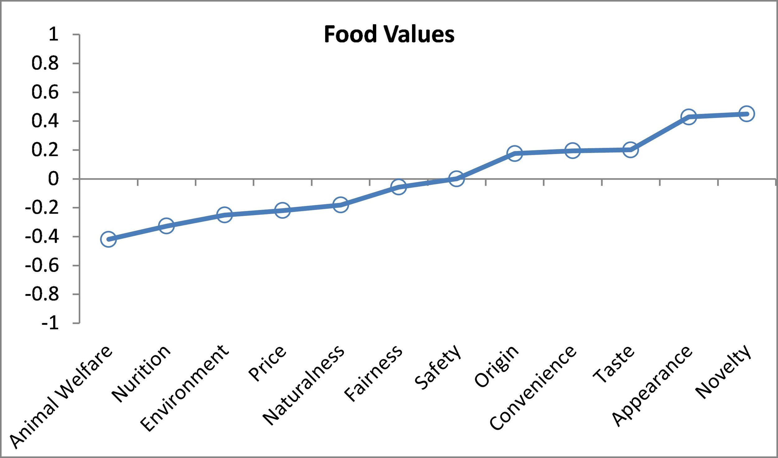
One of the first things we ask in the FooDS relates to "food values".  A list of 12 items is presented to respondents and they are asked which are most/least important when buying food.  Respondents have to click and drag four of the items into a "most important" box and also put four in a "least important" box, leaving four in neither box.  The nice thing about this questioning approach is that it requires a tradeoff - respondents can't say all issues are important and they have to indicate some as least important.  To create a scale of importance, I simply calculate the percent of times an issue is placed in the most important box and subtract it from the percent of times it is in the least important box, creating a measure that ranges from 100% to -100%.  

So, where does animal welfare fall in importance?  As the graph shows, it is 7th in the middle of the pack (this graph combines all the data from the last four years).  Animal welfare is much less important than taste, safety, nutrition and price but more important than origin, fairness, or novelty.  About 18% of consumers place animal welfare in the most important box and 31% place it in the least important box, creating a score of 18%-31%=-14%

The importance of animal welfare has increased a bit over time.  Here are the month-by-month averages going back more than four years.  Animal welfare importance has remained fairly stable for the past year, hovering around -10%, but this is higher than in 2013, when it was as low as -20%.

One question that might arise is "so what"?  Do these statements of importance on animal welfare and other food values have any relation to meat demand?  The answer is "yes" - there are some strong correlations.  In FooDS, we also ask people to make nine choices between different cuts of meat (and two non-meat items) at different prices.  A crude index of demand can be calculated as the number of times (out of nine) a meat product, say beef steak, is selected minus the number of times (out of nine) a non-meat item is selected (this produces a measure that ranges from -9 to +9).  Here are estimated relationships between food values and demand for steak and ground beef (controlling for demographics and other factors). 

Relationship between food values and steak demand

Relationship between food values and steak demand

Relationship between food values and ground beef

Relationship between food values and ground beef

The above graphs show that people who have higher concern for animal welfare have lower demand for steak and ground beef (recall the vertical axis is a demand index that ranges from -9 to +9; for reference the mean demand index for steak is 0.9 and the mean for ground beef is 1.32).

Results indicate that if an individual who indicated animal welfare as the most important food value (a score of +1) instead indicated animal welfare as a least important food value (a score of -1), steak would be chosen -0.42 fewer times on average. Similarly for nutrition, results indicate that if an individual who indicated nutrition as the most important food value (a score of +1) instead indicated nutrition as a least important food value (a score of -1), steak would be chosen -0.33 fewer times on average.  Conversely, people who think taste and appearance are relatively important food values have higher demand for steak and ground beef.  Not surprisingly, importance on price is a positive contributor for ground beef demand but a negative contributor for steak demand.   If an individual with the four most favorable food values for steak demand were replaced with an individual with the four least favorable food values, then steak demand would increase by 2.49 (given that the mean is 0.9, this is a very large change). The take-home: to the extent animal welfare increases in importance over time, these results suggest demand for beef will fall (I find similar results for pork and chicken products too).  

By, the way, I can place these food values in the context of other correlates with demand.  Here is a comparison of different determinants of steak demand (the upper left-hand image is the food values graph that was already shown but rescaled so comparisons are made to the lowest impact).  Next to food values, household income, political ideology, and gender have the biggest impacts on steak demand.  Steak demand is higher for higher income and more conservative individuals and for males.  

Correlates with Steak Demand

Correlates with Steak Demand

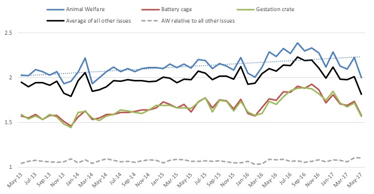
In FooDS, we also ask, for more than 16 different issues,  “Overall, how much have you heard or read about each of the following topics in the past two weeks” and we classify responses as 1=nothing; 2=a little; 3=a moderate amount; 4=quite a bit; 5=a great deal.  Below are the results pertaining to animal welfare related issues.

Awareness of issues in the news over time

Awareness of issues in the news over time

Result seem to suggest an up-tick in awareness of animal-welfare related issues during 2016, which subsequently declined.  However, this increase in awareness also occurred for ALL the issues we track (the solid black line), many of which (like E. Coli, pink slime, etc) have nothing to do with animal welfare.  

A similar pattern emerges in relation to "concern" for the same set of 16 or so issues over time.  We ask, “How concerned are you that the following pose a health hazard in the food that you eat in the next two weeks”, where 1=very unconcerned; 2= somewhat unconcerned; 3=neither concerned nor unconcerned; 4=somewhat concerned; 5=very concerned.  (Yes, I realize, asking whether animal welfare is a "health hazard" is strange, but that's what data I have).  The graph below slows a slight uptick in concern for animal welfare related issues, but this is also true for ALL the issues we track (the solid black line).  In other words, people don't seem to be discriminating much between animal welfare and other food issues.  

Concern for various issues over time

Concern for various issues over time

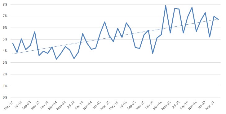
Finally, one of the questions we ask every month is whether respondents are vegetarian or vegan.  There has been an increase in this self-reported measure over time (see here or here for my previous discussions of these data).  In early 2014, the figure was between 3% and 4% of respondents.  This has roughly doubled and we now routinely see values between 7% and 8% of respondents self-identifying as vegetarian or vegan.  

Are you a vegetarian of vegan?  (% saying "yes")

Are you a vegetarian of vegan?  (% saying "yes")