Blog

Nutrition and Genetics

But this new study, funded by the National Institutes of Health and the U.S. Department of Agriculture, shows that different people may need radically different ratios of the substances in their diet depending on their genes, and it supports the growing evidence against a one-size-fits-all approach to nutrition and for highly personalized advice.

That's from this article in the Washington Post discussing some recent research that has found a genetic variation that is much more prevalent among vegetarians.  The author writes:

Cornell University researchers have found a fascinating genetic variation that they said appears to have evolved in populations that favored vegetarian diets over hundreds of generations. The geography of the vegetarian allele is vast and includes people from India, Africa and parts of East Asia who are known to have green diets even today.

Researcher Kaixiong Ye said that the vegetarian adaptation allows people to “efficiently process omega-3 and omega-6 fatty acids and convert them into compounds essential for early brain development.”

Food Demand Survey (FooDS) - January 2016

The January 2016 edition of the Food Demand Survey (FooDS) is now out.

Here are a few highlights from the regular tracking portion of the survey:

  • Willingness-to-pays (WTP) for all meat products, except pork chops, were down a bit this month compared to last, but were generally higher than was the case a year ago.  The changes in WTP were generally small and within the margin of error (which varies across meat products but is typically about +/- 7%).  
    • On a related note, my paper with Glynn Tonsor, where we used these WTP choice data to estimate demand inter-relationships is now finally out in the journal Applied Economic Perspectives and Policy (I previously discussed that paper here)
  • There was a large drop in plans to eat away from home in January compared to December.
  • There was also a large drop in awareness of E Coli and Salmonella in the news, and a small drop in concern for these issues as well (a likely Chipotle effect).  The same pattern of results was also true for GMOs and antibiotics.  
  • Two different questions suggested an uptick in concern for farm animal welfare at the beginning of 2016.

Three new ad hoc questions were added to the survey this month.

The three questions inquired about consumers’ perceptions of taste, health, and safety of the eight different food products for which we track WTP.  The first question asked: “How tasty or untasty do you consider the following products, where -5 is very untasty and +5 is very tasty?” Participants were asked the same questions twice more, only the words “tasty or untasty” were replaced with “healthy or unhealthy” and “safe or unsafe”.


Chicken breast was, on average, perceived as most healthy and as the most tasty. While beans and rice were perceived as the safest option, it was also the least tasty of the eight choices. Participants perceived deli ham was, on average, one of the least healthy, least tasty, and least safe products. Pork chop and chicken wing fell in the middle for each of the three categories. On average, all six meat products were perceived as less safe than the two non-meat products.

The average perception of taste can be plotted against average perceived health or
average perceived safety.

There is a slight positive correlation between perceived taste and health (correlation
coefficient of 0.15).  Similar plots reveal a slight negative correlation between perceived taste and safety (correlation coefficient of -0.14) and a strong positive correlation between perceived health and safety (correlation coefficient of 0.83).   All of this of course is at the aggregate level; plots like this could be created for each and every one of the 1,000 respondents.

What the above graph shows is that although beef products rate relatively well in terms of taste, they fall well below chicken breast in terms of perceived health.  I can use my demand model estimates (the model that gives rise to the WTP values) to do some thought experiments.  What if ground beef was perceived as healthy or as tasty as chicken breast?  How much would WTP for ground beef increase?  

First, we have to ask how much people value improvements in taste, health, and safety.  My model estimates suggest, unsurprisingly, that the higher the perceived taste, health, and safety, the higher the WTP for a product. But, by how much?  I find that a 1 unit increase in perceived taste (on the -5 to +5 scale) has about twice the impact on WTP as a 1 unit increase in safety (again on the -5 to +5 scale) and about the 1.4 times the impact on WTP as a 1 unit increase in perceived health (again on a -5 to +5 scale).  So, changes in perceived health have a bigger impact than changes in perceived health, which in turn has a bigger impact than changes in perceived safety.

All that would seem to suggest that  meat industry organizations would want to focus on improvements in perceived taste.  And that's true.  Increasing the perceived taste of pork chops by 1 unit, for example, would increase WTP by $0.36, whereas increasing perceived health by one unit only increases WTP by $0.25 (note: the mean WTP for chops was about $3.94 this month).

But, it is also important to note that there are larger differences in perceived healthiness across the meat products than there is in perceived taste or safety.  This leads me back to the question I asked earlier: What if ground beef was perceived as healthy or as tasty as chicken breast? How much would WTP for ground beef increase?  Here are my projections based on the model estimates and average perceptions.  

If ground beef had the same average taste perceptions as chicken breast, WTP for ground beef would increase $0.09.  If ground beef had the same average health perceptions as chicken breast, WTP for ground beef would increase $0.45.  If ground beef had the same average safety perceptions as chicken breast, WTP would increase $0.11.  For reference, average WTP for ground beef was $4.36 this month.  

The last thing I'll note is that it's not all about perceived taste, health, and safety.  Average WTP for steak, for example, is about $7.43 whereas average WTP for chicken breast is only $5.34.  How is it that people are willing to pay more for steak than chicken breast when they tell us that they think chicken breast is tastier, healthier, and safer?  The answer is that people care about other stuff than just these three things.  There's just something that makes a steak a steak and a chicken breast a chicken breast that is hard to put in words.  Call it "steakyness"  (not to be confused with the popular dance move).  Of the roughly $2 premium people are willing to pay for steak over chicken breast, about 20% can be explained by taste, health, and safety perceptions, and the other 80% is a desire for "steakyness."

Did the Cancer Announcement Affect Bacon Demand?

On October 26, 2015 the International Agency for Research on Cancer (IARC) — an agency within the World Health Organization — released its report indicating that processed meat is carcinogenic.  

The announcement sparked a lot of media coverage with titles like: "Bad Day for Bacon".  (Here were my thoughts shortly after the announcement, along with some survey responses based the news).

Despite the news coverage after the announcement, I haven't seen much investigation of whether it impacted meat markets.  Thus, I thought I'd take a look at the data, recognizing it is probably impossible at this point to conclusively identify whether the IARC report caused a shift in demand.

I turned to the USDA Ag Marketing Service's daily reporting of pork primal composite values.  Rather than just looking at what happened to the prices of bacon (or rather pork belly) in isolation, it is probably useful to look in relation to another cut that may be less affected by the announcement.  I chose the pork loin.  This is an attempt to control for any changes over time happening on the supply-side (the quantity of loin from a pig is, at least in the short run, in fixed proportion to the quantity of pig belly).

I calculated the ratio of pork belly prices to pork loin prices over the past year.  The graph below shows the price ratio before and after the IARC announcement.  In the few weeks before the announcement, bellys were selling at 1.9 times the price of loins.  In the few weeks after the announcement, bellys were selling at only 1.5 times the price of loins.  Thus, there has been a roughly 26% drop in the relative value of bacon. 

At this point, I'd be hesitant to say that the IARC announcement is THE cause of this change, but the large immediate drop just following the release date is suggestive of some impact.  


Country of Origin Labeling Conspiracy

I've seen the following meme going around on social media.    

I don't know whether the source is actually March Against Monsanto, but whoever put it out is obviously trying to stoke paranoia without any context or background.  And, like most good lies, the meme contains an element of truth.

First, it is true that both Houses of Congress repealed mandatory country of origin labeling (MCOOL).  This happened about a month ago.  What the meme doesn't revel is why.

MCOOL has been controversial since it's inception more than a decade ago, and the policy was fought by the largest beef and pork producer organizations.  Moreover, our trading partners were less than happy with the law.  Canada and Mexico filed suit with the World Trade Organization (WTO) claiming the law represented a non tariff trade barrier.  The USA lost the first round and several appeals (here's the timeline from the WTO).  What the meme doesn't reveal is that if Congress didn't repeal MCOOL then Canada and Mexico could slap on more than a billion dollars in retaliatory tariffs; my understanding is that these tariffs could have been on any products, not just meat.

What's not true about the meme?  

Well, despite the existence of MCOOL, our research shows most consumers didn't know where their beef or pork was coming from anyway; the vast majority of consumer's weren't checking the label.  More importantly, it simply isn't true that "now you will not know which country your meat comes from" simply because the government doesn't require the information.  If consumers really want the information and are willing to pay to have it, why wouldn't a retailer voluntarily advertise origin?  The restaurant chain Wendy's, for example, advertised for a while it only used North American beef.  Lots of small producers sell the animal products they raise at farmers' markets and at local restaurants.  There are thousands of products that voluntarily (without a government mandate) use  the "Made in the USA" logo to try to garner more sales.   There are lots of things I want (a new BMW; a private jet; perhaps origin information on meat), but just because I want something doesn't mean the government should mandate that it be provided. 

For more background, here's a recent report on issues surrounding MCOOL by the Congressional Research Service; here's another recent report summarizing the research on the subject prepared by my friends Glynn Tonsor, Ted Schroeder, and Joe Parcell for the USDA Chief Economist.

Lettuce a bigger environmental threat than beef?

On Monday a press release began making the rounds claiming that "Vegetarian and 'healthy' diets are more harmful to the environment" and the story has generated provocative headlines like, "Lettuce three times worse than bacon for the environment."  The results are based on this paper published in Environment Systems and Decisions by Michelle Tom , Paul Fischbeck, and Chris Hendrickson.

Here's a portion of the abstract:

This article measures the changes in energy use, blue water footprint, and greenhouse gas (GHG) emissions associated with shifting from current US food consumption patterns to three dietary scenarios, which are based, in part, on the 2010 USDA Dietary Guidelines . . . . This study finds that shifting from the current US diet to dietary Scenario 1 [same mix of foods but fewer calories] decreases energy use, blue water footprint, and GHG emissions by around 9%, while shifting to dietary Scenario 2 [holding calories consumed constant but shifting away from meat to fruit and veg] increases energy use by 43%, blue water footprint by 16%, and GHG emissions by 11 %. Shifting to dietary Scenario 3, which accounts for both reduced Caloric intake and a shift to the USDA recommended food mix, increases energy use by 38 %, blue water footprint by 10 %, and GHG emissions by 6 %. These perhaps counterintuitive results are primarily due to USDA recommendations for greater Caloric intake of fruits, vegetables, dairy, and fish/seafood, which have relatively high resource use and emissions per Calorie.

So, what's going on here?  Didn't the authors of the latest (proposed) Nutritional Guidelines suggest less meat eating due to "sustainability" concerns?  Haven't we repeatedly read things like this quote from a story in Time in  2008? 

It’s true that giving up that average 176 lb. of meat a year is one of the greenest lifestyle changes you can make as an individual.

A few comments about this latest study and how it relates to the "received wisdom."

First, meat eating often looks bad in aggregate because the industry is so big.  In the US, we eat a lot of meat.  As a group, animal products probably represent the largest share of food expenditures of any food category.  As a result, we need to put the outcomes on some kind of units where foods can be compared on an even playing field.  There are a lot of options: lbs of food produced, dollars spent, acres used, or as the current study uses, calories.  As I've discussed before:

. . . meat is relatively (relative to many fruits and vegetables) inexpensive on a per calorie or per gram of protein basis, although meat looks more expensive when placed on a per pound basis. If you want really inexpensive calories eat vegetable oil or crackers or sugar; if you want real expensive calories, eat zucchini or lettuce or tomatoes.

For what it's worth, this discussion is related to the debate on whether eating healthy is more or less expensive.  As it turns out: the answer depends how you measure it ($/lb or $/calorie) .

Second, it is important to think on the margin, or think in terms of changes.  Meat is bad.  Compared to what?  As I discussed in the Food Police,  many fruits and vegetables are big users of water and pesticides.  So, if we eat less meat, what will we eat more of instead, and what are the impacts of the items we switch to?  This recent study produces results that look a bit different because it looks not just at aggregates but at marginal changes.  

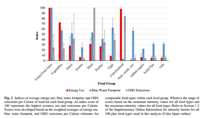
Third, as this study makes clear, "the environment" is not a single thing.  It is multidimensional.  Here's a graph from the paper.

Some foods are better water users, others worse in terms of GHS emission, others produce more calories/acre and spare more land, and so on.  Very rarely are there "have your cake and eat it too" moments, and there are typically tough tradeoffs between health, environment, and taste (and even tradeoffs within each of those categories).  One problem with studies like this is that they don't count the consumer welfare cost from eating a different mix of foods or different number of calories from what they normally consume, so we don't have any sense for the tradeoff between taste and cost on the one hand and health and the environment on the other.  

The last comment is that it's tough for me to evaluate the "quality" of this paper, and one should probably be a bit careful of suffering from confirmation bias.  A lot of the assumptions driving the result actually come from other papers and analyses.  Moreover, the work was published in a relatively new journal (started in 2012) and I know nothing about it. [update: a follower on Twitter informed me that the journal has been around since the 1980's but recently changed its name]  However, it does appear that the authors' results are similar to those in another paper that the Nutritional Guidelines Committee actually discussed in their report.  The committee writes: 


a report from Heller and Keoleian suggests that an isocaloric shift from the average U.S. diet (at current U.S. per capita intake of 2,534 kcals/day from Loss-Adjusted Food Availability (LAFA) data) to a pattern that adheres to the 2010 Dietary Guidelines for Americans would result in a 12 percent increase in diet-related GHG emissions. This result was modified, however, by their finding that if Americans consumed the recommended pattern within the recommended calorie intake level of 2,000 kcal/day, there would be a 1 percent decrease in GHG emissions.

But, of course, people don't just follow the guidelines to a tee.  That's one reason why these sorts of guidelines and recommendations should consider consumers' behavioral responses to the policies in question.