Five years ago in May 2013, I put out the first issue of the Food Demand Survey (FooDS). Every month since that time, a survey of over 1,000 food consumers (a different 1,000 each month), has been conducted where we've tracked concerns, attitudes, and preferences for various food issues over time. This has been a really fun project. Alas, all good things must come to an end and the May 2018 edition of FooDS will be the last - at least in its current incarnation.
Here I wanted to highlight some of the findings we've generated and provide some graphs showing the trends we've observed over the past five years (every issue of FooDS and all the underlying data is available here). At the end, I'll give a few "thanks" and give insights on where the project may be heading next.
Some highlights.
- The survey result that easily generated the most attention over the past five years was the finding that over 80% of consumers said they wanted mandatory labeling of foods that contain DNA (we've subsequently asked this question at least a half dozen times in different ways and have consistently found similar results).
- About two thirds of consumers say that a food with "added salt" would be considered natural, but only about one-third say the same of a food with "added sodium chloride."
- During the past farm bill debate, we found that consumers supported a number of reforms to the SNAP (aka "food stamp") program but also opposed significant monetary cuts.
- The results were used to show how meat demand varies across different states in the U.S.
- How do vegetarians and vegans differ from meat eaters?
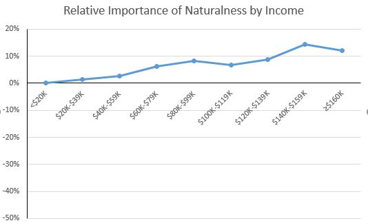
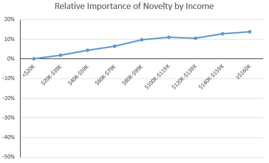
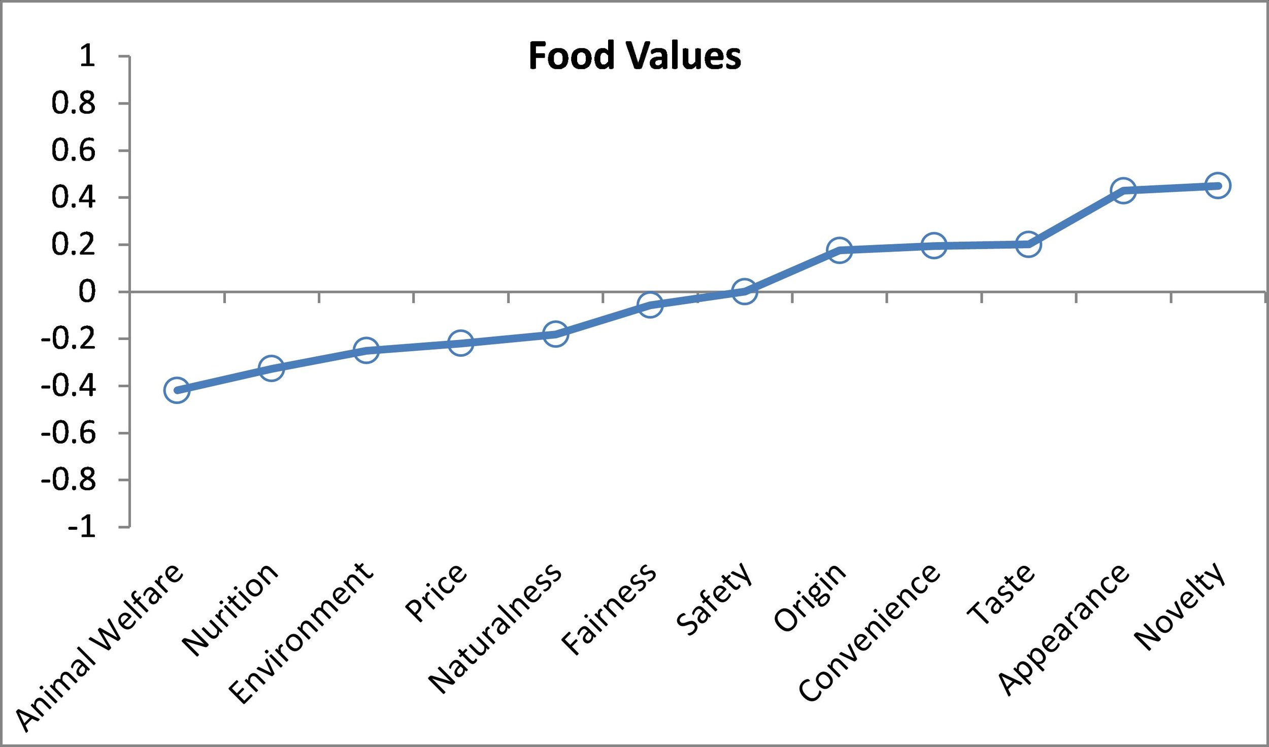
- We explored the "food values" of Millennials and looked at how food values varied for the rich and poor.
- Who do people trust for information about food?
- How does spending on food vary with income?
- I haven't kept good track of it, but I'd guess we've published at least a dozen academic journal articles that have used FooDS data in one way or another, including my AAEA presidential address in the AJAE, a paper with Glynn Tonsor on meat demand in AEPP, a Food Policy paper with Brandon McFadden and Norbert Wilson on GMOs, a paper on food waste with Brenna Ellison in AEPP, a paper with Brad Rickard and Brandon McFadden in the Biotechnology Journal, a paper in AEPP on GMO labels with Brandon, papers in Ecological Economics and the European Review of Agricultural Economics with Trey Malone on inattention in surveys, another paper with Trey on impact of taste, health, and safety beliefs on meat demand in JAAE, and the data is also mentioned in papers on effect of new egg laws on egg prices in a paper with Trey Malone in JARE and another one with Connor Mullally in AJAE. Marc Bellemare even used some results from FooDS in his recent AJAE paper with Jenny Nguyen on farmers markets and food safety.
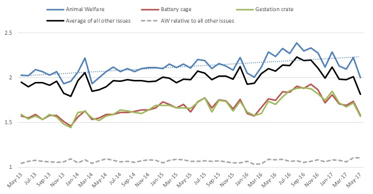
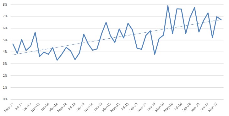
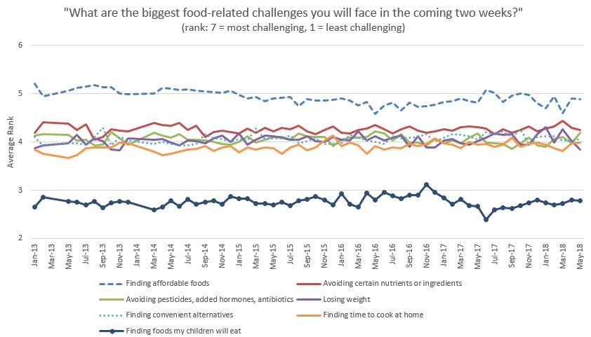
Now for some trends (note: each of the graphs below shows data from at least 1,000 consumers surveyed each month for 5 years for a total of more than 60,000 observations). Because I've discussed these results many times in the past, I'm going to let these graphs "stand on their own" without interpretation or description of how the data are collected or analyzed.


note: "average" is the average of about 16 other issues tracked in the survey

note: "average" is the average of about 16 other issues tracked in the survey
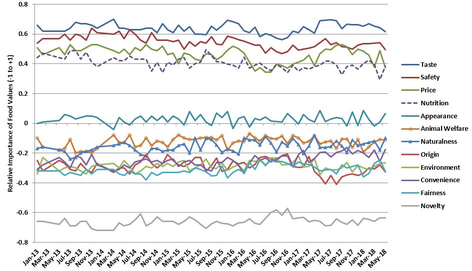
Food Values over Time


Finally, I want to say thanks to Susan Murray who did the heavy lifting every month, Bailey Norwood who helped me conceptualize the project and kept it running for the last year, Glynn Tonsor who provided intellectual capital over the course of the project, and many graduate students who provided great ideas and analysis. Early on, funding support for the project came from the Willard Sparks Endowed Chair. Later, the Division of Agriculture and Natural Resources at Oklahoma State pitched in. For the past several years, funding support came from a USDA-AFRI-NIFA grant. I've had numerous conversations with Bailey (at Oklahoma State), Glynn (at Kansas State), and Trey (at Michigan State) about the future of the project, where it might "reside", and how it should change to be even more informative. All the details are yet to be worked out, but I think there is a good chance FooDS will re-emerge in the next several months with a new "home" and focus.