Blog

Chicken Price Manipulation?

This article in the New York Times by Stephanie Strom argues that something may be fishy with chicken prices.  

The main focus of the article is about a widely used price index of chicken prices (the so-called Georgia Dock index) that is used by some retailers to negotiate prices with poultry producers.  Apparently the Georgia Dock price of chicken is higher than a couple of other price indices of wholesale chicken prices (one of which the USDA just created), and the Georgia Dock price hasn't fallen by as much as another index in recent months.  The article insinuates that something nefarious could be going on to artificially inflate the Georgia Dock price (and by extension the retail prices you and I pay for chicken).  

I have no deep insights into the allegations in the article.  However, I do want to push back just a bit on the broader issue of chicken prices relative to beef and pork.  Here is Strom: 

Beef prices at grocery stores are lower. So, too, are pork prices. But chicken? Steady as she goes.

A glut of corn and soybeans has led to lower prices for a variety of meats. But chicken in grocery stores has bucked the trend, leaving prices up for shoppers and buoying the fortunes of major chicken producers.

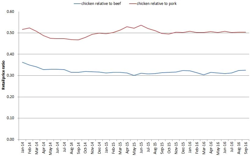
I'm not so sure about that first line - that beef and pork have become cheaper relative to chicken. Using data from the USDA-ERS on retail meat prices, I constructed the following graph showing the retail price of chicken relative to the retail prices of beef and pork.  Unfortunately, the last data point is September (the USDA bases it's calculations on retail prices reported by Bureau of Labor Statistics, but BLS hasn't released October prices yet), so it is possible that there have been some changes in recent weeks that aren't reflected in the graph below (but, even still, one might wonder why it's just now in the past month or two that the poultry producers figured out how to rig the wholesale price).  

Two broad points: 

1) As of September, the ratio of chicken to pork prices is essentially flat (i.e., chicken isn't getting more expensive relative to pork).  While chicken is a tad more expensive than beef in August and September relative to July, overall the trend looks pretty flat to me.  

2) Chicken is really cheap!  It is about half the price of pork and about a third the price of beef.

Moreover, if we take a step back and take the long view, chicken has progressively gotten cheaper relative to beef.  (note: the graph below uses the price for a whole chicken rather than composite retail prices as in the prior graph because the whole chicken data series goes back further in time).  Whereas whole chickens sold about 40% the price of beef in the 1970's, today they're about 25% the price of beef.

So, are poultry producers manipulating a price index leading us to pay more than we otherwise would have paid for chicken?  I don't know.  But, as the above graph shows, there's a whole lot of other things poultry producers have done over time (better genetics, better feed, better housing, etc.) to make chicken ever more affordably priced compared to other proteins.  

What do meat eaters and vegetarians spend on food?

Bailey Norwood and I have a new paper forthcoming in the journal Ecological Economics that seeks to identify how much money vegetarians spend on food relative to meat eaters.  This issue is of interest because food costs are often a reason touted for reduced meat consumption.  The argument is that meat is expensive and thus eschewing meat (or participating in meatless Monday, for example) will save you money.  Here additional motivation for the work:

The implications of the dietary costs of vegetarians goes beyond the impacts on one’s wallet—it will help determine the carbon footprint of meat, dairy, and eggs. If a vegetarian spends less on food, what do they do with their remaining income? And do those other purchases have higher or lower carbon impacts? If vegetarian diets have both a lower carbon footprint and a lower price-tag, then one cannot really determine the carbon impact of becoming a vegetarian without accounting for how those food savings are spent. If vegetarians spend 15% less on food but use those savings on a plane flight, then their overall carbon footprint might rise. Indeed, Grabs (2015), who labels this a “rebound effect”, found that half of the carbon footprint reduction attributable to a vegetarian diet actually disappeared after accounting for the carbon effects of the remaining expenditures. Like Berners-Lee, Grabs infers the expenditure patterns of vegetarians using an amalgamated dataset using inferred (rather than observed) prices paid by each individual, where US data on the differences between the diets of vegetarians and omnivores based on Haddad and Tanzman (2003) is assumed to hold true for Swedish citizens.

Even if the cost of food isn’t a prime reason typically given to adopt vegetarianism, environmental impacts are, and what Grabs shows is that the two items are related. A better understanding on the relationship between vegetarian diets and food expenditures is thus warranted not just because it helps us understand the monetary consequences of altering our diets, but the environmental consequences as well.

We used data from my monthly Food Demand Survey (FooDS) to determine how much vegetarians report spending on food at home and away from home compared to meat eaters. The analysis is complicated by several factors.  First, many of the people in our survey who say they are vegetarian or vegan actually choose a meat item in a prior portion of the survey that simulates a shopping experience (perhaps because someone else in their household eats meat).  Thus, we conduct our analysis separately for "true" vegetarians (about 2.2% of the sample) and "partial" vegetarians (about 3% of our sample).  Secondly, vegetarians/vegans differ from meat eaters in a variety of ways, such as gender, political ideology, income, etc.  This raises the question of whether differences in gender, income, etc. explain differences in spending patterns or whether it is dietary choices.  Moreover, while one can change from from a meat eater to vegetarian, one cannot (easily) change from male to female, very conservative to very liberal, or black to white.  Thus, we conduct several counter-factual simulations where we ask what happens if one converts to vegetarianism but retains their prior demographic characteristics vs. someone who differs in both regards.  

Here are some summary statistics on distribution of spending by meat eating status (not controlling for demographic or income differences)

It appears "partial vegetarians" spend more on food than the other two groups, however, when one looks at the demographics this group is also a bit richer, is more likely to have children in the household, and has larger household size - all things that are correlated with higher food expenditures.  

After adjusting for differences in demographics, we continue to find differences in spending patterns, though the differences are typically smaller.  Here are some graphs I constructed using the estimates in the paper. The figure shows spending for each consumption group assuming each group has demographics equal to the mean demographics in the sample (i.e., each group has the same demographics) for different levels of income.  

In general, richer households spend more on food than poor households regardless of whether one eats meat or not.  However, at every income level, partial vegetarians spend more than meat eaters while true vegetarians spend less (assuming same gender, household size, etc.).  For example, for households earning between $60,000 and $79,000 per year, weekly spending on food for meat eaters is $156, for partial vegetarians its $196, and for true vegetarians its $116.

Here is the same result expressed as a share of income (these are the so-called Engel curves).

Meat eaters in households earning between $60,000 and $79,000 per year spend about 11.6% of their income on food for partial vegetarians at the same income level it's 14.5%, and for true vegetarians it 8.5%.

Of course, these three groups don't have the same incomes.  The percent of respondents living in households making more than $100,000/year is 11.3% for meat eaters, 18.3% for partial vegetarians, and 14.4% for true vegetarians.  Thus, if one adjusts for differences in household income, some of the differences shown in the above graphs disappear.

Here is a summary of what we found.

To the extent that self-reported food expenditures are reliably correlated with actual expenditures, true vegetarians spend less money on food than meat eaters and partial vegetarians spend more. Although this result might be used to suggest that meat eaters could replace their meat with vegetables and save around $20 per week in food, this is deceiving. Roughly half of these savings are not due to the change in types of food purchased, but demographic differences. There are certain demographics that one can change in an effort to better mimic true vegetarians. Two of these are body mass index and political attitudes, but although they can be modified by the individual, their impact on food expenditures is small if not zero. The demographic traits that help true vegetarians save money must then reside with more fixed factors like household size, gender, and the like.

Changes in Meat Consumption

There's been a lot of discussion lately about changes in meat consumption over the last year or two.  Much of it seems to have been generated by a Rabobank report (based on USDA's data and projections).  For example here's a representative tweet.

There were headlines like: "America Cannot Kick Its Meat Habit".  Yesterday there was a story at Vox.com (in which I am quoted) that summarizes now dated cheers by animal advocates that meat consumption was falling.  This new news seems to contradict those claims.  

So what's going on with meat consumption?  I think it's useful to take a step back and take a longer view.  Here's USDA quarterly data on per-capita meat consumption (it's technically a measure of "disappearance" not consumption) going back to 1980.  Note: these are the same underlying data driving all the headlines.

Over this long time period, there has been a general decline in beef consumption, falling or steady pork consumption, and the big story is rising chicken consumption.  "Yes" it appears over the past few quarters or so there has been increasing total meat consumption, but that's mainly a result of eating more chicken.  Moreover the total consumption levels in 2016 are lower than they were in 2002-2006.

What caused the total meat consumption decline from roughly 2006 to early 2015?  Most journalists seem to want to focus on demand-side factors.  The typical story was that consumers were more concerned about health, environment, animal welfare, etc.  These might have played some role, but the much bigger driver is likely supply-side issues.  I noted these issues back in 2014 (see here and here for longer discussions).  In short, consumption was down because prices were high.  Prices were high because of supply-side issues like drought, high feed prices, a disease issue in pork, etc.  

Why is consumption starting to tick back up?  The answer is same as it was before: prices.  Here are changes in relative meat prices over the same time period as the previous graph.

Here's what I wrote back in July 2014 near the price peaks

Ultimately, the old adage is likely to hold: the cure for high prices is high prices. The high meat prices we’re seeing today will eventually encourage larger beef and pork supplies, which eventually will put downward pressure on prices. When will that day come?

Looks like the answer is "now."  

The long term price trends shown above also help explain the rise in chicken consumption over time.  While all meats are today more expensive than in 1980s (some of this is due to inflation - the prices changes above haven't been adjusted for inflation), today chicken is "only" about 200% more expensive than it was in January 1980 whereas beef and pork are both about 264% more expensive than in January 1980.  

Here's a graph of the price changes just since 2010 (January 2010 = 100).  These graph show relative changes, but if you look at actual price levels, it's also apparent why chicken consumption is up.  In July 2016, the USDA reported prices for beef, pork, and chicken were $6.09/lb, $3.78/lb, and $1.44/lb.  

The main message here is that we don't need to grapple for complex, convoluted stories to explain  recent changes in meat consumption.  The prices of meat have fallen (because feed is less expensive and because there are larger inventories), and lower prices encourage consumers to buy more.  It's just basic economics at work.  

Food Demand Survey (FooDS) - August 2016

The August 2016 edition of the Food Demand Survey (FooDS) is now out.

A few if the items from the regular tracking portion of the survey:

  • After a spike up last month, willingness-to-pay (WTP) for steak fell 12%.  WTP for other meat products remained relatively steady compared to last month.
  • Awareness in the news of all items we track (but one) increased in August compared to July, and the largest percent increases in concern were cloning and hormones.
  • Consumers anticipate lower prices for beef and indicate they plan to eat more beef and chicken this month compared to last.
  • Consumer are spending slightly more at home and less away from home on food this month compared to last.

Three new ad hoc questions were added this month.

I was recently made aware of some programs being pursued by food and agricultural organizations to add labels to food advertising, for lack of a better phrase, social causes.  So, I was curious what consumers thought of these sorts of programs.

First, participants were asked: “Imagine seeing a label on a food product that pledges a portion of the proceeds from the sale of the food go to a particular social cause or group.  Which of the following social causes or groups would be most appealing to you?  Participants were asked to rank each of the outcomes on a scale of 5 to 1 where 5=most appealing and 1=least appealing. 

On average, participants ranked a label pledging a “portion of the proceeds go to a local food bank to help the hungry” as the most appealing.  Participants ranked a label pledging a “portion of the proceeds go to a campaign to promote healthy eating and exercise” as the least appealing.   The following figure shows the percent of respondents who ranked each issues as most appealing: More than half the participants ranked "Portion of the proceeds go to a local food bank to help the hungry" as most appealing.  

Second, participants were asked “Which of the following characteristics would be most important to you when shopping for eggs? Please allocate 100 points to the following characteristics in terms of the importance in deciding whether and which egg option to buy (total points must sum to 100).”

Six different characteristics were shown in random order. 

On average, “Price: low vs. high price” was most important when shopping for eggs, with 26 out of 100 points allocated to this issue on average across participants. The brand of eggs was rated as least important with less than half the points allocated to brand than price.  Size was, on average rated slightly more important than cage vs. cage free, whereas color was slightly less important than this issue.  

These statistics can provide a crude estimate of willingness-to-pap (WTP).  Presuming respondents perceive that the gap between low vs. high prices is a $1/dozen difference, then for every dollar change, mean rating falls by 26 points.  By contrast, going from small to large eggs increases the mean rating by about 20 points.  It follows that people would give up 20/26=$0.77/dozen to have large instead of small eggs.  Using similar logic, WTP for cage free vs. cage is $0.67/dozen, brown vs. white is $0.48/dozen, proceeds to preferred social cause vs. none is $0.46/dozen, and least to most preferred brand is $0.46/dozen. 

Presuming respondents perceive that the gap between low vs. high prices is a $2/dozen difference, then for every dollar change, mean rating falls by 26/2 = 13 points. And, in this scenario, WTP for large vs. small eggs is 20/13 = $1.55/dozen.  WTP for the other attributes also double under these assumptions.

Lastly, I added the question, "Are you a member of the AmeriCorps program?"  This question was added in response to a suggestion I received at the end of my AAEA presidential address.  As I discussed a few days ago, one of the points of discussion in my talk related to predicting vegetarian status.  I mentioned how vegetarians/vegans tend to be young, female, liberal, and paradoxically somewhat high income and on food stamps.  After my talk a young women approached me and asked whether I knew if my participants were a part of the AmeriCorps program.  I said "no" - why?  She remarked that the characteristics I just described fit the people she knew who were AmeriCorp members.  I honestly don't know much about the program, but according to my questioner many of the members are young, recent college grads who tend to be liberal and who are often from relatively well-off families but who are encouraged by people in the program to sign up for SNAP (aka "food stamps").  

What did I find in this most recent survey?  Overall, 7.65% of the respondents said they were members of AmeriCorps.  And, overall, 5.6% of respondents said they were vegetarian or vegan.  So, how did my young questioner's hypothesis hold up?  Amazingly well!  Of the people who said they were a member of AmeriCorps, a whopping 40% said they were vegetarian or vegan!  By contrast, only 2.7% of non-AmeriCorps members said they were vegetarian or vegan.  Stated differently, of all the vegetarian/vegans in our sample, over 55% of them were a member of AmeriCorps.  

When Bigger Isn't Better

One of my Ph.D. students at Oklahoma State (and soon to be faculty member at Mississippi State University) has been working on an interesting paper on the impacts of changing cattle sizes on the desirability of steaks.  The average beef cow now weights more than 300lbs more than it did a few decades ago.  Generally that's a good thing as we can get more meat from fewer animals (which means less resource use, less land, less greenhouse gas emissions, etc. in addition to lower prices for consumers).  

But, there's a downside:

As a response to varying muscle sizes such as the ribeye, grocery stores and restaurants are often forced to adjust the thickness to which the steaks are cut in order to meet a target weight. Thus, a ribeye steak from a carcass with a large [loin] will likely be cut thinner than a ribeye steak from a carcass with a smaller [loin]. This has led to the introduction of “thin cut” steaks in some grocery stores. Compounding the issue of altering larger steaks are the historically strong beef prices. Some retailers utilize target prices for packages of steaks. Therefore, consumers are not only facing high beef prices, but also an increase in total package price due to the larger dimensions of the steak. This has caused retailers to reduce thickness to meet a target package price.

The key question, then, is whether people prefer thicker steaks with smaller surface areas (like those that existed 20 years ago) or thinner steaks with larger surface areas (like those that sell today)?  To address this question, a survey was taken by a representative sample of over 1,000 steak consumers.  We gave consumers choices like the one below, and asked which steak they'd choose.  Consumers answered a number of these questions where the steak thickness, area, and price, systematically varied across choices.  

So, what did we find?  For most consumers, there is a trade off between thickness and size.  Moreover, it seems changes in thickness are more important than changes in size.  As a result, most consumers are less happy with the steaks they see today in the grocery store (holding prices constant).  That is, consumers prefer a thicker, smaller area steak to a thinner, larger area steak.  We use the estimates to do a little thought experiment.  How much additional money would have to be to give to today's consumers to make their steak choices as satisfying as they were 40 years ago (in terms of thickness and area, holding prices constant)?   

Table 6 reports the estimated welfare changes by moving from a scenario where the choice set include small area and thick steaks (40 years ago scenario) to a scenario where the choice set includes large area and thin steaks (today scenario). Estimated welfare changes were
calculated for the conditional logit model as well as the two classes from the latent class model
which had statistically significant estimates for price per package. The welfare change estimate
from the conditional logit model implies that moving from the scenario representing 40 years ago to today’s scenario decreased welfare by $5.37 per choice, an amount that is statistically
significant at the five percent level. When multiplied by the number of steak purchases in the U.S. each year, estimates from latent classes one and two suggest decreases in total welfare of
$5.8 billion and $2.8 billion respectively, by moving toward a choice set with large area and
thin steaks, though the estimate for class one is not statistically significant at the 5 percent level.

Now, it should be noted that consumers might be, overall, better off from changing cattle sizes because they now have more ground beef available and because prices are lower than they'd otherwise be.

Josh's paper was accepted for presentation in one of the new lightening sessions at the AAEA meetings this year in Boston.  These are short sessions where authors have only seven minutes to present their work.  Here's Josh presenting this paper in lighting session format.