Blog

Trends in demand for plant based meat

There continues to be high interest in plant-based meat alternatives and speculation about impacts of the emergence of these alternatives on traditional beef, pork, and chicken demand.  This past summer, I discussed the results of a consumer study conducted to address some of these issues, but the results relied on pre-pandemic survey data.  Have consumer preferences changed?  And, how might the emergence of plant-based alternatives affect the entire portfolio of animal-based protein offerings?

As a follow up to the Food Demand Survey (FooDS) I ran monthly for over five years, Glynn Tonsor and I have been running the monthly Meat Demand Monitor (MDM) since February 2020.  The MDM contains a series of 9 simulated grocery shopping choices where people indicate which, if any, protein product they’d buy at different price levels when shopping. Below is an example choice.

mdm1.png

As you’ll notice in the above question, one of the choice options is a plant-based patty.  Every month, Glynn has released results of the MDM survey reporting the percent of times the plant-based patty is chosen out of this set of 8 meal options (plus a ninth “none of these”).  Say what you may about the merits of survey questions, but the advantages of tracking surveys is that we can at least see if there are significant trends or changes from one month to the next. Below is a graph showing the trends in market shares of two of the items over time. 

mdm2.png

Throughout 2020, plant-based patties have consistently been chosen about 3% of the time in comparison to ground beef, which is chosen about 24% of the time.  The ~3% market share for plant-based patties is much smaller than the estimates I’d previously reported from my study with Ellan van Loo and Vincenzina Caputo.  Part of the explanation for the discrepancy is that the the choice set used in the MDM contains many more options, so of course the share of any one item is likely to be smaller.  The other explanation could be that people who choose plant-based patties might have instead chosen something other than ground beef. That is, some of the people who would choose a plant based patty in a binary choice between ground beef and plant-based instead choose something different, like a chicken breast, when presented a larger set of meal options. 

To explore this issue in a bit more detail, I took the data from the August through December 2020 versions of the MDM associated with retail grocery choices (all the data and description of underlying methods is here). The data consist of 36,018 choices made by 4,002 consumers (a bit under 1,000 each month).  I estimated a choice model that allows for flexible substitution patterns and utilize the estimates to predict which options people would choose in different conditions.

At the average price levels, I predict about 3% of consumers would choose the plant-based patty.  This isn’t surprising as it simply confirms the findings in the figure above.  Here is perhaps a more interesting question.  Of the roughly 3% of consumers who chose the plant-based patty: what would they have chosen instead if the plant-based patty wasn’t available?  The model-based prediction is below.  Perhaps somewhat surprisingly, about the same number of people would have instead have chosen chicken breast as ground beef.  Only 6% were predicted to have not have chosen one of the other items on this list. 

mdm3.png

What about price elasticities?  The model suggests that for every 1% reduction in the price of plant-based patties, there is a 3.08% increase in market share of plant-based patties (this is the own-price elasticity of demand).   This same 1% reduction in the price of plant-based patties would reduce the market share of bacon and shrimp by about 0.12% each, reduce the market share of ribeye and pork chops by about 0.10% each, and ground beef by about 0.08% (these are the cross-price elasticities).  Thus, the estimates suggest very little substitution caused by small marginal price changes.

Some of the above results stem from the fact that, based on current market data, the plant-based patty had an average price of $11.99lb whereas ground beef was assumed to be $4.49/lb.  What if both were priced at $4.49?  Assuming this dramatic price reduction for plant based, the model predicts the market share for plant-based would jump from about 3% to about 22%, lagging only chicken breast at 22.1%.  In this scenario, ground beef is projected to take 18% market share.  One caveat is that this scenario presumes a much larger price change than we used in the survey (so it is a projection outside the range of choices we actually observed). 

This is a fluid situation and there remains much to be learned. Along with Ted Schroeder, Glynn and I have recently completed a series of new studies on the possible impacts of plant-based alternatives on beef demand. I hope be able to release those results in the coming weeks.

Size and Vulnerability in Meat Packing

Today, I participated (virtually) in the WSJ Global Food Forum, and there continues to be lively discussion about COVID19 disruptions to the food supply chain, and there were ample questions put to food industry executives about how to improve resiliency. The shutdowns that happened in the beef and pork packing sectors in April and May continue to raise questions about size and concentration. I’ve written about this issue repeatedly and have run simulations, revealing my somewhat contrarian view that a smaller, more distributed packing sector wouldn’t have necessarily performed better in response to this pandemic.

A key challenge is that we do not have good data relating packing plant size to likelihood of shutdown or disruption. However, the USDA does publish a monthly report revealing hog and cattle slaughter and red meat production by state, which might provide some indirect clues about size and vulnerability.

For some states (even some of the most important packing states), data on slaughter volumes are not release due to confidentiality rules, but there is better coverage for total red meat production. So, let’s start there. I focus in on data in April and May, when the worst of the COVID-related shutdowns occurred, and compared total April+May production in 2020 to production in April+May in 2019 across all 50 U.S. states.

The median change was -1%, however there was wide dispersion across states ranging from -49% in South Dakota to +130% in West Virginia. How does this change relate to the total volume of red meat production in each state in the prior year (a proxy for the processing capacity of the state)? Did states that have more red meat production capacity (presumably because of larger, more concentrated plants) experience larger year-over-year declines during the COVID19 shutdowns?

The figure below plots the relationship. Among the states with the smallest levels of production in 2019 (i.e., the smallest capacity), there was a tendency to see an increase in production during the 2020 shutdown periods compared to the same time last year, and moreover, as state’s total production capacity increases, the declines initially seem to get worse. This would seem to confirm the prevailing narrative that places with less concentration were less affected (and generally benefitted) from the COVID19-related packing plant shutdowns.

However, after about 300 million lbs of production (during April and May), there is essentially no relationship between these variables. For example, Nebraska produced 1340 million lbs of red meat in April and May 2019, and they experienced a year-over-year decline of 25% in 2020. However, Colorado produced “only” 361.8 million lbs of red meat in April and May 2019, and they experienced a -32% year-over-year decline in 2020. A states total capacity didn’t seem to matter much after a certain level.

redmeat_size.JPG

Here is a map of the changes in red meat production in April and May 2020 compared to April and May 2019, showing how each state faired during the worst of the COVID19 plant shutdown period. The biggest red meat packing states are: 1) Iowa, 2) Nebraska, 3) Kansas, 4) Texas, 5) Illinois, and 6) Minnesota. Three of those states are in red but three aren’t. Moreover, there are states like Washington that experienced one of the largest declines, despite being middle of the pack in terms of total production.

Some of the states with the largest percent increases (dark green) are near states with the largest decreases (red), a phenomenon likely resulting from producers trying to find nearby processing facilities when their “typical” plant shutdown.

redmeat_map.JPG

Here is the same analysis but focusing in on number of hogs slaughtered in April and May 2020 relative to April and May 2019. Again, states with a smaller number of hog slaughtered, while all over the map, tended to be more likely to experience gains than losses; however, once one moves beyond about 500,000 head slaughtered (in April and May 2019), there is essentially no relationship between the size of a state’s processing capacity and the extent of it’s shutdown.

hog_slaughter_size.JPG

And, here is the change in number of hogs slaughtered in April and May 2020 compared to April and May 2019 by state.

hog_slaughter_map.JPG

The relationship between a state’s cattle slaughter in 2019 and it’s change during COVID is below, and a similar phenomenon is observed as was the case for pork and red meat production. States with minimal slaughter capacity tended to see a strong uptick in processing during COVID, but once one moves beyond the smallest of processing states, there is essentially no relationship between COVID19 processing changes and a state’s processing capacity.

cattle_slaughter_size.JPG

And, finally, here is the geographic distribution of the change in cattle slaughter in April and May 2020 relative to April and May 2019.

cattle_slaughter_map.JPG

Concentration and Resilience

We’ve fortunately worked our way through the worst of the COVID-19 related packing plant shutdowns that caused massive disruptions in beef and pork sectors, and packing plants are now operating at levels on par with last year.

One of the features of the beef and pork packing sectors that has served as a focal point is the concentrated nature of production, with a relatively small number of plants accounting for a large share of total industry output. Many people have begun to advocate for a less concentrated packing sector under the premise that this market structure would be less prone to the sorts of disruptions we witnessed during the pandemic (see my previous discussion on the matter here).

Ultimately this is an empirical question amenable to analysis, provided one is willing to make some assumptions. To explore this question a bit, I set up a hypothetical simulation that allows us to investigate how total output in an industry varies with the number of packing plants, each of which faces a known probability of closure.

I consider a case in which maximum total output for the entire industry is 100,000 units, but consider different “worlds” where there are a different number of packing plants responsible for producing this total. In one “world” that is highly concentrated, there are a mere 5 plants, and each plant is the same size, implying each plant produces 100,000/5= 20,000 “units” when operating. If a plant is open, it produces 20,000 units, but if it gets a bad luck of the draw, it closes and produces 0. By contrast, another “world” is highly diffuse and there are 100 plants, and each plant is the same size, implying the each plant produces 100,000/100 = 1,000 units when operating. In this world, if a plant is open, it produces 1,000 units, but if it gets a bad luck of the draw, it closes and produces 0. I explore expected outcomes where each plant in each world faces an independent probability of closure.

First, let’s consider a case where the likelihood of any individual plant closing is 0.1 (i.e., 10% of the time a given plant will close). The figure below shows the likelihood that total industry output falls below a given level of production for different “worlds” with different levels of concentration. So, for example, in the highly concentrated world (5 plants producing all the output), there is only a 42% chance that total industry output falls below the a maximum capacity of 100,000. By contrast, in the highly diffuse world (100 plants producing all the output), there is 100% chance that total industry output falls below the maximum. Why? Because with so many plants, there is a very high chance at least one of them goes down.

For a given level of output, a world that has a smaller probability of falling below the output level is “better” in the sense that it ensures greater production for both consumers and producers. So, while the most concentrated world is “best” at ensuring the highest level of output, it is also the case that more diffuse worlds are better at ensuring output doesn’t fall below very low levels.

So, for example, in the figure below, the most concentrated world (5 plants) has a roughly 8% chance of falling below 70,000 units of production, where the most diffuse world (100 plants) has a 0% chance of falling below 70,000 units of production. The intuition is that in a world with 100 plants, and each plant only faces a 10% chance of closure, it is practically certain enough plants will remain open to produced at least 70,000 units.

closure1.JPG

How do these results hold up if the probability of a plant closure changes? The three figures below consider that question for closure probabilities of 0.2, 0.3, and 0.5.

closure2.JPG
closure3.JPG
closure5.JPG

What does the pattern of results reveal?

  • First, the obvious. As the probability of plant closure increases, there is a greater likelihood of falling below a given level of total industry output for any particular level of industry concentration.

  • Generally, concentrated “worlds” are better at ensuring high levels of output while less concentrated “worlds” are better at ensuring output doesn’t fall below “low” levels.

    • Still, the differences in probability of ensuring a “minimum threshold” of output are not particularly large across different levels of concentration.

  • As the probability of plant closure increases, it is more likely that a more concentrated “world” is preferable to a more diffuse “world” insofar as ensuring a given level of total industry output.

The results of this exercise confirm most people’s basic intuition that a more diffuse packing sector would be less prone to the worst possible outcomes than a more concentrated sector. However, the results also reveal some important nuance. Namely “how much” less prone to the worst outcomes is a more diffuse sector? The figures above suggest “not much” as there are not big differences in the lines at the far left-hand corner of the charts unless plants face a really high chance of closure (e.g., a 50% chance). The figures also reveal a less intuitive result - namely that when facing a given probability of closure, a more concentrated sector has a higher likelihood of hitting high levels of industry output. Thus, we have a trade-off between the likelihoods of producing the maximum vs. preventing the worst possible outcomes.

Curious trend in sales of plant-based meat alternatives

I came across a report from IRI showing changes in sales of plant-based meat alternatives during March, April, and May relative to the same time last year. The figure below shows some dramatic sales growth during the early part of the pandemic. Of course, the large percentage growth is partly explained by the fact that plant-based sales were starting from a low base (i.e., if you go from 1lb to 2lbs, that’s 100% growth, whereas if you go from 100 to 101lbs, that’s only 1% growth).  The rest of the report shows the enormous difference in relative magnitudes as plant-based sales are only about 0.66% of total dollar sales (or 0.33% of total lbs of meat sales) .

pbsales.JPG

What I want to focus on here though isn’t the spike in sales in March, but rather what happened later. Why wasn’t there a similar spike in sales in April and May? It was in late April and early May that beef and pork production were being most adversely affected from plant shutdowns. During this time, wholesale meat prices were skyrocketing and there were stories in every major media outlet about the possibilities of meat shortages. Data from USDA and the Bureau of Labor Statistics shows retail ground beef prices in grocery stores, for example, jumped more than 10% from April to May (after rising about 5% from March to April).

So, at time when beef prices rose dramatically, retailers were limiting how much beef consumers could buy, and there was overall limited availability of beef, the growth in sales of plant based meats began to fall from almost 80% at the end of April to 57% at the end of May.

At the time the economic environment was most opportune for consumers to switch from beef and pork to plant-based alternatives, it seems that few made that substitution. The figure below shows the trends in volume (or lbs) market share. The share of plant-based sales did indeed rise over the period in question from 0.22% of all lbs purchased to 0.33% of lbs purchased. I’m a bit surprised it wasn’t more.

One of the inferences we can draw from these data, which is also consistent with the research we recently conducted, is that a lot of the purchases of plant-based alternatives are coming from consumers who wouldn’t have bought much beef or pork to begin with.

I look forward to seeing how these trends continue to evolve.

pbsales2.JPG

Consumer Preferences for Beef Alternatives

The journal Food Policy just published a paper I co-authored with Ellen Van Loo and Vincenzina Caputo entitled, “Consumer preferences for farm-raised meat, lab-grown meat, and plant-based meat alternatives: Does information or brand matter?” I blogged about the working version of this paper this past fall when we finished the first draft, so I won’t re-iterate all the main findings (I should also note the paper at Food Policy is open access, and as such the results are freely available).

What I thought I’d do here is convey some results from the study that are not in the published paper but that are based on the models described therein.

First, a big unresolved question that often comes up when discussing the introduction and evolution of plant-based or lab-based alternatives is whether the the projected market share for the new alternatives is “stealing” sales from beef or rather drawing new people into the market who wouldn’t bought beef to begin with. Using the models estimated in our paper (in the “control” no information, no brand condition), I project that before any alternatives are introduced about 74% of consumers would buy ground beef on a grocery shopping trip (assuming the price is $5/lb) and 26% would refrain from buying ground beef. After the alternatives are introduced (at an assumed price of $9/lb), it is projected about 12% of shoppers would buy one of the beef alternatives. Thus, of the buyers of the new alternatives, I project about 57% (6.9/12.1) would have instead bought conventional ground beef whereas the remaining 43% (5.2/12.1) wouldn’t have bought beef in the first place.

altbeef1.JPG

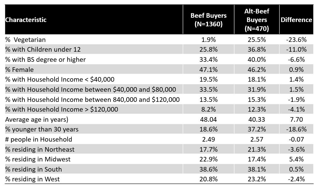
The paper in Food Policy shows some results related to the relationship between demographic characteristics and projections of which alternatives people would buy. To help make these findings a little more digestible, below is a table that shows the demographics of people predicted to choose conventional beef vs. people predicted to choose one of the beef alternatives (assuming all are the same price). Unsurprisingly, the people who are predicted to choose a beef alternative are way more likely to be vegetarian than are people predicted to choose beef. It is also the case that alt-beef buyers are much more likely to be younger and are somewhat more likely to have a college degree than conventional beef buyers. There are not big gender differences.

altbeef2.JPG

The table below shows a similar breakdown but instead of focusing on demographics, I report the importance consumers say they place on 12 different factors when buying food. Predicted beef buyers place greater importance on safety, taste, appearance, and naturalness. By contrast, people projected to buy one of the beef alternatives place more importance on novelty, environment, and animal welfare. (note: in general differences greater than about 0.1 are significantly different than zero at the 0.05 significance level).

altbeef3.JPG

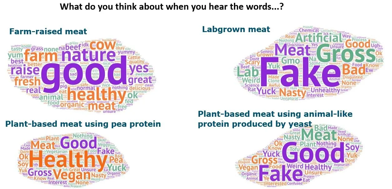
Finally, one of the most interesting results of the survey were responses to open-ended questions we asked about people’s perceptions of the competing products. Here are some word clouds Ellen created.

altbeef4.JPG

These data were collected about a year and a half ago, and given the novelty of the products, it is possible perspectives have changed, particularly following COVID19. Fortunately I have some follow-up work planned with Glynn Tonsor and Ted Schroeder. Be on the lookout for some of those results hopefully some time this coming fall.