Blog

The Most Popular Fruits and Vegetables

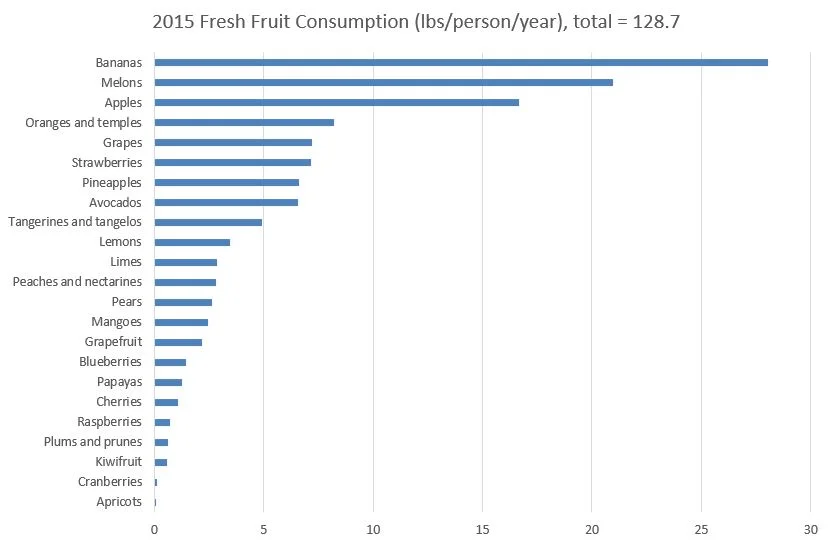
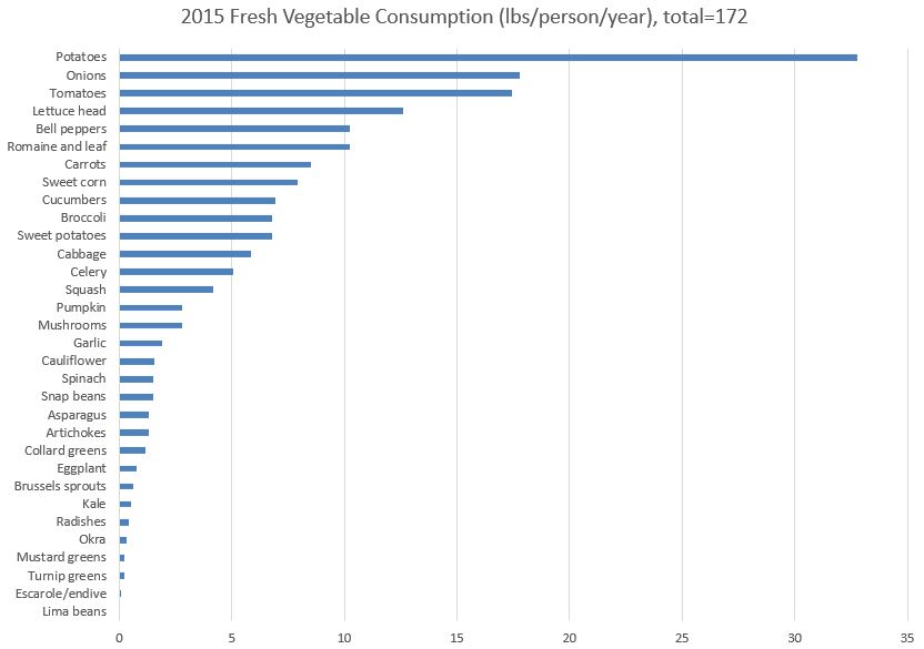
I recently had some questions about which fruits and vegetables are most commonly consumed. The USDA Economic Research Service reports data on per-capita availability of different foods.  This is not a direct measure of consumption per se, but it is an indirect extrapolation of what was left in the U.S. for consumption after accounting for exports and storage.  Their latest update was for the year 2015.

Here is per-capita "consumption" of fresh fruit.

fresh_fruit_consumption.JPG

And, per-capita "consumption" of fresh vegetables is below.

fresh_veg_consumption.JPG

Do any of these findings surprise you?  One of the results that was a little surprising to me is that melons were the 2nd most commonly consumed fresh fruit. Why are melons so commonly consumed?  There are likely a variety of reasons, but I suspect price is one factor.

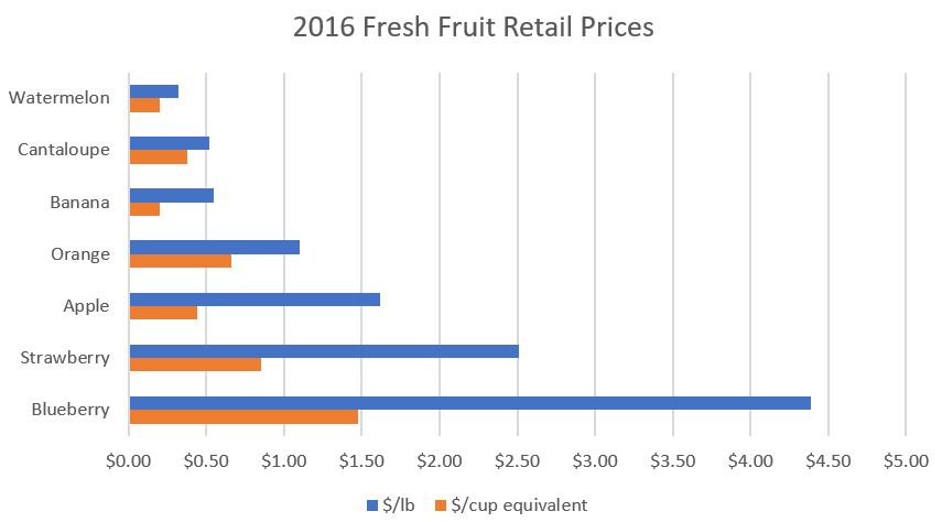
Here is 2016 retail data from USDA Economic Research Service for fresh fruit.  I've shown prices in $/lb and $/cup equivalent ("a 1-cup equivalent equals the weight of enough edible food to fill a measuring cup") for some of the most commonly fresh fruits.

fruit_prices.JPG

Why do people eat a lot of fresh melons?  Apparently one reasons is that they're relatively affordable.

Farmer's Share of the Retail Dollar - Enough Already

Every so often, the people seem to get excited about the farmer’s share of the retail dollar – particularly when USDA updates the figures or a news article mentions the issue.  A couple months ago, for example, the National Farmer’s Union issued a press release decrying the fact that farmers “only” receive 14.8 cents of every dollar consumers spend on food.  About the same time, the Food Tank put out this tweet.

The widespread implication seems to be that a lower share of the retail dollar is an unambiguous sign that farmers are worse off.  But one has very little to do with the other.  Let me try to illustrate with an example.   

Suppose there are two countries where the farmer’s share of the retail dollar differs dramatically.  In Country A, the share is only 10% and in Country B, the share is 90%.  So, when a consumer spends $1 on food, the farmer in Country A receives 10 cents and the farmer in Country B receives 90 cents.  On a dollar-spent-on-food basis, it thus looks like a farmer would much prefer to live in Country B than Country A.  But, let’s dig a little deeper.

Suppose the farmers in our two countries actually produce the same value of agricultural output.  To make the math easy, let’s say farmers in Country A produce $100 billion worth of ag output and farmers in Country B do the same. 

What are consumers in the two countries spending on food?  By definition, consumers in Country A are spending $100 billion/0.1 = $1,000 billion and consumers in country B are only spending $100 billion/0.9 = $111.11 billion. By definition, for a fixed value of ag output, a smaller value for the farmer's share of the retail dollar implies a larger total food economy. As I'll show in a minute, it matters a lot if you're selling into a $1 trillion market or a $111 billion market.

Why might consumers in Country A spend so much more on food than consumers in Country B despite the same volume of ag output in both countries?  Well, it could be there is more market power with greedy agribusinesses and retailers siphoning off profits in Country A than B (that seems to be the common layman’s interpretation).  But, it could also be that consumers in Country A have the preferences or ability to pay more for better packaging, increased food safety, better working conditions in food processing, more convenience (they pay the processor or a restaurant to do more of the preparation for them), etc.

So, what happens if there is a 10% increase in consumer demand for food in both Country A and Country B?  This could happen, for examples, if the populations increase in each country or if the respective food industries run advertisements or there are post-farm innovations that increase quality. 

Now, let’s construct a very simple economic model (such as the one we use in this paper), where, in both countries, the elasticity of demand is -0.8 and the elasticity of supply is 0.2, and the farm product is supplied to the retail sector in fixed proportions. 

In this situation, a 10% increase in consumer demand in country A (with only a 10% farmer’s share of the retail dollar) will increase farmers' profits by $29 billion.  However, in country B, where farmers “get” a full 90% of the retail dollar, that same 10% increase in consumer demand only increases farmers' profits by $8.8 billion.  So, for the same percentage increase in consumer demand, farmers in country A are more than 3x better off than farmers in country B despite the fact that their share of the retail dollar is only 10% instead of 90%. 

So, here’s a fundamental lesson: a small share of a big number can be much higher than a larger share of a smaller number.

Now, none of this means that one cannot construct scenarios in which producers are worse off when the farmer’s share of the retail dollar falls.  That’s easy to do too.  But, as I’ve shown here, I can easily do the opposite. 

The point?  Changes in the farmer’s share of the retail dollar are meaningless insofar as telling us whether farmers are better or worse off. 

Don't believe me?  Listen to other agricultural economists.  Here is Gary Brester, John Marsh, and Joseph Atwood and colleagues writing in a 2009 journal article:
We have empirically demonstrated that [the farmer’s share of the retail dollar] statistics and, by construction, farm-to-retail marketing margins, are not reliable measures of changes in producer surplus (welfare) given exogenous shocks to various economic factors … In fact, little or no accurate information is conveyed by [farmer’s share of the retail dollar] statistics … Consequently, these data should not be used for policy purposes.

New Published Research

I've had several new papers published in the last month or so that I haven't had a chance to discuss here on the blog.  So, before I forget, here's a short list.

  • What to Eat When Having a Millennial over for Dinner with Kelsey Conley was published in Applied Economic Perspectives and Policy.  We found Millennials have higher demand for cereal, beef, pork, poultry, eggs, and fresh fruit and lower demand for “other” food, and for food away from home relative to what would have been expected from the eating patterns of the young and old 35 years prior.  I'd previously blogged about an earlier version of this paper.
  • A simple diagnostic measure of inattention bias in discrete choice models with Trey Malone in the European Review of Agricultural Economics. Measuring the "fit" of discrete choice models has long been a challenge, and in this paper, we suggest a simple, easy-to-understand measure of inattention bias in discrete choice models. The metric, ranging from 0 to 1, can be compared across studies and samples.
  • Mitigating Overbidding Behavior using Hybrid Auction Mechanisms: Results from an Induced Value Experiment with David Ortega Rob Shupp and Rudy Nayga in Agribusiness.  Experimental auctions are a popular and useful tool in understanding demand for food and agricultural products. However, bidding behavior often deviates from theoretical predictions in traditional Vickrey and Becker–DeGroot–Marschak (BDM) auction mechanisms. We propose and explore the bidding behavior and demand revealing properties of a hybrid first price‐Vickrey auction and a hybrid first price‐BDM mechanism. We find the hybrid first price‐Vickrey auction and hybrid first price‐BDM mechanism significantly reduce participants’ likelihood of overbidding, and on average yield bids closer to true valuations. 


GMO labels - not as bad as I thought

Science Advances (the open-access version of Science Magazine) just published a paper I co-authored with Jane Kolodinsky from the University of Vermont.  I suspect the paper's findings may raise a few eyebrows, as we find that opposition to GMOs in Vermont fell relative to that in the rest of the U.S. after mandatory labeling was adopted in that state.

Some background context might be useful here.  Several years go, I was decidedly in the camp that thought imposition of mandatory labels would cause people to be more concerned about GMOs because it would signal that something was unsafe about the technology.  Prominent scholars such as Cass Sunstein have argued the same.  A few years ago, Marco Costanigro and I put this hypothesis to the test in a paper published by Food Policy, and we found little evidence (in a series of survey-based experiments) that the label per se neither increased or decreased aversion to GMOs.  So, I was less convinced that this particular argument against mandatory GMO labeling was valid, but I was still unsure.  

Then, last summer at the annual meetings of the Agricultural and Applied Economics Association (AAEA), I saw Jane present a paper based on survey data she collected in Vermont before and after mandatory labels went into place there.  Her data suggested opposition to GMOs fell at faster rate after mandatory labels were in place.  Despite my findings in Food Policy, I remained dubious and Jane and I went back and forth a bit on the robustness of her findings. 

I'd been in enough conversations with Jane to know that we had different philosophical leanings about the desirability of GMOs, but this was an empirical question, so we put our differences aside and decided to join our data and put the hypothesis to the test.  Through the Food Demand Survey (FooDS), I had been collecting nationwide data on consumer's concerns about GMOs, and I suggested we combine our two sets of data and do a true "difference-in-difference" test: Did the difference in concern among consumers in VT and the result of the US increase or decrease after mandatory labeling was adopted in VT?

Our article in Science Advances has the result:

This research aims to help resolve this issue using a data set containing more than 7800 observations that measures levels of opposition in a national control group compared to levels in Vermont, the only U.S. state to have implemented mandatory labeling of GE foods. Difference-in-difference estimates of opposition to GE food before and after mandatory labeling show that the labeling policy led to a 19% reduction in opposition to GE food. The findings help provide insights into the psychology of consumers’ risk perceptions that can be used in communicating the benefits and risks of genetic engineering technology to the public.

One important caveat should be mentioned here.  Our result does NOT suggest people will suddenly support GMOs once mandatory labels are in place.  Rather, our findings suggest that people will be somewhat less opposed than they were prior to labels.  I mention this because in the wake of my paper with Marco in Food Policy some of the media's interpretation of our results (such as that of the New York Times editorial board), could have been construed as suggesting that imposition of mandatory labels would not cause economic harm.  That may or may not be true.  But, this new study suggest that labels per se may in fact reduce opposition.

It was great to work with Jane on this project, and for me it was a good lesson to test your beliefs, particularly when there are theoretical reasons that could support the opposing point of view.

I'll end with a key graph from the paper.

gmo_labels.JPG

Future Food Demand

Will we be able to produce enough food to feed a more populated and likely richer world in 2050?  The answer to this question depends not just on what technologies we develop but also on what people in different parts of the world will want to eat in 2050.  A new paper by Christophe Gouel and Houssein Guimbard in the American Journal of Agricultural Economics takes data from consumption of 7 categories of food in over 100 different countries to explore how food demand changes with income and population, and then they use these estimates to project future food demand given estimates of income and population growth.  

First, they show that as incomes rise, demand for oils and fats and for animal-based food increases. 

futurefooddemand1.JPG

The following graph (from their appendix) shows the projected changes in global demand for different types of food on out to 2100.

futurefooddemand2.JPG

Here is a summary of their findings:

The main results of our projections to 2050 are that (a) food demand will increase by 47%, representing less than half of the growth experienced in the four decades before 2010; (b) this growth will come mainly from developing countries because in high-income countries, food demand is already at high per capita levels and population growth will be low; (c) growth in starchy staples will be small at 19%, supported by population increases because per capita consumption is predicted to decrease while demand for animal-based food will double, thereby increasing the global share of animal-based calories from 17% in 2010 to 23% in 2050; and (d) these projections present large uncertainties that are neglected in related studies: under alternative plausible futures for GDP and population, demand for animal-based calories increases between 74% and 114%.