Blog

Farm subsidies by state

This post by Kevin Patrick at farmdocdaily alerted me to an interesting data visualization tool created by the USDA Economic Research Service (see the bottom of this web page for a three different tools).  

I used the "get to know your state" tool and pulled up Oklahoma.  I was a bit surprised to see that in 2014, total government payments to the state were over $1 billion while at the same time net farm income was $2.8 billion.  If I'm reading this right, it implies 36% of net farm income in OK in 2014 was government payments, and Oklahoma ranked 2nd in government payments while ranking only 23rd in sales.  Thinking this might be an aberration, I pulled up 2013, and then "only" 19% of net farm income in Oklahoma was government payments.  

Looking at the supposed "big government", California (which has the most ag sales of any state), only 1.5% of its net farm income was from government payments in 2014.  

The "farm income atlas" tool lets you plot government payments (and other components of income) for each state. Here's total government payments for 2014. 

There's a lot more available in the tools.  Check it out yourself.

Farm-to-Table Baloney

This is a story we are all being fed. A story about overalls, rich soil and John Deere tractors scattering broods of busy chickens. A story about healthy animals living happy lives, heirloom tomatoes hanging heavy and earnest artisans rolling wheels of cheese into aging caves nearby.

More often than not, those things are fairy tales. A long list of Tampa Bay restaurants are willing to capitalize on our hunger for the story.

That's from a story by Laura Reiley in the Tampa Bay Times.  After some investigation, she finds most farm-to-table restaurant claims are anything but.  The whole article is worth a read - the ubiquity of the lies is truly astounding.  

It goes to show that show much of what we taste comes from what happens in our heads and not what happens on our tongues.  It also goes to show that whatever restaurateurs say they want to sell, they too recognize that if you want affordable, high quality, consistent products all year round, it makes sense to trade with others who aren't necessarily living 100 miles from you. 

Where have all the cows gone?

Over past the half century or so, there has been a dramatic shift in where most of the cattle in the U.S. are feed just prior to slaughter.  Using data from USDA-NASS, I calculated the percentage of all U.S. cattle on feed that were in 6 selected states at the beginning of January each year from 1965 to 2005.

The story is familiar to industry analysts.  Over this time period, cattle largely moved from the upper Midwest (Iowa and Illinois) to drier climates in Texas, Oklahoma, and Kansas.  Whereas 19% of cattle on feed were in Iowa in 1965, the figure was only 8% by 2005; by contrast only about 5% of cattle on feed were in Texas in 1965, but around 20% were in the state by 2005.  Whereas only 47% of all US cattle on feed were in these six states in 1965, concentration had increased as 67% of all cattle were being fed out in these six states by 2005. Stated differently, if you eat a steak today, there's a roughly two-thirds chance it came from a cow that was fed in Iowa, Nebraska, Illinois, Kansas, Oklahoma, or Texas.  

The trends in the above figure might appear to be something of a paradox because Iowa, Illinois, and Nebraska grow a lot more corn (i.e., cattle food) than Kansas, Oklahoma, and Texas.  But apparently the economics were such that it made more sense to ship to corn (and the cattle) to drier climates and locations where large packing plants could be situated far away from population centers.  

I'm wondering if this trend is starting to change, even if just by a little bit.  Beginning in the early to mid 2000s, US policy started to encourage corn-ethanol production in a big way.  Now, all that corn didn't need to travel to cows, it could go to all those ethanol plants which began popping up around the upper Midwest.  Here's a graph of the percentage of U.S. corn use that went to ethanol production from 2000 to 2012 (data are from the Feed grains yearbook, USDA-ERS).

Such a dramatic shift in the use of corn must have had some effect on cattle feeding.  Perhaps even in the geographic location of cattle.  According to a least one source, the largest producers of ethanol in 2015 were Iowa (at 3,820 million gallons/year capacity), Nebraska (1,976 gallons), and Illinois (1,525 gallons).  Much further down the list were Kansas (529), Texas (381 gallons), and Oklahoma (no capacity reported).  

Often lost in the discussions of food waste is the acknowledgement that cattle (and other livestock) are often big consumers of what would otherwise be waste products.  In this case, cattle can eat so-called distillers grains that are byproducts of ethanol production.  However, this distillers grain is not as easy or cheap to transport.  Thus, the economics might have shifted a bit toward bringing the cattle back closer to their finishing food.  

Here's the same graph as the one above but for the more recent time period from 2005-2016.  

There aren't dramatic geographic shifts, but the trends are consistent with the idea that ethanol has altered the geographic location of cattle finishing. Fitting a linear trend line through each state's data over this time period indicates that the states heavy with ethanol production have gained cattle and states with relatively little ethanol production have lost cattle.  Iowa, Nebraska, and Illinois have increased their share of the US cattle on feed inventory by an average of 0.11%, 0.11%, and 0.05% per year over the last 11 years.  By contrast, Kansas, Oklahoma, and Texas have decreased their share of the US cattle on feed inventory by an average of -0.13%, -0.04%, and -0.09% per year over the last 11 years.

Obviously a lot has changed during the past 10 years other than ethanol production (drought and lower overall cattle inventories come to mind), but this might be a factor contributing to the spatial location of cattle in the US.

Growing Flintstones

That's the title of Chapter 5 of Unnaturally Delicious, which discusses a variety of efforts to combat malnutrition in the developing world by breeding crops with higher vitamin and mineral content.  

Providing vitamin supplements (think Flintstones Vitamins on a global scale) has indeed produced positive outcomes in many parts of the world. The approach, however, has proved less beneficial than the optimists had predicted. Vitamin supplements present a number of challenges. First, you’ve got to deliver them to where they’re needed—some of the most remote, unpaved, undeveloped places in the world. Then you’ve got to convince people to take them. Regularly. Then you’ve got to do it all over again. Every year. In perpetuity. Supplements are a one-off, partial solution to an ongoing problem. . . .

A more innovative, bottom-up approach is starting to challenge this top-down approach to ending malnutrition. One of the root causes of malnutrition is lack of dietary diversity, caused by both a lack of access and the inability to afford different foodstuffs. . . .

In this conundrum may lie a solution. If the staple crops of these farm families were more nutrient dense, some of the problems of malnutrition could be solved. Biofortification is the science of breeding crops to increase nutritional content.

I talk about the organization Harvest Plus, and about one of my former students Abdul Naico who's back home in Mozambique working to increase adoption of sweet potatoes that are higher in beta carotene.  Here are a couple pictures he sent me.

While the efforts of Harvest Plus and other organizations have utilized conventional breeding techniques to create, for example, "high iron beans" in Rwanda, others have used biotechnology.  The most famous example is the work of Ingo Potrykus, who graciously answered some questions for me about golden rice, which contains a daffodil gene so that the rice produces beta carotene (which the body converts to vitamin A).  

The initial varieties of rice createdby Potrykus and colleagues expressed only a small amount of vitamin A. Further iterations of golden rice have resulted in a twenty-threefold increase in the carotene content. Current varieties can produce 55 to 77 percent of recommend daily intake of vitamin A by eating a mere hundred grams of uncooked rice (or about half a cupful), and human research has found it safe and as effective as vitamin A supplements

The Golden Rice Humanitarian Board shared the following photos with  me.

Where do we like to shop?

I thoroughly enjoyed reading this paper by Rebecca Taylor and Sofia Villas-Boas, which was just published in the American Journal of Agricultural Economics.  The research makes use of a new data set - the National Household Food Acquisition and Purchase Survey (FoodAPS) - initiated by the USDA to study where people of different income levels prefer to shop for food.  This question is relevant to the debate on so-called food deserts.  Are poorer households eating less healthily because of the lack of "good" food outlets in their area, or are there no "good" food outlets in an area because people there don't want that kind of food?  To sort this out, you need to know where people of different incomes prefer to shop, and that's precisely what Taylor and Villas-Boas estimate.

Their data suggest that, if anything, lower income households tend to have more stores near them, and at least one store closer to them, than higher income households.  For example, in a 1 mile radius, low income households have, on average, 1 superstore near them, whereas higher income households have, on average, only 0.58.  Using the USDA's definition of a food desert, the authors calculate that only 5%, 8%, and 3% of low, medium, and high income households live in a so-called food desert.  Whereas low income households live, on average, closer to the nearest farmers market than high income households (10.7 miles vs 11.93 miles), high income households are more likely to actually visit a farmers market.  

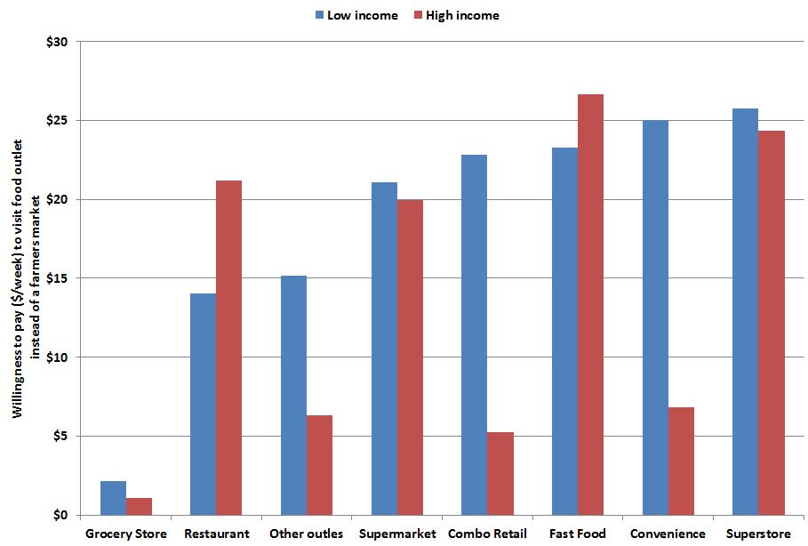
The authors go on to estimate a consumer demand model.  Where do consumers prefer to shop given the distances they have to travel?  When economists say "prefer" - they don't mean how one feels about a location or the images it conjures up, but rather what is actually chosen.  The authors find that people prefer going to locations that are closer to home.  That is, people don't like to travel too far to shop.  This estimate, then, lets them calculate how far one is willing to travel to shop at one type of store vs. another.  The authors consider 9 types of stores (including restaurants and fast food outlets), and find farmers markets are the least preferable shopping outlet in that people are willing to travel the least distance to get to a farmers market.  

Using the authors estimates, I calculated how much people would be willing to pay ($/week) to shop at each of the 8 other types of food outlets instead of the (least preferable) farmers market.

Both low and high income households would be willing to pay around $25/week to shop at a superstore instead of a farmer's market.  The data also suggests that higher income households prefer farmers markets more than do lower income households.  Across all the outlet types, low income household are willing to pay $18.67 to shops somewhere other than a farmers market, but for higher income households, the figure is only $13.95.  The figure also shows that higher income households are more willing to pay to eat at restaurants than are low income households.  This suggests that farmers markets and restaurants are normal goods - the more income you get the more you want to shop in these kinds of outlets. 

The authors write in the conclusions:

the households in this sample have low WTP for Farmers Markets to be closer to home, and high WTP to pay for Fast Food to be closer to home. This implies that simply building Farmers Markets will not induce households to shop there.

The authors interpret this finding to mean, "low-income households may need to be compensated to shop at Farmers Markets."  But, why?  Why would we use tax payer dollars to encourage shopping in food outlets people least prefer?  Perhaps some would say that farmers market sell healthier food.  Maybe, but the highly desirable superstores sell healthy food too.  And, if the problem is healthy eating, where is the market failure, and why would farmers markets be the most efficient solution to solve that failure?  

In any event, I look forward to seeing the authors' follow up work on the subject, which they discuss at the end of this paper.