Blog

Zhen et al. on Soda Taxes

Yesterday, I was browsing recent back issues of the American Journal of Agricultural Economics looking for papers on consumer demand (somebody has an AAEA presidential address to write).  

I came across two papers by Chen Zhen and co-authors published in 2014 on effects of sugared sweetened beverage taxes (or "soda taxes") that I'd previously read but not blogged on before.  I thought I'd mention them here given the ongoing policy discussions surrounding the issue (Philadelphia politicians are currently considering a soda tax; Oakland has a ballot measure planned on the issue; and there is much debate about the potential effects of the soda tax already passed in Mexico).

In the first paper, Zhen and colleagues show that the way most of these taxes are designed, on a per ounce of soda basis, is not nearly as effective as would be a tax on a per calorie basis.  The authors write:

For every 3,500 beverage calories reduced, the estimated consumer surplus loss due to a calorie-based tax is $1.40 lower than the loss induced by an ounce-based tax. A 0.04 cent per kcal SSB tax is predicted to reduce beverage energy from ScanTrack supermarkets by 9.3%, compared with 8.6% from a half-cent per ounce tax. Applying this percentage change to beverages obtained from all sources, we calculated that a 0.04 cent per kcal tax on SSBs will reduce total beverage energy by about 5,800 kcal per capita per year.14 Compared with an ounce-based SSB tax that also achieves a 5,800 kcal reduction in beverage energy, the 0.04 cent per kcal SSB tax is estimated to save $2.35 per capita or $736 million for the U.S. population in consumer surplus per year.

The "lost consumer surplus" means consumers are worse off with either tax.  This is an issue I've raised several times before: there have been few serious attempts to carefully articulate how a soda tax improves consumer welfare given that consumers don't like paying higher prices (e.g., see here or here).

In the second paper, the authors show how a sugar-sweetened beverage tax might have unintended consequences. 

The preferred demand specification predicts that almost half of the reduction in SSB calories caused by an increase in SSB prices is compensated for by an increase in calories from other foods. We further found potential unintended consequences of an SSB price increase on sodium and fat intake. Because energy intake is just one of many dimensions of nutrition, the results on sodium and fat highlight the complexity of using targeted food and beverage taxes to improve nutrition outcomes.

They predict that one half-cent per ounce tax on such beverages would reduce body weight by "0.37 and 0.16 kg/person in 1 year and 0.70 and 0.31 kg/person in 10 years for low- and high-income adults, respectively."

They also write:

The welfare loss for low-income households is about $5 per household per year more than high-income households because low-income households reported higher SSB purchases in Homescan. This difference in welfare loss between low- and high-income households reinforces the regressive nature of an SSB tax

My Crystal Ball was Clear (at least this time)

About three weeks ago, I discussed the Restaurant Performance Index (RPI) put out by the National Restaurant Association (NRA) and speculated as to whether I could predict the RPI using data from my Food Demand Survey (FooDS).  I wrote the following:

Right now, the latest figures available from the National Restaurant Association (NRA) are for March. However, I already have a measure of April’s away from home food expenditures from FooDS (it’s $55.43). A simple linear regression predicts that NRA’s current situation index will be 102.3 for April.

The NRA released their latest data on the RPI a couple days ago.  Here's what they found:

The Current Situation Index stood at 102.1 in April – up 1.9 percent from a level of 100.2 in March

So, three weeks ago my prediction (based on data from the Food Demand Survey (FooDS)) was that the RPI current situation index would go from 100.2 to 102.3.  It actually went from 100.2 to 102.1.  Overall, I'd say, not too shabby.

While I'm at it, I'll go ahead and make a prediction for NRA's May current situation based on our May FooDS data.  It'll go down slightly to 102.0.*

*For those following along, the prediction is a based on a simple linear regression: Current Situation RPI = 93.349+0.161*(Weekly Spending on Food Away from Home from FooDS) 

Support for GMO Labeling a Left-Wing Phenomenon?

Much has been written about whether aversion to biotechnology and GMOs has ideological dimensions rooted in the left.  I've written about this before, as have many others (this paper in Food Policy extends the discussion to a whole host of food regulations beyond biotechnology).  Most of the studies I've seen (including my own data) suggest only small differences in the left and the right in terms of beliefs about safety of eating GMOs.  However, as I previously argued:

One distinction, which I think is missing, is the greater willingness of those on the left to regulate on economic issues, such as GMOs, than those on the right. Stated differently, there are questions of science: what are the risks of climate change or eating GMOs. And then there are more normative questions: given said risk, what should we do about it? Even if the left and the right agreed on the level of risk, I don’t think we should expect agreement on political action.

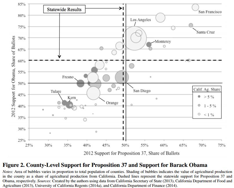
Perhaps the clearest demonstration of this difference in willingness to regulate comes from a new paper by John Bovay and Julian Alston in the Journal of Agricultural and Resource Economics. They look at precinct-level voting data on the Prop 37 mandatory labeling initiative in California in 2012. One of the best predictors of support for Prop 37?  The share of people in the precinct voting for Obama. Here's a telling graph from their paper.   It's an almost perfect positive, linear relationship. 

The authors went on to use these results to predict what would have happened in other states if they'd had an opportunity to vote on Prop 37 (I should note we did something very similar in a paper on for votes on California's Prop 2 related to animal welfare in 2008).  Bovay and Alston found the following:

Projections using our estimated model imply that a majority of voters in only three of fifty states (Hawaii, Rhode Island, and Vermont) plus the District of Columbia would have passed Proposition 37 had it been on their ballots in 2012

Millennials' Food Values

I've given a couple presentations recently on food trends, and in each instance I was asked whether the so-called Millennial generation thinks differently about food issues than older generations.  I haven't spent a lot of time delving into this question because a lot of the willingness-to-pay research I've been involved with over the years suggests demographics don't tend to explain a lot of the variation in willingness-to-pay.

But, given the interest in the subject, I thought I'd take a quick look at some of the data from the monthly Food Demand Survey (FooDS) I've been running for over three years now.  In particular, I pulled the data we ask on so-called "food values."  The question shows respondents 12 issues (randomly ordered across surveys) and asks respondents which are most and least important when buying food.   Respondents have to click with their mouse and drag four (and only four) items in the “most important” box and then do the same for the “least important” box. 

A scale of importance is created by calculating the proportion of times (across the entire
sample) a food value appeared in the most important box minus the proportion of times it
appeared in the least important box. Thus, the range of possible values for a food value is from -1 to +1, where a higher number implies more importance (a +1 would mean the particular food value was placed in the most important box by 100% of respondents). This is a zero-sum scale, and it only reveals relative importance (e.g., how importance taste is compared to price) not overall importance.   

Ok, so here's a graphical illustration of the food values by age group (I've pulled the data over time, so each age group has several thousand observations, yielding margins of error of around +/- 0.025 importance points).

Except for the oldest group, there is agreement in ranking at the top: Taste>Safety>Price.  In the middle-range of importance, there is far less agreement.  Both the 18-24 year old group and the 25-34 year old group could be considered Millennials according to most definitions I've seen.  The Millennials place less relative importance on nutrition than the 55 and older crowd.  However, the top four issues (taste, safety, price, and nutrition) are way more important than the other issues regardless of the generation under consideration.

The Millennials place less importance on appearance but more relative importance on naturalness, animal welfare, convenience and environment than do older generations, particularly the 65 and older group, which compared to the other age groups, places the lowest importance on naturalness, animal welfare, and environment.  There is a big divide when it comes to the importance of origin: the 65 and older group places quite a bit more importance on origin than do people who are 24 years and younger.  

The biggest gap is for origin (there is a 0.30 spread on the -1 to +1 scale) between the youngest Millennials and the oldest group.  The next biggest gap is for naturalness (there is a 0.22 spread on the importance scale) between the oldest group and the 25-34 year old Millennials.  The most agreement is for "fairness."

It might also be instructive to compare all this along another demographic category: gender (margin of error here is +/- 0.014).  

Women place more relative importance on safety, animal welfare, and naturalness than men. Men place more importance on convenience and novelty than women.  The biggest gap is for animal welfare (a 0.19 point difference on the -1 to +1 scale) and then convenience (a 0.16 difference).