Blog

What if we forced food to be more local?

I recently ran across this paper in Food Policy published back in 2011 by Charles Nicholson, Miguel Gomez, and Oliver Gao.  The paper asks an interesting question: what would happen if we required food (or in this case, milk in particular) to be more local?   This is a policy proposal that has been seriously put forth by prominent food writers.  

The authors took data on current location of milk production, processing plants, and consumers and created a mathematical model to minimize the cost of supplying various dairy products to consumers.  Here's their description of the spatial dimensions of the data:

The model uses 231 multiple-county milk supply regions, each represented with a single centrally-located point. Dairy processing plant locations are specified based on observed plant locations observed in 2005, and vary in number from 319 possible locations for fluid plants (Fig. 3) to 11 for milk protein concentrate products. Demand locations are represented as a single point for 424 major population centers and aggregations of multiple-county regions

Given this set-up, what is the effect of cost of reducing the number of miles traveled - or the weighted average source distance (WASD) - by 10% or 20%?  

The authors find that (in the month of May), requiring a 10% or 20% reduction in WASD would increase total costs by about $1 million and $18 million per month (0.1% and 1.7% cost increases), respectively.  All this is a way of saying that milk production and dairy processing is located in particular regions for a reason, and forcing a different spatial configuration will increase costs.  The authors write:

These relatively small reductions in overall costs contrast with more marked shifts in the allocation of costs within the supply chain. In each case, the costs for assembling milk from farms to plants decreases, as it is optimal to ship milk shorter distances to processing facilities. Costs for interplant shipments increase by about the same magnitude of the increase in total costs. The largest increase in costs occurs in product distribution; increases in distribution costs range from 2% to 25%–6 to 24 times as large as the overall increase in costs.

In other words: the effects are complicated and impose much larger costs on some portions of the supply chain than others.  In terms of the impacts on consumers:

The increases in the value of a gallon of milk due to reduced WASD vary from less than $0.50 (which is often more than 10% of the retail price) in the western US to more than $4.00 per gallon in the southeastern US, but the average for all demand locations is $1.66.

Another interesting result is that even though WASD is reduced over all by 10% or 20%, some dairy products, such as cheese, end up having to be transported even further.  

The authors consider another interesting scenario in which people just want to reduce the distance traveled by fluid milk by 10%.  In this case, total costs increase a whopping 12%, and the WASD for all products actually increases by 98 miles (a 31% increase in distance traveled). This remarkable result shows the unintended result of, for example, local schools requiring their milk be purchased locally without considering what happens to the yogurt, butter, cheese, and nonfat dry milk that will also be consumed by someone.  

The authors conclude as follows:

The primary conclusion is that developing a cost effective strategy to localize a multi-product supply chain is complex. Such complexity accrues to the multiple links that exists in a multi-product supply chain including the relationships across supply chain segments, the dependency of the various products, the diversity in supply and demand across geographic regions, and the seasonality of the production process. Therefore, decision makers should adopt a systems approach to anticipate the consequences of industry wide or public policy initiatives to increase localization in the food industry.

Food Demand Survey (FooDS) - A Look Back at Year Four

It is hard to believe but we've now been conducting the Food Demand Survey (FooDS) for four years!  That means we've obtained responses from over 48,000 consumers (1,000 consumers each month for 48 months).  Thanks to Susan Murray who has faithfully got the survey out the door on time each month and has always pulled together the monthly report on schedule.  Thanks also goes to the USDA-NIFA for funding the project as well as the Oklahoma Agricultural Experiment Station and the Willard Sparks Endowment.

A summary of the forth year of results can be found here (we are working on putting up some links on our project's web site to that one can easily download all 48 months worth of data both at the aggregate monthly level and each individual response).  

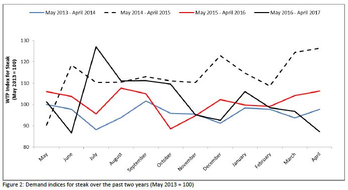
Data on consumers' willingness-to-pay (WTP) shows demand for meat products is generally similar to that last year although lower than two years ago.  

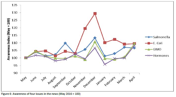
As shown below, there was a sharp spike up in awareness of E. coli in the news in November and December 2016 perhaps as a result of the news associated with Chipotle.

For more, check out the whole report.  

Books that have arrived on my desk

One of the nice things about writing books is that you then often get free books sent to you to review.  I've written "blurbs" for three such books that have recently arrived on my desk.

Discriminating Taste: How Class Anxiety Created the American Food Revolution by S. Margot Finn, "Finn offers an engaging and compelling explanation for the rise of the modern food movement. It's one that the leaders of the movement will no doubt find unsettling."

Food Truths from Farm to Table: 25 Surprising Ways to Shop & Eat without Guilt by Michele Payn, ""An engaging defense of modern agricultural production practices."

Nudge Theory in Action: Behavioral Design in Policy and Markets, edited by Sherzod Abdukadirov, “Finally, a serious look at how government nudges would work in the real world.  A valuable guide for anyone interested in how behavioral economics interacts with public choice economics and market forces.”

Subsidizing Backyard Chickens?

There are a lot of really bad food policy proposals.  But, this one take the cake.  Apparently the city of Austin, TX is subsidizing backyard chicken coops.  

The city announced Thursday that as a part of Austin Resource Recovery’s Home Composting Rebate Program, Austinites can attend one of five “chicken keeping classes,” buy a chicken coop, submit a rebate application online and receive a $75 check from the city.

Austin Resource Recovery is promoting the program as a way for Austinites to help reach the city’s Zero Waste goal by keeping food waste out of the landfill.

A few questions come to mind.  What happens to the waste that comes out of the chickens?  Does this waste (and the smell and the sound) impose externalities on neighbors?  What happens to the hens who have reached the end of their egg-laying life?  What happens to the hens who, whoops, turn out to be roosters.  Bird flu?  Will the chickens be protected from preditors and extreme weather conditions?  How much does it cost to maintain the chickens and how expensive is supplemental feed and veterinary care?

I'm not necessarily trying to discourage backyard chickens.  I just want to know why taxpayer A should be required to pay for person B's chickens?  If the problem is food waste, and supposing it causes some unmentioned externalities, why not just increase the price of garbage pick-up?  Then households can respond in whatever ways they find most effective and convenient.  I doubt, for most, that chickens are the optimal solution.      

How Many Americans Go Hungry?

One of the most basic measures of well-being is whether people have enough food to eat. Whether the U.S. does well in this regard seems to depend on who you ask.  There are many people in the so-called food movement who seem to think we're doing ok on this front and that food is actually too cheap.  There are other groups like Feeding America that think hunger is a serious concern and are doing what they can to reduce it.

The USDA Economic Research Service produces the most widely used measure of hunger (or as they call it "food security").  According to their data

An estimated 12.7 percent of American households were food insecure at least some time during the year in 2015, meaning they lacked access to enough food for an active, healthy life for all household members. That is down from 14.0 percent in 2014.

This figure shot up during the great recession (reaching a high of 14.9% of households in 2011) but has subsequently fallen a bit as indicated above, but still remains higher than was the case prior to 2008 when it was regularly in the 10 to 11% range.  

I was curious how the sample of people I study every month in my Food Demand Survey (FooDS) matches up with these official government statistics.  In the most recent April 2017 edition of FooDS, we added some questions (the short 6-item measure) based on work by the USDA to measure food insecurity.  As an example, one of the questions is "'The food that I bought just didn’t last, and I didn’t have money to get more.' Was that often, sometimes, or never true for you/your household in the last 12 months?"

Data from FooDS reveals a strikingly high level of food insecurity - much higher than what the USDA reports.  According to the criteria outlined at the above link, we found a whopping 46.7% of respondents were classified as having low or very low food security (22.9% of the sample had low food security and 23.8% had very low food security).  

My first thought was that we must have made a mistake in how we asked the questions or in how we analyzed the data.  We ruled out those possibilities.  My second thought was that maybe my survey sample is really different from the U.S. population.  After all, who is willing to sign up to take online surveys?  Maybe people who really need the money and who are thus more likely to be food insecure.  But, this couldn't be the complete answer because I use weights to force my sample to match the U.S. population in terms of age, education, gender, and region of residence, and the average income of my sample isn't much different from the average income of the country as a whole.  Maybe the difference is that I used a 6-item measure of food insecurity rather than the full 18 items used by the USDA (but previous research has found strong agreement between the two).

When I mentioned this quandary to my friend Bailey Norwood, he knew immediately what was causing part of the the discrepancy, and I think it could have a big impact on how we fundamentally view the food security measures reported by the USDA.  

In short, the USDA assumes that if you make enough money you can't be food insecure [*Addendum, this original sentence, as stated, was too strong. As the quote below suggests, you can't be classified as food insecure if you're high income AND if you answer two preliminary questions on food insufficiency in particular way.  Some researchers in this area emailed me to note that about 25% of food insecure households have incomes at least 300% of the poverty line]. In their latest report, they indicate in footnote 5: 

To reduce the burden on higher income respondents, households with incomes above 185 percent of the Federal poverty line that give no indication of food-access problems on either of two preliminary screening questions are deemed to be food secure and are not asked the questions in the food security assessment series.

What if I take my FooDS data and just assume anyone that has an income that puts them at 185% of the poverty line (based on these criteria) is food secure despite the answers they gave on the survey? (note: my calculations are crude because I only measure household income in wide $20,000 ranges and I simply assign people to the midpoint of the income range they selected).   

When I do this, I find that now "only" 22% are classified as having low or very low food security (9% of the sample had low food security and 13% had very low food security).  That's still a lot higher than what the USDA reports, so maybe my internet survey still has some sample selection issues.  However, it's still HALF the original measure.

What does this mean?  There are a lot of relatively high income people that would be classified as food insecure if the USDA simply asked them the same questions as everyone else.  There are a lot of relatively high income people that say "yes" to questions like "In the last 12 months, did you ever eat less than you felt you should because there wasn't enough money for food?"  

None of this to say that income isn't a determinant of food security, but that it shouldn't be the only signal, particularly if someone is in a lot of debt or if they have large households, they could still be going hungry.

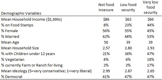
In any event, here are some of the demographic characteristics of the people who, according to my sample (and without making the above discussed income correction), classify as being food secure, low food security, or very low food security.  

As the above table indicates, income matters as the average income of food secure households is $86,000/year.  However, households with low food security still average $60,000/year, which is far above 185% of the poverty level for most households.

Households that classify as very low food security are much more likely to be on SNAP (aka food stamps).  Of course, this isn't causal: being on SNAP isn't causing food insecurity but likely the other way around.  Two other noteworthy results.  Households classified as having very low food security are much more likely to 1) have children in the household and 2) report farming or ranching as a primary occupation.