Blog

The non-price effects of soda taxes and bans

The American Journal of Agricultural Economics just published a paper I co-authored with Sunjin Ahn, who is a post-doc at Mississippi State University entitled “Non‐Pecuniary Effects of Sugar‐Sweetened Beverage Policies.” (for the non-economists out there, “non-pecuniary” just means non-price).

Here was our motivation for the study:

There is some market evidence that passage of SSB [sugar sweetened beverage] taxes might generate outcomes beyond that predicted by price elasticities (or the pecuniary effects). Non‐pecuniary effects could amplify the effects of a tax, increasing the intended effects of the policy. In particular, the tax (and the debate and publicity surrounding it) could send information to consumers about the relative healthfulness of beverage options and send cues as to which choices are “socially acceptable”
...
Signaling and information effects associated with SSB taxes are only one potential non‐pecuniary effect, and it is possible that some non‐pecuniary factors, such as reactance, could dampen the effects of a tax, and in the extreme could result in outcomes opposite that intended by the policy. ... Reactance is thought to arise from perceptions of threats to individual freedom, among other factors (Brehm 1966). Thus, although it seems clear that non‐pecuniary effects might exist, the size and the direction of the effect is ambiguous.

We tackled this issue by conducting a series of experiments through surveys with consumers. We asked consumers to participate in a series of simulated grocery shopping exercises. Consumers first made choices between beverage options at a given set of prices, and then they were randomly allocated to different treatments where either:

  • A) prices of SSB increased but respondents were not told why,

  • B) prices of SSB increased and respondents were told it was a result of a soda tax,

  • C) prices of SSB increased and respondents were told it was a result of a shortage of sugar beets and sugar cane,

  • D) the size of SSB was reduced but respondents were not told why,

  • E) the size of SSB was reduced and respondents were told the reduction was due to a government ban on large sized sugared sodas, or

  • F) the size of of SSB was reduced and respondents were told the reduction was due to a plastic shortage.

By comparing how choices of SSBs change when people were told prices or size changes were a result of a policy vs. other non-policy factors, we can get a sense of the size and direction of the non-pecuniary effects.

When conducted our first study in 2016, we found significant results related to the SSB taxes. In particular, our results suggested people who were told price changes were a result of a tax were more likely to choose SSB than people who were not given a reason for the price change. We certainly weren’t the first to find such an effect. Here is a bit about previous research on this topic:

Just and Hanks (2015) argued that consumers might respond with resistance when a new policy obstructs their ability to obtain their preferred option. They argued that the phenomenon arises because consumers are emotionally attached to consumption goods, resulting in reactance. Policies perceived as paternalistic might cause consumers to “double down” on purchases of forbidden or restricted goods (Lusk, Marette, and Norwood 2013). Just and Hanks (2015) constructed a model in which controversial policies such as a sin tax could lead to an increase in the marginal utility for a good, potentially leading to increased consumption even if prices rise. In addition, Hanks et al. (2013) found that demand for unhealthy foods under a tax frame increased while the demand for subsidized healthy foods fell. Similarly, Muller et al. (2017) found that almost 40% of low‐income individuals increased their share of expenditures on unhealthy food after an unhealthy food tax.

When we sent the paper off for review, we received a number of valuable comments, which caused us to make a number of changes to our experiment, and repeat the study with some extensions in 2019. What did we find with these newer data? On average: nothing, nada, zilch. There was no significant difference in the average market share of SSBs across the various information treatments. However, we did find significant variability in the treatment effects, meaning some people choose more SSBs when they knew it was a tax/ban and others chose less; however, these variations were only partly explained by demographic effects. In summary, our results didn’t provide a clear answer on the question we sought out to address: non-pecuniary effects, to the extent they exist, seem to work in different ways for different people, making the net effect small and hard to identify, at least in our experimental setting.

A note on the publication process is worthwhile. Normally, it is very hard to publish null results. This is problematic for the advancement of science because it results in publication biases like the file draw problem. To the credit of Tim Richards, the journal editor, and the three anonymous reviewers at the American Journal of Agricultural Economics, we received a positive reaction and ultimately, after a more changes, acceptance for publication even though we failed to replicate our previous result and found null effects. This is really an example of peer-review working at it’s best.
Impacts of Coronavirus on Food Markets

Last week was a whirlwind of trip and event cancellations, movement of courses online, and the dusting off of emergency and contingency plans. This week is likely to bring more social-distancing and quarantining measures. The ultimate toll and impacts of the coronavirus are highly uncertain at present.  Nonetheless, it might be useful to speculate a bit about impacts of coronavirus and the events surrounding it on food markets. 

1. Grocery buying behavior. It has been fascinating to watch online, and in my own local grocery stores, which items consumers are choosing to stock-up on.  The run on toilet paper, for example, seems on the surface of it, downright irrational.  After all, COVID-19 does not cause digestive issues.  As irrational as the initial movement to toilet paper may seem, it isn’t crazy for subsequent consumers to then stock up too.  After all, it doesn’t take much for a reasonable person to see that if all other consumers are buying up all the toilet paper, that they’d better off getting theirs before none is left.  There is a long and interesting economics literature on information cascades and herding behavior, which shows that even if you disagree with what other people are doing, it is sometimes sensible to go along with the crowd.      

Much of the information we have at this point on which items are stocking-out is anecdotal, but there do seem to be some common trends in what I see in my own local stores and commentary online.  For example, it seems many of the new plant-based burgers are being left behind while the rest of the meat case is being cleared (see here or here).  I was surprised to see in my own local store, that virtually all the beef was gone (except for a bit of ground beef), about half the pork was gone, and chicken was plentiful.  This must say something about people’s psychology to go for the highest-price, perishable produce in this time of panic; that or differences in supply chain issues, but more on that later.  In other aisles, rice and pasta went quickly, presumably for issues related to the long shelf life, should quarantining result.  Still, I noticed what was left in those aisles were the gluten-free options and the lesser-known brands or unusual flavors, suggesting stock-outs are related to item popularity.  I hope we can learn more about this behavior after the fact. Unfortunately, it’s difficult to study stocking-out phenomenon because stores are usually well stocked, and because grocery store scanner data only shows us what people bought, but we can’t see what people didn’t buy because it wasn’t available.

2.       Stock-outs and supply chains.  The New York Times ran a story yesterday with the heading “There Is Plenty of Food in the Country.” I largely agree.  The stock-outs we are seeing now are likely temporary disruptions resulting from consumers pulling forward buying behavior in anticipation of future reduce mobility.  But, it’s unlikely people will eat more in aggregate because of the coronavirus.  Thus, this is largely a temporal adjustment in buying behavior with smaller effects on aggregate food demand. 

However, there could be more serious food market disruptions. Some of the stock-outs and slowdowns in grocery check-out lines are because employees are staying at home and practicing social-distancing.  This problem is likely to grow if more people become ill. So, while we might have the food supply available, will we have the workers to get it to us?  

Now, take a step back in the supply chain, and this is where worker issues could have serious issues.  Remember all the fervor over the beef packing-plant fire back in August?  While the impacts was counter-intuitive to many producers, the economics were straightforward: an unexpected disruption in supply depressed cattle prices and boosted wholesale beef prices.  It isn’t far-fetched to imagine worker illnesses getting to the point that plants have to temporarily shut down on a scale that is at least as large as the August-fire, which removed about 5% of the nation’s beef processing capacity.  One difference is that destroying a plant via fire is not the same as temporarily closing plants due to lack of healthy workers; one resulted in a long-term price adjustment while the latter is more likely a temporary price fluctuation.

One thing that makes me nervous even about temporary closures, if large scale, is the animals that have been placed to be market-weight in the next few weeks.  While feedlot cattle can likely remain on feed a few weeks longer with relatively small changes in profitability, that is less true for hogs, and particularly chickens.  Meat supply chains are optimized for efficiency and low-cost production, not necessarily for flexibility and resiliency.    

A signal to keep an eye on is the amount of meat in cold storage (the data currently available are lagged by at least a month).  The buying behavior we’re seeing now is likely to pull meat out of storage and onto our dinner plates.  However, that boost in domestic demand is likely to be offset by reductions in foreign demand, and the coronavirus has hit hard some of our biggest export markets.

The flip-side of this is that we rely on imports from China for a variety of consumer goods, and this trade is likely to be disrupted by coronavirus. I’ve often been critical of the local foods movement, but it’s times like these that highlight some of the benefits of localization and heterogeneity in the food supply chain.

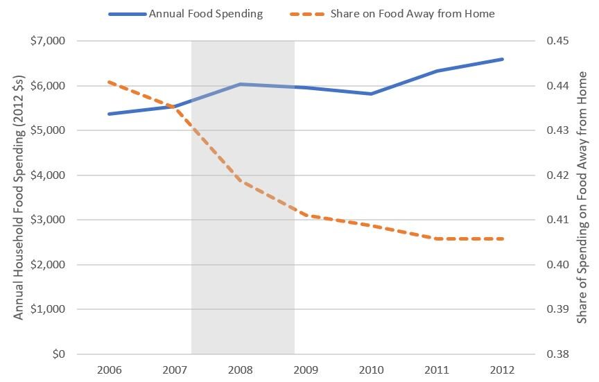
3. Recession. Given the reaction of the stock-market and the disruption to normal business and spending activity, the chances of a recession are high.  The “Great Recession” in 2007-09 had significant impacts on food spending, particularly spending on food away from home.  Here are data from the Bureau of Labor Statistics Consumer Expenditure Survey.  These data show food spending at home only declined slightly after the recession, but the share of spending that occurred outside the home (at restaurants, etc.)  fell from 0.44 to 0.41. 

foodspendingrecession.JPG

It is also interesting to look at how spending on different types of food changed during the Great Recession.  The figure below shows spending on food eaten at home (plus total alcohol spending).  All at-home food spending increased in 2008 before falling in 2009, but the increase was smaller for beef and pork, which implies the share of food spending on these items fell over this period.  Spending on alcohol took the biggest hit.  By contrast, spending on fruits and vegetables, cereal and bakery, and dairy, fared pretty well during the last recession.

spendingrecession_byfood.JPG

There is an old saying that “generals are always fighting the last war.”  Likewise, it is probably wise not to focus too much on the past recession to predict how consumers might respond to one potentially caused by the coronavirus.  Nonetheless, the pattern of reduced spending on food away from home is already occurring, and meat demand is typically thought to respond significantly to income, which suggests, at least in these two cases, the pattern may re-emerge. 

During the past recession, rates of food insecurity spiked. There are concerns about impacts of school closures on childhood food security, and the USDA is considering policies that will allow delivery of free school lunch and breakfast to low income children even in instances where schools are closed.

4. Population. A couple months ago, I discussed the role of population in affecting food demand.  I was writing then about the fact that birth rates have been falling, and indicated a smaller population would put downward pressure on food prices and farm incomes.  Unfortunately, a global pandemic like the coronavirus has the potential to reduce the world’s population (or at least slow the increase). For example, estimates suggest the flu pandemic in 1918 sickened about 27% of the world’s population and killed about 2 to 3% of the world’s population at the time. Estimates of the potential number of deaths from the coronavirus are all over the board, but the greater the number of “excess” deaths, the greater the reduction in aggregate food demand. On the up-side, all this social-distancing and self-quarantining means many more couples will be home together. We may need to hang on to all those hospital beds for the new babies that will arrive in nine months.

Who are you calling food insecure?

Every year, the USDA Economic Research Service (ERS) reports rates of food security in the United States. In 2018, 11.1% of U.S. households were estimated to be food insecure, down from a recent-history high of 14.9% in 2011.

These official statistics on food security are often interpreted in the media and by lay audiences as a measure of hunger. But, that’s not exactly what the USDA-ERS measures. A new paper by Sunjin Ahn, Travis Smith, and Bailey Norwood in Applied Economics Perspectives and Policy does a great job de-mystifying how official government measures of food insecurity are actually calculated. They also ably explain and articulate what other survey researchers must do to produce results that approximate the official measures.

Food insecurity is measured by the US Census Bureau asking a large sample of nationally-representative U.S. households a series of 10 questions (plus an additional 8 questions if there are children in the household) like how often, “In the last 12 months, were you ever hungry, but didn't eat, because you couldn't afford enough food?” or how often “I couldn’t afford to eat balanced meals.” A score is then calculated based on the frequency with which people respond affirmatively to the questions. If the score is high enough, the household is deemed food insecure. Seen in this way, food insecurity is probably best interpreted as a measure of a household’s perception of food affordability, although it almost surely positively correlated with hunger. The ERS has more information on how food security differs from hunger, and on the details of their measurement of food security here.

Ahn, Smith, and Norwood point out another issue that is not widely appreciated. They write:

To avoid overburdening respondents with unnecessary questions in the CPS‐FSS [Census Bureau Current Population Survey - Food Security Supplement] survey, surveyors first conduct a screening process. If a household’s income is greater than 185% of the poverty threshold, and they answer

(1) “no” to “… did you ever run short of money and try to make your food or your money go further,” or

(2) “enough of the kinds of food (I/we) want to eat” from the question “Which of these statements best describes the food eaten in your household …,”

they are assumed to be food secure and are not administered the Food Security questionnaire (ERS 2015b). This screening process varies: In a 2012 design description, the first of the above questions was not used (ERS 2012a), and documentation of the survey suggests sometimes the income threshold is 200% of the poverty threshold. Though it is recognized that some of the individuals screened out of the questions will in fact be food insecure, the screening was still seen as desirable because it reduces respondent burden (ERS 2015a). Thus, the CPS‐FSS food insecurity rates are a function of responses to food insecurity questions conditional on the statistical screening procedures employed.

Ahn, Smith, and Norwood’s paper is mainly framed around the question of whether opt-in, internet-based surveys can mimic the official government estimates of food insecurity. However, their results make abundantly clear the critical role of the income threshold in setting official food insecurity rates. In short, if we simply counted the scores on the food insecurity questions and ignored income, we would find MUCH higher rates of measured food insecurity. Before applying the income-cutoff, Ahn, Smith, and Norwood find food insecurity rates of 43% (in a 2016 survey) and 31% (in a 2017 survey). After applying the income cut-offs (essentially assuming anyone with an income over 180% of the poverty line can’t be food insecure) and some demographic weighting, the authors find opt-in internet surveys can produce estimates of food insecurity that are similar to that reported by the USDA-ERS.

I’m a little unsure of how to interpret these findings. On the one hand, I’m left with a sense that the official food insecurity statistics are heavily influenced by a somewhat arbitrary income cut-off, and that perhaps the official measure of food insecurity are too imprecise at measuring the construct we are really after. Another, reasonable, albeit alarming, conclusion is that there may a lot more food insecure people than we thought.

Consumer Demand for Redundant Food Labels

That’s the title of a new working paper co-authored with Lacey Wilson. Here is the abstract:

Previous studies, as well as market sales data, show some consumers are willing to pay a premium for redundant or superfluous food labels that carry no additional information for the informed consumer. Some advocacy groups have argued that the use of such redundant labels is misleading or unethical. To determine whether premiums for redundant labels stem from misunderstanding or other factors, this study seeks to determine whether greater knowledge of the claims - in the form of expertise in food production and scientific literacy - decreases willingness to pay for redundant labels. We also explore whether de-biasing information influences consumers’ valuations of redundant labels. An online survey of 1,122 U.S. consumers elicited preferences for three redundantly labeled products: non-GMO sea salt, gluten-free orange juice, and no-hormone-added chicken breast. Respondents with farm experience report lower premiums for non-GMO salt and no-hormone-added chicken. Those with higher scientific literacy state lower premiums for gluten-free orange juice. However, after providing information about the redundancy of the claims, less than half of respondents who were initially willing to pay extra for the label are convinced otherwise. Over 30% of respondents counter-intuitively increase their premiums, behavior that is associated with less a priori scientific knowledge. The likelihood of “overpricing” redundant labels is associated with willingness-to-pay premiums for organic food, suggesting at least some of the premium for organic is a result of misinformation.

The figure below shows a key result. People place a $0 premium on non-GMO salt, gluten-free orange juice, and hormone-free chicken have significantly higher scientific literacy scores than people who place positive or negative premiums on these redundantly labeled products.

redundantlabels.JPG

Food Spending by State

There seems to be a insatiable desire for information on regional food consumption patterns, fed by click-bait headlines fueled by dubious data sources. To help provide some “hard” data on this topic, about three years ago, I wrote a post about how meat demand varies by state. The graphs I presented then came from data collected from the Food Demand Survey (FooDS) we ran for five years, and they relate to measures of demand, not consumption.

I’ve been receiving a large number of emails in recent months about this post, which suggests even more demand for this type of information than I’d originally anticipated. Unfortunately, a big challenge is that there is no good, easily accessible, publicly available data on food consumption by U.S. state.*

Given the apparent interest in the topic, I turned to data collected by the Bureau of Labor Statistics (BLS) Consumer Expenditure Survey (CES). With special permission, one can access state-level consumer spending on food, but anyone can access their representative consumer spending data by U.S. census region. Here, I delve into that data to provide insights into how food spending varies by the nine Census regions they report.

First, here is data on total annual spending on food by region. Consumers in the Pacific Region (Alaska, California, Hawaii, Oregon, and Washington) spend the most on food at $9,166 annually in 2017-18, whereas consumers in the East, South Central Region (Alabama, Kentucky, Mississippi, and Tennessee) spend the least at $6,807/year.

CEX_fig1.JPG

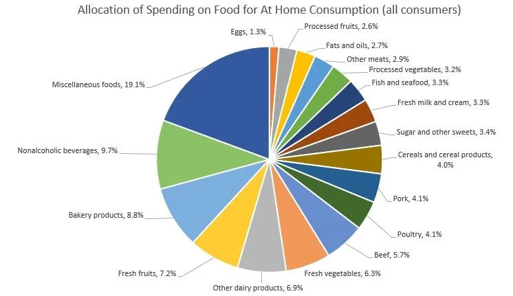
According to these data, on average about 43.6% of spending is on food to be consumed away from home (e.g., at restaurants), whereas 56.4% is spending for food to be consumed at home (e.g., spending at grocery stores). The BLS does not segregate data on spending on food away from home by the type of food, but it does so for spending on food to be consumed at home. Of the spending on food to be consumed at home (e.g., spending at grocery stores), the figure below shows the breakdown for the “average” food consumer. 19.1% of “at home” food spending is for “miscellaneous foods” and the next biggest category is nonalcoholic beverages (9.7%) and then bakery products (8.8%). Combined, all meat products including beef, pork, poultry, and fish account for 21.6% of at home food spending, and all dairy products account for another 10.2%.

The main reason for delving into these data is that they provide information on regional differences in food spending patterns. To explore these issues, I calculated the at food expenditure shares for each of the nine census regions, and then calculate the percent difference in expenditure share for a given region compared to the “average” consumer in the U.S. Here are some breakdowns, starting first with spending on beef as a share of all spending on food at home.

Differences in Spending on Beef by Region.

Differences in Spending on Beef by Region.

Consumers in the South West Central region (Arkansas, Louisiana, Oklahoma, and Texas) allocate 16.2% more of their at-home food budget to beef than does the national average food consumer, whereas on the other extreme, New England consumers (in Connecticut, Maine, Massachusetts, New Hampshire, Rhode Island, Vermont) allocate about 8.7% less of their food budget to beef than does the national average food consumer.

The following shows similar figures for pork and poultry. Whereas consumers in the Upper Midwest allocates a higher than average share of their food at home food budget to beef and pork, consumers there allocate 21.1% less of their food at home budget to poultry as compared to the average national food consumer.

Differences in Spending on Pork by Region

Differences in Spending on Pork by Region

Differences in Spending on Poultry by Region.

Differences in Spending on Poultry by Region.

Turning from meat items, here is data on relative spending on fresh fruits and fresh vegetables by region, which is higher in the West and New England.

Differences in Spending on Fresh Fruit by Region.

Differences in Spending on Fresh Fruit by Region.

Differences in Spending on Fresh Vegetables by Region.

Differences in Spending on Fresh Vegetables by Region.

What about items that are often considered “unhealthy” like sugar and sweets and fats and oils? Spending on sugar and sweets is 27.3% higher in the Mountain region as compared to the average consumer, and spending on oils and fats is relatively highest in the East South Central Region.

Differences in Spending on Sugar and Sweets by Region.

Differences in Spending on Sugar and Sweets by Region.

Differences in Spending on Fats and Oils by Region.

Differences in Spending on Fats and Oils by Region.

The BLS CES reports spending on alcoholic beverages as a separate category from food at home or food away from home. Across all consumers, about 7% of food spending (either at home or away) is on alcoholic beverages. The variation across region is shown below. Spending on alcohol (as a share of total food spending) is positively correlated with spending on fresh fruits and fresh vegetables (as a share of spending on food at home), as alcohol spending is highest in the West and New England.

Differences in Spending on Alcohol by Region.

Differences in Spending on Alcohol by Region.

Finally, here is spending on food away from home as a share of total food spending. Consumers in the South West Central Region (Arkansas, Louisiana, Oklahoma, and Texas) and in the West spend 4% more on food away from home as a share of total food spending as compared to the average food consumer.

Differences in Spending on Food Away from Home by Region.

Differences in Spending on Food Away from Home by Region.

Readers who want to further explore the differences in regional spending patterns can access the BLS CES data here.

*The USDA Economic Research Service (ERS) reports data on per-capita “consumption” (this is actually “disapperance data, which infers consumption based on production, minus exports, plus imports, plus or minus net change in storage), but this is only at the national level. There are some other datasets which provide more local information on food purchases or consumption, but they are proprietary. Examples include grocery store scanner data by Nielsen or IRI. There are publicly available data, like the National Health and Nutrition Examination Survey (NHANES), which have information on location and food consumption, but it often requires significant data analytic abilities or special permission to make use of these data to explore state or regional trends.