Blog

Food Demand Survey (FooDS) - March 2017

The March 2017 edition of the Food Demand Survey (FooDS) is now out.

Some items from the regular tracking portion of the survey:

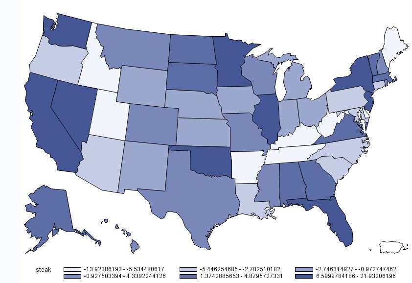
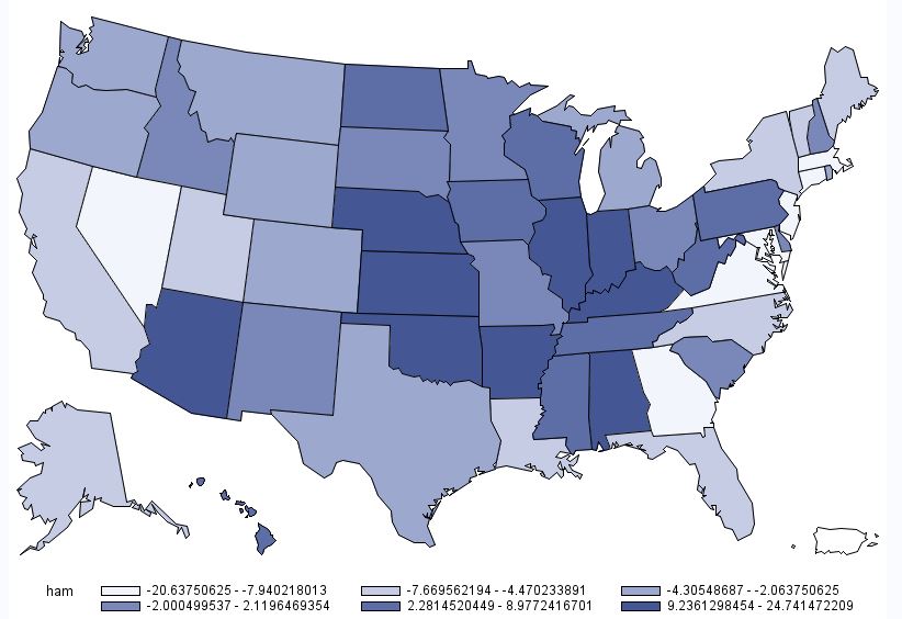
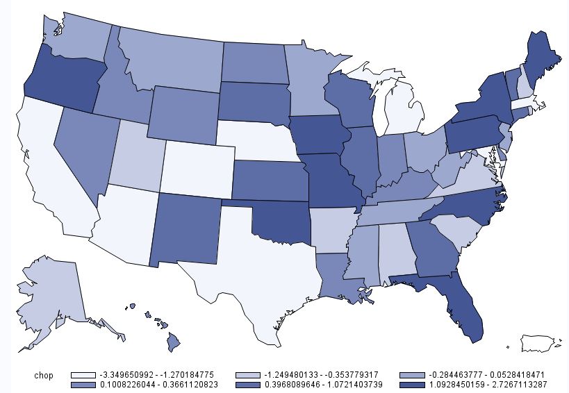
  • Willingness-to-pay (WTP) decreased for steak, pork chops, and especially deli ham. WTP increased for chicken breast, hamburger, and chicken wings. WTPs for all meat products are lower than one year ago, except for hamburger.
  • Consumers expect higher beef, chicken, and pork prices compared to one month ago. Consumers plan to buy slightly less chicken and beef compared to last month.
  • The largest percentage increase in concern was for bird flu and the largest decrease in concern was for farm animal welfare.

Several new ad hoc questions were added to this month’s survey that mainly dealt with knowledge of farm production practices.

Participants were first asked: “Have you ever worked on a farm or ranch?”. About 17% of participants answered “yes.” Participants who answered “yes” were then asked “which of the following best describes the kind of farm you worked on?” Respondents were provided with six options and they could check all that applied.

Of the 17% who said they had worked on a farm, 43% checked “A farm that produces commodity crops (e.g. corn, wheat, soybeans, cotton, or rice)” followed by 40% who checked “A farm that produces commercial livestock (e.g. cattle, swine, or poultry).” “A garden in your backyard” was picked by 38% and “A chicken coop in your backyard” was picked by 23%. 20% checked “other” (and provided responses such as working on a dairy farm or a horse farm or on school farms such as FFA), and 12% checked “A community garden”.

Secondly, participants were asked: "Which of the following animal production industries use added growth hormones?” Over half of participants stated that believed beef, pork, poultry and dairy industries use added growth hormones. Over 75% of participants indicated that they thought that the beef cattle industry uses added growth hormones. Over half of the respondents stated they believe the swine and poultry industries to uses added growth hormones. In reality, the swine and poultry industries do not use any added growth hormones. About 57% of participants stated they believed added growth hormones are used in the dairy industry.

Third, participants were asked: “What percentage of dairy cattle in the U.S. are treated with rBGH?” Overall participants perceive a much greater use of rBGH in dairy cattle than what is actually used. About 20% of participants believe that 50-59% of dairy cattle are treated with rBGH. 5.7% believe that 90- 100% of dairy cattle are treated with rBGH. Only, 10.9% of participants stated that less than 10% of dairy cattle are treated with rBGH. In reality, less than ten percent of all dairy cattle in the U.S. are treated with rBGH.

Lastly, participants were asked: “To what extent do you agree or disagree with the following statements?” Individuals responded on a 5-point scale: 1=strongly disagree, 2=somewhat disagree, 3=neither agree nor disagree, 4=somewhat agree, 5=strongly agree.

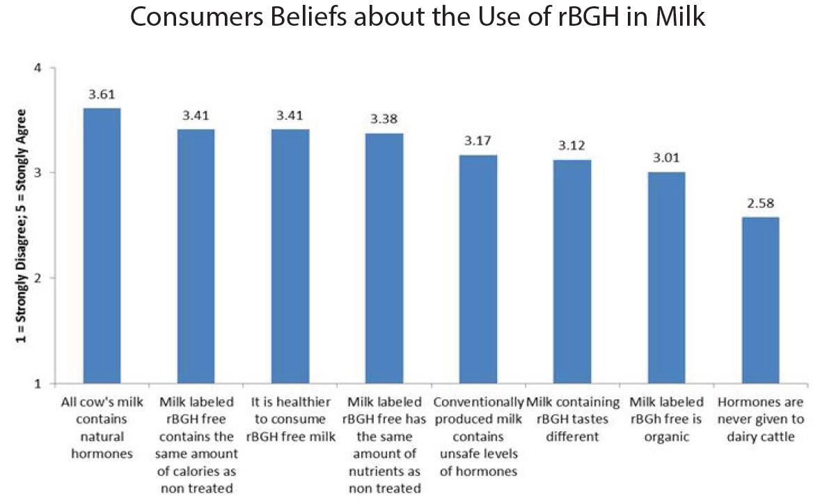
The most common answer for each item was “neither agree nor disagree”, except for the statement all milk contains natural hormones where the most common answer was “somewhat agree”. The statement “all cow’s milk contains natural hormones” was agreed upon most, whereas the statement “hormones are never given to dairy cattle” was agreed upon least.
About 38% of participants answered “somewhat agree” or “strongly agree” that it is healthier to consume milk labeled rBGH free. Approximately 30% of participants answered “somewhat agree or “strongly agree” that conventionally produced milk contains unsafe levels of hormones. Only 5.6% of participants selected “strongly disagree” that milk containing rBGH tastes different.

Measuring Beef Demand

There has been a lot of negative publicity about the health and environmental impacts of meat eating lately.  Has this reduced consumers' demand for beef?  Commodity organizations like the Beef Board run ads like "Beef It's What's for Dinner."  Have these ads increased beef demand?  To answer these sorts of questions, one needs a measure of consumer demand for beef.  In my FooDS project, I try to measure this by using consumers' willingness-to-pay for meat cuts over time.  But, there are other ways.

I just ran across this fascinating report Glynn Tonsor and Ted Scroeder wrote on beef demand.  At the onset, they explain their overall approach.

One way to synthesize beef demand is through construction of an index that measures and tracks changes in demand over time. An index is appealing because it provides an easy to understand, single-measure indicator of beef demand change over time. A demand index can be created by inferring the price one would expect to observe if demand was unchanged with that experienced in a base year (Tonsor, 2010). The “inferred” constant-demand price is compared to the beef price actually transpiring in the marketplace to indicate changes in underlying demand. If the realized beef price is higher (lower) than what is expected if demand were constant, economists say demand has increased (decreased) by the percentage difference detected. Applying this approach to publically available annual USDA aggregate beef disappearance and BLS retail price data provides information such as contained in Figure 1 indicating notable demand growth between 2010 and 2015 based upon existing indices currently maintained at Kansas State University.

They then show the beef demand index that Glynn has been updating for several years now based on aggregate USDA data.

In their report, Tonsor and Schroeder show, however, that measures of beef demand depend greatly on: 1) the data source being used, 2) the cut of beef in question, and 3) consumers' region of residence.  For example, here is a different beef demand index based on data from restaurants (or the "food service sector") segmented into different types of beef.  You'll notice the pattern of results below differs quite a bit from the aggregate measure above.  And, whereas demand for steak fell during the recession, demand for ground beef rose.

Another interesting result from their study is that the commonly used retail beef price series reported by the Bureau of Labor Statistics doesn't always mesh well with what we learn from from retail scanner data (in their case, data from the compiled by the company IRI).  Not only are BLS prices a biased estimate of scanner data prices, the bias isn’t constant over time.  In the report, Tonsor and Schroeder speculate a bit on why this is the case.  

In the near future, Glynn and I aim to compare my demand measures from FooDS with these demand measures. 

The Great Bacon Freak Out of 2017

By now, you've probably all seed the headlines: Now It’s Getting Serious: 2017 Could See a Bacon ShortageNation's bacon reserves hit 50-year low, and The Looming Disaster Of A US Bacon Shortage

As quickly as those headlines hit came another round of headlines proclaiming the original stories "fake news".  From the New York Times:  Bacon Shortage? Calm Down. It’s Fake News and USA Today: Bacon lovers, rest easy. You do not need to fear a shortage (coincidental, USA today also ran one of the initial stories hyping the issue before subsequently telling readers to "rest easy").  

Like so many issues, the truth is somewhere in the middle.  No, we're not going to run out of bacon.  However, it is true that bacon stocks (the amount of frozen bacon in storage) hit a 50 year low.  All the focus on storage is misplaced in my opinion.  What you really want to look at are prices.  Prices reflect scarcity relative to demand.  If bacon were really scarce, we'd expect bacon prices to rise because people would bid up the price to get their hands on the fewer supplies that remain.

Let's take a look at USDA data on wholesale pork prices (these are the so-called primal cutout values).  Below, I've plotted daily prices (cents per lb) for pork belly, and for comparison sake, the ratio of belly prices to pork loin prices from the first of 2014 to January 30, 2017.  

There has, indeed, been a dramatic increase in pork belly prices.  Prices increased from about $0.98/lb in November 2016 to now about $1.64/lb (a 67% increase).  However, as the graph also shows, this price point for bellies isn't unusual even in recent history.  Belly prices were at the same point or higher in the spring and then summer of 2014 and again in the summer of 2015.  The price swing in April and May of 2015 was much more dramatic than what we're currently seeing.  

Pork belly prices may rise and fall not because of scarcity of bellies per se but rather because of increases or decreases in overall pork supply.  As such, it is also useful to look at price ratios (i.e., are bellies in more demand than loins).  On this measure (the red dashed line in the above graph), bellies prices are higher than they've been in the past couple years: today pork belly prices are about 2.1 times higher than pork loin prices; back in late August, early September of 2015, the ratio was also high but only reached 2.07.

But, there is no fear that we'll run out of bacon in the short term. The pork industry is actually on pace to produce more pigs over the next year than it did last year.  Still, a hog can't be produced overnight.  So, how do we allocate a fixed supply of bacon in the short run?  That's the magic of the market.  Prices will adjust to ration out the supply that exists.  As such, the entire question that made he headlines was silly.  We shouldn't ask: will we run out?   But, rather: how high will prices go?  


TASTE TRUMPS HEALTH AND SAFETY: INCORPORATING CONSUMER PERCEPTIONS INTO A DISCRETE CHOICE EXPERIMENT FOR MEAT

That is the title of a paper I just published with Trey Malone in the Journal of Agricultural and Applied Economics.  

Here are some of the key results:

Our participants also indicate that they perceive chicken breast to be the healthiest option in our sample. Both beef products would generate substantial changes in WTP by increasing their perceived healthiness to that of chicken. For example, if hamburger had the same average health perceptions as chicken breast, WTP for hamburger would increase by $0.69. Deli ham, however, would experience an $0.83 increase in WTP if consumers were to believe it was as healthy as chicken breast. Even chicken wings would experience a $0.52 increase in WTP through a perception change.

and

The nonmeat options are actually perceived as safer than the meat options. As such, if the average participant perceived hamburger to be as safe as beans and rice,WTP would increase $0.34. Of all products, deli ham would benefit the most by an increase in perceived safety to the level of beans and rice. In fact, our sample indicates that pork products are not very highly appreciated. As noted, deli ham is perceived to be the worst tasting, least healthy, and least safe alternative in the choice set. Those negative perceptions are costly. If participants were to perceive deli ham as equal to chicken breast in taste and health, and equal to the perceived
safety of beans and rice, WTP for deli ham would increase by more than $2.

You can read the whole thing here.

Where do people eat the most meat?

It seems a fairly simple question: In which U.S. states do people eat the most meat?  Yet, there is surprisingly little good, publicly available data on this question.  Yes, there are fun maps like this one at Slate, but they are far from scientific or data driven.  

I thought I'd try to partially fill this void by turning to data from my Food Demand Survey (FooDS) that has been running now for almost four years.  Because I've surveyed over 1,000 people in the U.S. for about 44 months, that means I have responses from over 44,000 people spread all across the country that I can use to help look for geographic differences.  

In FooDS, each person is told "Imagine you are at the grocery store buying the ingredients to prepare a meal for you or your household.  For each of the following nine questions that follow, please indicate which meal you would be most likely to buy."  Then, they are presented with nine questions that look like the one below.  The only differences across the questions are the prices assigned to each item and the order of the items.      

For sake of simplicity, I counted the number of times each person chose steak, how many times they chose chicken breast, etc.  Thus, the maximum possible "score" a person could have for each item is 9 and the lowest is 0.  To be clear, this isn't a measure of consumption, but rather it is an index of demand.  It is a measure of how much people "like" each of the choice options relative to all the other choice options.  For point of reference, across all the people in my sample, the most frequently chosen option was chicken breast (chosen on average 2.43 times out of 9) followed by ground beef/hamburger (chosen on average 1.33 times out of 9).  The least popular meat items were pork chop and ham, chosen on average 0.80 and 0.68 times, respectively, out of 9.

I won't go into all the hairy details here (email if you want to know more), but I then estimated some statistical models to infer how often, on average, consumers in each state chose each of the meat options.  Then, I calculated how different (in percentage terms) each state was from the mean number of choices, and I created maps.

I'll start with one that has a very obvious regional pattern: chicken wings.

Chicken Wing Demand by State

Chicken Wing Demand by State

Demand for chicken wings is highest in the southeast US, where people chose this option 15% to 44% more often than in the average person in the US.  Consumers in western states like Oregon, Idaho, and Arizona chose wings 15% to 27% less often than the average consumer nationwide.

For other products, there is less of a regional pattern.  Below is the map for beef steak.  Demand for steak is highest in California, Nevada, Washington, Oklahoma, Minnesota, Illinois, Florida, and New York.  Steak demand is lowest in Idaho, Utah, Missouri,  and the Appalachian regions, Tennessee, Kentucky, and West Virginia.

Beef Steak Demand by State

Beef Steak Demand by State

While we are on beef, here is the map for hamburger/ground beef.  For ground beef, demand is generally highest in the upper midwest and is lower on the coasts.

Demand for Ground Beef by State

Demand for Ground Beef by State

A somewhat similar pattern emerges for deli ham (shown below), although the location of heaviest demand moves a bit south and east relative to that for hamburger.  

Deli Ham Demand by State

Deli Ham Demand by State

Below is the map for pork chops.  This map is interesting in the sense that there are several instances where some of the highest demand states are situated adjacent to some of the lowest demand states (e.g., Oregon next to California; Oklahoma next to Texas; etc.)  However, one thing to note in the case of pork chops is the scaling: there isn't much difference across any of the states.  Consumers in Missouri have the highest pork chop demand, but only chose pork chops 2.7% more than the average consumer.  Consumers in California have the lowest pork chop demand, but only chose pork chops 3.3% less than the average consumer nationwide.  

Pork Chop Demand by State

Pork Chop Demand by State

The last individual meat product is chicken breast.  As shown in the map below, chicken breast demand is generally highest in the west and the northeast.  I'm not at all surprised to learn that chicken breast demand is near the lowest in my home state of Oklahoma (at -4.5%), trailing only North Carolina, Missouri, and Mississippi.  

Chicken Breast Demand by State

Chicken Breast Demand by State

Finally, to round things out, here is a map associated with overall meat demand.  This figure was calculated by determining how many times a person chose any of the six aforementioned meat products (recall there were nine total options, three of which were non-meat).  On average people chose a meat option 7.03 times out of 9 total choices.  However, as the map below shows, there is some heterogeneity across states.  Overall meat demand is highest in the Midwest: consumers in Illinois, Indiana, and Iowa chose any meat option 1%+ more often than the average consumer.  Lowest overall meat demand was in places like California, Arizona, Maryland, Utah, New Jersey, and Massachusetts, where consumers chose a meat options at least 1% less often than the average consumer.  

Overall Meat Demand by State

Overall Meat Demand by State