Blog

Food Demand Survey (FooDS) - May 2017

The results from the May 2017 edition of the Food Demand Survey (FooDS) are now in.

Some observations from the regular tracking portion of the survey:

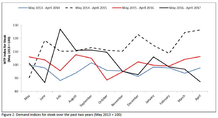
  • Willingness-to-pay for the "premium" cuts from each meat species (steak, chicken breast, and pork chop) all increased this month compared to last; exactly the opposite was true for the the lesser-valued cuts (ground beef, wings, and deli ham).  Willingness-to-pay for non-meat items declined significantly.
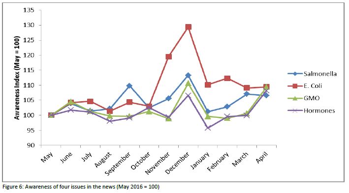
  • Awareness and concern for a list of 17 items all fell this month compared to last. Concern for antibiotic use rose to the top three behind E Coli and Salmonella.
  • Compared to last month, consumers increased expenditures on food at home but reduced expenditures on food away from home.  
  • Fewer people declared vegetarian status or indicated suffering from a food borne illness this month than has been the case for more than a year.

Several new ad hoc questions were added to the survey this month.  

The first set of questions was added in response to some queries by Ranjith Ramanathan who is a meat scientist at Oklahoma State. He was interested in some issues related to how consumers buy and cook ground beef.  To focus in on ground beef eaters, we first asked: “Do you eat ground beef patties (i.e., hamburgers)?” About 88% of the participants answered “yes”.  Those who answered yes were then asked several questions related to cooking and buying ground beef patties. 

Ground beef eaters were asked: “How do you determine the doneness of ground beef patties when cooking hamburger?”  Choice options were: A) By using a meat thermometer, B) By visual observation (i.e., looking at the color of meat in the center of the patty), C) By cooking a certain length of time, or D) Other ways.  

Approximately two-thirds of the participants who said they eat ground beef patties, stated they determine doneness by visual observation.  Next most common, selected by about 18% of respondents, was determining doneness by length of cooking time.  Only about 13.5% said they used a meat thermometer to determine doneness.   

The next question asked: “What is your preference for the cooked internal color of ground beef patties?”  Response options were: Red, Pink, Brown, or Another color.

The majority of participants, about 69%, stated they prefer the internal color of ground beef patties to be brown.  About 26% of participants stated pink as their preferred cooked internal color. Only 5% of participants stated they would want a red center in their ground beef patties.  Less than 1% stated they would want another color. 

Participants were then asked: “To what internal temperature (degrees Fahrenheit) does the USDA recommend cooking ground beef patties?”  Respondents could answer on a slider scale that ranged from 100 to 200 in one degree increments.

The average temperature stated by participants was 162 degrees Fahrenheit (the median was 161).  The figure is remarkably close to the actual USDA recommendation of 160F.  Nonetheless, a large share of participants were incorrect in their assessment.   Thirty one percent stated a temperature less than 160 and 54.5% stated a temperature higher than 160.  Even providing a five-degree margin of error, 28% stated a temperature less than 155 and 37% stated a temperature greater than 165.  Thus, 28%+37%=65% of respondents gave an answer that was at least 5 degrees higher or lower than the USDA recommendation.  Below is a histogram showing the distribution of responses.

Next, participants were asked: “How is the ground beef you normally buy packaged?”  Response categories included text and photos of six different packaging options including: vacuum sealed, in a box as frozen patties, in butcher wrapped paper, as a chub, film wrapped, and in a tray.

Of those who eat ground beef, about one third stated they buy packaged ground beef in a tray.  Ground beef in a film wrapped packaged was selected by about 28% of participants.  About 18.7% of respondents stated they buy ground beef packaged as a chub.  8.5% said they normally buy ground beef in a box as frozen patties.  Only 5.6% of participants said they normally purchase ground beef in a vacuum sealed package. 

Finally, as I was grading final projects from one of my classes, I noticed one team, comprised of Ph.D. students Bernadette Chimai and Pedro Machado, asked an interesting question on a survey they'd posed to students.  I modified it an included it on FooDs.  Here is a screenshot of the question asked:

Participants most frequently stated that free range chickens were the most efficient (i.e., used the least amount of feed to produce a pound of meat) followed by grass fed cattle and grain fed chickens.  However, response patterns were not necessarily symmetric.  Thirty percent of participants believed feedlot cattle were least efficient (i.e., used the most feed to produce a pound of meat) followed by 25%, who indicated grass fed cattle as most inefficient.  About an equal number of respondents thought free range pigs were both most and least efficient.  
 

To help summarize the results, I calculated the difference in the percent of respondents who viewed an animal and production system as most efficient and subtracted it from the percent who viewed it as least efficient.  Overall, free range and grain fed chickens were ranked highest in perceived efficienciency followed by free range pigs.  Grain fed pigs and feedlot cattle were perceived as least efficient.  

Food Demand Survey (FooDS) - A Look Back at Year Four

It is hard to believe but we've now been conducting the Food Demand Survey (FooDS) for four years!  That means we've obtained responses from over 48,000 consumers (1,000 consumers each month for 48 months).  Thanks to Susan Murray who has faithfully got the survey out the door on time each month and has always pulled together the monthly report on schedule.  Thanks also goes to the USDA-NIFA for funding the project as well as the Oklahoma Agricultural Experiment Station and the Willard Sparks Endowment.

A summary of the forth year of results can be found here (we are working on putting up some links on our project's web site to that one can easily download all 48 months worth of data both at the aggregate monthly level and each individual response).  

Data on consumers' willingness-to-pay (WTP) shows demand for meat products is generally similar to that last year although lower than two years ago.  

As shown below, there was a sharp spike up in awareness of E. coli in the news in November and December 2016 perhaps as a result of the news associated with Chipotle.

For more, check out the whole report.  

How Many Americans Go Hungry?

One of the most basic measures of well-being is whether people have enough food to eat. Whether the U.S. does well in this regard seems to depend on who you ask.  There are many people in the so-called food movement who seem to think we're doing ok on this front and that food is actually too cheap.  There are other groups like Feeding America that think hunger is a serious concern and are doing what they can to reduce it.

The USDA Economic Research Service produces the most widely used measure of hunger (or as they call it "food security").  According to their data

An estimated 12.7 percent of American households were food insecure at least some time during the year in 2015, meaning they lacked access to enough food for an active, healthy life for all household members. That is down from 14.0 percent in 2014.

This figure shot up during the great recession (reaching a high of 14.9% of households in 2011) but has subsequently fallen a bit as indicated above, but still remains higher than was the case prior to 2008 when it was regularly in the 10 to 11% range.  

I was curious how the sample of people I study every month in my Food Demand Survey (FooDS) matches up with these official government statistics.  In the most recent April 2017 edition of FooDS, we added some questions (the short 6-item measure) based on work by the USDA to measure food insecurity.  As an example, one of the questions is "'The food that I bought just didn’t last, and I didn’t have money to get more.' Was that often, sometimes, or never true for you/your household in the last 12 months?"

Data from FooDS reveals a strikingly high level of food insecurity - much higher than what the USDA reports.  According to the criteria outlined at the above link, we found a whopping 46.7% of respondents were classified as having low or very low food security (22.9% of the sample had low food security and 23.8% had very low food security).  

My first thought was that we must have made a mistake in how we asked the questions or in how we analyzed the data.  We ruled out those possibilities.  My second thought was that maybe my survey sample is really different from the U.S. population.  After all, who is willing to sign up to take online surveys?  Maybe people who really need the money and who are thus more likely to be food insecure.  But, this couldn't be the complete answer because I use weights to force my sample to match the U.S. population in terms of age, education, gender, and region of residence, and the average income of my sample isn't much different from the average income of the country as a whole.  Maybe the difference is that I used a 6-item measure of food insecurity rather than the full 18 items used by the USDA (but previous research has found strong agreement between the two).

When I mentioned this quandary to my friend Bailey Norwood, he knew immediately what was causing part of the the discrepancy, and I think it could have a big impact on how we fundamentally view the food security measures reported by the USDA.  

In short, the USDA assumes that if you make enough money you can't be food insecure [*Addendum, this original sentence, as stated, was too strong. As the quote below suggests, you can't be classified as food insecure if you're high income AND if you answer two preliminary questions on food insufficiency in particular way.  Some researchers in this area emailed me to note that about 25% of food insecure households have incomes at least 300% of the poverty line]. In their latest report, they indicate in footnote 5: 

To reduce the burden on higher income respondents, households with incomes above 185 percent of the Federal poverty line that give no indication of food-access problems on either of two preliminary screening questions are deemed to be food secure and are not asked the questions in the food security assessment series.

What if I take my FooDS data and just assume anyone that has an income that puts them at 185% of the poverty line (based on these criteria) is food secure despite the answers they gave on the survey? (note: my calculations are crude because I only measure household income in wide $20,000 ranges and I simply assign people to the midpoint of the income range they selected).   

When I do this, I find that now "only" 22% are classified as having low or very low food security (9% of the sample had low food security and 13% had very low food security).  That's still a lot higher than what the USDA reports, so maybe my internet survey still has some sample selection issues.  However, it's still HALF the original measure.

What does this mean?  There are a lot of relatively high income people that would be classified as food insecure if the USDA simply asked them the same questions as everyone else.  There are a lot of relatively high income people that say "yes" to questions like "In the last 12 months, did you ever eat less than you felt you should because there wasn't enough money for food?"  

None of this to say that income isn't a determinant of food security, but that it shouldn't be the only signal, particularly if someone is in a lot of debt or if they have large households, they could still be going hungry.

In any event, here are some of the demographic characteristics of the people who, according to my sample (and without making the above discussed income correction), classify as being food secure, low food security, or very low food security.  

As the above table indicates, income matters as the average income of food secure households is $86,000/year.  However, households with low food security still average $60,000/year, which is far above 185% of the poverty level for most households.

Households that classify as very low food security are much more likely to be on SNAP (aka food stamps).  Of course, this isn't causal: being on SNAP isn't causing food insecurity but likely the other way around.  Two other noteworthy results.  Households classified as having very low food security are much more likely to 1) have children in the household and 2) report farming or ranching as a primary occupation.  

Food Demand Survey (FooDS) - April 2017

The April 2017 edition of the Food Demand Survey (FooDS) is now out. 

A few comments on the regular tracking portion of the survey:

  • Willingness-to-pay for all meat products (except deli ham) fell from March to April.
  • WTP for pork chops reached the lowest point in the almost four-year history of food.  
  • Comparing April 2017 to April 2016, only WTP for hamburger is higher than was the case a year ago.
  • Awareness of bird flu in the news fell this month and concern for bird flu as a food safety issue experienced the smallest increase of any of the issues studied.  Awareness and concern for animal welfare issues rose this month.

We added several new ad-hoc questions to the survey this month.  

There has been a lot of discussion in the news about whether hydroponics should be able to be labeled organic.  We put the question to our participants.  They  were asked: “Do you think hydroponic vegetables should be allowed, under certain conditions, to be labeled organic? (note: hydroponic vegetables are grown without soil - their roots grow in water with added nutrients and minerals)” 

About 46% of participants stated “yes”, hydroponic vegetables should be labeled organic, 24% said “no”, and the remaining 29% said “I don’t know”.   It should be noted that due to a glitch in survey administration, only 250 people answered this particular question and as such, the sampling error is higher than usual (it is +/-6% rather than the usual +/- 3%).

A couple weeks ago, I discussed some research we'd conducted studying when consumers don't want to know about certain agricultural production practices.  We followed up on this research in this month's edition of FooDs.  We were interested in whether people actively sought to avoid information they may find undesirable.  

We split people into two equal sized groups.  Those in the first group were asked: “On the next page you have two choices of what to see.  You can either see a picture of how pregnant hogs are housed on a typical farm or a picture of a blank screen.  Which do you prefer?”

To check whether people simply preferred to see a blank screen in general, respondents randomly allocated to the second group were asked a similar question but instead of the option to see a picture of “how pregnant hogs are housed on a typical farm”,  they could choose between “a picture of a nature scene or a picture of a blank page.”

Fifty four percent said they wanted to see the picture of how pregnant hogs are housed.  By contrast, 46% preferred instead to see a blank page.  Thus, slightly less than half the sample actively chose to ignore free information about hog housing.  Those who preferred to see the blank screen were less concerned about farm animal welfare as a food safety risk (mean of 3.2 vs. 3.6 on the 5-point scale of concern) and placed less relative importance on animal welfare as a food value (mean of -0.116 vs. -0.097). 

Ninety one percent of respondents choose to see the nature scene.  Overall, the results suggest just about half the respondents preferred not to know how pregnant hogs are housed. 

Finally, we added some questions about food insecurity.  I'll discuss these in a separate post.   

What kind of farmer are you?

A couple days ago, I reported the results from the Food Demand Survey (FooDS) for March 2017. In addition to a typical question we ask every month "Have you ever worked on a farm or ranch?", we added a new follow up question, "Which of the following best describes the kind of farm you worked on? (Check all that apply)."

As I reported then, about 17% of people said yes to the first question.  Of this 17%, about 38% followed it up by saying the type of farm was a "garden in your backyard", 23% said "A chicken coop in your backyard" and 12% said "a community garden".  I received some Twitter questions and reaction to the results.  

Here's one vein of reaction:

Of course, this is exactly what we wanted to know: who are the people checking "yes" to this question and what do they (not us) consider farm or ranch work? 

A more substantive question was this one:

The answer is "yes".  This was a "check all that apply" question and a lot of commodity crop and livestock farms also have backyard gardens and chickens.  To get at this issue more directly, I went back to the data and looked at the 17% who said "yes" they had worked on a farm and ranch and looked at the percent of respondents who said they had a backyard garden (or chicken coop or community garden) but did NOT check “A farm that produces commodity crops (e.g. corn, wheat, soybeans, cotton, or rice)” or “A farm that produces commercial livestock (e.g. cattle, swine, or poultry).” 

Here are the results: of the 17% who said they'd worked on a farm or ranch: 4.7% indicated working in a community garden but NOT a commodity crop or livestock operation, 12.2% indicated they worked in a garden in their backyard but NOT in commodity crop or livestock operation, and 7.5% said they had a chicken coop in their backyard but had NOT worked in a commodity crop or livestock operation.