Blog

Consumer Food Insights - January 2023

The January 2023 edition of our Consumer Food Insights (CFI) survey is now out. This marks the 1 year anniversary of the inaugural edition of CFI, such that we can calculate year-over-year changes and now compare current estimates to the 2022 benchmark. Thanks to the members of the Center for Food Demand Analysis (CFDAS), particularly Sam Polzin, who have done a masterful job getting the survey out the door every month and expertly analyzing and reporting the results.

Given the new year, we asked respondents if they made any resolutions related to food and nutrition. About 1 in 5 said “yes.” All respondents were asked if they planned to make changes in their eating and exercising habits in the New Year. Here’s how people prioritized different activities.

Respondents said they planned to eat more fruits and vegetables, exercise more, and eat fewer snacks; they were least likely to say they would be eating less meat or growing their own food.

We ask a question every month about whether people were unable to find specific items when shopping. If someone says “yes” indicating a stock-out, which ask which items were missing. Below is the comparison from December to January. There was a dramatic increase in the number of people who said eggs were missing over this one month period over the same period egg prices spiked. Still, given that about 1,200 people take the survey, this implies only about (50/1200)*100 = 4.2% of respondents experienced an egg stock-out in January.

Our Sustainable Food Purchasing Index (SPI) remains fairly steady, but compared to last year, there is an improvement in taste, economic, security, and nutrition dimensions of sustainability. The environment indicator dipped a bit.

Consumers’ spending on food away from home (i.e., restaurants) has increased over the past three months and total food spending is up about 19% relative to the same time last year. There is an uptick in how much consumers say food prices have risen over the past 12 months, but they continue to expect lower rates of food price inflation for the future.

We find that our measured rate of food insecurity is essentially unchanged, although there is a dip in the share of households indicating that they have received free food from a food bank or food pantry this month.

This month we added some new questions on risk taking in different domains. On average people say they are not strongly risk averse (score of zero) or strongly risk loving (score of 10) - with an average score of 5.4. However, when asked the same question about their health, people are more conservative (average of 4.3). Median scores are also lower when asked about food consumption, suggesting people are less willing to take risk for health and food than for life in general.

With regard to stated food buying behaviors, we find a 9% reduction in the number of people who say they’re choosing plant-based proteins over animal proteins. This is consistent with the much discussed decline in sales of plant-based meat alternatives.

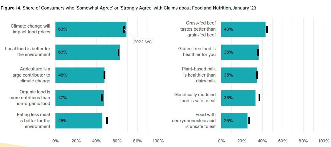
We observed some changes in consumers’ food and environmental beliefs. Fewer people today say GMOs are safe to eat or that eating meat is better for the environment than was the case last year.

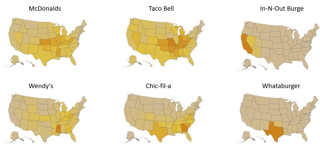
Compared to last year, this month, we are seeing sizable increases in trust in food-related information from people’s personal physicians, the American Medial Association, and the Dietary Guidelines committee. Conversely, there were sizable declines in trust of food companies like Nestle, Tyson, and McDonald’s.

Finally, leading into the Farm Bill debate this year, I’ll leave this figure here indicating the degree of support/opposition for several food/ag policies (exact wording is in the full report).

The whole report is available here.

Obesity since the 1980s

In a recent article, Matthew Yglesias takes issue “that conventional wisdom seems to have settled on the idea that there was a sharp uptick in obesity starting around 1980.” He argues instead that body weights have been increasing for a long time, and that if we are looking for causes of weight gain and obesity, we need to take a longer view than simply asking “what changed” in 1980, which seems fashionable today in the Twittersphere.

Here are his final two paragraphs on possible drivers of weight gain over the past century.

It just turns out that like a lot of things, this has some downsides. The question of what, if anything, to do about those downsides seems pretty difficult to me, but I don’t think its origins are a big causal mystery.

If anything, making the origins out to be some huge puzzle lends itself to the false suggestion that there’s a very simple and straightforward solution. The truth — that we are experiencing some downside to living in a society with a great deal of material abundance — is harder to wrestle with, since people would be pretty unhappy about policy changes that reversed the 100+ year trend toward food becoming tastier, more available, and more convenient.

I agree - perhaps because it is awfully similar to the conclusion I reached back in 2013 in The Food Police. Here’s what I wrote then at the conclusion of the chapter on fat taxes.

It is only reasonable that we eat a little more food when it costs less and give up manual labor when an air conditioned office job comes along. We can’t disentangle all the bad stuff we don’t like about obesity with all the good things we now enjoy, such as driving, eating snacks, cooking more quickly, and having less strenuous jobs. Yes, we can have less obesity, but at the costs of things we enjoy.

When you hear we need a fundamental change to get our waistlines back down to where they were three decades ago, beware that it might take a world that looks like it did three decades ago.

We are unlikely to finding a simple, mono-causal explanation for the rise in obesity. That is perhaps best illustrated in the figure below from a 2006 paper by Keith et al. in the International Journal of Obesity, which plots obesity (the red dashed line with x’s) alongside either other factors that have been suggested as causes for obesity. Obviously, lots of strong positive correlations, but it shows the likely futility of finding one single, easy answer.

Egg Prices and Avian Influenza - A Deep Dive

I’ve written and been interviewed quite a bit about the spike in egg prices that we’ve been experiencing. Given the volume of interest in the subject and recent claims of price gouging, I thought I’d pull together some data and do a bit of a deep dive.

First, what has been happening to egg prices? The figure below shows the retail price of a dozen large eggs according to the Bureau of Labor Statistics (BLS) and the wholesale egg price reported by USDA (these are nominal prices not adjusted for inflation). I’ve plotted these data over a long time horizon to include the last time we had a significant outbreak of Avian Influenza (AI) back in 2015. Interestingly, reported wholesale prices have converged with retail prices (at least according to these broad aggregate measures), suggesting retailer margins are being squeezed in recent months.

The most recent data is December 2022. Retail egg prices jumped from $1.79/dozen in December 2021 to $4.25/dozen in December 2022 (a 138% increase). Curiously, the BLS also reports an egg price index (as a part of constructing the consumer price index) which is “only” up 58.9% over the past year (see the second figure below). It is a bit unclear why the BLS egg index is so different from the change implied by the BLS average prices reported in $/dozen, but that’s a mystery best saved for another day. The BLS indicates that if interest is in comparing prices over time, the best figure to use is their index number. So, let’s round up and use 60% as the retail price increase in the rest of the this post to indicate the extent to which egg prices have gone up over the past year.

Average egg prices ($/dozen) based on BLS (retail) and USDA (wholesale) data

Year over year change in retail egg prices based on BLS index (https://ag.purdue.edu/cfdas/resource-library/changes-in-u-s-food-prices/)

The question that seems to be in everyone’s mind is “why?” Why have egg prices increased roughly 60% over the past year? The main (and perhaps only) answer is Avian Influenza (AI).

The USDA APHIS reports confirmed cases of AI. Using those data, and focusing just on egg laying hens, here are the number of table egg laying hens affected over the past year.

You can’t replace lost hens overnight, so in some ways what is more relevant is the cumulative number of cases over the course of the past year. Here’s that figure.

There have been a total of 44,472,700 egg laying hens affected by bird flu since the first case in mid February 2022. I should note that a few of these cases involved breeding stock, which has a potentially outsized and longer-lasting impact on the industry than the loss of a “regular” egg laying hen.

What has happened to actual production? Here are USDA data on that matter - both in terms of the size of the table egg laying flock and the number of table eggs produced each month.

In December 2022, there were 307,835,000 table egg laying hens in the U.S. compared to 326,730,000 one year prior in December 2021. So, we are down 18,895,000 laying hens over the course of 2022. But, as previously indicated, over the course of 2022, we lost 44,472,700 egg laying hens due to AI. Thus, over 2022, the industry worked hard (and were incentivized by high egg prices) to rebuild: the 44.47 million hen loss from AI “only” resulted in a 18.39 million hen loss by end of year. The industry was effectively able to add back 44.74-18.39 = 25.58 million hens. (note: I’m assuming the number of birds that USDA APHIS reports as “affected” is also the number depopulated.)

Relative December 2021 (before we were hit by AI), the number of egg laying hens was down -5.8% and actual table egg production was down -6.6% by December 2022 . Had the industry not added back the losses from AI, we would have been down -13.6%. In short, AI more than explains the reduction in flock size experienced over 2022.

What is the impact of these losses on egg prices? On this matter, there seems to be a lot of confusion. How can a small-ish reduction in quantity of eggs supplied (-6.6%) have such a large impact on retail egg prices (+60%)?

Time for some Econ 101. The answer is that egg demand is very inelastic. There aren’t good substitutes for eggs, and as such, consumers continue buying eggs even when prices rise. It takes a significant price increase to cause consumers to cut back. Stated differently, prices have to rise by a sizeable amount to convince enough consumers to cut back on their egg purchases so that there is alignment between the amount produced and the amount consumers want to buy.

The figure below illustrates the basic concepts. The figure on the left considers a good for which demand is inelastic (like eggs) and the figure on the right considers a good which is elastic in demand (i.e., consumer purchases are very sensitive to price changes). In both cases, I consider what happens when we reduce the quantity supplied by a small amount. On the right-hand side, when demand is elastic, a small reduction quantity supplied has an even smaller impact on prices. However, when demand is very inelastic, as illustrated in the left-hand side figure, a small reduction in quantity results in a large price increase. That’s what we’re witnessing for eggs.

A commonly assumed value for the elasticity of egg demand is -0.15. This implies that a 1% increase in price would result in a 0.15% reduction in the quantity of eggs demanded by consumers. We can invert this relationship: a 1% reduction in the quantity results in a 1/0.15 = 6.67% increase in price.

As indicated, we’ve had a 6.6% reduction in quantity of eggs supplied from Dec 2021 to Dec 2022. A 6.6% reduction in quantity supplied would be associated with a 6.6/0.15 = 44% increase in egg prices. That’s not quite the 60% reported by the BLS, but it’s not far off. An egg elasticity of demand of -0.11 (a value that would be consistent with some estimates) would rationalize the observed change in retail egg prices (i.e., 6.6/.011 = 60%).

Backing up for a moment, note that there was a 13.6% reduction in the number of egg laying hens due to AI. Had the industry not added back inventory and had egg production dropped by an equivalent amount, then this reduction in quantity supplied would be associated with a 13.6/0.15 = 90.7% increase in egg prices, much higher than the 60% reported by the BLS.

My initial back-of-the-envelope calculations indicated the AI-induced supply reductions would be associated with a 44% increase in egg prices. But, BLS reports egg prices have increased 60%. Is the “extra” 60-44 = 16% “gouging?” Well, for one, I’ve already indicated if egg demand is just a tad bit more inelastic than I initially assumed, there is no discrepancy. But, there are other explanations as well. Costs of production have escalated over the course of the past year, as the figure below shows. Egg layer feed costs (as reported by the Egg Industry Center) were 13% higher in December 2022 than they were one year prior and were running 30% higher earlier this fall in September. Energy prices are higher too - natural gas prices were about 40% higher through much of the year (the figure below reports changes in the U.S. Price of Natural Gas Sold to Commercial Consumers as reported by the US Energy Information Administration; the last data point is October). And of course, overall inflation is up. As of December 2022, overall prices in the economy are up 6.4% on a year over year basis. Thus, even if there were no unique shocks to egg production and it simply followed all other prices in the economy, we would expect egg prices to be 6.4% higher now than last year.

In short we don’t have to resort to conspiracy to explain the observed increase in egg prices. That doesn’t mean there isn’t malfeasance or collusion but absent any other evidence, the basic economics of the situation go a long way toward explaining the situation we are currently in.

Are egg producers making more money? That depends on whether they have eggs to sell. A producer who lost hens to AI suffer all the associated costs of building back and lost out on the revenue that would have received had they not been hit. If, instead, a producer has been fortunate enough not to be hit by AI, they may well be making more money (although note the figure above indicating that some of their costs have risen as well).

Just because some egg producers may be making more money does not necessarily imply gouging. Here is one commenter:

But here’s one weird thing: Have you noticed a scarcity of eggs or chicken at the grocery store? I sure haven’t: My local Wegmans is stacked to the rafters with eggs and chicken. Eggs are pricey — they top out at $7.78 — but they’re there.

So maybe something else is going on. Maybe, just maybe, there’s something else responsible for those soaring prices.

That’s a very strange line of argument. The reason we are NOT seeing widespread stock-outs is because prices are allowed to rise. Those higher prices keep eggs on the shelves for those consumers who most value them. They also incentivize egg producers to get back in the game and produce more eggs. The old saying “the cure for high prices is high prices” is apt. A sure-fire way to have empty shelves would be to put a cap on egg prices or egg producer profits.

All that said, let there be no mistake: high egg prices are bad for consumers. Higher egg prices lower household well-being and increase the odds of food insecurity. How can we get out of this mess? Hopefully innovation will ultimately result in vaccines for AI or new genetic strains more resistant to AI or housing systems or management practices that better protect hens from AI.

Inflation hasn’t increased US food insecurity overall, according to our new tracker

That’s the title of a new article Sam Polzin and I wrote for The Conversation.

Here’s an excerpt:

Grocery prices soared by 11.8% in 2022 – the swiftest pace since the early 1980s. Rapid inflation is, naturally, leading to concerns that it’s getting harder for Americans to put food on the table.

Indeed, Feeding America, a nonprofit that supports and connects roughly 60,000 food banks and pantries nationwide, has said that at least half of its members are seeing more demand for their services. And many journalists are reporting about struggling parents waiting in long lines for free food.

...

The data we’re collecting ourselves, as well as the information that we’ve compiled from other sources, including the Census Bureau, isn’t yet reflecting a sharp uptick in households without enough to eat. U.S. food insecurity has remained at troubling and yet relatively flat levels.

You can read the whole article here.

Or, if you want to play around with the data dashboard Sam created that compiles multiple measures of food insecurity over time, click here.

Restaurant Spending by Vendor and Location

My team in the Center for Food Demand Analysis and Sustainability (CFDAS) at Purdue University has worked to create two new data dashboards showing consumer spending at restaurants and for food delivery. We partnered with the firm Facteus, which processes debit/credit card transactions, and we use their data to understand trends, geographic differences, and rankings of restaurant in terms of consumer spending.

The first dashboard shows spending at restaurants, including fast food and casual dining (be patient: it might take a few seconds to load; the dataset is HUGE!). The figure below shows the dashboard set to McDonalds (the restaurant with the most sales). Apparently, Kansas is the state with the highest per-capita expenditures at McDonalds, although the highest McDonalds spending occurs in zip codes in Texas and California. The time trend shows McDonalds sales fared pretty well during the pandemic.

By contrast, if we look at a more traditional “sit down” restaurant like Applebee’s, the dip in sales during the pandemic is much more noticeable.

It is fun to look at geographic patterns in per-capita spending. For example, here are several top-selling fast food chains along with a couple regional favorites, including my personal favorite, Whataburger (yes, I am a Texas native).

You can even zoom in to the zip-code level if you want to see spending variation within a state. Have fun playing around with the dashboard yourself.

We have a second dashboard that looks similar except it shows spending patterns on meal delivery apps. Here is a screenshot of spending on Uber Eats, which clearly benefited by the pandemic.

We are looking forward to really digging into these data as we aim to better explore consumers food buying behavior in these food-away-from home markets.