Blog

Coming to a Grocery Store Near You: A New Nutrition Facts Panel

According to this story from the AP:

After 20 years, the nutrition facts label on the back of food packages is getting a makeover.

and

The FDA has sent guidelines for the new labels to the White House, but Taylor would not estimate when they might be released. The FDA has been working on the issue for a decade, he said.

and

The revised label is expected to make the calorie listing more prominent, and Regina Hildwine of the Grocery Manufacturers Association said that could be useful to consumers. Her group represents the nation's largest food companies.

Hildwine said the FDA also has suggested that it may be appropriate to remove the "calories from fat" declaration on the label.

It's not yet clear what other changes the FDA could decide on. 


Personally, I think it is a good idea to bring research to bear on the design of the nutrition facts panel.  I've been critical of certain aspects of the implications people draw from the research in behavioral economics.  But, here is an area where the research is useful and has direct relevance.  

The government is going to provide nutrition information anyway (and has been doing it for 20 years), and as such, shouldn't it at least be presented in a way that is most understood by the consumer?  It is impossible to believe that the current little black box with dozens of horizontal lines is the most effective format.  

How do we know which type of information is "most effective"?  Effective, of course, could have many meanings.  One definition could relate to the extent to which the information is accurately understood by the consumer (I'd prefer that over whether the label causes some change in behavior desired by particular nutritionist).  Another way is to see what types of information arise in markets (i.e., what information consumers demand and how companies provide it).  For example, I've notice cereal boxes with color coded labels on the front of the package in the upper left-hand corner.  Similar private initiatives abound.

I'm  sure interest groups on all sides - from food companies to health activists - will want a say.  I just hope solid consumer research is brought to bear on the issue as well.

cerealpic.JPG

Is More Information Always Better?

Last year, I wrote a report for the Council on Food, Agricultural, and Resource Economics (C-FARE) on the value of USDA data products.  There, I reviewed much of the literature on the value of providing information about market conditions, and discuss the ability of information provision to resolve some asymmetric information problems.

Thus, I was interested to see this paper published in the American Economic Journal: Policy by Sacha Kapoor and Arvind Magesan (earlier ungated version here).  They write:

We find that although countdown signals reduce the number of pedestrians struck by automobiles, they increase the number of collisions between automobiles. They also cause more collisions overall, implying that welfare gains can be attained by hiding the information from drivers. Whereas most empirical studies on the role of information in markets suggest that asymmetric information reduces welfare, we conclude that asymmetric information can, in fact, improve it.

Asymmetric information improving outcomes?  That is an interesting result - I wonder whether there are examples in markets where something similar is at play?  

I should note that it is possible to imagine other situations where more information isn't always better.  In a paper I published last year with Stephan Marette, we wrote:

In a one-good case with unlimited attention, we show consumer welfare is always improved with the provision of accurate information. However, in a two-good case with limited attention, we show that consumer welfare is not always improved with the provision of accurate information. When attention is constrained, welfare may fall with information provision policies irrespective of their costs. The results suggest information and labeling polices may sometimes be counterproductive when attention is limited

Do retailers respond to consumer concerns?

I often run across arguments and stories that seem to suggest that consumers have no choice (or very little choice).  Their "environment" is a function it seems, solely, of what food retailers choose to offer.  Representative of this sort of view is a tweet I noticed yesterday.

lappetweet.JPG

Does the food industry influence you and your kids?  Probably, to some extent.  I suspect they wouldn't spend millions on advertising if it didn't have some effect.

But, here is the question I want to ask: Do you influence the food industry?  The answer, is "yes"!  Food companies can't just offer anything they want.  Somebody has to buy it.  

Our choices are shaped by the environment in which we live and by the offerings of food companies. But, we have to realize that our food environment is also shaped by our cumulative choices. To stay in business, food companies must respond to our desires.

Just a few examples from stories I've seen in just the past couple weeks:

Of course, this just scratches the surface.  How many more "gluten free" products do you see today than even one year ago?  How many milk jugs advertise to be "rBST free" today vs. 10 years ago?  

I'm not at all claiming that each of these represent a rational response by consumers to the actual objective level of risk (or, rather the actual lack of risk) present in such products.  

However, anyone who thinks food retailers aren't responding to consumer desires simply isn't paying attention.

Strange Claims on Meat Consumption

Alison Spiegel at Huffington Post recently ran a story with the lead title: 

Chicken More Popular Than Beef In U.S. For First Time In 100 Years

As best I can tell, however, claim isn't true.  It is true that per capita consumption of chicken is increasing, but it surpassed beef back in the early 1990s.

The claim comes from a graph, which was reproduced from a story by Priceonomics,who in turn took it from Angela Wong at NPR, who in turn cites the Earth Policy Institute.  Beyond that, I have no idea where the data come from.  

For context, here is the graph from Huffington Post:

percapitawrong.JPG

But, according to USDA data, per capita chicken consumption passed beef in about 1992.  Here, for example, is a graph from the Livestock Marketing Information Center (which uses USDA data).

percapitaright.JPG

Oddly, the Earth Policy Institute has, on their web site, a graph showing something similar to the LMIC.  

There may be a rational explanation for the discrepancy (such as differences in data sources or differences in what is being counted in "total chicken") but without any details we only have to guess.

One final point.  Yes, per capita consumption of chicken is on on the rise and has been higher than beef for now over 20 years (according to USDA data).  But, that is largely because chicken has become much less expensive and, lately, beef more expensive.  

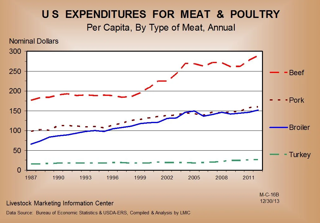
Thus, I don't know that we should say chicken is more "popular" than beef.  Indeed, people SPEND much more money on beef than chicken - about twice as much as the following graph shows.  If we judge by dollars spent, beef is much more popular than chicken.

meatexp.JPG

How surveys can mislead

Beef Magazine recently ran a story about changing consumer attitudes.  The story discussed the results of a nationwide survey which asked the question: "How has your attitude about the following issues changed during the past few years?"  Here is a screenshot showing the results  

moreconcerned.JPG

So, according to the survey, 29%+35%=64% of consumers are today more concerned about antibiotics than they were a few months ago.  In fact, the figure suggests that more than half of the respondents are more concerned today about antibiotics, hormones, GMOs, animal handling, and farmer values.   

I would submit that these findings are almost entirely a result of the way the question is asked.  Are you more concerned about issue X today?  Well, of course, any reasonable, caring person is today more concerned about X.  Indeed, why would you even be asking me about X unless I should be more concerned?

More generally, drawing inferences from such questions shows the danger of taking a "snapshot" as the truth.  To illustrate, let's compare how the above snapshot looks compared to the trends that come up in the Food Demand Survey (FooDS) I've been conducting for eight months.  

In that survey, I ask over 1,000 consumers each month a question, "How concerned are you that the following pose a health hazard in the food that you eat in the next two weeks?"  where the five-point response scale ranges from "very unconcerned" to "very concerned".  

I pulled out responses to the four issues that most closely match the survey above and plotted the change over time (I created an index where the responses in each month are relative to the response back in May which was set equal to 100).  If people are generally more concerned about these issues today compared to six months ago, it isn't obvious to me from the graph below.

So, a word of caution: you can't take every survey result at face value.  These sorts of comparisons show exactly why our Food Demand Survey is valuable: it replaces a snapshot with a trend. 

concernovertime.JPG