Blog

TASTE TRUMPS HEALTH AND SAFETY: INCORPORATING CONSUMER PERCEPTIONS INTO A DISCRETE CHOICE EXPERIMENT FOR MEAT

That is the title of a paper I just published with Trey Malone in the Journal of Agricultural and Applied Economics.  

Here are some of the key results:

Our participants also indicate that they perceive chicken breast to be the healthiest option in our sample. Both beef products would generate substantial changes in WTP by increasing their perceived healthiness to that of chicken. For example, if hamburger had the same average health perceptions as chicken breast, WTP for hamburger would increase by $0.69. Deli ham, however, would experience an $0.83 increase in WTP if consumers were to believe it was as healthy as chicken breast. Even chicken wings would experience a $0.52 increase in WTP through a perception change.

and

The nonmeat options are actually perceived as safer than the meat options. As such, if the average participant perceived hamburger to be as safe as beans and rice,WTP would increase $0.34. Of all products, deli ham would benefit the most by an increase in perceived safety to the level of beans and rice. In fact, our sample indicates that pork products are not very highly appreciated. As noted, deli ham is perceived to be the worst tasting, least healthy, and least safe alternative in the choice set. Those negative perceptions are costly. If participants were to perceive deli ham as equal to chicken breast in taste and health, and equal to the perceived
safety of beans and rice, WTP for deli ham would increase by more than $2.

You can read the whole thing here.
Where do people eat the most meat?

It seems a fairly simple question: In which U.S. states do people eat the most meat?  Yet, there is surprisingly little good, publicly available data on this question.  Yes, there are fun maps like this one at Slate, but they are far from scientific or data driven.  

I thought I'd try to partially fill this void by turning to data from my Food Demand Survey (FooDS) that has been running now for almost four years.  Because I've surveyed over 1,000 people in the U.S. for about 44 months, that means I have responses from over 44,000 people spread all across the country that I can use to help look for geographic differences.  

In FooDS, each person is told "Imagine you are at the grocery store buying the ingredients to prepare a meal for you or your household.  For each of the following nine questions that follow, please indicate which meal you would be most likely to buy."  Then, they are presented with nine questions that look like the one below.  The only differences across the questions are the prices assigned to each item and the order of the items.      

For sake of simplicity, I counted the number of times each person chose steak, how many times they chose chicken breast, etc.  Thus, the maximum possible "score" a person could have for each item is 9 and the lowest is 0.  To be clear, this isn't a measure of consumption, but rather it is an index of demand.  It is a measure of how much people "like" each of the choice options relative to all the other choice options.  For point of reference, across all the people in my sample, the most frequently chosen option was chicken breast (chosen on average 2.43 times out of 9) followed by ground beef/hamburger (chosen on average 1.33 times out of 9).  The least popular meat items were pork chop and ham, chosen on average 0.80 and 0.68 times, respectively, out of 9.

I won't go into all the hairy details here (email if you want to know more), but I then estimated some statistical models to infer how often, on average, consumers in each state chose each of the meat options.  Then, I calculated how different (in percentage terms) each state was from the mean number of choices, and I created maps.

I'll start with one that has a very obvious regional pattern: chicken wings.

Chicken Wing Demand by State

Chicken Wing Demand by State

Demand for chicken wings is highest in the southeast US, where people chose this option 15% to 44% more often than in the average person in the US.  Consumers in western states like Oregon, Idaho, and Arizona chose wings 15% to 27% less often than the average consumer nationwide.

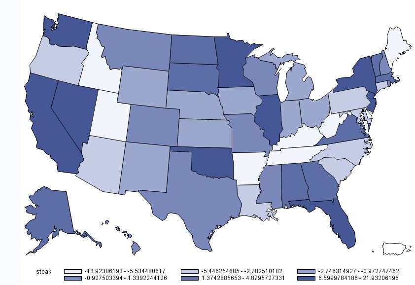
For other products, there is less of a regional pattern.  Below is the map for beef steak.  Demand for steak is highest in California, Nevada, Washington, Oklahoma, Minnesota, Illinois, Florida, and New York.  Steak demand is lowest in Idaho, Utah, Missouri,  and the Appalachian regions, Tennessee, Kentucky, and West Virginia.

Beef Steak Demand by State

Beef Steak Demand by State

While we are on beef, here is the map for hamburger/ground beef.  For ground beef, demand is generally highest in the upper midwest and is lower on the coasts.

Demand for Ground Beef by State

Demand for Ground Beef by State

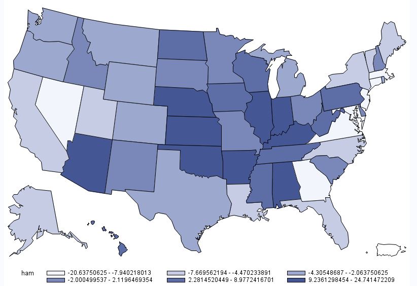
A somewhat similar pattern emerges for deli ham (shown below), although the location of heaviest demand moves a bit south and east relative to that for hamburger.  

Deli Ham Demand by State

Deli Ham Demand by State

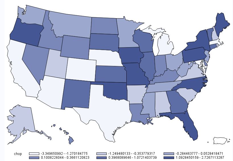
Below is the map for pork chops.  This map is interesting in the sense that there are several instances where some of the highest demand states are situated adjacent to some of the lowest demand states (e.g., Oregon next to California; Oklahoma next to Texas; etc.)  However, one thing to note in the case of pork chops is the scaling: there isn't much difference across any of the states.  Consumers in Missouri have the highest pork chop demand, but only chose pork chops 2.7% more than the average consumer.  Consumers in California have the lowest pork chop demand, but only chose pork chops 3.3% less than the average consumer nationwide.  

Pork Chop Demand by State

Pork Chop Demand by State

The last individual meat product is chicken breast.  As shown in the map below, chicken breast demand is generally highest in the west and the northeast.  I'm not at all surprised to learn that chicken breast demand is near the lowest in my home state of Oklahoma (at -4.5%), trailing only North Carolina, Missouri, and Mississippi.  

Chicken Breast Demand by State

Chicken Breast Demand by State

Finally, to round things out, here is a map associated with overall meat demand.  This figure was calculated by determining how many times a person chose any of the six aforementioned meat products (recall there were nine total options, three of which were non-meat).  On average people chose a meat option 7.03 times out of 9 total choices.  However, as the map below shows, there is some heterogeneity across states.  Overall meat demand is highest in the Midwest: consumers in Illinois, Indiana, and Iowa chose any meat option 1%+ more often than the average consumer.  Lowest overall meat demand was in places like California, Arizona, Maryland, Utah, New Jersey, and Massachusetts, where consumers chose a meat options at least 1% less often than the average consumer.  

Overall Meat Demand by State

Overall Meat Demand by State

Unanticipated Effects of Soda Tax, example 1037

On the surface the logic of a soda tax seems simple: raise the price of an unhealthy food, people consume less, and public health improves.  But, as I've pointed out again and again on this blog, the story is much less simple than it first appears.  

First, even if we believe people suffer from various behavioral biases, higher prices almost certainly make people worse off.  Second, when we raise the price of one unhealthy thing, people might substitute to consume other unhealthy things.  Third, if the tax is just added at the checkout counter and not on the shelf display, it may not have nearly the effect on purchase behavior as assumed.  Forth, if people know the reason for the tax, some may "protest" and buy more instead.  Fifth, the projected weight loss from such taxes often relies on unreasonable rules of thumb like 3500kcal=1lb. Six, even when taxes have an effect, the causal impact may arise more from an "information effect" rather than a "price effect."  Seventh, such taxes may induce unanticipated effects because of how sellers respond to the policy.  Finally, soda taxes are regressive - having a proportionally larger effect on on lower income households (see also my co-authored paper on effects of "unhealthy" food taxes more generally).

Now, comes this new paper in the American Journal of Agricultural Economics by Emily Wang, Christian Rojas, and Francesca Colantuoni, which incorporates the insight that some households are more likely to respond to promotions and to store.  The abstract:

We apply a dynamic estimation procedure to investigate the effect of obesity on the demand for soda. The dynamic model accounts for consumers’ storing behavior, and allows us to study soda consumers’ price sensitivity (how responsive consumers are to the overall price) and sale sensitivity (the fraction of consumers that store soda during temporary price reductions). By matching store-level purchase data to county-level data on obesity incidence, we find higher sale sensitivity in populations with higher obesity rates. Conversely, we find that storers are less price sensitive than non-storers, and that their price sensitivity decreases with the obesity rate. Our results suggest that policies aimed at increasing soda prices might be less effective than previously thought, especially in areas where consumers can counteract that price increase by stockpiling during sale periods; according to our results, this dampening effect would be more pronounced precisely in those areas with higher obesity rates.

How risk averse are you?

Economists have long been interested in trying to figure out people's tolerance for risk.  Such information is useful in predicting, for examples, which crops farmers will plant, which stocks investors will buy, how much insurance is bought, how much of a premium one is willing to pay for organic food, and how fast people drive.  Of course, we don't expect all people to have the same risk preferences, so for decades economists have sought to identify tools and methods that will allow them to discover different people's levels of risk aversion.

One of the most popular techniques is the so-called Holt and Laury (H&L) multiple price list (MPL) based on this paper in the American Economic Review.  As of this writing, the paper has been cited 3,900 times according to googlescholar, making it one of the most cited economic papers published in the last 15 years.  The approach requires people to make a choice between a relatively safe lottery (e.g., 10% chance of $2 and a 90% chance of $1.60) and a relatively risky lottery (e.g., 10% chance of $3.85 and a 90% chance of $0.10).  Then, the subject repeats the choice except the probability of the higher payoffs increases.  This process is repeated again and again about 10 times until one gets to the very easy choice between 100% chance of $2 and 100% chance of $3.85 (If you don't know which of those you prefer, give me a call.  We need to talk).  One very crude measure of risk aversion is simply the number of times a person chooses the relatively safe lottery over the relatively risky lottery.  

The H&L method is relatively easy to use, which goes a long way toward explaining it's popularity.

With all that as a backdrop, I'll point you to a new paper I published with Andreas Drichoutis in the Journal of Risk and Uncertainty. We point out an important problem with using the H&L method as a measure of risk aversion and propose a new, yet equally easy to use, MPL that helps solve the problem.  If you're not an academic economist, the rest of this may get a bit wonky, but here goes:

In what follows, we show that H&L’s original MPL is, perhaps ironically, not particularly well suited to measuring the traditional notion of risk preferences — the curvature of the utility function. Rather, it is likely to provide a better approximation of the curvature of the probability weighting function. We then introduce an alternative MPL that has exactly the opposite property. By combining the information gained from both types of MPLs, we show that greater prediction performance can be attained.

Here is one of the main critiques of H&L, which relates to whether people weight probabilities non-linearly (the parameter γ is a measure of the extent to which probabilities are "distorted").

Now, consider a simple example where individuals have a linear utility function (i.e., they are risk neutral in the traditional sense), U(x) = x. With the traditional H&L task, a risk neutral person with U(x) = x and γ = 1 would switch from option A to B at the fifth decision task. However, if the person weights probabilities non-linearly, say with a value of γ = 0.6, then they would instead switch from option A to B at the sixth decision task. Thus, in the original H&L decision task, an individual with γ = 0.6 will appear to have a concave utility function (if one ignores probability weighting) even though they have a linear utility function, U(x) = x. The problem is further exasperated as γ diverges from one. Of course in reality, people may weight probabilities non-linearly and exhibit diminishing marginal utility of earnings, but the point remains: simply observing the A-B switching point in the H&L decision task is insufficient to identify the shape of U(x) and the shape of w(p). The two are confounded. While it is possible to use data from the H&L technique to estimate these two constructs, U(x) and w(p), ex post, we argue that more information is contained about w(p) than U(x) in the original H&L MPL.

The other problem we point out with the H&L approach is that it provides very little information about the shape of U(x) as only four dollar amounts are used in the design (and only two differences are uniquely identified).  Instead, 10 different probabilities are used, which provides much more information about the shape of γ.  What can one do about this if they truly want to know about the shape of U(x)?  We suggest a new kind of payoff-varying MPL.

Given the preceding discussion, one might ask if there is a simple way to use a MPL that yields more information about U(x) and, at least in some special cases, avoids the confound between w(p) and U(x)? One can indeed achieve such an outcome by following an approach like the one used by Wakker and Deneffe (1996) in which probabilities are held constant. Using this insight, we modify the H&L task such that probabilities remain constant across the ten decision tasks and instead change the monetary payoffs down the ten tasks.

I'm under no allusion that our new MPL will become nearly as popular as the original H&L task.  But, if we even get one-tenth their number of citations, I'll be thrilled.


What do school children want to eat?

In the past I have, at times, been somewhat critical of the National School Lunch Program (NSLP) guidelines destined to make school lunches healthier by reducing calories, sodium content, saturated fat, etc.  It's not not that I'm against healthy kids!  Rather, I bristled at the idea of a bunch of nutritionists, policy makers, etc. setting rules and guidelines for how they think kids should eat without considering how the children would respond to the rules.  Nutritional content is but one of the components we care about when eating - don't we also care about how the food tastes, how much it costs, whether it leaves feeling full, whether it is safe to eat, etc. etc.  In short, the guidelines were established with limited understanding of what children want to eat, and as such we knew very little about whether the rules might increase food waste, increase the frequency of home lunches, cause unintended substitution patterns, and so on.  

In an interesting paper in the most recent edition of the American Journal of Agricultural Economics, a team of six researchers sought to do what should have been done prior to implementing nutritional guidelines.  In particular, the authors studied almost 280,000 school lunch choices of about 5,500 elementary age children in a suburban South Carolina school district.  The authors know the precise foods available at each lunch offering, the nutritional characteristics of the foods, which foods the child selected (or whether the child brought a lunch from home - note that lunch menus were published well in advance), and some of the characteristics of the child who made the choice such as their grade, gender, race, and whether they received free or reduced price lunch.

The authors are able to take all this data to estimate demand curves associated with different food offerings.  Their demand models let them answer questions like the following:

  • If the sodium content of a pizza offering were lowered, how would that change the number of children who select it?  
  • If a low fat pizza is paired with a peanut butter sandwich, which would most people choose?
  • If the caloric content were unilaterally lowered on all offerings, how many more children would bring their lunches from home?       

Here's what the authors find:

If the protein content of Entrée 1 is increased by 3.2grams (one standard deviation of all entree offerings over the course of study), students are, on average, 2.8 percentage points more likely to select that offering. Increasing the fat content of Entrée 1 by one standard deviation (3.9grams) has a similar effect, though smaller in magnitude; students are only 0.2 percentage points more likely to select Entrée 1 because of this increase in its fat content. Increasing the carbohydrate content has the opposite effect; the average probability of choosing Entrée 1 over the alternatives decreases by 3 percentage points if the carbohydrate content increased by 6.8grams (one standard deviation). Thus, the first row of table 3 reveals that students prefer more fat and protein but dislike additional carbohydrates. While the results for sodium are positive, the effect is not statistically significant.

There are important differences across children:

While an increase in the fat content of Entrée 1 increases the average probability that a student receiving free lunch will select it, the same increase in fat reduces the likelihood a student who pays full-price will select Entrée 1. The results also suggest that students who pay full-price are more likely to select offerings with more protein than students receiving free or reduced-price lunches (Bonferroni p-value <0.0001), and those who received free lunches are more likely to reject entrées with additional sodium relative to students who pay full-price or students who received reduced-price lunches (Bonferroni p-value =0.0044).

The authors use their results to suggest how "schools can increase the healthfulness of their students’ meals by replacing unhealthy options with relatively healthy options that are already popular amongst the students."  One things the authors didn't do (but which is possible given their estimates) is to ask: are the children better or worse off (at least as measured by their own preferences revealed by their short run choice behavior) with the new nutritional standards?  Which types of children are now happier or sadder?  Because there is no price variation in the dataset, the authors can't provide a monetary measure of the loss (or gain) in student happiness, but they could covert it to some other unit they measure - such as grams of protein or calories.  

Nonetheless, this is a really interesting study, and it has a number of important findings.  Here's some from the conclusions:

Nationwide between school year 2010–11 and 2012–13, the number of students receiving free lunches increased while the number of students purchasing full-price lunches decreased, leading to an overall reduction in participation by 3.7% (Government Accounting Office 2014). The results of our analyses suggest that the underlying preferences for offerings with higher levels of fat and lower levels of carbohydrates may be driving the decline in NSLP participation. Full-price participants are most likely to respond to changes in the nutritional content of the offered entrées by opting out of purchasing a school lunch altogether. Our findings have particularly important implications for the NSLP’s stated goal of reducing childhood obesity as they indicate that children are likely to reject those entrées that are most compatible with this particular aim. However, our results do suggest that the future guidelines reducing sodium levels may not trigger additional participation declines.