Blog

Food Spending by State

There seems to be a insatiable desire for information on regional food consumption patterns, fed by click-bait headlines fueled by dubious data sources. To help provide some “hard” data on this topic, about three years ago, I wrote a post about how meat demand varies by state. The graphs I presented then came from data collected from the Food Demand Survey (FooDS) we ran for five years, and they relate to measures of demand, not consumption.

I’ve been receiving a large number of emails in recent months about this post, which suggests even more demand for this type of information than I’d originally anticipated. Unfortunately, a big challenge is that there is no good, easily accessible, publicly available data on food consumption by U.S. state.*

Given the apparent interest in the topic, I turned to data collected by the Bureau of Labor Statistics (BLS) Consumer Expenditure Survey (CES). With special permission, one can access state-level consumer spending on food, but anyone can access their representative consumer spending data by U.S. census region. Here, I delve into that data to provide insights into how food spending varies by the nine Census regions they report.

First, here is data on total annual spending on food by region. Consumers in the Pacific Region (Alaska, California, Hawaii, Oregon, and Washington) spend the most on food at $9,166 annually in 2017-18, whereas consumers in the East, South Central Region (Alabama, Kentucky, Mississippi, and Tennessee) spend the least at $6,807/year.

CEX_fig1.JPG

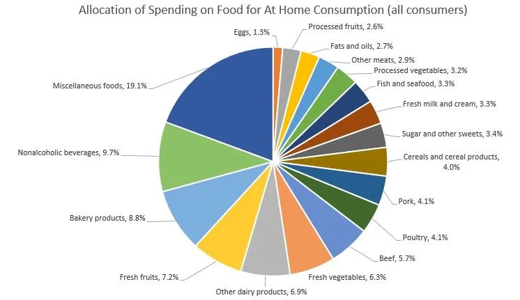
According to these data, on average about 43.6% of spending is on food to be consumed away from home (e.g., at restaurants), whereas 56.4% is spending for food to be consumed at home (e.g., spending at grocery stores). The BLS does not segregate data on spending on food away from home by the type of food, but it does so for spending on food to be consumed at home. Of the spending on food to be consumed at home (e.g., spending at grocery stores), the figure below shows the breakdown for the “average” food consumer. 19.1% of “at home” food spending is for “miscellaneous foods” and the next biggest category is nonalcoholic beverages (9.7%) and then bakery products (8.8%). Combined, all meat products including beef, pork, poultry, and fish account for 21.6% of at home food spending, and all dairy products account for another 10.2%.

The main reason for delving into these data is that they provide information on regional differences in food spending patterns. To explore these issues, I calculated the at food expenditure shares for each of the nine census regions, and then calculate the percent difference in expenditure share for a given region compared to the “average” consumer in the U.S. Here are some breakdowns, starting first with spending on beef as a share of all spending on food at home.

Differences in Spending on Beef by Region.

Differences in Spending on Beef by Region.

Consumers in the South West Central region (Arkansas, Louisiana, Oklahoma, and Texas) allocate 16.2% more of their at-home food budget to beef than does the national average food consumer, whereas on the other extreme, New England consumers (in Connecticut, Maine, Massachusetts, New Hampshire, Rhode Island, Vermont) allocate about 8.7% less of their food budget to beef than does the national average food consumer.

The following shows similar figures for pork and poultry. Whereas consumers in the Upper Midwest allocates a higher than average share of their food at home food budget to beef and pork, consumers there allocate 21.1% less of their food at home budget to poultry as compared to the average national food consumer.

Differences in Spending on Pork by Region

Differences in Spending on Pork by Region

Differences in Spending on Poultry by Region.

Differences in Spending on Poultry by Region.

Turning from meat items, here is data on relative spending on fresh fruits and fresh vegetables by region, which is higher in the West and New England.

Differences in Spending on Fresh Fruit by Region.

Differences in Spending on Fresh Fruit by Region.

Differences in Spending on Fresh Vegetables by Region.

Differences in Spending on Fresh Vegetables by Region.

What about items that are often considered “unhealthy” like sugar and sweets and fats and oils? Spending on sugar and sweets is 27.3% higher in the Mountain region as compared to the average consumer, and spending on oils and fats is relatively highest in the East South Central Region.

Differences in Spending on Sugar and Sweets by Region.

Differences in Spending on Sugar and Sweets by Region.

Differences in Spending on Fats and Oils by Region.

Differences in Spending on Fats and Oils by Region.

The BLS CES reports spending on alcoholic beverages as a separate category from food at home or food away from home. Across all consumers, about 7% of food spending (either at home or away) is on alcoholic beverages. The variation across region is shown below. Spending on alcohol (as a share of total food spending) is positively correlated with spending on fresh fruits and fresh vegetables (as a share of spending on food at home), as alcohol spending is highest in the West and New England.

Differences in Spending on Alcohol by Region.

Differences in Spending on Alcohol by Region.

Finally, here is spending on food away from home as a share of total food spending. Consumers in the South West Central Region (Arkansas, Louisiana, Oklahoma, and Texas) and in the West spend 4% more on food away from home as a share of total food spending as compared to the average food consumer.

Differences in Spending on Food Away from Home by Region.

Differences in Spending on Food Away from Home by Region.

Readers who want to further explore the differences in regional spending patterns can access the BLS CES data here.

*The USDA Economic Research Service (ERS) reports data on per-capita “consumption” (this is actually “disapperance data, which infers consumption based on production, minus exports, plus imports, plus or minus net change in storage), but this is only at the national level. There are some other datasets which provide more local information on food purchases or consumption, but they are proprietary. Examples include grocery store scanner data by Nielsen or IRI. There are publicly available data, like the National Health and Nutrition Examination Survey (NHANES), which have information on location and food consumption, but it often requires significant data analytic abilities or special permission to make use of these data to explore state or regional trends.

Food Environment or Preferences?

Do poorer people eat unhealthily because they don’t have access to grocery stores and fresh fruits and vegetables (and are more easily able grab fast food or convenience store options), or is it because their preferences for healthy food differs from higher income households? In a sense, this is a question of nature vs. nurture applied to healthiness of food consumption, and it is a lively debate related to questions about food deserts, convenience store regulations, zoning, and more.

This interesting and rigorous paper (gated version here) on the topic by Hunt Allcott, Rebecca Diamond, Jean-Pierre Dube, Jessie Handbury, Ilya Rahkovsky, and Molly Schnell was recently published on the topic in the Quarterly Journal of Economics. I blogged about this paper a couple years ago, but I mentioned again now that it’s been revised and put through the rigors of the peer-reviewed process, and because the implications are quite important. Here’s the abstract:

We study the causes of “nutritional inequality”: why the wealthy eat more healthfully than the poor in the United States. Exploiting supermarket entry and household moves to healthier neighborhoods, we reject that neighborhood environments contribute meaningfully to nutritional inequality. We then estimate a structural model of grocery demand, using a new instrument exploiting the combination of grocery retail chains’ differing presence across geographic markets with their differing comparative advantages across product groups. Counterfactual simulations show that exposing low-income households to the same products and prices available to high income households reduces nutritional inequality by only about ten percent, while the remaining 90 percent is driven by differences in demand. These findings counter the argument that policies to increase the supply of healthy groceries could play an important role in reducing nutritional inequality.

These findings suggest efforts to eliminate food desserts or to constrain offerings of convenience stores are likely to have minimal effects. This paper shows, like some of my work, that higher- income households tend to eat healthier than lower-income households. Want lower income people to eat healthier? Then, we probably need to think about ways to increase their incomes. Another possible solution, albeit difficult to successfully and cost-effectively implement, is nutrition and health education.

Experimental Auctions - What's New?

It is hard to believe it’s been over a decade since my book with Jason Shogren on experimental auctions was first published. We’ve learned a lot and the field has evolved in the intervening years since this publication. As a result, I’m happy to announce a new review article, just released by the European Review of Agricultural Economics, on experimental auctions with Maurizio Canavari, Andreas Drichoutis, Rudy Nayga, and myself. Maurizio, Andrea, Rudy, and I have been hosting a summer school in various European locations on this topic ever since 2011, and our annual discussions have been very useful in thinking about works well and what doesn’t when conducting an experimental auction.

For readers of this blog who aren’t academic economists, you might be wondering: what, exactly, is an experimental auction and why would you want to conduct one? The motivation for the method comes from the widely known fact that people’s answers on surveys don’t always align with their behavior in a grocery store. A general rule of thumb is that the average willingness-to-pay one finds in a survey can be divided by two if one wants to know know what people will actually pay when money is on the line.

The problem is that we often want to know the value people place on times that aren’t regularly traded in a market, where real economic incentives are at play. An experimental auction solves the non-market problem by creating a market in a lab or online setting. An experimental auction involves people bidding real money to obtain (or exchange) real goods (typically food in my applications) in a type of auction with rules where people have an incentive to truthfully reveal their preferences.

Here’s the abstract:

In this paper, we review recent advances in experimental auctions and provide practical advice and guidelines for researchers. We focus on issues related to randomisation to treatment and causal identification of treatment effects, design issues such as selection between different elicitation formats, multiple auction groups in a single session and house money effects. We also discuss sample size and power analysis issues in relation to recent trends in experimental research about pre-registration and pre-analysis plans. We position our discussion with respect to how the agricultural economics profession could benefit from practices adopted in the experimental economics community. We then present the pros and cons of moving auction studies from the laboratory to the field and review the recent literature on behavioural factors that have been identified as important for auction outcomes.

For Ph.D. students, or anyone looking for a new idea to work on, I’ll note that the conclusions section has a slew of ideas for future research.

Milk - Differentiation and Substitution

This article in the Wall Street Journal has some interesting data and anecdotes about the rise of Fairlife Milk - an ultrafiltered, branded milk product that has more protein and less sugar than regular milk. Apparently sales of Fairlife are up 30% over the past year, and that’s in spite of some negative publicity about some animal welfare issues over the same time period. What’s interesting about the article is that we are likely to see similar trends in mean animal protein markets in the coming years - the push to differentiate and the rise of unexpected competitors.

As the article makes clear, the rise of Fairlife has been quick and surprising. Fairlife now commands about 3% of the dairy-milk market, just a bit less than Horizon, the largest organic milk brand, which has been on the market for 30 years and has a market share of 3.7%. I suspect not many would have guessed 5 to 10 years ago, that the hottest selling milk brand would make its mark based on a technology-enabled nutritional profile as opposed to sustainability/animal-welfare claims.

As for unexpected competition, I’m heard folks in the dairy industry complain about competition from plant-based sources such as almond milk and soy milk, but according to the article:

... in the last four years, when milk sales fell by 330 million gallons, plant-based milk sales increased by only 60 million gallons.

The sector lost 270 million gallons elsewhere.

The likely culprit? Water.

“We’re losing over 50% to bottled water,” Mr. Ziemnisky said. “No. 2 is ready-to-drink coffee.” In addition, Americans are eating less breakfast cereal, accounting for about 25% of milk’s decline.

Consumer beliefs about healthy foods and diets

That’s the title of a new article I just published in the journal PLoS ONE. This is an exploratory/descriptive study with the aim of probing consumer’s perceptions of the term “healthy” in relation to food. The study is motivated by the fact that the FDA regulates the use of the term on food packages, and is in the process of reconsidering the definition. Here are some of the key results:

Consumers were about evenly split on whether a food can be deemed healthy based solely on the foods’ nutritional content (52.1% believing as such) or whether there were other factors that affect whether a food is healthy (47.9% believing as such). Consumers were also about evenly split on whether an individual food can be considered healthy (believed by 47.9%) or whether this healthiness is instead a characteristic of one’s overall diet (believed by 52.1%). Ratings of individual food products revealed that “healthy” perceptions are comprised of at least three underlying latent dimensions related to animal origin, preservation, and freshness/processing. Focusing on individual macronutrients, perceived healthiness was generally decreasing in a food’s fat, sodium, and carbohydrate content and increasing in protein content. About 40% of consumers thought a healthy label implied they should increase consumption of the type of food bearing the label and about 15% thought the label meant they could eat all they wanted.

One part of the analysis focuses on parsing out the correlations between the healthiness rating consumers placed on different types of foods . Below are three dimensions of 15 food’s healthiness ratings as determined by factor analysis.

healthy_factor.JPG

Here’s the portion of the text describing these results:

The first factor (explaining 54% of the total variance), shown on the vertical axis of the bottom panel of Fig 3 shows all animal products with high values and other non-animal products with lower values, suggesting consumers use animal origin as a primary factor in judging whether a food is healthy. A second factor (explaining 31% of the total variance), illustrated on the horizontal axis of the top panel of Fig 3, has canned and frozen fruits and vegetables with the highest values, bakery and cereal items, candy, and fresh fruits and vegetables with mid-to-low values, and animal products with the lowest values, which seems to suggest consumers use degree of preservation as another dimension of healthiness. Finally, the third factor (explaining 22% of total variance), illustrated on the vertical axis of the top panel and the horizontal axis of the bottom panel of Fig 3, indicates freshness or degree of processing is another dimension to healthiness evaluations. These results indicate that healthiness is not a single unifying construct, but rather consumers evaluate healthiness along a number of different dimensions or factors. A food, such as beef or fish, can be seen as scoring high in some dimensions of healthy but low in another.

There’s a lot more in the article.