Blog

Thanksgiving Likely Less Expensive This Year

Next week is Thanksgiving, and it seems as suitable a time as any to take a look at changes in food prices.  I turned to the Bureau of Labor Statistics (BLS) data to investigate how prices of frozen turkey have evolved over time in the month of November.  The BLS hasn't yet reported retail prices for the month of November (or for the month of October for that matter), but nonetheless I can project this year's November turkey price based on past correlations between prevailing prices in September and November.  

novprices4.JPG

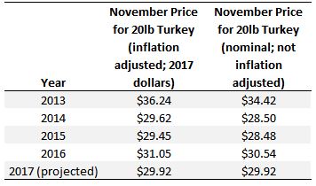
As the above table shows, I'm projecting the price this November for a 20lb turkey to be $29.92, which is slightly less than last year but similar to 2014 and 2015.  By and large, one of the stories of turkey prices (and poultry more generally) is how stable prices have become over time.  This can be seen more dramatically by comparing turkey prices with the prices of other meats.  

My family isn't a big fan of turkey.  We often opt for steak.  The figure below shows past and projected November prices for turkey and beef steak (on a $/lb basis).

novprices1.JPG

Prices for steak have increased more than a dollar per pound in both real and nominal terms over the past 20 years; however, turkey prices have hovered around $1.45/lb in real terms for the past two decades, which a slight up-tick in 2013.  Projected prices for steak this November are within a nickle per pound of where they were in November 2016.

If you're considering whether to have turkey or steak, another interesting comparison is the ratio of beef steak prices to turkey prices.  This ratio tells you how many pounds of turkey can be purchased for each pound of steak for the same budget.    

novprices2.JPG

In November 2015, one could purchase about 5.5lbs of turkey for each pound of beef steak for the same total cost.  This year, I'm projecting that a consumer can only buy 4.88 lbs of turkey for each pound of beef steak.  That is, steak is projected to be relatively less expensive than turkey was in 2015 (though slightly more expensive than last year in 2016).  

Of course, a Thanksgiving meal consists of more than just turkey or beef.  Thus, it might be useful to compare overall how expensive food is this November compared to non-food items.  Using BLS data on price indices for food at home and non-food items, I calculated the change in cost of food at home relative to non-food over time.  

novprices3.JPG

Compared to the base year, which I set to 1998, November prices of food at home rose at a slower rate than November prices of non-food items (i.e., food at home became less expensive relative to non-food items).  That pattern reversed course in 2008, when food prices began increasing at a faster rate than non-food prices. 

In 2016, and I'm also projecting for 2017, food at home has again started becoming less expensive relative to non-food items.  So, this Thanksgiving, be a good economist, buy fewer non-food items, and eat well!  

Agricultural Productivity and Food Security

There are two competing narratives about the future of food.  One is that the world population is growing and we need to increase agricultural productivity to "feed the world".  The other argument is that we don't need to produce more food - we already produce enough food to feed the world and our problems are really more about distribution than production.  Folks in the later camp often advocate for lower-productivity forms of agriculture that they perceive to have health or environmental benefits.  Like most arguments, there are elements of truth to both sides.  

As a proponent of improved agricultural productivity (which, I've argued is the key metric to improved sustainability), it bears asking: if a country's agriculture is more productive are it's people better fed?  

To delve into this question, I combined two data sets.  The first is a measure of a country's agricultural productivity from the World Bank in the year 2015.  In particular, they calculate for a large number of countries, the agricultural value added per worker.  In their words:

Agriculture value added per worker is a measure of agricultural productivity. Value added in agriculture measures the output of the agricultural sector (ISIC divisions 1-5) less the value of intermediate inputs. Agriculture comprises value added from forestry, hunting, and fishing as well as cultivation of crops and livestock production. Data are in constant 2010 U.S. dollars.

By this measure, the most productive countries are Slovenia, Singapore, Norway, France, Lebanon, Canada, New Zealand, Finland, and the United States, each of which produced more than $80,000 in agricultural value per worker in 2015 (measured in 2010 dollars).  Places like Malawi, Congo, Mozambique, Gambia, and Madagascar had some of the lowest productivity, with agricultural value added at around $400/worker or less.

Secondly, I collected data from the Global Food Security Index, a project ran by The Economist and supported by DuPont.  In their words:

The Global Food Security Index considers the core issues of affordability, availability, and quality across a set of 113 countries. The index is a dynamic quantitative and qualitative benchmarking model, constructed from 28 unique indicators, that measures these drivers of food security across both developing and developed countries.

This index is the first to examine food security comprehensively across the three internationally established dimensions. Moreover, the study looks beyond hunger to the underlying factors affecting food insecurity. This year the GFSI includes an adjustment factor on natural resources and resilience. This new category assesses a country’s exposure to the impacts of a changing climate; its susceptibility to natural resource risks; and how the country is adapting to these risks.

From this project, I pulled each country's overall food insecurity score (calculated in September 2017), which took on the values of around 30 for countries like the Congo, Madagascar, Chad, and Malawi, and was above 80 for countries like the U.S., the U.K., Ireland, and France.  Although they call this a measure of food insecurity, a higher score actually means a country is more food secure.   

So, what did I find?

food security by value added.JPG

There is a strong positive relationship between a country's agricultural productivity and how well it's people are fed and how food secure they are.  Fitting a logarithmic relationship between the two variables suggests that 82% of the variation in the food security scores across countries is explained by differences in agricultural productivity.  

Now, there are a lot of other things going on here as agricultural productivity is likely correlated with and affected by other factors affecting a country's general productivity and development, but the above figure might give pause to those arguing for lower productivity forms of agriculture. 

At the top end, the curve suggests one can sacrifice some productivity with only a small reduction in food security (going from $80,000/worker to $40,000/worker) reduces the food security scale from about 80 to 75.  But, at the lower end, going from, say, $20,000 in agricultural output per worker to $10,000/worker reduces the food security scale from about 70 to 60, and reducing productivity another $10,000 lowers the food security scale down to the 30s.  

Inequalities of Fat Taxes and Thin Subsidies

I was excited to see The Economist ran an article on my paper with Laurent Muller, Anne Lacroix, and Bernard Ruffieux, which appeared in the Economic Journal.  In typical Economist fashion, they didn't mention us by name, but here's their summary of our findings:

The study found that the taxes and subsidies actually widened health and fiscal inequalities. Fat taxes meant the women on lower incomes paid disproportionately more for food—their habits changed less. They preferred to buy food they liked rather than what made nutritional sense. Taxing the food they eat most made the poor poorer.

Subsidies encouraged all income groups to buy more fruit and vegetables. But those on higher incomes proved more responsive and so benefited most. Interestingly, richer folk were also more likely to buy the subsidised healthy food and then spend the savings they had accrued on yet more healthy food. But poorer women, if they responded to lower prices, often used the money saved to buy unhealthy items or something else entirely. Once the nutritional price policies were applied, the average share of budget spent on healthy food actually increased for the better-off.

How Food Consumption Varies in Rich and Poor Countries

The American Journal of Agricultural Economics recently released an interesting paper entitled by Kenneth Clements and Jiawei Si.  Using previously unpublished data from the World Bank on consumption of 31 different food items in 150 countries, the paper has a lot of fascinating details about how food consumption differs in rich and poor countries, where find "substantial differences in per capita incomes lead to sharp, almost extreme, differences in consumption patterns."  I took some of the data in their paper to construct the graphs below.

First, their data strongly support "Engel's Law" in that the share of income spent on food declines the wealthier the country.  One of the poorest countries in their sample is the Central African Republic where consumers spend 64% of their income on food; in the richest countries like the U.S. and Bermuda, consumers spend less than 10% of their income on food.

engelworld.jpg

The paper reviews some interesting details about how food expenditures differ across countries.  For example, the figures below show how consumers' food budgets are allocated in the richest quarter of countries as compared to countries in the lowest quartile of income.  I've drawn the pie charts so that they are roughly proportional to the quantity of food consumed in each country grouping.  Consumers in the lowest income countries consume about 77% less food than consumers in the highest income countries.  So, compared to richer consumers, poorer consumers are not only consuming a larger share of their income on food, they're eating less food.  

The other thing revealed in the graphs below is that richer consumers have greater diversity in their diets than poor consumers.  Just to give one example, Clements and Si estimate that consumers in richer countries spend only 3.3% of their food budget on rice and other cereals and flours (this is part of the 14% for bread, rice, and cereals in the figure below), but consumers in poorer countries spend 23.7% on rice and other cereals and flours (this is part of the 29% for bread, rice, and cereals). Thus, poorer consumers diets are more concentrated in rice and cereals and is less diversified in other foodstuffs.  Of course dietary diversity is a key measure of the nutritional quality of consumers' diets.  Clements and Si estimate that the diets of the rich are 3.5 times more diverse than the poor's.  

They write:

A more varied diet brings nutritional advantages and for most, diet diversity is valued in and of itself, if not an essential part of their life. As the diversity of the diet tends to increase with income, not only does the food share fall with higher incomes, spending is also likely to be spread more evenly over foodstuffs, providing a more balanced diet. Relatedly, higher incomes bring a shift away from lower-quality items, towards more expensive, possibly more tasty and nutritious foods.
foodspending_rich_poor.JPG

Clements and Si find other interesting consumption patterns, such as the following::

we find considerable differences between pairs of countries. Higher incomes bring higher-quality food, but the overall elasticity is small: enhanced food quality can only be achieved with substantially higher incomes. Furthermore, better-quality food comes at a higher price, but interestingly, this cost, relative to lower-quality food, falls as we move from poorer to richer countries. The structure of food prices is thus regressive in its impact on the global distribution of real income. This effect is modest, however.

The whole thing is here.

Food Values of the Rich and Poor

As I've discussed in the past, I've been measuring consumers "food values" in the monthly Food Demand Survey (FooDS) for the past four years.  The way this works is that a list of 12 items is presented to respondents and they are asked which are most and which are least important when buying food.  Respondents have to click and drag four of the items into a "most important" box and also put four in a "least important" box, leaving four in neither box (for exact question wording see page 7 of this document).  

The advantage of this questioning approach is that it requires a tradeoff - respondents can't say all issues are important and they have to indicate some food values as least important.  To create a scale of importance, I simply calculate the percent of times an issue is placed in the most important box and subtract it from the percent of times it is in the least important box, creating a measure that ranges from 100% to -100%.  

Month in and month out, we consistently find that taste, safety, nutrition, and price are the four most important food values and environment, origin, fairness, and especially novelty are the least important.  Issues like appearance, naturalness, animal welfare, and convenience fall in the middle.  

While the above rankings of values are true on average, it is useful to ask: how do food values differ across consumers with different incomes?  This question is important because not all consumers have the same preferences, and the people with the ability and connections to affect public policy (and grocery store bottom lines) may give priority to food issues that are less relevant to people in the lower end of the socioeconomic spectrum.  

To address this issue, I used some statistical analysis to control for differences in age, gender, education, etc. and then compare how people in different income categories rate each food value.  For ease of comparison, I always set the food value of people lowest income category (less than $20,000 in annual household income) at zero and compare how much higher or lower (again on the -100% to +100% scale) people in other income categories are relative to consumers in the lowest category.    
 

Food Values Relatively More Important to the Poor than the Rich

There were three food values for which importance tended to decline with income: price, safety, and taste.  The big one is price.

foodvalue6.JPG

Compared to consumers in the highest income category (more than $160,000/year in household income), consumers in the lowest income category (less than $20,000/year in household income) place 42 percentage points higher level of importance on the price they pay for food.  Recall that the scale only spans from +100 to -100, and as such, this is a huge difference in the importance of price.  The implication is that policies and actions that adversely affect food prices will matter much more to lower than higher income consumers.  This isn't necessarily surprising, but as the above graph shows, the difference in magnitudes is remarkable. 

Lower income consumers also place relatively more importance on food safety than higher income consumers as indicated in the graph below, however the differences aren't as pronounced as that for price.  Note that this doesn't mean high income consumers don't care about food safety per se, only that safety is less important than other food values to the rich compared to the poor.

foodvalue8.JPG

Lower income consumers also tend to place a lower relative value on taste than higher income consumers, however, the differences aren't particularly pronounced (at most a 7 percentage point spread between high and low income).


Food Values Relatively More Important to the Rich than the Poor

There were five food values for which importance tended to increase with income: naturalness, nutrition, environment, novelty, and origin.

foodvalue1.JPG

As the figure above shows, the highest income consumers placed about 12-14 percentage points higher importance on naturalness than lower income consumers; for nutrition and environment (see below), the results are similar.  

foodvalue2.JPG
foodvalue3.JPG

The environment result is somewhat relevant to debates about the environmental Kuznets curve, which posits that as a country's income increases from a low to mid level, the environment degrades, but then as income increases from a mid to higher level, the environment improves.  One reason cited for the later results is that as people become wealthier, they care more about environmental amenities.  The above graph suggests this is true for the environmental impacts of food production as well.

The figure below also shows that higher income households place a higher relative value on the novelty of food than lower-income consumers.  This results is consistent with other research that suggests that lower-income households cannot afford to purchase novel or unfamiliar foods that other household members may not like and that might go uneaten.  That is, higher income households can afford the "risk" of trying new foods that may ultimately go to waste.

foodvalue4.JPG