Blog

An unplanned shock to beef quality supply

In economics, it's tough to separate correlation from causation because the world is a messy place with lots of things changing at the same time.  As a result, empirical economists are always on the lookout for natural experiments, or situations where there was some random, unanticipated "shock" to the market that can help us get closer to an experimental setting, where we know a change in X was not due to a change in Y.  

I was reading through the latest edition of Meatingplace magazine, and was surprised to see a story about an event that provides precisely the sort of unplanned "shock" that we are always looking for. In particular, about eight years, ago, the USDA started using cameras (rather than people) to determine meat quality.  The two main quality grades are Choice (more marbled (or fattier), higher quality) and Select (leaner, lower quality).  

Apparently in June 2017, the USDA issued an update to USDA's camera grading system that "appeared to inaccurately assess the degree of marbling on some carcasses - allegedly grading some Choice that should have been Select." The USDA issued a new update to the cameras in October in 2017 to correct the problem. One analysis, quoted in the article, estimates that about 12,000 cattle were inadvertently graded Choice rather than Select (a 2.4% increase according to the article, if I'm reading it right).

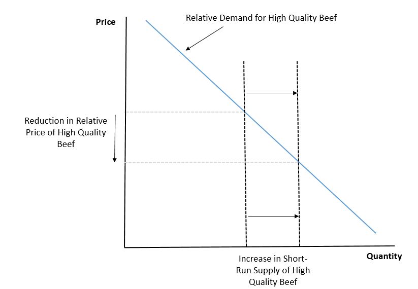
So, we have an unplanned, unanticipated "shock" to the beef quality market that shifted the supply of high quality meat and reduced the supply of lower quality meat.  This is illustrated by the two vertical lines in the figure (the lines are vertical because the supply is fixed in the short-run: you can't take Choice carcass and turn it into a Select one once the animal has been removed from feed).  If demand curve slopes downward, then this unanticipated increase in supply of Choice (and reduction in Select) quantity, should reduce the price premium for Choice over Select.  And in-fact, because the shock to supply is completely exogenous (it had nothing to do with demand but with a camera update), we should be able to use the natural experiment to estimate the slope of the relative demand curve for high quality beef (or the so-called elasticity of demand).  

choicetoselect2.JPG

Here is data from the USDA on the difference in price between Choice and Select beef, or the so-called Choice-to-Select spread, over the time period of interest (in particular, this is the difference in boxed beef cutout values measured in dollars per hundredweight - or cents per pound).    

choicetoselect.JPG

Just as one would expect, the increase supply of Choice relative to Select led to a reduction in the price premium charged for Choice relative to Select.  Of course, these raw data might be misleading - what if there is a seasonal pattern in which the Choice-to-Select spread falls every year from June to October?  To address this concern, I downloaded the last 10 years of data on the Choice-to-Select spread and found that the observed Choice-to-Select spread from mid June to late October in 2017 was $4.34/cwt lower than would be expected even after controlling for seasonality (month of the year), year, and a time trend.  This works out to about a 31% lower Choice-to-Select spread than would have expected during this time had it not been for the grading camera update (assuming there aren't other confounds I'm not controlling for).  

So, good news, it appears, the demand curves do indeed slope downward.  We can also go further if we take the aforementioned 2.4% change in quantity at face value that came from the Meatingplace article.  The price flexibility of demand (this is roughly the inverse of the elasticity of demand) for Choice (relative to Select) is given by the percent change in price over quantity, or -31%/2.4% = -12.9%.  So for every 1% increase in the quantity of Choice vs. Select supplied, there is a 12.9% reduction in the Choice-to-Select price spread.  

Don't Want to Eat Pink Slime? Would You Even Know?

It's hard to believe it's been almost five years since the finely textured beef (aka "pink slime")  scandal broke.  To briefly re-cap, by 2012 it had become an industry standard to include finely textured beef with other beef trimmings to make ground beef.  The process enabled food processors to add value, cut down on waste, and increased the leanness of ground beef in an affordable manner.  But, a series of news stories broke, which caused public backlash against the process, and ultimately led to the closure of several plants that produced finely textured beef.  In 2013, I wrote about my visit to BPI, one of the largest producers of lean finely textured beef (this summer, ABC settled a multi-million dollar lawsuit brought by BPI regarding ABC's coverage of the issue).  I devoted a whole chapter of my 2016 book, Unnaturally Delicious, to the issue.  I'll also note, for some aspiring journalist out there,  that I can imagine a highly compelling a book-length treatment of the saga.

Back to the heart of the story, must of the public backlash presumably came about because the public was worried about taste or safety of ground beef made with finely textured beef.  In the monthly Food Demand Survey (FooDS), we've been running for almost five years, we ask about perceptions of the safety of "pink slime" and of "lean finely textured beef".  The data suggests neither are top safety concerns.  The most common answer is that people are "neither concerned nor unconcerned" about the safety of these issues (for lean finely textured beef, the average response is actually in the direction of "somewhat unconcerned").

Well, what about taste?  People may think "pink slime" tastes bad, but what would happen in a blind taste test?  Along with several of my former econ and meat science colleagues at Oklahoma State University (Molly Depue, Morgan Neilson, Gretchen Mafi, Bailey Norwood, Ranjith Ramanathan, and Deb VanOverbek), we conducted a study to find out.  The results were just published in PLoS ONE.  Here's what we found.

Over 200 untrained subjects participated in a sensory analysis in which they tasted one ground beef sample with no finely textured beef, another with 15% finely textured beef (by weight), and another with more than 15%. Beef with 15% finely textured beef has an improved juiciness (p < 0.01) and tenderness (p < 0.01) quality. However, subjects rate the flavor-liking and overall likeability the same regardless of the finely textured beef content. Moreover, when the three beef types are consumed as part of a slider (small hamburger), subjects are indifferent to the level of finely textured beef.

So, a burger made with 15% finely textured beef is as tasty or tastier than a burger without finely textured beef.  If people knew this, would it have changed their reaction to the Jamie Oliver show or the 2012 ABC News stories?   

Meat Consumption in 2018

An article in Bloomberg today reports on a USDA forecast that per capita meat consumption is projected to hit a high in 2018 of 222 pounds per person.  I received a number of emails from people today asking how this is possible.  Questions were of the sort: Aren't there more vegetarians than ever? Isn't plant-based protein and lab grown meat taking off? Aren't people more worried about environmental and health effects of animal production?  Aren't animal welfare concerns on the rise?

Embedded in many of these questions is conflation of demand and supply.  Yes, consumers are projected to consumer more meat in 2018, but that’s because we’re producing more of it than was the case a few years ago.  We consume everything that’s produced (after adjusting for trade).  In short, it's not that demand for meat has increased (what people are willing to pay for meat has remained fairly steady for the past several years - see also these beef and pork demand indices).  Rather, the supply of meat has increased.   

How do I know this is true?  If there were a demand increase, we'd expect higher quantities and higher prices.  But, at least compared to a couple years ago, we're seeing higher quantities but lower beef and pork prices, suggesting it is the supply curve that has shifted. To induce people to consume the higher volume of meat that’s currently being produced, prices have to fall to clear the market.

So, why have supplies increased?  One main reason is that feed prices (particularly corn) dropped and have remained low for the past several years.  All the while, productivity has increased.  Lower input prices and greater inefficiencies means we are going to have more meat as long as consumer demand remains steady.  And at least for now, despite all the negative information about meat production I alluded to earlier, demand appears to be fairly stable.  

2018 Agricultural Outlook

The latest edition of the Purdue Agricultural Economics Report has 12 articles that provide outlook on the forthcoming year.  The effort was led by Chris Hurt, who provides outlook on the overall agricultural economy in addition to specific pieces on hog, corn, and soybean outlooks.  Larry DeBoer provides an overall macro-economy outlook, Russell Hillberry focuses on trade, Roman Keeney provides some perspective on the next Farm Bill, Jim Mintert provides a beef cattle outlook, and Nicole Widmar and Courtney Bir look at dairy and butter trends.  The report is rounded out with pieces by Micheal Langemeier and Craig Dobbins on the future of crop costs and returns, rental rates, and land values.  

I chipped in with a short piece on food prices.  Here is what I had to say (including an extra bonus graph that didn't make the final report).  

Last year, 2016, proved to be a record setter, at least in recent history, for food price changes.  For the first time in at least three decades, the annual consumer price index for food at home fell.  Driven in part by the fall in agricultural commodity prices, prices for food at home fell 1.3% from 2015 to 2016. While prices for food eaten away from home increased 2.6% from 2015 to 2016, this change remained below the twenty-year historical average increase of 2.7%.  

Where are retail food prices heading in 2017 and beyond?  The fall in prices from food at home appears to have abated.  Through the first ten months of 2017, prices for food at home increased every month save one (June), but the increases were quite modest – averaging a tenth of a percentage increase each month.  Increases in prices of food away from home through the first ten months of 2017 are similar to that observed during the same time in 2016.  The USDA Economic Research Service forecast overall food price inflation of 1% to 2% in 2017 and 1.5% to 2.5% in 2018, with most of the increases coming from changes in prices of food away from home.

The figure below shows the year-over-year monthly changes (for example, the percent change from September 2016 to September 2017) in prices of several food and non-food items.  The year-over-year change in the price of food away from home has hovered around 2.5% for the past four years.  By contrast, the year-over-year changes in prices of food at home were largely negative in 2016, but have subsequently trended positive.  Similar, though more dramatic, patterns are observable for prices of meat and for fruits and vegetables.  Despite the recent increases in prices of food at home, meat, and fruits and vegetables, the increases remain quite modest.  In-fact, the year-over-year increases for each of these food items remain below the increases in prices of non-food items, which have averaged about 2% since mid-2016.  It is important to make comparisons to changes of non-food prices because it is the relative changes that drive consumer purchase behavior.  If the price of non-food items increases at the same rate as food items, one wouldn’t expect much change in consumers’ food purchases. 

foodprices1.JPG

It is useful to place these recent changes into a broader historical perspective, as in the following figure, which shows the percentage price changes relative to January 2007.  Over this more than decade-long stretch, the price of food away from home increased at a steady pace to a point to where prices are now 33% higher than a decade ago.  From 2007 through 2014, the increase in prices of food at home largely tracked that of prices away from home, but in more recent years, the two price series have diverged, and now food away from home is only about 22% higher than was the case in January 2007. While low commodity prices have helped push down food price inflation at home, the same phenomenon hasn’t held true for food away from home, perhaps due to the greater contribution of non-commodity inputs, such as labor and real estate, that factor into prices of food away from home.  

These trends suggest that, to the extent commodity prices remain low, we can expect small increases in prices of food at home in the future, but prices of food away from home may nonetheless continue increasing at historical rates.
 

foodprices2.JPG

Thanksgiving Likely Less Expensive This Year

Next week is Thanksgiving, and it seems as suitable a time as any to take a look at changes in food prices.  I turned to the Bureau of Labor Statistics (BLS) data to investigate how prices of frozen turkey have evolved over time in the month of November.  The BLS hasn't yet reported retail prices for the month of November (or for the month of October for that matter), but nonetheless I can project this year's November turkey price based on past correlations between prevailing prices in September and November.  

novprices4.JPG

As the above table shows, I'm projecting the price this November for a 20lb turkey to be $29.92, which is slightly less than last year but similar to 2014 and 2015.  By and large, one of the stories of turkey prices (and poultry more generally) is how stable prices have become over time.  This can be seen more dramatically by comparing turkey prices with the prices of other meats.  

My family isn't a big fan of turkey.  We often opt for steak.  The figure below shows past and projected November prices for turkey and beef steak (on a $/lb basis).

novprices1.JPG

Prices for steak have increased more than a dollar per pound in both real and nominal terms over the past 20 years; however, turkey prices have hovered around $1.45/lb in real terms for the past two decades, which a slight up-tick in 2013.  Projected prices for steak this November are within a nickle per pound of where they were in November 2016.

If you're considering whether to have turkey or steak, another interesting comparison is the ratio of beef steak prices to turkey prices.  This ratio tells you how many pounds of turkey can be purchased for each pound of steak for the same budget.    

novprices2.JPG

In November 2015, one could purchase about 5.5lbs of turkey for each pound of beef steak for the same total cost.  This year, I'm projecting that a consumer can only buy 4.88 lbs of turkey for each pound of beef steak.  That is, steak is projected to be relatively less expensive than turkey was in 2015 (though slightly more expensive than last year in 2016).  

Of course, a Thanksgiving meal consists of more than just turkey or beef.  Thus, it might be useful to compare overall how expensive food is this November compared to non-food items.  Using BLS data on price indices for food at home and non-food items, I calculated the change in cost of food at home relative to non-food over time.  

novprices3.JPG

Compared to the base year, which I set to 1998, November prices of food at home rose at a slower rate than November prices of non-food items (i.e., food at home became less expensive relative to non-food items).  That pattern reversed course in 2008, when food prices began increasing at a faster rate than non-food prices. 

In 2016, and I'm also projecting for 2017, food at home has again started becoming less expensive relative to non-food items.  So, this Thanksgiving, be a good economist, buy fewer non-food items, and eat well!