It seems a fairly simple question: In which U.S. states do people eat the most meat? Yet, there is surprisingly little good, publicly available data on this question. Yes, there are fun maps like this one at Slate, but they are far from scientific or data driven.
I thought I'd try to partially fill this void by turning to data from my Food Demand Survey (FooDS) that has been running now for almost four years. Because I've surveyed over 1,000 people in the U.S. for about 44 months, that means I have responses from over 44,000 people spread all across the country that I can use to help look for geographic differences.
In FooDS, each person is told "Imagine you are at the grocery store buying the ingredients to prepare a meal for you or your household. For each of the following nine questions that follow, please indicate which meal you would be most likely to buy." Then, they are presented with nine questions that look like the one below. The only differences across the questions are the prices assigned to each item and the order of the items.

For sake of simplicity, I counted the number of times each person chose steak, how many times they chose chicken breast, etc. Thus, the maximum possible "score" a person could have for each item is 9 and the lowest is 0. To be clear, this isn't a measure of consumption, but rather it is an index of demand. It is a measure of how much people "like" each of the choice options relative to all the other choice options. For point of reference, across all the people in my sample, the most frequently chosen option was chicken breast (chosen on average 2.43 times out of 9) followed by ground beef/hamburger (chosen on average 1.33 times out of 9). The least popular meat items were pork chop and ham, chosen on average 0.80 and 0.68 times, respectively, out of 9.
I won't go into all the hairy details here (email if you want to know more), but I then estimated some statistical models to infer how often, on average, consumers in each state chose each of the meat options. Then, I calculated how different (in percentage terms) each state was from the mean number of choices, and I created maps.
I'll start with one that has a very obvious regional pattern: chicken wings.

Chicken Wing Demand by State
Demand for chicken wings is highest in the southeast US, where people chose this option 15% to 44% more often than in the average person in the US. Consumers in western states like Oregon, Idaho, and Arizona chose wings 15% to 27% less often than the average consumer nationwide.
For other products, there is less of a regional pattern. Below is the map for beef steak. Demand for steak is highest in California, Nevada, Washington, Oklahoma, Minnesota, Illinois, Florida, and New York. Steak demand is lowest in Idaho, Utah, Missouri, and the Appalachian regions, Tennessee, Kentucky, and West Virginia.
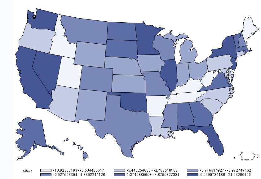
Beef Steak Demand by State
While we are on beef, here is the map for hamburger/ground beef. For ground beef, demand is generally highest in the upper midwest and is lower on the coasts.

Demand for Ground Beef by State
A somewhat similar pattern emerges for deli ham (shown below), although the location of heaviest demand moves a bit south and east relative to that for hamburger.
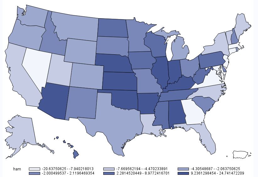
Deli Ham Demand by State
Below is the map for pork chops. This map is interesting in the sense that there are several instances where some of the highest demand states are situated adjacent to some of the lowest demand states (e.g., Oregon next to California; Oklahoma next to Texas; etc.) However, one thing to note in the case of pork chops is the scaling: there isn't much difference across any of the states. Consumers in Missouri have the highest pork chop demand, but only chose pork chops 2.7% more than the average consumer. Consumers in California have the lowest pork chop demand, but only chose pork chops 3.3% less than the average consumer nationwide.
Pork Chop Demand by State
The last individual meat product is chicken breast. As shown in the map below, chicken breast demand is generally highest in the west and the northeast. I'm not at all surprised to learn that chicken breast demand is near the lowest in my home state of Oklahoma (at -4.5%), trailing only North Carolina, Missouri, and Mississippi.

Chicken Breast Demand by State
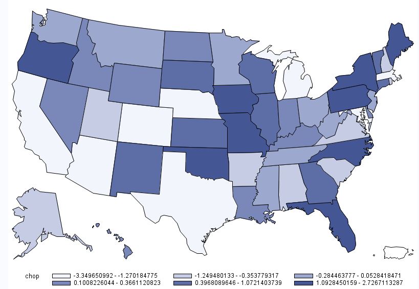
Finally, to round things out, here is a map associated with overall meat demand. This figure was calculated by determining how many times a person chose any of the six aforementioned meat products (recall there were nine total options, three of which were non-meat). On average people chose a meat option 7.03 times out of 9 total choices. However, as the map below shows, there is some heterogeneity across states. Overall meat demand is highest in the Midwest: consumers in Illinois, Indiana, and Iowa chose any meat option 1%+ more often than the average consumer. Lowest overall meat demand was in places like California, Arizona, Maryland, Utah, New Jersey, and Massachusetts, where consumers chose a meat options at least 1% less often than the average consumer.

Overall Meat Demand by State