Blog

A short lesson on experimental auctions

One of the most robust findings from the research on what consumers are willing to pay for non-market goods (for example, foods made with new technologies that are not yet on the market) is that people tell researchers they are willing to pay more than they actually will when money is actually on the line.  One review showed, for example, that people tend to overstate how much they are willing to pay in hypothetical settings by a factor of about three.  That means if someone tells you on a survey that they're willing to pay $15, then they'd probably only actually pay about $5.

One way to deal with this problem of hypothetical bias is to construct experimental markets where real money and real products are exchanged.  The key is to use market institutions that give consumers an incentive to truthfully reveal their values' for the good up for sale.  I wrote a whole book with Jason Shogren on the subject of using experimental auctions for this purpose a few years back.

I recently filmed a short primer on the consumer research method for an on-line course being created by my colleague Bailey Norwood.  He graciously put it up online for anyone's viewing pleasure.  

How has medical spending changed and why

Last week, I gave a plenary address to the annual meeting of the American Association of Clinical Endocrinologists on the topic of obesity and the government's role in addressing the issue.  

In my talk, I showed the following graph illustrating the change in spending on medical care expressed as a percentage of GDP from 1960 to 2012 (I created the graph using data from here)

People often use this sort of data to try to illustrate the adverse consequences of obesity and other dietary-related diseases that have risen over time.  That is part of the story.  But, it is also a complicated story, and a lot has changed over time.  

One partial explanation for the change is that Medicaid and Medicare didn't exist in 1960; some of the spending by these programs in 2012 would have occurred anyway but some probably wouldn't have (i.e., some people would have delayed or foregone treatments if they weren't covered by these programs), so that's part of the story.  But, it can't be a huge part, as these two program make up less than half of total spending in 2012.

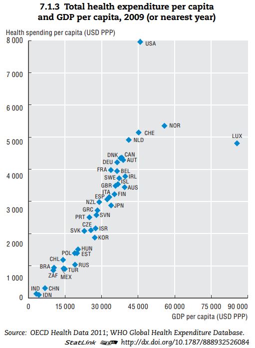
Another reason we likely spend more of our GDP on medical care today than we did in 1960 is that we are today richer.  Health care is a normal good, meaning that we buy more of it when we become wealthier.  Here, for example, is a recent cross-sectional comparison of how countries that differ in terms of per-capital GDP spend money on health care.

Clearly, the US is an outlier.  But, don't let that distract from the main message of the graph.  Richer countries spend more on health care.  It is almost a perfectly linear trend except for the US and Luxembourg.  

So, let's do a little thought experiment.  In real terms, per-capital GDP in the US in 1960 was around $15,000, whereas today it is around $45,000.  Look at the graph above,  Countries that make around $15,000 in per-capita GDP spend about $1,000/person/year on heath care.  Countries that make around $45,000 in per-capita GDP spend about $5,000/person/year on heath care.  Extrapolating from these data would suggest that we're spending $4,000 more per person on medical care in the US today than we did in the 1960s simply because we're richer today than in 1960.  

If I take 2012 cross-sectional WHO data (173 countries) from here and here, I find the following relationship from a simple linear regression: (spending on medical care as a % of GDP) = 6.47 + 0.033*(GDP per capita in thousands of $).  P-values for both coefficients are well below 0.01.  As previously stated, US GDP per capita has gone up by about $30,000 since 1960.  This means, we would expect the % of our GDP spent on health care to be 30*0.033=0.99 percentage points higher simply as result of income changes.

One final thought experiment.  We are a lot older today than in the 1960s.  For example, 35.9% of the population was under the age of 18 in 1960.  Today that figure is only 24%.  Older people spend more on health care than younger people.  Thus, we'd expect more spending on medical care today than in 1960 because we have more older people today.

Thus, I thought I'd do a crude-age adjusted calculation of medical spending as a % of GDP.    

I pulled data on per-capita spending by age category from the Centers for Medicare and Medicaid Services, Office of the Actuary, National Health Statistics Group and data from the Census Bureau on distribution of age in 2010 and 1960.

Here is the data and my calculations.

The last two columns construct a counter-factual.  The second to last column multiplies the 1960 age distribution by the total population in 2010; it imagines a world as populated as our current one but with ages distributed like 1960.  The last column calculates expected spending on health care with this 1960 age distribution by multiplying per-capita spending by the counter-factual age distribution.

The data suggest we actually spent $2,192 billion on medical spending in 2010.  However, if our nation had been younger, like it was in 1960, we would have only spent $1,922 billion.  Thus, we're spending 14% more in total on health care in 2010 than in 1960 because we are today an older population (of course we're also spending more because there are more of us).  If I express these figures as a percentage of 2010 US GDP, I find that current medical spending (as determined from this particular set of data) is 14.7% of GDP.  However, if we had the 1960 age distribution, medical spending would only be 12.8% of 2010 GDP.

In summary, increasing medical expenditures might indeed be a cause for alarm.  But, that rise is also partially explained by the fact that we are today richer and living longer.  I'd say that's a good thing.

Does eating chicken on the bone make children more violent?

That is the finding of a study published in the journal Eating Behaviors.  I have a lot of admiration for the study's lead author, Brian Winsink (I highly recommend his book Mindless Eating), but I'm going to have to file this one under "I don't believe it."  

I thought it was worth weighing in on since I'd seen the study reported on in several major media outlets.  I'm not saying that it isn't possible that eating chicken on the bone (vs. in chunks) doesn't cause aggression, I'm just saying that my priors are such that it will take a lot more than this to convince me.  

Why would we even expect that eating chicken on the bone causes aggression?  The authors suggest the following hypothesis:

Showing teeth is a common sign of aggression in the animal world. Dogs retract their lips and bare their teeth as a sign that they are willing to fight (Galac, & Knol, 1997). The baring of teeth may have similar meaning in intuitive human behavior

So, the authors ran an experiment.  

They took 12 children participating in a 4-H summer camp (yes, N=12), and split them in two groups, 6 in one and 6 in another.  On day 1, one group was fed chunks and the other group was fed chicken on the bone.  On day 2 , they reversed the foods fed to the groups.  On both days, the children's behavior was monitored and recorded.  For example, the children were asked to stay in a circle and the monitors counted the number of times the children left the circle (glad I didn't go to that 4-H camp!).  Paired t-tests were used to test whether behavior differed on the day the child got the bone vs. the chunk.

Here are some shortcomings of the study that make the results a bit hard to believe:

  • The small sample size.
  • Each child was only observed on 2 days (one with bone one with chunk).  However, on one day, the temperature was 97 degrees and on the other it was 76.  Lots of prior research has posited a link between temperature and aggression (hot = more aggressive).  Suppose you had a couple kids in a group with a tendency toward aggression who got assigned chunks on the colder (76 degree) day and bones on the hotter (97 degree) day?   The difference in their behavior may be due to temperature not bones.  It would be nice to see tests for within-day differences in bone vs. chunk.  If one had a large sample with random assignment to treatments on multiple days this wouldn't be as much of a concern, but it certainly is here.
  • Children assigned to the same group sat at the same table together.  This may have produced some sort of group dynamic.  Suppose, for example, the kids assigned to bone started arguing at the table and the conflict spilled over to the playground.  The current study cannot separate group-day effects from the treatment effect (bone vs. chunk).
  • Given the small sample size, really all it takes is one or two kids changing behavior from day 1 to day 2.  How do we know this wasn't due to something at home that carried over to the camp?  With such a small number of observations, I don't know why the authors didn't just report the entire data set in one table.  That way, we could see whether the difference was from a small increase in aggression of every child or a large increase in aggression of 1 o 2 kids.  
  • The counselors who kept the kids in the circle and who rated behavior were "blind" as to the treatment and control groups each day. That's good.  However, the study doesn't tell us whether the people who subsequently watched the videos and rated behavior were also blinded.
  • Maybe the effect exists but for very different reasons than those hypothesized in the paper.  I've already mentioned a temperature explanation.  What if children like to eat chicken on the bones more than they do in chunks (my kids certainly do).  Maybe they get more excited and rambunctious when they get a "treat" or something they like, which the current authors attribute to "aggression."  Perhaps when the counselors give the kids a food that the kids perceive as more generous or benevolent, it signals to the kids that the counselors will subsequently be more permissive.  To control for this, you'd want some treatments where the bone-in food was less desirable than the boneless food.

At the end of their article, the authors suggest a number of lines of additional research that are interesting and worthwhile.  But, they also give some advice.   The authors suggest

school cafeterias may reconsider the types of food they serve if it is known that there are behavioral advantages to serving food in bite-size pieces

and

it may not be wise to serve young children chicken wings shortly before bedtime, or to serve steak and corn-on-the-cobb in the company of dinner guests.

That may be good advice in general, but this study alone is insufficient reason to re-engineer lunch lines or dinner plans in an effort to reduce child aggression.  


How surveys can mislead

Beef Magazine recently ran a story about changing consumer attitudes.  The story discussed the results of a nationwide survey which asked the question: "How has your attitude about the following issues changed during the past few years?"  Here is a screenshot showing the results  

moreconcerned.JPG

So, according to the survey, 29%+35%=64% of consumers are today more concerned about antibiotics than they were a few months ago.  In fact, the figure suggests that more than half of the respondents are more concerned today about antibiotics, hormones, GMOs, animal handling, and farmer values.   

I would submit that these findings are almost entirely a result of the way the question is asked.  Are you more concerned about issue X today?  Well, of course, any reasonable, caring person is today more concerned about X.  Indeed, why would you even be asking me about X unless I should be more concerned?

More generally, drawing inferences from such questions shows the danger of taking a "snapshot" as the truth.  To illustrate, let's compare how the above snapshot looks compared to the trends that come up in the Food Demand Survey (FooDS) I've been conducting for eight months.  

In that survey, I ask over 1,000 consumers each month a question, "How concerned are you that the following pose a health hazard in the food that you eat in the next two weeks?"  where the five-point response scale ranges from "very unconcerned" to "very concerned".  

I pulled out responses to the four issues that most closely match the survey above and plotted the change over time (I created an index where the responses in each month are relative to the response back in May which was set equal to 100).  If people are generally more concerned about these issues today compared to six months ago, it isn't obvious to me from the graph below.

So, a word of caution: you can't take every survey result at face value.  These sorts of comparisons show exactly why our Food Demand Survey is valuable: it replaces a snapshot with a trend. 

concernovertime.JPG

Distinguishing beliefs from preferences in food choice

That's the title of a paper I co-authored with Glynn Tonsor and Ted Schroeder, which is forthcoming in the European Review of Agricultural Economics.  The abstract:

In the past two decades, there has been an explosion of studies eliciting consumer willingness-to-pay for food attributes; however, this work has largely refrained from drawing a distinction between preferences for health, safety and quality on the one hand and consumers' subjective beliefs that the products studied possess these attributes, on the other. Using data from three experimental studies, along with structural economic models, we show that controlling for subjective beliefs can substantively alter the interpretation of results and the ultimate implications derived from a study. The results suggest the need to measure subjective beliefs in studies of consumer choice and to utilise the measures when making policy and marketing recommendations.

We show applications related to tenderness, added growth hormones in beef, and country of origin labeling.  Here are a couple excerpts:

The reason why the conventional ‘reduced form’ model yields a potentially misleading result is that it does not take into account the fact that most people believe that the generic steak is safe. The reason the premium for natural over generic was so low in the ‘reduced form’ model was not because people did not care about safety but rather because they, on average, believed the health risks from growth hormones and antibiotics in the generic steak were low.

and

the results reveal that, at the mean beliefs, consumers are WTP a premium of only about USD 1.68 . . . for a US origin steak relative to the ‘weighted average origin’ steak. The reason why the value is so low is that most people believe the unlabelled steak is highly likely to come from US origin.

The estimates allow us to make interesting calculations like:

of the total WTP premium for guaranteed tender steak, 46 per cent is due to perceived value of added tenderness; the remaining 54 per cent is due to other factors. A similar computation reveals that of the total WTP premium for natural steak over the generic steak, only 38 per cent is due to perceived added healthiness or no hormone use; the remaining 62 per cent is due to other factors.

and

The implication is that when a product has a mixed-origin label, people are
apparently pessimistic, believing the joint-labelled product to have a much
higher likelihood of coming from the less-preferred origin.