Last week, I gave a plenary address to the annual meeting of the American Association of Clinical Endocrinologists on the topic of obesity and the government's role in addressing the issue.
In my talk, I showed the following graph illustrating the change in spending on medical care expressed as a percentage of GDP from 1960 to 2012 (I created the graph using data from here)

People often use this sort of data to try to illustrate the adverse consequences of obesity and other dietary-related diseases that have risen over time. That is part of the story. But, it is also a complicated story, and a lot has changed over time.
One partial explanation for the change is that Medicaid and Medicare didn't exist in 1960; some of the spending by these programs in 2012 would have occurred anyway but some probably wouldn't have (i.e., some people would have delayed or foregone treatments if they weren't covered by these programs), so that's part of the story. But, it can't be a huge part, as these two program make up less than half of total spending in 2012.
Another reason we likely spend more of our GDP on medical care today than we did in 1960 is that we are today richer. Health care is a normal good, meaning that we buy more of it when we become wealthier. Here, for example, is a recent cross-sectional comparison of how countries that differ in terms of per-capital GDP spend money on health care.
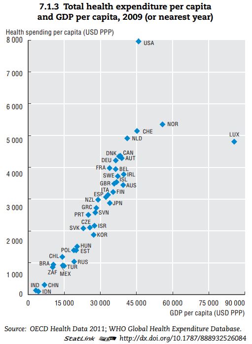
Clearly, the US is an outlier. But, don't let that distract from the main message of the graph. Richer countries spend more on health care. It is almost a perfectly linear trend except for the US and Luxembourg.
So, let's do a little thought experiment. In real terms, per-capital GDP in the US in 1960 was around $15,000, whereas today it is around $45,000. Look at the graph above, Countries that make around $15,000 in per-capita GDP spend about $1,000/person/year on heath care. Countries that make around $45,000 in per-capita GDP spend about $5,000/person/year on heath care. Extrapolating from these data would suggest that we're spending $4,000 more per person on medical care in the US today than we did in the 1960s simply because we're richer today than in 1960.
If I take 2012 cross-sectional WHO data (173 countries) from here and here, I find the following relationship from a simple linear regression: (spending on medical care as a % of GDP) = 6.47 + 0.033*(GDP per capita in thousands of $). P-values for both coefficients are well below 0.01. As previously stated, US GDP per capita has gone up by about $30,000 since 1960. This means, we would expect the % of our GDP spent on health care to be 30*0.033=0.99 percentage points higher simply as result of income changes.
One final thought experiment. We are a lot older today than in the 1960s. For example, 35.9% of the population was under the age of 18 in 1960. Today that figure is only 24%. Older people spend more on health care than younger people. Thus, we'd expect more spending on medical care today than in 1960 because we have more older people today.
Thus, I thought I'd do a crude-age adjusted calculation of medical spending as a % of GDP.
I pulled data on per-capita spending by age category from the Centers for Medicare and Medicaid Services, Office of the Actuary, National Health Statistics Group and data from the Census Bureau on distribution of age in 2010 and 1960.
Here is the data and my calculations.
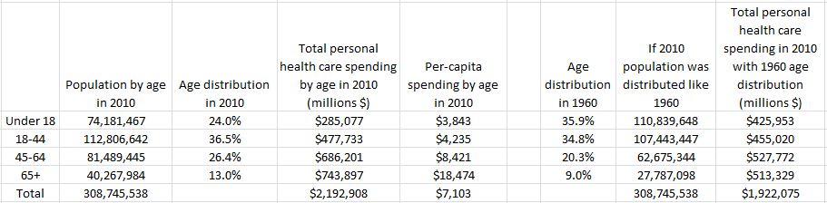
The last two columns construct a counter-factual. The second to last column multiplies the 1960 age distribution by the total population in 2010; it imagines a world as populated as our current one but with ages distributed like 1960. The last column calculates expected spending on health care with this 1960 age distribution by multiplying per-capita spending by the counter-factual age distribution.
The data suggest we actually spent $2,192 billion on medical spending in 2010. However, if our nation had been younger, like it was in 1960, we would have only spent $1,922 billion. Thus, we're spending 14% more in total on health care in 2010 than in 1960 because we are today an older population (of course we're also spending more because there are more of us). If I express these figures as a percentage of 2010 US GDP, I find that current medical spending (as determined from this particular set of data) is 14.7% of GDP. However, if we had the 1960 age distribution, medical spending would only be 12.8% of 2010 GDP.
In summary, increasing medical expenditures might indeed be a cause for alarm. But, that rise is also partially explained by the fact that we are today richer and living longer. I'd say that's a good thing.