- This NYT article by Stephanie Strom discusses an interesting fault line in the organic movement: whether hydroponic crops (which are not grown in soil) can be called organic.
- A couple days ago, the USDA Economic Research Service put out this "chart of of note" showing trends in private and public spending on agricultural research. As the chart shows, public spending has been falling, although private spending has increased.
- The USDA-AMS has started putting out what appears to be a relatively new monthly report on production and prices of cage free and organic eggs.
- The Journal of Economic Psychology has released a special issue I co-edited with Marco Perugini on food consumption behavior. There are 11 articles on a whole host of interesting topics from organic, food labeling, school lunches, nutrition, "fairness", food security, and more.
- More controversy over chicken pricing, this time from the Washington Post. I spoke to some industry folks about this a few days ago, and one thing they highlighted is that the type of chicken priced by the Georgia Dock is quite different (higher quality - contracted in advance) than what is being priced by other indices like the Uner-Barry (chicken parts - in spot markets). Thus, a lot is being made of an apples-to-oranges comparison (even if the apple price report is flawed).
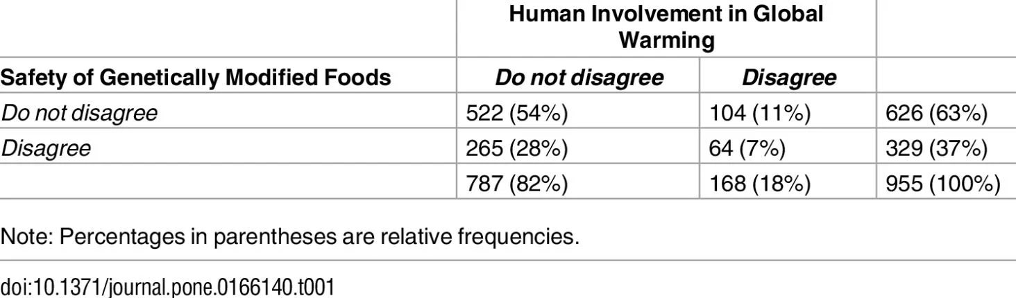
- One of my former students, Brandon McFadden, has a new article in PloS ONE looking at the factors that drive a wedge between public and scientific option about climate change and genetically engineered food. He's got some cool graphs showing people's joint beliefs about climate change and genetically engineered foods, and he explores how those beliefs are affected by cognitive ability, illusionary correlations, objective knowledge, and political party affiliation.
Blog
Food Demand Survey (FooDS) - November 2016
The November 2016 edition of the Food Demand Survey (FooDS) is now out.
The regular tracking portion of the survey suggest lower food demand overall. For example, willingness-to-pay for all meat products fell by at least 8%, and reported spending on food at home and away from home fell by 5.7% and 10.5%, respectively. Some of the WTP declines may be due to post-election uncertainty (the surveys were completed on November 10 and 11). In addition, reported consumer awareness of all 18 issues we track fell in November relative to October as did reported concern for the same set of 18 issues.
Three sets of new ad hoc questions were added this month.
The first question came about as a result of discussion with my OSU colleagues Damona Doye and Dave Lalman who have been exploring some alternative cattle production systems. At issue is what the new systems should be called. Thus, participants were asked: “Imagine shopping at your local grocery store for ground beef. What is the most you would be willing to pay ($/lb) for a package of ground beef that had the following labels? (Note: The current average price of ground beef in the U.S. is around $3.66/lb)”

Participants stated they would be willing to pay the most for ground beef labeled as “grass fed” at an average WTP of $4.26/lb followed by ground beef labeled “organic” at an average WTP of $4. 24/lb. Semi-free range was valued more than semi-confinement ($3.78 vs. $3.28). Participants stated they would pay the least amount for unlabeled ground beef at an average price of $2.92/lb. The sampling error for each WTP value is about +/- $0.15/lb with 95% confidence (thus, if two means are $0.30/lb apart or more, they are statistically different).
Next, participants were asked: “Farmers rely on fertilizers to promote plant growth and grow more food. How desirable or undesirable would you consider it to eat a fruit or vegetable grown with the following fertilizers?” Individuals responded on a five-point scale: 1=very undesirable, 2=somewhat undesirable, 3=neither desirable nor undesirable, 4=somewhat desirable, or 5=very desirable.

The most common answer for each item was “neither desirable nor undesirable”, except for municipal waste where very undesirable was the most common response. On average, fertilizer created through a process that uses natural gas and nitrogen in the air (this is the so-called Haber-Bosch process also called "synthetic fertilizer" by the organic industry) was perceived as most desirable followed by animal manure. Blood meal and municipal waste were rated as the least desirable fertilizer products. The sampling error is about +/- 0.075 with 95% confidence (thus, if two means are apart by 0.15 or more, they are statistically different).
Then, to follow up on this questions, participants were asked: “Which types of fertilizer are allowed in organic agriculture?” Participants could select all that applied.

Over half of the participants (correctly) believed that the use of animal manure as a fertilizer was allowed in organic agriculture. About 38% of respondents (incorrectly) believed fertilizer created through a process that uses natural gas and nitrogen air was an allowed fertilizer in organic agriculture. Only 13% of participants thought that municipal waste was an allowed fertilizer in organic agriculture (see here for a discussion of allowable fertilizers in organic). The sampling error is about +/- 3% with 95% confidence.
A couple comments. First, it is curious that the fertilizer most respondents thought was allowable in organic (manure) only only believed to be allowable by about 50%. It raises the question: how do respondents think organic producers fertilize their crops? Perhaps I should have allowed that as a response option (e.g., something like "no added fertilizers are allowed in organic production"). Second, comparing the two graphs above, it is curious that the most desirable type of fertilizer (created via Haber-Bosch) is disallowed in organic agriculture - a fact that roughly 61% of respondents appear to recognize.
Country of Origin Labeling and Cattle Prices
Last week, I traveled quite a bit - from Georgia to Montana and back to Oklahoma. In all three locations, I heard a claim that I hadn't yet heard before. Namely that the low cattle prices we are now observing is a result of the repeal of mandatory country of origin labeling (MCOOL) for meat around the first of this year (note: the repeal came about a result of a series of World Trade Organization rulings against the U.S. policy).
I have to admit to being skeptical of the claim. Agricultural economists have been researching this issue for quite some time (e.g., I have a paper on the topic with John Anderson published more than a decade ago back in 2004). By and large the conclusion from this body of research is that MCOOL has had detrimental effects on beef producers and consumers (e.g., see this recent report prepared for the USDA chief economist by Tonsor, Schroeder, and Parcell). It is true that some consumer research (including my own) reveals consumer interest in the topic and willingness-to-pay premiums for U.S. beef over Canadian or Mexican beef in surveys and experiments; however, most consumers were unaware MCOOL was even in place, and research using actual market data hasn't been able to identify any shifts in retail demand as a result of the policy (a summary of this research is in the aforementioned report).
So, let's put my initial skepticism to the side and look at the data. Here is a graph of fed steer prices (blue line) and number of fed steers marketed (red line) over the past several years (these are USDA data from the LMIC and represent the 5-market weekly weighted average including all grades).

The solid black vertical line indicates the point where MCOOL stopped being enforced by the USDA (just prior to January 1, 2016). Looking at cattle prices, one can see how the claim that the repeal of MCOOL caused a drop in cattle prices came about, as the repeal came right after the peak of fed steer prices, after which prices began to fall rather dramatically.
But, is this just a coincidence? Correlation is not always causation.
The red line in the graph shows the number of steers marketed (I plotted the 6 week moving average to smooth out some of the "jumpiness" in the line). There is a strong inverse correlation between the number of fed steers marketed and the price of fed steers. When more cattle are brought to market, prices fall and vice versa. The correlation coefficient is -0.78 over this time period (January 2, 2000 to early November 2016).
What started happening at almost the exact same time MCOOL was repealed? Producers started marketing more cattle. Here's the thing: one can't create a fed steer overnight. The production decisions that led to the increase in fed steers around January 1, 2016 would have had to have been made around two years before. Were producers so prescient that they could anticipate the exact time of the repeal of MCOOL two years prior? Or, rather, was this a "natural" part of the cattle cycle?
As the above graph shows, producers started having many fewer cattle to sell beginning in '08 on into 2012 for a variety of reasons such as drought and high feed prices. These lower cattle numbers led to higher prices, which in turn eventually incentivized producers to retain heifers and add more supply to reap the benefits of higher prices. When did all those extra cattle start hitting the market? It turns out (largely by chance) that it was the same time MCOOL was repealed.
Let's go one step further. Because the supply of fed cattle is relatively fixed in the short run (as production decisions have to be made many months prior), we can use the above data to get a very crude estimate of the demand for fed cattle. Using just the data shown in the above graph, I find that 81% of the variation in (log) live steer prices is explained by changes in the (log) quantity of steers marketed. Estimates suggest that a 1% increase in the (six month moving average of the) number of steers marketed is associated with a 0.5% decline in live steer prices.
Since the 1st of the year there has been a roughly 120% increase in the number of steers marketed (from an average of around 14,600 head/week just prior to the first of the year to an average of around 32,500 head today), and our simple demand model would suggest that this would lead to a 120*0.5=60% decline in cattle prices. Yet, cattle prices have "only" declined about 25% (from around $133/cwt at the first of the year to around $100/cwt now). So what? Well, if MCOOL was the cause of the reduction in cattle prices, we would have expected an even larger fall in cattle prices than our simple demand model predicted, but instead, we're actually seeing a smaller fall than expected.
Now, let's address one possible criticism of the above discussion. What if the rise in fed steers marketed in the graph above is because of cattle flowing into the US from Canada and Mexico once MCOOL was repealed? Here is data on imports of cattle from Canada to the US (again from LMIC).

There was a fall and then a larger uptick in the number of cattle imported from Canada to the US right after MCOOL, but nothing out of the ordinary from the typical fluctuations in the three years prior. For example, the "spike" in total imports (slaughter cows + fed cattle + feeder cattle) around May of 2016 is at least 5,000 head smaller than the five previous spikes that occurred when MCOOL was in place.
Even if I take the roughly 5,000 extra imports of fed cattle that came in from Canada after MCOOL from January 1, 2016 to the middle of May, and assumed even than 75% were steers, this would represent only 13% of the number of steers in the 5-market dataset sold to packers. At most, this would cause a 13*0.5 = 6.5% decline in U.S. fed cattle prices according to my simple demand model. This is nowhere near the 25% decline actually observed since the 1st of the year. Moreover, look at what happened to cattle imports during this summer. They fell. They fell at a time when U.S. cattle prices were falling. So, it can't be that extra Canadian imports were the cause of falling U.S. prices during mid summer.
In summary: while it is conceptually possible that the repeal of MCOOL could adversely affect U.S. cattle prices, any actual effect appears to be quite small (if there is any effect at all). The fact that cattle prices fell immediately after the repeal of MCOOL appears to be a coincidence. The falling prices seem more to do with "normal" changes in supply resulting from the cattle cycle than anything to do with MCOOL.
Food and Ag Related Election Results
Donald Trumps surprising electoral win is likely to dominate the headlines for weeks. But, across the nation there were a variety of less-well-publicized votes on issues related to food and agriculture. Here are a few of those results.
Massachusetts Ballot Question 3 appears to have passed with a whopping 78% of the vote. This state ballot initiative bans farmers from producing eggs from hens in so-called battery cage systems and it bars grocery stores from selling eggs from such systems. Here are results from my research papers on the effects of this type of regulation in California.
Oklahoma State Question 777 appears to have failed garnering only about 40% of the vote. This was a so-called "right to farm" amendment to the state constitution (details here). Also in Oklahoma, state question 792 passed, allowing (among other things) grocery stores to sell wine and liquor stores to sell cold beer.
Soda taxes appear to have passed in San Francisco and Oakland with roughly 60% of the vote and also appears to have passed in Boulder, CO with about 55% voting in favor. These cities now join Berkeley, Chicago, and Philadelphia in instituting soda taxes on the premise that they will fight obesity.
Marijuana legalization was on the ballot in several states, While perhaps not considered an agricultural issue, somebody has to grow the stuff! A majority of California, Nevada, and Massachusetts citizens voted in favor of legalizing recreational marijuana use, but the issue failed to garner majority support in Arizona.
Chicken Price Manipulation?
This article in the New York Times by Stephanie Strom argues that something may be fishy with chicken prices.
The main focus of the article is about a widely used price index of chicken prices (the so-called Georgia Dock index) that is used by some retailers to negotiate prices with poultry producers. Apparently the Georgia Dock price of chicken is higher than a couple of other price indices of wholesale chicken prices (one of which the USDA just created), and the Georgia Dock price hasn't fallen by as much as another index in recent months. The article insinuates that something nefarious could be going on to artificially inflate the Georgia Dock price (and by extension the retail prices you and I pay for chicken).
I have no deep insights into the allegations in the article. However, I do want to push back just a bit on the broader issue of chicken prices relative to beef and pork. Here is Strom:
“Beef prices at grocery stores are lower. So, too, are pork prices. But chicken? Steady as she goes.
A glut of corn and soybeans has led to lower prices for a variety of meats. But chicken in grocery stores has bucked the trend, leaving prices up for shoppers and buoying the fortunes of major chicken producers.”
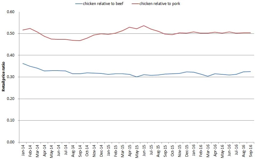
I'm not so sure about that first line - that beef and pork have become cheaper relative to chicken. Using data from the USDA-ERS on retail meat prices, I constructed the following graph showing the retail price of chicken relative to the retail prices of beef and pork. Unfortunately, the last data point is September (the USDA bases it's calculations on retail prices reported by Bureau of Labor Statistics, but BLS hasn't released October prices yet), so it is possible that there have been some changes in recent weeks that aren't reflected in the graph below (but, even still, one might wonder why it's just now in the past month or two that the poultry producers figured out how to rig the wholesale price).
Two broad points:
1) As of September, the ratio of chicken to pork prices is essentially flat (i.e., chicken isn't getting more expensive relative to pork). While chicken is a tad more expensive than beef in August and September relative to July, overall the trend looks pretty flat to me.
2) Chicken is really cheap! It is about half the price of pork and about a third the price of beef.
Moreover, if we take a step back and take the long view, chicken has progressively gotten cheaper relative to beef. (note: the graph below uses the price for a whole chicken rather than composite retail prices as in the prior graph because the whole chicken data series goes back further in time). Whereas whole chickens sold about 40% the price of beef in the 1970's, today they're about 25% the price of beef.

So, are poultry producers manipulating a price index leading us to pay more than we otherwise would have paid for chicken? I don't know. But, as the above graph shows, there's a whole lot of other things poultry producers have done over time (better genetics, better feed, better housing, etc.) to make chicken ever more affordably priced compared to other proteins.