Blog

TASTE TRUMPS HEALTH AND SAFETY: INCORPORATING CONSUMER PERCEPTIONS INTO A DISCRETE CHOICE EXPERIMENT FOR MEAT

That is the title of a paper I just published with Trey Malone in the Journal of Agricultural and Applied Economics.  

Here are some of the key results:

Our participants also indicate that they perceive chicken breast to be the healthiest option in our sample. Both beef products would generate substantial changes in WTP by increasing their perceived healthiness to that of chicken. For example, if hamburger had the same average health perceptions as chicken breast, WTP for hamburger would increase by $0.69. Deli ham, however, would experience an $0.83 increase in WTP if consumers were to believe it was as healthy as chicken breast. Even chicken wings would experience a $0.52 increase in WTP through a perception change.

and

The nonmeat options are actually perceived as safer than the meat options. As such, if the average participant perceived hamburger to be as safe as beans and rice,WTP would increase $0.34. Of all products, deli ham would benefit the most by an increase in perceived safety to the level of beans and rice. In fact, our sample indicates that pork products are not very highly appreciated. As noted, deli ham is perceived to be the worst tasting, least healthy, and least safe alternative in the choice set. Those negative perceptions are costly. If participants were to perceive deli ham as equal to chicken breast in taste and health, and equal to the perceived
safety of beans and rice, WTP for deli ham would increase by more than $2.

You can read the whole thing here.

Where do people eat the most meat?

It seems a fairly simple question: In which U.S. states do people eat the most meat?  Yet, there is surprisingly little good, publicly available data on this question.  Yes, there are fun maps like this one at Slate, but they are far from scientific or data driven.  

I thought I'd try to partially fill this void by turning to data from my Food Demand Survey (FooDS) that has been running now for almost four years.  Because I've surveyed over 1,000 people in the U.S. for about 44 months, that means I have responses from over 44,000 people spread all across the country that I can use to help look for geographic differences.  

In FooDS, each person is told "Imagine you are at the grocery store buying the ingredients to prepare a meal for you or your household.  For each of the following nine questions that follow, please indicate which meal you would be most likely to buy."  Then, they are presented with nine questions that look like the one below.  The only differences across the questions are the prices assigned to each item and the order of the items.      

For sake of simplicity, I counted the number of times each person chose steak, how many times they chose chicken breast, etc.  Thus, the maximum possible "score" a person could have for each item is 9 and the lowest is 0.  To be clear, this isn't a measure of consumption, but rather it is an index of demand.  It is a measure of how much people "like" each of the choice options relative to all the other choice options.  For point of reference, across all the people in my sample, the most frequently chosen option was chicken breast (chosen on average 2.43 times out of 9) followed by ground beef/hamburger (chosen on average 1.33 times out of 9).  The least popular meat items were pork chop and ham, chosen on average 0.80 and 0.68 times, respectively, out of 9.

I won't go into all the hairy details here (email if you want to know more), but I then estimated some statistical models to infer how often, on average, consumers in each state chose each of the meat options.  Then, I calculated how different (in percentage terms) each state was from the mean number of choices, and I created maps.

I'll start with one that has a very obvious regional pattern: chicken wings.

Chicken Wing Demand by State

Chicken Wing Demand by State

Demand for chicken wings is highest in the southeast US, where people chose this option 15% to 44% more often than in the average person in the US.  Consumers in western states like Oregon, Idaho, and Arizona chose wings 15% to 27% less often than the average consumer nationwide.

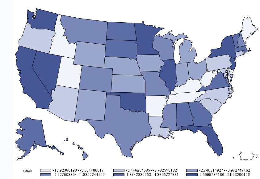
For other products, there is less of a regional pattern.  Below is the map for beef steak.  Demand for steak is highest in California, Nevada, Washington, Oklahoma, Minnesota, Illinois, Florida, and New York.  Steak demand is lowest in Idaho, Utah, Missouri,  and the Appalachian regions, Tennessee, Kentucky, and West Virginia.

Beef Steak Demand by State

Beef Steak Demand by State

While we are on beef, here is the map for hamburger/ground beef.  For ground beef, demand is generally highest in the upper midwest and is lower on the coasts.

Demand for Ground Beef by State

Demand for Ground Beef by State

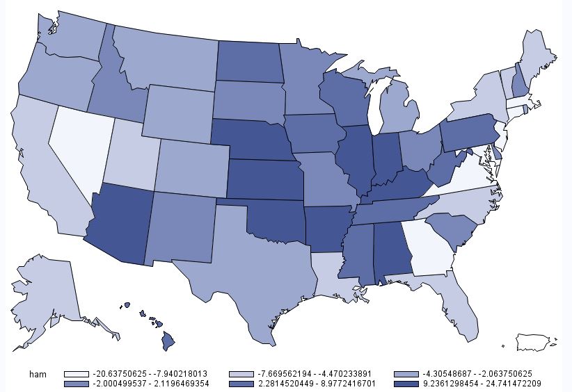
A somewhat similar pattern emerges for deli ham (shown below), although the location of heaviest demand moves a bit south and east relative to that for hamburger.  

Deli Ham Demand by State

Deli Ham Demand by State

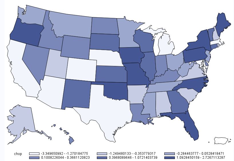
Below is the map for pork chops.  This map is interesting in the sense that there are several instances where some of the highest demand states are situated adjacent to some of the lowest demand states (e.g., Oregon next to California; Oklahoma next to Texas; etc.)  However, one thing to note in the case of pork chops is the scaling: there isn't much difference across any of the states.  Consumers in Missouri have the highest pork chop demand, but only chose pork chops 2.7% more than the average consumer.  Consumers in California have the lowest pork chop demand, but only chose pork chops 3.3% less than the average consumer nationwide.  

Pork Chop Demand by State

Pork Chop Demand by State

The last individual meat product is chicken breast.  As shown in the map below, chicken breast demand is generally highest in the west and the northeast.  I'm not at all surprised to learn that chicken breast demand is near the lowest in my home state of Oklahoma (at -4.5%), trailing only North Carolina, Missouri, and Mississippi.  

Chicken Breast Demand by State

Chicken Breast Demand by State

Finally, to round things out, here is a map associated with overall meat demand.  This figure was calculated by determining how many times a person chose any of the six aforementioned meat products (recall there were nine total options, three of which were non-meat).  On average people chose a meat option 7.03 times out of 9 total choices.  However, as the map below shows, there is some heterogeneity across states.  Overall meat demand is highest in the Midwest: consumers in Illinois, Indiana, and Iowa chose any meat option 1%+ more often than the average consumer.  Lowest overall meat demand was in places like California, Arizona, Maryland, Utah, New Jersey, and Massachusetts, where consumers chose a meat options at least 1% less often than the average consumer.  

Overall Meat Demand by State

Overall Meat Demand by State

The Future of Meat

If you haven't yet heard of the Breakthrough Institute, it is time you did.  They're bringing a fresh approach to thinking about environmental and food issues - one that isn't anti-technology, anti-growth, or anti-markets, and that is focused on improving the lives of the poor among us.  

The Breakthrough Institute is in the midst of releasing a series of articles on the future of food.  The latest article in their series is one on the future of meat by Marian Swain.  After discussing some of the environmental challenges with meat production, Swain is able to see through all the popular prognostications to get to the heart of the problem:

conversations about mitigating this impact have focused on two strategies: convincing people to eat lower on the food chain and shifting meat production toward more extensive systems. But a growing body of evidence suggests that the former may not prove particularly practical, while the latter may not always bring about better environmental outcomes, particularly at global scales.

Advocates of "convincing people to eat less meat" are right in one sense.  Eating meat isn't necessary.  Many people can live a perfectly healthy life without needing to eat meat.  We also don't need to drive cars, use electric light bulbs, type on our laptops, or have children.  But, we are immensely better off having these things in our lives.  The trick is to consume the things we want while trying to be responsible about it.  Swain, however, turns the table on perceptions of "responsible" by noting that intensive forms of production often come at a lower environmental cost than the extensive forms (e.g., free range, grass fed, etc.) so often favored by environmentalists.   

Swain documents the trends in consumption of meat products in different parts of the world over time.  When thinking about environmental outcomes, however, it is useful to focus on the number of animals rather than just the number of pounds or kilograms consumed.  The reason is that environmental impacts are more correlated with numbers of animals than numbers of pounds, and when it comes to animal welfare, animal well-being is experienced one brain at a time.  

As the graph below shows, we now have many fewer cows in the U.S. than we once did (for a broader discussion, see this article I wrote for the journal Animal Frontiers) 

The figure reports the ratio of the total beef production in a given year to the inventory of all cows and heifers (2 yr old and older) for the same year. The change is dramatic.  For each cow and heifer in the US, in 2012 an additional 217 lbs of beef was produced as compared with 1970 (a 50% increase). Meanwhile, the number of cows per capita has fallen by about 47%. Remarkably, 4.4 billion more pounds of beef were produced in 2012 than in 1970 despite the fact that there are now 9.5 million fewer cows and heifers. In a New York Times article, I pointed out that we would need 15.3 million more cows (not counting the additional heifers, stockers, and feedlot cattle) to produce the amount of beef Americans actually ate in 2015 if we were instead using 1950s technology.  For dairy, we'd need another 30 million cows to produce the amount of dairy products we enjoyed in 2015 if we were instead getting only 1950s yields.  The dramatic increase in productivity, brought about by changes in genetics, management, and other technologies, has given us more of want we want (meat and dairy) with fewer resource-using, methane emitting animals.  

One of the concerns in all this is the impact on animal welfare.  Yet, the tradeoffs are difficult.  Beef cattle have higher land requirements, lower feed efficiency, and higher carbon-equivalent emissions than pork and poultry.  Yet, a good case could be made that animal well-being is higher for beef cattle than for pork and poultry.  (And "no" it isn't the case that animal welfare is uniformly better or worse at small vs. large farms).  A key challenge for the future is in identifying how to realize the gains in efficiency and reductions resource use brought about by intensification without unduly sacrificing animal welfare or the price consumers pay for food.  As I discussed in my latest book, Unnaturally Delicious, there are innovate housing systems and creative markets that are attempting achieve these compromises.

Swain mentions another solution - lab grown meat.  As I discussed in Unnaturally Delicious, I'm a fan of this bovine-in-a-beaker approach.  But, it isn't a free lunch.  Lab-grown cell have to eat something.  And they produce waste.  The high costs of producing lab grown meat suggest the process currently uses many more resources than old-fashioned animals, but advances in technology may one day reverse that equation.  Whether people actually want to eat a lab grown burger is a different story and my surveys suggest the new burgers will face an uphill battle in terms of consumer acceptance.  Time will tell.

Regardless of whether we get meat from a lab, from a cow, or from a chicken, it is important to recognize science and technology as a path to improve environmental outcomes and animal welfare.  As I put in in a Wall Street Journal editorial on the subject:

Let us also not gloss over what is beef’s most obvious benefit: Livestock take inedible grasses and untasty grains and convert them into a protein-packed food most humans love to eat. We may be able to reduce our impact on the environment by eating less meat, but we can also do the same by using science to make livestock more productive and environmentally friendly.

Country of Origin Labeling and Cattle Prices

Last week, I traveled quite a bit - from Georgia to Montana and back to Oklahoma.  In all three locations, I heard a claim that I hadn't yet heard before.  Namely that the low cattle prices we are now observing is a result of the repeal of mandatory country of origin labeling (MCOOL) for meat around the first of this year (note: the repeal came about a result of a series of World Trade Organization rulings against the U.S. policy).

I have to admit to being skeptical of the claim.  Agricultural economists have been researching this issue for quite some time (e.g., I have a paper on the topic with John Anderson published more than a decade ago back in 2004).  By and large the conclusion from this body of research is that MCOOL has had detrimental effects on beef producers and consumers (e.g., see this recent report prepared for the USDA chief economist by Tonsor, Schroeder, and Parcell).  It is true that some consumer research (including my own) reveals consumer interest in the topic and willingness-to-pay premiums for U.S. beef over Canadian or Mexican beef in surveys and experiments; however, most consumers were unaware MCOOL was even in place, and research using actual market data hasn't been able to identify any shifts in retail demand as a result of the policy (a summary of this research is in the aforementioned report).

So, let's put my initial skepticism to the side and look at the data.  Here is a graph of fed steer prices (blue line) and number of fed steers marketed (red line) over the past several years (these are USDA data from the LMIC and represent the 5-market weekly weighted average including all grades).   

The solid black vertical line indicates the point where MCOOL stopped being enforced by the USDA (just prior to January 1, 2016).  Looking at cattle prices, one can see how the claim that the repeal of MCOOL caused a drop in cattle prices came about, as the repeal came right after the peak of fed steer prices, after which prices began to fall rather dramatically.  

But, is this just a coincidence?  Correlation is not always causation.  

The red line in the graph shows the number of steers marketed (I plotted the 6 week moving average to smooth out some of the "jumpiness" in the line).  There is a strong inverse correlation between the number of fed steers marketed and the price of fed steers.  When more cattle are brought to market, prices fall and vice versa.  The correlation coefficient is -0.78 over this time period (January 2, 2000 to early November 2016).  

What started happening at almost the exact same time MCOOL was repealed?  Producers started marketing more cattle.  Here's the thing: one can't create a fed steer overnight.  The production decisions that led to the increase in fed steers around January 1, 2016 would have had to have been made around two years before.  Were producers so prescient that they could anticipate the exact time of the repeal of MCOOL two years prior?  Or, rather, was this a "natural" part of the cattle cycle?  

As the above graph shows, producers started having many fewer cattle to sell beginning in '08 on into 2012 for a variety of reasons such as drought and high feed prices.  These lower cattle numbers led to higher prices, which in turn eventually incentivized producers to retain heifers and add more supply to reap the benefits of higher prices.  When did all those extra cattle start hitting the market?  It turns out (largely by chance) that it was the same time MCOOL was repealed.  

Let's go one step further.  Because the supply of fed cattle is relatively fixed in the short run (as production decisions have to be made many months prior), we can use the above data to get a very crude estimate of the demand for fed cattle.  Using just the data shown in the above graph, I find that 81% of the variation in (log) live steer prices is explained by changes in the (log) quantity of steers marketed.  Estimates suggest that a 1% increase in the (six month moving average of the) number of steers marketed is associated with a 0.5% decline in live steer prices.  

Since the 1st of the year there has been a roughly 120% increase in the number of steers marketed (from an average of around 14,600 head/week just prior to the first of the year to an average of around 32,500 head today), and our simple demand model would suggest that this would lead to a 120*0.5=60% decline in cattle prices.  Yet, cattle prices have "only" declined about 25% (from around $133/cwt at the first of the year to around $100/cwt now).  So what?  Well, if MCOOL was the cause of the reduction in cattle prices, we would have expected an even larger fall in cattle prices than our simple demand model predicted, but instead, we're actually seeing a smaller fall than expected.  

Now, let's address one possible criticism of the above discussion.  What if the rise in fed steers marketed in the graph above is because of cattle flowing into the US from Canada and Mexico once MCOOL was repealed?  Here is data on imports of cattle from Canada to the US (again from LMIC).

There was a fall and then a larger uptick in the number of cattle imported from Canada to the US right after MCOOL, but nothing out of the ordinary from the typical fluctuations in the three years prior.  For example, the "spike" in total imports (slaughter cows + fed cattle + feeder cattle) around May of 2016 is at least 5,000 head smaller than the five previous spikes that occurred when MCOOL was in place.   

Even if I take the roughly 5,000 extra imports of fed cattle that came in from Canada after MCOOL from January 1, 2016 to the middle of May, and assumed even than 75% were steers, this would represent only 13% of the number of steers in the 5-market dataset sold to packers.  At most, this would cause a 13*0.5 = 6.5% decline in U.S. fed cattle prices according to my simple demand model.  This is nowhere near the 25% decline actually observed since the 1st of the year.  Moreover, look at what happened to cattle imports during this summer.  They fell.  They fell at a time when U.S. cattle prices were falling.  So, it can't be that extra Canadian imports were the cause of falling U.S. prices during mid summer.

In summary: while it is conceptually possible that the repeal of MCOOL could adversely affect U.S. cattle prices, any actual effect appears to be quite small (if there is any effect at all).  The fact that cattle prices fell immediately after the repeal of MCOOL appears to be a coincidence.  The falling prices seem more to do with "normal" changes in supply resulting from the cattle cycle than anything to do with MCOOL.  

Chicken Price Manipulation?

This article in the New York Times by Stephanie Strom argues that something may be fishy with chicken prices.  

The main focus of the article is about a widely used price index of chicken prices (the so-called Georgia Dock index) that is used by some retailers to negotiate prices with poultry producers.  Apparently the Georgia Dock price of chicken is higher than a couple of other price indices of wholesale chicken prices (one of which the USDA just created), and the Georgia Dock price hasn't fallen by as much as another index in recent months.  The article insinuates that something nefarious could be going on to artificially inflate the Georgia Dock price (and by extension the retail prices you and I pay for chicken).  

I have no deep insights into the allegations in the article.  However, I do want to push back just a bit on the broader issue of chicken prices relative to beef and pork.  Here is Strom: 

Beef prices at grocery stores are lower. So, too, are pork prices. But chicken? Steady as she goes.

A glut of corn and soybeans has led to lower prices for a variety of meats. But chicken in grocery stores has bucked the trend, leaving prices up for shoppers and buoying the fortunes of major chicken producers.

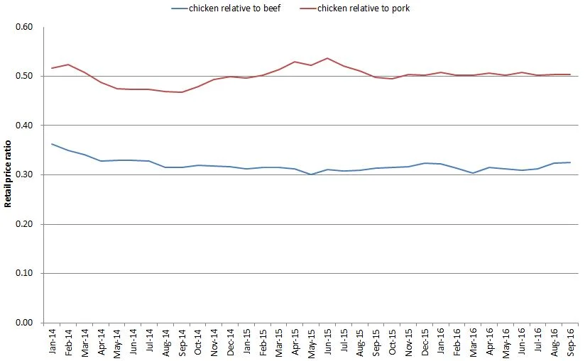
I'm not so sure about that first line - that beef and pork have become cheaper relative to chicken. Using data from the USDA-ERS on retail meat prices, I constructed the following graph showing the retail price of chicken relative to the retail prices of beef and pork.  Unfortunately, the last data point is September (the USDA bases it's calculations on retail prices reported by Bureau of Labor Statistics, but BLS hasn't released October prices yet), so it is possible that there have been some changes in recent weeks that aren't reflected in the graph below (but, even still, one might wonder why it's just now in the past month or two that the poultry producers figured out how to rig the wholesale price).  

Two broad points: 

1) As of September, the ratio of chicken to pork prices is essentially flat (i.e., chicken isn't getting more expensive relative to pork).  While chicken is a tad more expensive than beef in August and September relative to July, overall the trend looks pretty flat to me.  

2) Chicken is really cheap!  It is about half the price of pork and about a third the price of beef.

Moreover, if we take a step back and take the long view, chicken has progressively gotten cheaper relative to beef.  (note: the graph below uses the price for a whole chicken rather than composite retail prices as in the prior graph because the whole chicken data series goes back further in time).  Whereas whole chickens sold about 40% the price of beef in the 1970's, today they're about 25% the price of beef.

So, are poultry producers manipulating a price index leading us to pay more than we otherwise would have paid for chicken?  I don't know.  But, as the above graph shows, there's a whole lot of other things poultry producers have done over time (better genetics, better feed, better housing, etc.) to make chicken ever more affordably priced compared to other proteins.