Blog

GMO labeling: Text vs. QR codes

Taken together, these results indicate that respondents were willing to pay a premium for food products with labels that communicate the absence of GM [genetically modified] material relative to GM labels. Furthermore, there was a premium associated with a QR code compared to text communicating the presence of GM. Thus, respondents reacted more negatively to text that communicates the presence of GM relative to a QR code that must be scanned. We should note that we do not know if respondents scanned the QR codes, but it seems unlikely that all respondents did, given the premium associated with the QR code. While this may seem strange, we chose to use an experimental design similar to the purchasing environment for consumers after the establishment of the NBFDS. Finally, comparing these results for the two products reveals that consumers are more sensitive to GM whole foods than GM manufactured foods.

That's from a new paper I co-authored with Brandon Mcfadden, which was just released by the journal Applied Economic Perspectives and Policy.  The work was motivated by the National Bioengineered Food Disclosure Standard (NBFDS), which was signed into law in last summer and has yet to be implemented.  Under the current wording of the NBFDS, companies may disclose the presence of GMO material by text, symbol, or an electronic digital link like a Quick Response (QR) code. 

To investigate how consumers might respond to these new "contains GMO" labels compared to existing labels indicating absence of GMOs (organic and non-GMO project verified), we conducted a survey of over 1,100 US food consumers.  We asked people how much they were willing to pay for whole and processed foods, and we randomly assigned people to different treatments where the food labels systematically varied.  Here is how willingness-to-pay (WTP) premiums varied for different labels placed on granola bars (the full text has a similar figure for apples).

gmo2.JPG

Aside from treatment 5 (which seems something of an aberration), WTP premiums for organic or non-GMO are higher when GMOs are disclosed via text vs. QR code.  Also note that combined organic and non-GMO labels aren't much different than when either label is used in isolation (I blogged on this result last week).  

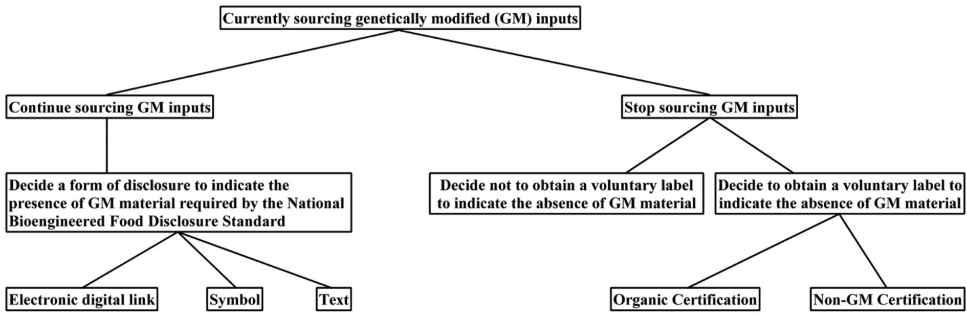
Given that mandatory GMO labels are coming, food companies will need to decide how to respond.  Below is a flow chart Brandon put together describingthe options available to food companies who are currently sourcing GMO ingredients.  Hopefully these research results will be useful in deciding which decisions to make.

gmo1.JPG

Are Organic and Non-GMO Labels Substitutes or Complements?

For the first time today, I saw the following label on a packaged food.

organicisnongmo.JPG

In a way, the label seems a little odd.  An organic seal on a product should already convey to consumers that the ingredients came from a process that excluded GMOs.  However, the very presence of the label suggests many consumers may not be aware of this fact.  

I have a paper with Brandon McFadden forthcoming in journal Applied Economic Perspectives and Policy (sorry, I don't yet have a link to the paper on the AEPP's website; I'll pass it along when I get the link and discuss the whole paper in more detail).  In the paper we delve into this issue and others.  Here's part of the motivation.  

It appears that organic organizations are concerned that consumers perceive non-GM and organic labels to be substitutes. Although many organic food companies supported the general idea of mandatory labeling, now that the policy has passed, organic producers have expressed concern that non-GM verification may be perceived as a substitute for the more expensive and encompassing organic certification. For examples, California Certified Organic Farmers (CCOF) initiated a campaign “Organic is Non-GMO and More” to highlight the differences in the two claims, and the Organic Trade Association (OTA) emphasizes, “Organic = Non-GMO…and so much more!!” Despite these concerns, little is known about the extent to which the two most common non-GM labels, USDA Organic and Non-GMO Project, are demand substitutes or complements. Whether the labels are demand substitutes or complements can be determined, in our context, by investigating whether WTP [willingness-to-pay] is supra- or sub-additive when the labels are combined. If the premium for displaying both labels is less than the sum of individual premiums for each label, then the two labels must be providing some of the same underlying characteristics of value to the consumer and implies the two labels are substitutes. By contrast, if the premium for displaying both labels is greater than the sum of individual premiums, then the two labels are complements and provide more value when provided together.

We ultimately find that products with the organic seal and products with the non-GMO verified seal are indeed demand substitutes.  Here's one paragraph related to those results:

For apples, the results revealed large and statistically significant substitution effects for Non-GMO and USDA Organic labels. In fact, results indicated that the two are almost perfect substitutes as WTP [willingness-to-pay] premiums for apples with both Non-GMO and USDA Organic labels roughly the same as WTP premiums for apples that display only one label. This result is made obvious by the third column of results. The WTP premium for apples with the Non-GMO label only (vs text label) is $0.446, the WTP premium for apples with the organic label only (vs text label) was $0.474, and the WTP premium for apples with both Non-GMO and USDA Organic labels was $0.446+$0.447-$0.461=$0.432, which is actually lower than when either label is present in isolation.

Because it is more costly to be organic than non-GMO (since the latter is a subset of the former), it is easy to see why many food companies would want to add the additional label that "Organic is non-GMO and more".

Food Spending by Age and Household Size

I received several emails and comments about my post a couple days ago on food spending by households with different incomes.  For example, over on twitter Adam Ozimek asked:

I'm happy to help provide additional information.  Here is total food spending by age and income.

foodspend4.JPG

As the figure shows, low income households all spend about the same on food regardless of age.  People aged 65-74 years tend to spend the least on food regardless of income until the highest income categories at which point the oldest respondents spend the least on food.  Households between the ages of 25 and 44 years tend to spend the most on food (holding constant factors such as household size, etc.)

How much of this food spending is away from home?  Here is how households allocate their food budget between away from home vs. at home by age and income.

foodspend5.JPG

Regardless of age, households with higher incomes tend to spend more of their food budget eating out than lower income households.  However, the youngest consumers tend to spend much more of their budget away from home than older consumers.  At the lowest income category, for example, people age 18-24 spend 38% of their food budget way from home whereas people age 65-74 only spend 25% of their food budget away from home. All high income households (above $160,000) allocate more than 40% of their food budget to away from home spending - the highest is by 25-34 year olds who spend 46% of their food budget away from home.  

What about household size?  It's fairly well known that there are economies of scale in household food spending (i.e., two people can eat more cheaply than one on a per-person basis).  For example, the SNAP (or food stamp) program provides up to $194/month for a one person household.  If every person was expected to spend the same, then one should give $194*2=$388 for a two person household.  But, that's not what the SNAP program does.  They only give up to $357/month for a two person household.  The program administrators didn't just decide this willy-nilly, but rather they observed in spending data (like the kind I'm using here) that spending doesn't increase 1:1 for each additional person in the household.  

In my data, for example, the estimated spending on food at home for a household of size one is $73.60/week, but the spending at home for a household of size two is far less than double ($73.60*2=$147.20) and is only $92.12/week.  The figure below shows spending on food at home and away from home for households with 1, 2, 3, and 4 members holding constant income, age, education, etc. Spending on food away from home is essentially flat.  Does that mean a four person household can eat out for the same as a two person person household?  Not necessarily.  It may mean that 4 person households are eating at McDonald's while 2 person household are eating at something a little higher end.   

foodspend6.JPG

How Food Spending Varies with Income

The question of how much money people spend on food as their income rises or falls has been a question that has long interested economists.  If food is a "normal" good, one would expect consumption (and spending) to increase as income increases.  This relationship has implications for projections of food demand and food security as incomes grow or as countries develop and become wealthier.  

However, just because people will spend more on food as their income increases, the relationship isn't necessarily proportional.  In fact, the famous Engel curve, hypothesized in the mid- 1800s, conjectured that the share of total spending allocated to food would fall as income increased.  Also of interest is how demand for "quality" and "convenience" changes as income changes, which relates to whether people spend more money on food at home vs. away from home as income increases.  

To explore these issues, I turned to data from the Food Demand Survey (FooDS), (I'm using data from the first four years of the project which includes observations from more than 48,000 respondents).  On the survey, respondents are asked how much money they spent (per week) on food at home and away from home (you can find exact wording of the questions on page 3 of this document).  I use these data to estimate mean food spending for different household income categories at home and away from home, while controlling for other factors like age, gender, education, race, region of residence, household size, presence of children in the household, and status as primary shopper or SNAP recipient.  


Here is estimated weekly food spending by annual household income.

foodspend1.JPG

Food at home, and particularly food away from home, appear to be "normal" goods - people spend more on these categories as their income grows.  Note that my estimation approach does not require a monotonic relationship (i.e., completely increasing or decreasing relationship) between income and food spending, but that's what the estimates reveal.  People in the lowest income category only spend $78/week at home and $33/week away from home on food on average (for a total of $111/week).  By contrast, people in the highest income category spend $125/week at home and $96/week away from home on food (for a total of $221/week).  These differences are not a result of differences in household size, etc. because I've already controlled for those factors.  Spending on food away from home tends to accelerate the fastest when going from $60,000-$59,999/year to $80,000-$99,000/year and then again when moving from the penultimate to the highest income category.  

Despite the fact that spending on food increases as income increases, the Engel curve suggests that spending on food as a SHARE of income should decline as income increases.  Below are the estimates from my data, which suggest exactly that.

foodspend2.JPG

Consumers with annual household incomes below $20,000/year spend 27% of their total income on food at home and 12% of their income on food away from home (for a total of 39% of income spent on food).  By contrast, people with annual household incomes above $160,000/year, only spend 3.6% of their income on food at home and 2.8% of their income on food away from home (for a total of 6.4% of income spent on food).    

Also of interest is how food spending away from as a share of total food spending varies with income.  That is, do richer households tend to eat out vs. in more than poorer households?  The following figure suggests the answer is "yes".  

foodspend3.JPG

Respondents in the lowest income categories spend about 30% of their food budget on food away from home.  By contrast, households in the highest income category spend 43% of their food budget away from home.*  

Why would higher income households spend more of their food budget away from home than lower income households?  There are a variety of fairly obvious answers. For example, if one can afford to pay others to cook and clean up for them, they will.  And, food away from home can often be more expensive, making it less attractive (or available) to lower income households.  

I'll also throw out a potentially less conventional explanation: eating away from home is more visible than eating at home.  There is some research suggesting that the size of the income elasticity of demand (i.e., how much consumption increases with income) is driven by how "visible" the consumption of the good is because of a concept known as conspicuous consumption.  That is, we buy some goods to signal to others our "status" or "social standing", and the more visible the purchase of the good is, the more prone it is to these sorts of status-competitions (which economists typical view as socially wasteful as it's a zero sum game).  If this is true, it would be interesting to know whether there are similar effects for different foods with different levels of "visibility".  


*Note: These shares are a bit lower than the aggregate food spending at home vs. away from home reported by the USDA (e.g., see table 10 at this site, which shows in 2014 that 43.7% of household spending is away from home of food expenditures; a figure that rises to 50.1% if one includes food eaten at schools and prisons and meals paid for by expense accounts, etc.) but note that I'm holding various demographic characteristics constant to compare across household incomes, whereas USDA data are simply comparing aggregate spending regardless of who spent it.

Published papers

In a testament to the slowness of academic publishing in economics, I noticed two co-authored papers were just released that we've been working and waiting on quite literally for years.  

1) The Economic Journal finally released a paper I wrote with Laurent Muller, Anne Lacroix, and  Bernard Ruffieux.  I blogged on this paper about a year and a half ago when it was first accepted. In short, we find that "fat taxes" and "thin subsidies" are a double whammy on the poor because the price policies lead to i): the poor paying higher taxes owing to the fact they tend to eat more unhealthy foods than the rich, and ii) the poor receiving fewer subsidies owing to the fact they tend to eat fewer healthy foods than the rich.  These effects were exacerbated by the finding in that the poor tended to be more habit prone than the rich, sticking more to their now relatively more expensive diets. These findings have direct implications for the food movement policy proposals I discussed last week.   

2)  In early 2010, I was working with a bright young Master's student named Rock Andre.  Rock happened to be from Haiti, and when the earthquake hit his homeland, he decided to shift his research focus.  He returned home in the aftermath of the earthquake and surveyed over 1,000 people.  Development Policy Review just published that research.  Here's part of the abstract:   

The results indicate that almost two thirds of Haitians lost a friend to the earthquake, and nearly half lost a family member. People reported spending more on food in the aftermath of the earthquake, and the level of food aid received does not appear to have any impact on food expenditures. Among different types of aid, Haitians stated being most in need of a job—something difficult for international aid agencies to supply over the long run. They also indicated that quality of life would be most improved by education. The lessons learned in Haiti may prove useful in addressing future natural disasters.