I was excited to see The Economist ran an article on my paper with Laurent Muller, Anne Lacroix, and Bernard Ruffieux, which appeared in the Economic Journal. In typical Economist fashion, they didn't mention us by name, but here's their summary of our findings:
Blog
How Food Consumption Varies in Rich and Poor Countries
The American Journal of Agricultural Economics recently released an interesting paper entitled by Kenneth Clements and Jiawei Si. Using previously unpublished data from the World Bank on consumption of 31 different food items in 150 countries, the paper has a lot of fascinating details about how food consumption differs in rich and poor countries, where find "substantial differences in per capita incomes lead to sharp, almost extreme, differences in consumption patterns." I took some of the data in their paper to construct the graphs below.
First, their data strongly support "Engel's Law" in that the share of income spent on food declines the wealthier the country. One of the poorest countries in their sample is the Central African Republic where consumers spend 64% of their income on food; in the richest countries like the U.S. and Bermuda, consumers spend less than 10% of their income on food.
The paper reviews some interesting details about how food expenditures differ across countries. For example, the figures below show how consumers' food budgets are allocated in the richest quarter of countries as compared to countries in the lowest quartile of income. I've drawn the pie charts so that they are roughly proportional to the quantity of food consumed in each country grouping. Consumers in the lowest income countries consume about 77% less food than consumers in the highest income countries. So, compared to richer consumers, poorer consumers are not only consuming a larger share of their income on food, they're eating less food.
The other thing revealed in the graphs below is that richer consumers have greater diversity in their diets than poor consumers. Just to give one example, Clements and Si estimate that consumers in richer countries spend only 3.3% of their food budget on rice and other cereals and flours (this is part of the 14% for bread, rice, and cereals in the figure below), but consumers in poorer countries spend 23.7% on rice and other cereals and flours (this is part of the 29% for bread, rice, and cereals). Thus, poorer consumers diets are more concentrated in rice and cereals and is less diversified in other foodstuffs. Of course dietary diversity is a key measure of the nutritional quality of consumers' diets. Clements and Si estimate that the diets of the rich are 3.5 times more diverse than the poor's.
They write:
Clements and Si find other interesting consumption patterns, such as the following::
The whole thing is here.
Cage free eggs: Too many or too few?
Depending on what you read, we either have way too many or way too few cage free eggs at the moment. Here's from a USDA report on September 29, 2017 suggesting current pledges to go cage free are far outstripping the production of cage free eggs, resulting in a "shortage":
And yet, according to this October 4th article, the largest egg producer in the U.S. (Cal-Maine) suggests there is an over-supply of cage-free eggs and retailers are having to offer significant discounts to move them off the shelf. Here is what Cal-Maine said in their press release:
The shortage of cage free eggs mentioned by the USDA refers to the gap between the future promises and comments made by retailers and others to go cage free and the current level of cage free production. The oversupply of cage free eggs mentioned by Cal-Maine is referring to the gap between the current number of cage free eggs being produced and what the final consumers are currently willing to pay and buy.
At some point there will have to be a reckoning between the long term commitments by retailers to go cage free and the willingness of real-life consumers to cover the added costs of cage free eggs. Consumer demand will have to shift out as more cage free eggs come on the market, retailers will have to live with selling fewer eggs, or some of the cage free commitments will ultimately have to be receded.
Food Values of the Rich and Poor
As I've discussed in the past, I've been measuring consumers "food values" in the monthly Food Demand Survey (FooDS) for the past four years. The way this works is that a list of 12 items is presented to respondents and they are asked which are most and which are least important when buying food. Respondents have to click and drag four of the items into a "most important" box and also put four in a "least important" box, leaving four in neither box (for exact question wording see page 7 of this document).
The advantage of this questioning approach is that it requires a tradeoff - respondents can't say all issues are important and they have to indicate some food values as least important. To create a scale of importance, I simply calculate the percent of times an issue is placed in the most important box and subtract it from the percent of times it is in the least important box, creating a measure that ranges from 100% to -100%.
Month in and month out, we consistently find that taste, safety, nutrition, and price are the four most important food values and environment, origin, fairness, and especially novelty are the least important. Issues like appearance, naturalness, animal welfare, and convenience fall in the middle.
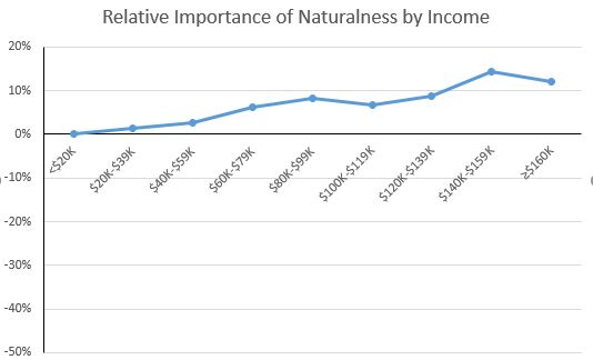
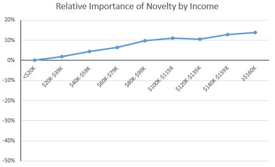
While the above rankings of values are true on average, it is useful to ask: how do food values differ across consumers with different incomes? This question is important because not all consumers have the same preferences, and the people with the ability and connections to affect public policy (and grocery store bottom lines) may give priority to food issues that are less relevant to people in the lower end of the socioeconomic spectrum.
To address this issue, I used some statistical analysis to control for differences in age, gender, education, etc. and then compare how people in different income categories rate each food value. For ease of comparison, I always set the food value of people lowest income category (less than $20,000 in annual household income) at zero and compare how much higher or lower (again on the -100% to +100% scale) people in other income categories are relative to consumers in the lowest category.
Food Values Relatively More Important to the Poor than the Rich
There were three food values for which importance tended to decline with income: price, safety, and taste. The big one is price.
Compared to consumers in the highest income category (more than $160,000/year in household income), consumers in the lowest income category (less than $20,000/year in household income) place 42 percentage points higher level of importance on the price they pay for food. Recall that the scale only spans from +100 to -100, and as such, this is a huge difference in the importance of price. The implication is that policies and actions that adversely affect food prices will matter much more to lower than higher income consumers. This isn't necessarily surprising, but as the above graph shows, the difference in magnitudes is remarkable.
Lower income consumers also place relatively more importance on food safety than higher income consumers as indicated in the graph below, however the differences aren't as pronounced as that for price. Note that this doesn't mean high income consumers don't care about food safety per se, only that safety is less important than other food values to the rich compared to the poor.
Lower income consumers also tend to place a lower relative value on taste than higher income consumers, however, the differences aren't particularly pronounced (at most a 7 percentage point spread between high and low income).
Food Values Relatively More Important to the Rich than the Poor
There were five food values for which importance tended to increase with income: naturalness, nutrition, environment, novelty, and origin.
As the figure above shows, the highest income consumers placed about 12-14 percentage points higher importance on naturalness than lower income consumers; for nutrition and environment (see below), the results are similar.
The environment result is somewhat relevant to debates about the environmental Kuznets curve, which posits that as a country's income increases from a low to mid level, the environment degrades, but then as income increases from a mid to higher level, the environment improves. One reason cited for the later results is that as people become wealthier, they care more about environmental amenities. The above graph suggests this is true for the environmental impacts of food production as well.
The figure below also shows that higher income households place a higher relative value on the novelty of food than lower-income consumers. This results is consistent with other research that suggests that lower-income households cannot afford to purchase novel or unfamiliar foods that other household members may not like and that might go uneaten. That is, higher income households can afford the "risk" of trying new foods that may ultimately go to waste.
GMO labeling: Text vs. QR codes
That's from a new paper I co-authored with Brandon Mcfadden, which was just released by the journal Applied Economic Perspectives and Policy. The work was motivated by the National Bioengineered Food Disclosure Standard (NBFDS), which was signed into law in last summer and has yet to be implemented. Under the current wording of the NBFDS, companies may disclose the presence of GMO material by text, symbol, or an electronic digital link like a Quick Response (QR) code.
To investigate how consumers might respond to these new "contains GMO" labels compared to existing labels indicating absence of GMOs (organic and non-GMO project verified), we conducted a survey of over 1,100 US food consumers. We asked people how much they were willing to pay for whole and processed foods, and we randomly assigned people to different treatments where the food labels systematically varied. Here is how willingness-to-pay (WTP) premiums varied for different labels placed on granola bars (the full text has a similar figure for apples).
Aside from treatment 5 (which seems something of an aberration), WTP premiums for organic or non-GMO are higher when GMOs are disclosed via text vs. QR code. Also note that combined organic and non-GMO labels aren't much different than when either label is used in isolation (I blogged on this result last week).
Given that mandatory GMO labels are coming, food companies will need to decide how to respond. Below is a flow chart Brandon put together describingthe options available to food companies who are currently sourcing GMO ingredients. Hopefully these research results will be useful in deciding which decisions to make.