Blog

2019 in Review

Happy New Year!

In keeping with tradition, I thought I’d review a few highlights from last year, 2019.

2019 marked the first year in almost a decade when I didn’t have significant service responsibilities with the Agricultural and Applied Economics Association (AAEA). Nonetheless, time seemed to fill up with new responsibilities. Last year, I served on advisory boards or committees for organizations such as U.S. Department of Agriculture; Manna Partners; Council for Agricultural Science and Technology (CAST); National Pork Board; Noble Research Institute; and Veylinx, among others. I gave a large number of outreach presentations and talks, with the most noteworthy being testimony to the U.S. Senate Committee on Agriculture, Nutrition, and Forestry on issues facing the livestock and poultry sectors.

Last year was another productive research year. I’ll have authored or co-authored 20 peer-reviewed journal articles with a 2019 publication date, including articles in Economic Inquiry, Journal of Behavioral and Experimental Economics, Applied Economic Perspectives and Policy, and Food Policy, among others. Some highlights include a new review article on experimental auctions in the European Review of Agricultural Economics with Canavari, Drichoutis, and Nayga, a sole-authored piece in Journal of Economic Behavior and Organization on rationality, food choice, and income, and a paper exploring how people discount the future for decisions that involve their own outcomes vs. outcomes affecting others in the Journal of Risk and Uncertainty with Rong, Grijalva, and Shaw. I’ve got a couple grants and planned research on neuro-economics and consumer acceptance of gene editing (with Vincenzina Caputo and Marco Palma) and effects of changing cattle size and composition on consumer demand for beef (with Josh Maples, Glynn Tonsor, and Derrell Peel).

It’s also been a busy year in the Department of Agricultural Economics at Purdue. We were saddened at the untimely passing of one of our colleagues, Wally Tyner, and we celebrated the retirements of Otto Doering and Micheal Wetzstein. We were fortunate to hire two new endowed chair faculty members and begin searches for a couple new positions. The Department is celebrating it’s 100th year anniversary, and it’s been fun to reminisce about the past and strategically plan for the future (alumni, be on the lookout in the near future for a special issue of our annual print edition of Keeping Track).

Here on the website, there more than 106,000 pageviews in 2019, and there were 34 new posts. The number of page views is up significantly from the past couple years, but I fell below my goal of one post per week. Pressing administrative duties have eaten into time for blogging, but I’ll renew my goal for 2020 - about one post a week.

The most popular posts from last year were

Hope you have a great 2020!
Food Price Inflation is on the Rise Globally but Steady at Home

That’s the title of my short contribution to the 2020 Outlook Issue of the Purdue Ag Econ Report. The whole thing is below.

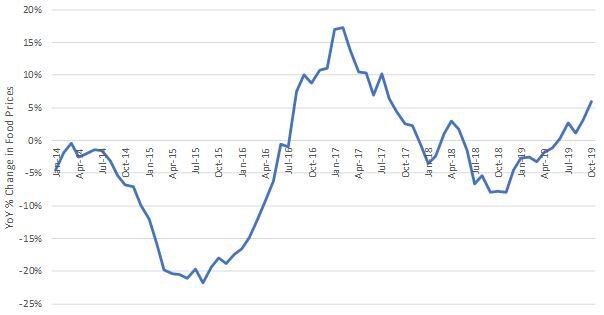
After a steady decline in global food prices throughout most of 2017 and 2018, this summer in 2019, prices began to rise. In October 2019, the last date data are available, global food prices rose 6% relative to the same month a year earlier. It has been more than two years since prices rose at this pace. The recent global food price spike is primarily caused by rising meat prices, which have increased more than 10% in each of the last two moths relative to the same months in 2018. Reductions to the supply of pork in China, due to African Swine Fever, have played a major rule in contributing to the upswing in global food prices. Reports of rising prices of onions in India and supply disruptions in Turkey and Nigeria are additional contributors. Still, the 6% year-over-year monthly increase in global food prices is modest in historical terms. From March 2007 to March 2008, global food prices rose 58%, and after falling more than 30%, rose again by almost 40% in mid-2011.

In the United States, retail food price inflation has remained modest over the past year. From October 2018 to October 2019, prices of food away from home increased 3.3% and prices for food bought for at home consumption increased only about 1%. The USDA Economic Research Service is projecting an overall annual inflation rate for food consumed away from home of between 2% and 3% for both 2019 and 2020. More modest annual inflation of 0.5% to 1.5% is projected for food bought in grocery outlets for at home consumption. These figures are low in historical terms, but are slightly higher than the annual retail food inflation experienced over the past three to four years. Annual inflation rates for food away from home were 2.9%, 2.6%, and 2.3% and for food at home were -1.3%, -0.2% and 0.4% in 2016, 2017, and 2018, respectively. Helped by lower commodity prices, food at home prices have risen at a rate slower than overall non-food price inflation, which averaged about 2.1% per year from 2016-18.

Year-over-Year Percent Change in Global Food Prices (source: United Nations Food and Agricultural Organization)

Year-over-Year Percent Change in Global Food Prices (source: United Nations Food and Agricultural Organization)

What to Expect in 2020

My colleagues and I have pulled together the 2020 Outlook issue of the Purdue Ag Econ Report. Contributions include:

  • Our Long, Slow, Steady Expansion Should Continue by Larry DeBoer

  • Trade and trade policy outlook for 2020 by Russell Hillberry

  • 2020 Outlook: Farm Policy by Roman Keeney

  • Food Price Inflation is on the Rise Globally but Steady at Home by Jayson Lusk

  • Farmland Market Outlook for 2020 by Todd Kuethe and Craig Dobbins

  • Increase in Indiana cash rent seems unlikely in 2020 by Criag Dobbins and Todd Kuethe

  • More milk, consolidation continues, but still an improved 2020 price outlook by Nicole Widmar

  • 2020 Purdue Crop Cost & Return Guide by Michael Langemeier and Craig Dobbins

  • 2020 Corn Price Outlook by James Mintert and Mindy Mallory

  • 2020 Soybean Price Outlook by James Mintert and Mindy Mallory.

Check out the whole thing here.

Food Spending by State

There seems to be a insatiable desire for information on regional food consumption patterns, fed by click-bait headlines fueled by dubious data sources. To help provide some “hard” data on this topic, about three years ago, I wrote a post about how meat demand varies by state. The graphs I presented then came from data collected from the Food Demand Survey (FooDS) we ran for five years, and they relate to measures of demand, not consumption.

I’ve been receiving a large number of emails in recent months about this post, which suggests even more demand for this type of information than I’d originally anticipated. Unfortunately, a big challenge is that there is no good, easily accessible, publicly available data on food consumption by U.S. state.*

Given the apparent interest in the topic, I turned to data collected by the Bureau of Labor Statistics (BLS) Consumer Expenditure Survey (CES). With special permission, one can access state-level consumer spending on food, but anyone can access their representative consumer spending data by U.S. census region. Here, I delve into that data to provide insights into how food spending varies by the nine Census regions they report.

First, here is data on total annual spending on food by region. Consumers in the Pacific Region (Alaska, California, Hawaii, Oregon, and Washington) spend the most on food at $9,166 annually in 2017-18, whereas consumers in the East, South Central Region (Alabama, Kentucky, Mississippi, and Tennessee) spend the least at $6,807/year.

CEX_fig1.JPG

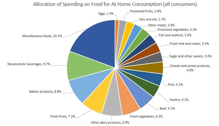
According to these data, on average about 43.6% of spending is on food to be consumed away from home (e.g., at restaurants), whereas 56.4% is spending for food to be consumed at home (e.g., spending at grocery stores). The BLS does not segregate data on spending on food away from home by the type of food, but it does so for spending on food to be consumed at home. Of the spending on food to be consumed at home (e.g., spending at grocery stores), the figure below shows the breakdown for the “average” food consumer. 19.1% of “at home” food spending is for “miscellaneous foods” and the next biggest category is nonalcoholic beverages (9.7%) and then bakery products (8.8%). Combined, all meat products including beef, pork, poultry, and fish account for 21.6% of at home food spending, and all dairy products account for another 10.2%.

The main reason for delving into these data is that they provide information on regional differences in food spending patterns. To explore these issues, I calculated the at food expenditure shares for each of the nine census regions, and then calculate the percent difference in expenditure share for a given region compared to the “average” consumer in the U.S. Here are some breakdowns, starting first with spending on beef as a share of all spending on food at home.

Differences in Spending on Beef by Region.

Differences in Spending on Beef by Region.

Consumers in the South West Central region (Arkansas, Louisiana, Oklahoma, and Texas) allocate 16.2% more of their at-home food budget to beef than does the national average food consumer, whereas on the other extreme, New England consumers (in Connecticut, Maine, Massachusetts, New Hampshire, Rhode Island, Vermont) allocate about 8.7% less of their food budget to beef than does the national average food consumer.

The following shows similar figures for pork and poultry. Whereas consumers in the Upper Midwest allocates a higher than average share of their food at home food budget to beef and pork, consumers there allocate 21.1% less of their food at home budget to poultry as compared to the average national food consumer.

Differences in Spending on Pork by Region

Differences in Spending on Pork by Region

Differences in Spending on Poultry by Region.

Differences in Spending on Poultry by Region.

Turning from meat items, here is data on relative spending on fresh fruits and fresh vegetables by region, which is higher in the West and New England.

Differences in Spending on Fresh Fruit by Region.

Differences in Spending on Fresh Fruit by Region.

Differences in Spending on Fresh Vegetables by Region.

Differences in Spending on Fresh Vegetables by Region.

What about items that are often considered “unhealthy” like sugar and sweets and fats and oils? Spending on sugar and sweets is 27.3% higher in the Mountain region as compared to the average consumer, and spending on oils and fats is relatively highest in the East South Central Region.

Differences in Spending on Sugar and Sweets by Region.

Differences in Spending on Sugar and Sweets by Region.

Differences in Spending on Fats and Oils by Region.

Differences in Spending on Fats and Oils by Region.

The BLS CES reports spending on alcoholic beverages as a separate category from food at home or food away from home. Across all consumers, about 7% of food spending (either at home or away) is on alcoholic beverages. The variation across region is shown below. Spending on alcohol (as a share of total food spending) is positively correlated with spending on fresh fruits and fresh vegetables (as a share of spending on food at home), as alcohol spending is highest in the West and New England.

Differences in Spending on Alcohol by Region.

Differences in Spending on Alcohol by Region.

Finally, here is spending on food away from home as a share of total food spending. Consumers in the South West Central Region (Arkansas, Louisiana, Oklahoma, and Texas) and in the West spend 4% more on food away from home as a share of total food spending as compared to the average food consumer.

Differences in Spending on Food Away from Home by Region.

Differences in Spending on Food Away from Home by Region.

Readers who want to further explore the differences in regional spending patterns can access the BLS CES data here.

*The USDA Economic Research Service (ERS) reports data on per-capita “consumption” (this is actually “disapperance data, which infers consumption based on production, minus exports, plus imports, plus or minus net change in storage), but this is only at the national level. There are some other datasets which provide more local information on food purchases or consumption, but they are proprietary. Examples include grocery store scanner data by Nielsen or IRI. There are publicly available data, like the National Health and Nutrition Examination Survey (NHANES), which have information on location and food consumption, but it often requires significant data analytic abilities or special permission to make use of these data to explore state or regional trends.

Food Environment or Preferences?

Do poorer people eat unhealthily because they don’t have access to grocery stores and fresh fruits and vegetables (and are more easily able grab fast food or convenience store options), or is it because their preferences for healthy food differs from higher income households? In a sense, this is a question of nature vs. nurture applied to healthiness of food consumption, and it is a lively debate related to questions about food deserts, convenience store regulations, zoning, and more.

This interesting and rigorous paper (gated version here) on the topic by Hunt Allcott, Rebecca Diamond, Jean-Pierre Dube, Jessie Handbury, Ilya Rahkovsky, and Molly Schnell was recently published on the topic in the Quarterly Journal of Economics. I blogged about this paper a couple years ago, but I mentioned again now that it’s been revised and put through the rigors of the peer-reviewed process, and because the implications are quite important. Here’s the abstract:

We study the causes of “nutritional inequality”: why the wealthy eat more healthfully than the poor in the United States. Exploiting supermarket entry and household moves to healthier neighborhoods, we reject that neighborhood environments contribute meaningfully to nutritional inequality. We then estimate a structural model of grocery demand, using a new instrument exploiting the combination of grocery retail chains’ differing presence across geographic markets with their differing comparative advantages across product groups. Counterfactual simulations show that exposing low-income households to the same products and prices available to high income households reduces nutritional inequality by only about ten percent, while the remaining 90 percent is driven by differences in demand. These findings counter the argument that policies to increase the supply of healthy groceries could play an important role in reducing nutritional inequality.

These findings suggest efforts to eliminate food desserts or to constrain offerings of convenience stores are likely to have minimal effects. This paper shows, like some of my work, that higher- income households tend to eat healthier than lower-income households. Want lower income people to eat healthier? Then, we probably need to think about ways to increase their incomes. Another possible solution, albeit difficult to successfully and cost-effectively implement, is nutrition and health education.