Blog

How much do millennials like to eat out?

A recent article in Forbes discussed millennial's eating habits utilizing, it seems, a report from the Food Institute and USDA Economic Research Service Data.

The Forbes article writes:

Millennials spend 44 percent of their food dollars – or $2,921 annually – on eating out, according to the Food Institute’s analysis of the United States Department of Agriculture’s food expenditure data from 2014. That represents a 10.7 percent increase from prior data points in 2010.

In contrast, baby boomers in 2014 spent 40 percent of their food dollars on eating out or $2,629 annually.

It's a little hard from this article to really get a nice comparison of millennials food spending without controlling for differences in income and total spending on food at home and away from home.  Thus, I turned to the data from my Food Demand Survey (FooDS) where we've been asking, for more than three years, how much people spent on food at home and away from home.

Here is a breakdown on spending on food away from home (expressed as a share of total household income) by age and by income.  The black and red dashed lines are the two age groups that could be considered millennials.  The results show that for incomes less than about $80,000/year, millennials do indeed spend a larger share of their income on food away from home than do other generations; however, the same isn't necessarily true for higher income households.  People in the two oldest age categories spend a lower share of their income on food away from home at virtually every income level.  For each age group, the curves are downward sloping as suggested by Engle's Law: the share of income spend on food falls as income rises.   

The next graph below shows the same but for spending on food at home.  For the lowest income categories, the youngest individuals spend more of their income on food at home than do older consumers; however, at higher income levels, all age groups are fairly similar.  Coupling the insights from the two graphs suggests that, at incomes less than about $60,000, younger folks are spending more of their income on food (combined at home and away from home) than older folks.   

Finally, here is the share of total food spending that goes toward food away from home by age group and income level.  In general, as incomes rise, people spend more of their food budget away from home.  That is, richer people eat out more.  No surprise there. 

Generally speaking, consumers younger than 44 years of age spend more of their food budget away from home than do older consumers.  The 24-34 year old age group that is firmly in the millennial generation consistently spends more of their food budget away from home than other age groups at almost every income level.   

What's going on in your brain?

Ever wonder why you choose one food over another?  Sure, you might have the reasons you tell yourself for why you picked, say, cage vs. cage free eggs. But, are these the real reasons?

I've been interested in these sorts of questions for a while, and along with several colleagues, have turned to a new tool - functional magnetic resonance imaging (fMRI) - to peak people inside people's brains as they're choosing between different foods.  You might be able to fool yourself (or survey administrators) about why you do something, but you're brain activity doesn't lie (at lest we don't think it does).  

In a new study that was just released by the Journal of Economic Behavior and Organization,  my co-authors and I sought to explore some issues related to food choice.  The main questions we wanted to know were: 1) does one of the core theories for how consumers choose between goods of different qualities (think cage vs cage free eggs) have any support in neural activity?, and 2) after only seeing how your brain responses to seeing images of eggs with different labels, can we actually predict which eggs you will ultimately choose in a subsequent choice task?   

Our study suggests the answers to these two questions are "maybe" and "yes".  

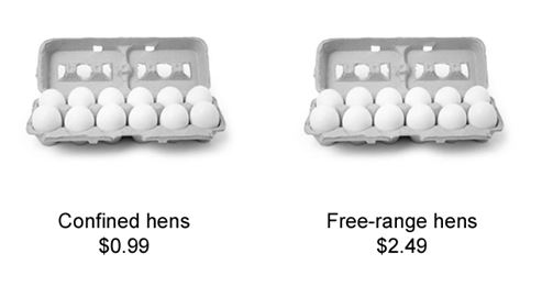
First, we asked people to just look at eggs with different labels while they were laying in the scanner.  The labels were either a high price, a low price, a "closed" production method (caged or confined), or an "open" production method (cage free or free range), as the below image suggests.  As participants were looking at different labels we observed whether blood flow increased or decreased to different parts of the brain when seeing, say, higher prices vs. lower prices.  

We focused on a specific areas of the brain, the ventromedial prefrontal cortex (vmPFC), which previous research had identified as a brain region associated with forming value.  

What did his stage of the research study find?  Not much.  There were no significant differences in brain activation in the vmPFC when looking at high vs. low prices or when looking at open vs. closed production methods.  However, there was a lot of variability across people.  And, we conjectured that this variability across people might predict which eggs people might choose in a subsequent task.  

So, in the second stage of the study, we gave people a non-hypothetical choice like the following, which pitted a more expensive carton of eggs produced in a cage free system against a lower priced carton of eggs from a cage system.  People answered 28 such questions where we varied the prices, the words (e.g., free range instead of cage free), and the order of the options.  One of the choices was randomly selected as binding and people had to buy the option they chose in the binding task.  

Our main question was this: can the brain activation we observed in the first step, where people were just looking at eggs with different labels predict which eggs they would choose in the second step?

The answer is "yes".  In particular, if we look at the difference in the brain activation in the vmPFC when looking at eggs with a "open" label vs. an "closed" label, this is significantly related to the propensity to choose the higher-priced open eggs over the lower-priced closed eggs (it should be noted that we did not any predictive power from the difference in vmPFC when looking at high vs. low priced egg labels).  

Based on a statistical model, we can even translate these differences in brain activation into willingness-to-pay (WTP) premiums:

Here's what we say in the text:

Moving from the mean value of approximately zero for vmPFCmethodi to twice the standard deviation (0.2) in the sample while holding the price effect at its mean value (also approximately zero), increases the willingness-to-pay premium for cage-free eggs from $2.02 to $3.67. Likewise, moving two standard deviations in the other direction (-0.2) results in a discount of about 38 cents per carton. The variation in activations across our participants fluctuates more than 80 percent, a sizable effect that could be missed by simply looking at vmPFCmethod value alone and misinterpreting its zero mean as the lack of an effect.

Polling 101

I teach a graduate level course every spring semester on survey and experiment methods in economics and the social sciences.  In this election season, I thought it might be worthwhile to share a few of the things I discuss in the course so that you might more intelligibly interpret some of survey research results being continuously reported in the newspapers and on the nightly news. 

You've been hiding under a rock if you haven't by now seen reports of polls on the likelihood of Trump or Clinton winning the presidential election.  Almost all these polls will report (often in small font) something like "the margin of error is plus or minus 3 percent".  

What does this mean?

In technical lingo it means the "sampling error" is +/- 3% with 95% confidence.  This is the error that comes about from the fact that the polling company doesn't survey every single voter in the U.S.  Because not every single voter is sampled, there will be some error, and this is the error you see reported alongside the polls.  Let's say the projected percent vote for Trump is 45% with a "margin of error" of 3%.  The interpretation would be that if we were to repeatedly sample potential voters, 95% of the time we would expect to find a voting percentage for Trump that is between 42% and 48%.

The thought experiment goes like this: imagine you had a large basket full of a million black and white balls.  You want to know the percentage of balls in the basket that are black.  How many balls would you have to pull out and inspect before you could be confident of the proportion of balls that are black?  We can construct many such baskets where we know the truth about the proportion of black balls and try different experiments to see how accurate we are in many repeated attempts where we, say, pull out 100, 1,000, or 10,000 balls.  The good news is that we don't have to manually do these experiments because statisticians have produced precise mathematical formulas that give us the answers we want.  

As it turns out, you need to sample about 1,000 to 1,500 people (the answer is 1,067 to be precise) out of the U.S. population to get a sampling error of 3%, and thus most polls use this sample size.  Why not a 1% sampling error you might ask?  Well, you'd need to survey almost 10,000 respondents to achieve a 1% sample error and the 10x increase in cost is probably not worth a measly two percentage point increase in accuracy. 

Here is a key point: the 3% "margin of error" you see reported on the nightly news is only one kind of error.  The true error rate is likely something much larger because there are many additional types of error besides just sampling error. However, these other types of errors are more difficult to quantify, and thus, are not reported.

For example, a prominent kind of error is "selection bias" or "non-response error" that comes about because the people who choose to answer the survey or poll may be systematically different than the people who choose not to answer the survey or poll.  Alas, response rates to surveys have been falling quite dramatically over time, even for "gold standard" government surveys (see this paper or listen to this podcast).  Curiously, those nightly news polls don't tell you the response rate, but my guess is that it is typically far less than 10% - meaning that less than 10% of the people they tried to contact actually told them whether they intend to vote for Trump or Clinton or someone else.  That means more than 90% of the people they contacted wouldn't talk to them.  Is there something special about the ~10% willing to talk to the pollsters that is different than the ~90% of non-respondents?  Probably.  Respondents are probably much more interested and passionate about their candidate and politics and general.  And yet, we - the consumer of polling information - are rarely told anything about this potential error.

One way pollsters try to partially "correct" for non-response error is through weighting.  To give a sense for how this works, consider a simple example.  Let's say I surveyed 1,000 Americans and asked whether they prefer vanilla or chocolate ice cream.  When I get my data back, I find that there are 650 males and 350 females.  Apparently males were more likely to take my survey.  Knowing that males might have different ice cream preferences than females, I know that my answer of the most popular ice cream flavor will likely be biased if I don't do something.  So, I can create a weight.  I know that the true proportion of the US population is roughly 50% male and 50% female (in actuality, there are slightly more females than males but lets put that to the side).  So, what I need to do is make the female respondents "count" more in the final answer than the males.  When we typically take an average, each person has a weight of one (we add up all the answers - implicitly multiplied by a weight of one - and divide by the total).  A simple correction in our ice cream example would be to make a females have a weight of 0.5/0.35=1.43 and males have a weight of 0.5/0.65=0.7.  Females will count more than one and males will count less.  And, I report a weighted average: add up all the female answers (and multiply by a weight of 1.43) and add to them all the male answers (multiplied by 0.7), and divide by the total.  

Problem solved right?  Hardly.  For one, gender is not a perfect predictor of ice cream preference.  And the reason someone chooses to respond to my survey almost certainly has something to do with more than gender.  Moreover, weights can only be constructed using variables for which we know the "truth" - or have census bureau data which reveals the characteristics of the whole population.  But, in the case of political polling, we aren't trying to match up with the universe of U.S. citizens but the universe of U.S. voters.  Determine the characteristics of voters is a major challenge that is in constant flux.  

I addition, when we create weights, we could end up with a few people having a disproportionate effect on the final outcome - dramatically increasing the possible error rate. Yesterday, the New York Times ran a fantastic story by Nate Cohn illustrating exactly how this can happen.  Here are the first few paragraphs:

There is a 19-year-old black man in Illinois who has no idea of the role he is playing in this election.

He is sure he is going to vote for Donald J. Trump.

And he has been held up as proof by conservatives — including outlets like Breitbart News and The New York Post — that Mr. Trump is excelling among black voters. He has even played a modest role in shifting entire polling aggregates, like the Real Clear Politics average, toward Mr. Trump.

How? He’s a panelist on the U.S.C. Dornsife/Los Angeles Times Daybreak poll, which has emerged as the biggest polling outlier of the presidential campaign. Despite falling behind by double digits in some national surveys, Mr. Trump has generally led in the U.S.C./LAT poll. He held the lead for a full month until Wednesday, when Hillary Clinton took a nominal lead.

Our Trump-supporting friend in Illinois is a surprisingly big part of the reason. In some polls, he’s weighted as much as 30 times more than the average respondent, and as much as 300 times more than the least-weighted respondent.

Here's a figure they produced showing how this sort of "extreme" weighting affects the polling result reported:

The problem here is that when one individual in the sample counts 30 times more than the typical respondent, the effective sample size is actually something much smaller than actual sample size, and the "margin of error" is something much higher than +/- 3%.

There are many additional types of biases and errors that can influence survey results (e.g., How was the survey question asked? Is there an interviewer bias? Is the sample drawn from a list of all likely voters?).   This doesn't make polling useless.  But, it does mean that one needs to be a savvy consumer of polling results.  It's also why it's often useful to look at aggregations across lots of polls or, my favorite, betting markets.

Value of Nutritional Information

There is a general sense that nutritional information on food products is "good" and "valuable."  But, just how valuable is it?  Are the benefits greater than the costs?

There have been a large number of studies that have attempted to address this question and all have significant shortcomings.  Some studies just ask people survey questions about whether they use or look at labels.  Other studies have tried to look at how the addition of labels changes purchase behavior - but the focus here is typically limited to only a handful of products. As noted in an important early paper on this topic, by Mario Teisl, Nancy Bockstael, and Alan Levy, nutritional labels don't have to cause people to choose healthier foods to be valuable.  Here is one example they give:

consider the individual who suffers from hypertension, has reduced his sodium intake according to medical advice, and believes his current sodium intake is satisfactory. If this individual were to learn that certain brands of popcorn were low in salt, then he may switch to these brands and allow himself more of some other high sodium food that he enjoys. Better nutritional information will cause changes in demand for products and increases in welfare even though it may not always cause a backwards shift in all risk increasing foods nor even a positive change in health status.

This is why it is important to consider a large number of foods and food choices when trying to figure out the value of nutritional labels.  And that's exactly what we did in a new paper just published in the journal Food Policy.  One of my Ph.D. students, Jisung Jo, used some data from an experiment conducted by Laurent Muller and Bernard Ruffieux in France to estimate consumers' demands for 173 different food items in an environment where shoppers made an entire day's worth of food choices.  This lets us calculate the value of nutritional information per day (not just per product).  

The nutritional information we studied relies on two simple nutritional indices created by French researchers.  They are something akin to a NuVal label system or a traffic light system.  We first asked people where they thought each of the 173 foods fell on the nutritional indices (and we also asked how tasty or untasty each of the foods were), and then after making a day's worth of (non-hypothetical) food choices, we told them were each food actually fell.   Here's a bit more detail.  

The initial “day 1” food choices were based on the individuals’ subjective (and implicit) health beliefs. Between days 1 and 2, we sought to measure those subjective health beliefs and also to provide objective information about each of the 173 foods. The beliefs were measured by asking respondents to pick the quadrant in the SAIN (Nutrient Adequacy Score for Individual foods) and LIM (for Limited Nutrient) table (Fig. 2) that best described where they thought each food fit. The SAIN and LIM are nutrient profiling models and indices introduced by the French Food Safety Agency. The SAIN score is a measure of “good” nutrients calculated as an un-weighted arithmetic mean of the percentage adequacy for five positive nutrients: protein, fiber, ascorbic acid, calcium, and iron. The LIM score is a measure of “bad” nutrients calculated as the mean percentage of the maximum recommended values for three nutrients: sodium, added sugar, and saturated fatty acid.2 Since indices help reduce search costs, displaying the information in the form of an index is a way to make the information available in an objective way but also allows consumers to better compare the many alternative products in their choice set.

Here are the key results:

In this study, we found that nutrient information conveyed through simple indices influences consumers’ grocery choices. Nutrient information increases willingness-to-pay (WTP) for healthy food and decreases WTP for unhealthy food. The added certainty provided by objective nutrient information increased the marginal WTP for healthy food. Moreover, there is a sort of loss aversion at play in that WTP for healthy vs. neutral food is lower than WTP for neutral vs. unhealthy food, and this loss aversion increases with information. . . . This study estimated the value of the nutrient index information at €0.98/family/day. The advantage of our approach is that the value of information reflects choices over a larger number of possible foods and represents an aggregate value over the whole day.

I should also note that people valued the taste of their food as well.  We found consumers were willing to pay 4.33 eruos/kg more for a one-unit increase in on the -5 to +5 taste scale.  To put this number in perspective, let's take a closer look at the average taste rating given to all 173 food items. Most items had a mean rating above zero. The highest rated items on average were items like tomatoes (+4.1), green salad (+4), and zucchini (+3.9). The lowest rated items on average included cheese spread ( 0.2) and Orangina light ( 1.9). [remember: these were French consumers] Moving from one of the lower to higher rated items would induce a four-point change in the taste scale associated with a change in economic value of 4.33 ⁄ 4 = 17.32 euros/kg.”

Real World Demand Curves

On a recent flight, I listened to the latest Freakonomics podcast in which Stephen Dubner interviewed the University of Chicago economist Steven Levitt about some of his latest research.  The podcast is mainly about how Levitt creatively estimated demand for Uber and then used the demand estimates to calculate the benefits we consumers derive from the new ride sharing service.  

Levitt made some pretty strong statements at the beginning of the podcast that I just couldn't let slide.  He said the following:

And I looked around, and I realized that nobody ever had really actually estimated a demand curve. Obviously, we know what they are. We know how to put them on a board, but I literally could not find a good example where we could put it in a box in our textbook to say, “This is what a demand curve really looks like in the real world,” because someone went out and found it.

As someone whose spent the better part of his professional career estimating consumer demand curves, I was a bit surprised to hear Levitt claim "nobody ever had really estimated a demand curve."  He also said, "we completely and totally understand what a demand curve is, but we’ve never seen one."  The implication seems to be that Levitt is the first economist to produce a real world estimate of a demand curve.  That's sheer baloney.  

The most recent Nobel prize winner in economics, Angus Deaton, is perhaps most well known for his work on estimating consumer demand curves.

In fact, agricultural economists were among the first people to estimate real world demand curves (see this historical account I coauthored a few years ago).  Here is a screenshot of a figure out of a paper by Schultz in the Journal of Farm Economics in 1924 who estimated demand for beef.  Yes - in 1924!  I'm pretty sure that figure was hand drawn!

Or, here's Working in a paper in the Quarterly Journal of Economics in 1925 estimating demand for potatoes.

Two years later in 1927, Working's brother was perhaps the first to discuss "endogeneity" in demand (how do we know we're observing a demand curve and not a supply curve?), an insight that had a big influence on future empirical work.

Fast forward to today and there are literally thousands of studies that have estimated consumer demand curves.  The USDA ERS even has a database which, in their words,  "contains a collection of demand elasticities-expenditure, income, own price, and cross price-for a range of commodities and food products for over 100 countries."   

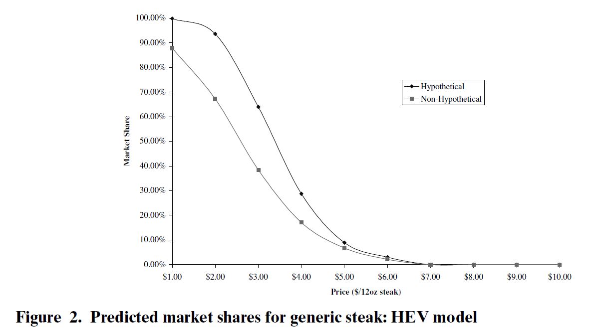
Here is a figure from one of my papers, where the demand curve is cleanly identified because we experimentally varied prices.  

And, of course, I've been doing a survey every month for over three years where we estimate demand curves for various food items.

In summary, I haven't the slightest idea what Levitt is talking about.