Blog

GMO labels - not as bad as I thought

Science Advances (the open-access version of Science Magazine) just published a paper I co-authored with Jane Kolodinsky from the University of Vermont.  I suspect the paper's findings may raise a few eyebrows, as we find that opposition to GMOs in Vermont fell relative to that in the rest of the U.S. after mandatory labeling was adopted in that state.

Some background context might be useful here.  Several years go, I was decidedly in the camp that thought imposition of mandatory labels would cause people to be more concerned about GMOs because it would signal that something was unsafe about the technology.  Prominent scholars such as Cass Sunstein have argued the same.  A few years ago, Marco Costanigro and I put this hypothesis to the test in a paper published by Food Policy, and we found little evidence (in a series of survey-based experiments) that the label per se neither increased or decreased aversion to GMOs.  So, I was less convinced that this particular argument against mandatory GMO labeling was valid, but I was still unsure.  

Then, last summer at the annual meetings of the Agricultural and Applied Economics Association (AAEA), I saw Jane present a paper based on survey data she collected in Vermont before and after mandatory labels went into place there.  Her data suggested opposition to GMOs fell at faster rate after mandatory labels were in place.  Despite my findings in Food Policy, I remained dubious and Jane and I went back and forth a bit on the robustness of her findings. 

I'd been in enough conversations with Jane to know that we had different philosophical leanings about the desirability of GMOs, but this was an empirical question, so we put our differences aside and decided to join our data and put the hypothesis to the test.  Through the Food Demand Survey (FooDS), I had been collecting nationwide data on consumer's concerns about GMOs, and I suggested we combine our two sets of data and do a true "difference-in-difference" test: Did the difference in concern among consumers in VT and the result of the US increase or decrease after mandatory labeling was adopted in VT?

Our article in Science Advances has the result:

This research aims to help resolve this issue using a data set containing more than 7800 observations that measures levels of opposition in a national control group compared to levels in Vermont, the only U.S. state to have implemented mandatory labeling of GE foods. Difference-in-difference estimates of opposition to GE food before and after mandatory labeling show that the labeling policy led to a 19% reduction in opposition to GE food. The findings help provide insights into the psychology of consumers’ risk perceptions that can be used in communicating the benefits and risks of genetic engineering technology to the public.

One important caveat should be mentioned here.  Our result does NOT suggest people will suddenly support GMOs once mandatory labels are in place.  Rather, our findings suggest that people will be somewhat less opposed than they were prior to labels.  I mention this because in the wake of my paper with Marco in Food Policy some of the media's interpretation of our results (such as that of the New York Times editorial board), could have been construed as suggesting that imposition of mandatory labels would not cause economic harm.  That may or may not be true.  But, this new study suggest that labels per se may in fact reduce opposition.

It was great to work with Jane on this project, and for me it was a good lesson to test your beliefs, particularly when there are theoretical reasons that could support the opposing point of view.

I'll end with a key graph from the paper.

gmo_labels.JPG

Future Food Demand

Will we be able to produce enough food to feed a more populated and likely richer world in 2050?  The answer to this question depends not just on what technologies we develop but also on what people in different parts of the world will want to eat in 2050.  A new paper by Christophe Gouel and Houssein Guimbard in the American Journal of Agricultural Economics takes data from consumption of 7 categories of food in over 100 different countries to explore how food demand changes with income and population, and then they use these estimates to project future food demand given estimates of income and population growth.  

First, they show that as incomes rise, demand for oils and fats and for animal-based food increases. 

futurefooddemand1.JPG

The following graph (from their appendix) shows the projected changes in global demand for different types of food on out to 2100.

futurefooddemand2.JPG

Here is a summary of their findings:

The main results of our projections to 2050 are that (a) food demand will increase by 47%, representing less than half of the growth experienced in the four decades before 2010; (b) this growth will come mainly from developing countries because in high-income countries, food demand is already at high per capita levels and population growth will be low; (c) growth in starchy staples will be small at 19%, supported by population increases because per capita consumption is predicted to decrease while demand for animal-based food will double, thereby increasing the global share of animal-based calories from 17% in 2010 to 23% in 2050; and (d) these projections present large uncertainties that are neglected in related studies: under alternative plausible futures for GDP and population, demand for animal-based calories increases between 74% and 114%.

Food Demand Survey (FooDS) Finale - at least for now

Five years ago in May 2013, I put out the first issue of the Food Demand Survey (FooDS).  Every month since that time, a survey of over 1,000 food consumers (a different 1,000 each month), has been conducted where we've tracked concerns, attitudes, and preferences for various food issues over time.  This has been a really fun project.  Alas, all good things must come to an end and the May 2018 edition of FooDS will be the last - at least in its current incarnation.  

Here I wanted to highlight some of the findings we've generated and provide some graphs showing the trends we've observed over the past five years (every issue of FooDS and all the underlying data is available here).  At the end, I'll give a few "thanks" and give insights on where the project may be heading next.  

Some highlights.

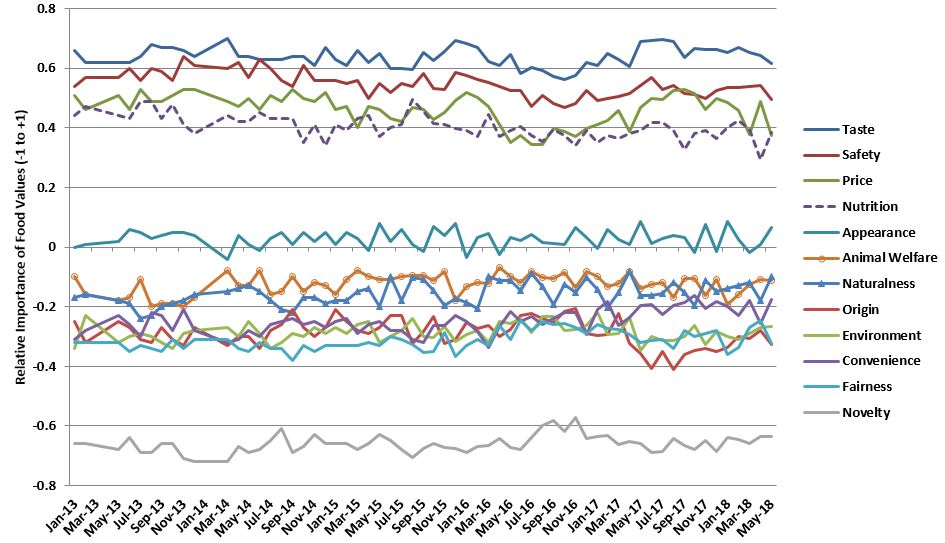
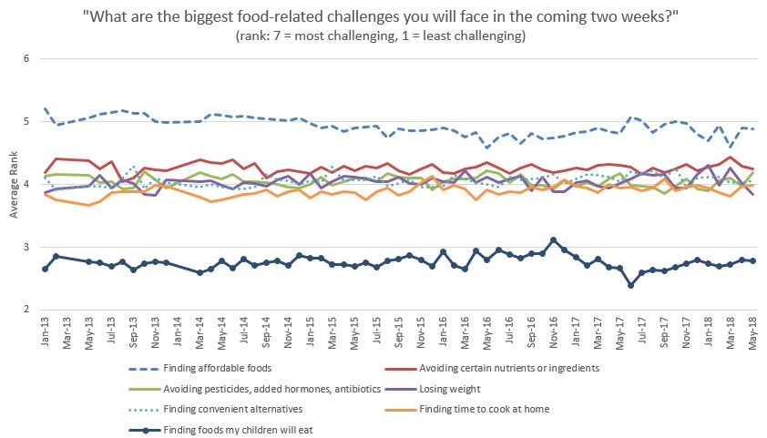
Now for some trends (note: each of the graphs below shows data from at least 1,000 consumers surveyed each month for 5 years for a total of more than 60,000 observations).  Because I've discussed these results many times in the past, I'm going to let these graphs "stand on their own" without interpretation or description of how the data are collected or analyzed.

FooDS_1.JPG
note: "average" is the average of about 16 other issues tracked in the survey

note: "average" is the average of about 16 other issues tracked in the survey

note: "average" is the average of about 16 other issues tracked in the survey

note: "average" is the average of about 16 other issues tracked in the survey

Food Values over Time

Food Values over Time

FooDS_5.JPG
FooDS_6.JPG
FooDS_7.JPG
FooDS_8.JPG
FooDS_9.JPG

Finally, I want to say thanks to Susan Murray who did the heavy lifting every month, Bailey Norwood who helped me conceptualize the project and kept it running for the last year, Glynn Tonsor who provided intellectual capital over the course of the project, and many graduate students who provided great ideas and analysis.  Early on, funding support for the project came from the Willard Sparks Endowed Chair.  Later, the Division of Agriculture and Natural Resources at Oklahoma State pitched in.  For the past several years, funding support came from a USDA-AFRI-NIFA grant.  I've had numerous conversations with Bailey (at Oklahoma State), Glynn (at Kansas State), and Trey (at Michigan State) about the future of the project, where it might "reside", and how it should change to be even more informative.  All the details are yet to be worked out, but I think there is a good chance FooDS will re-emerge in the next several months with a new "home" and focus.  

Pork: The Other Red Meat

Remember the long running campaign by the Pork Board?

pork_white.JPG

The campaign pitching pork as the other white meat made sense at a time when there was rising concern about fat content and red meat consumption and increased competition from chicken.  But, times have changed.

One of the changes has come about from scientific developments.  As it turns out, pork color is a good indicator of eating quality, and in blind taste tests, consumers prefer redder pork to whiter pork.  Do consumers know this?  Could a quality labeling system help coordinate the pork supply chain and better align production with consumers' eating expectations?

These were the questions that led to this paper just released by the journal Food Policy that I co-authored with Glynn Tonsor, Ted Schroeder, and Dermot Hayes with funding by the National Pork Board (a longer report of the results is here).

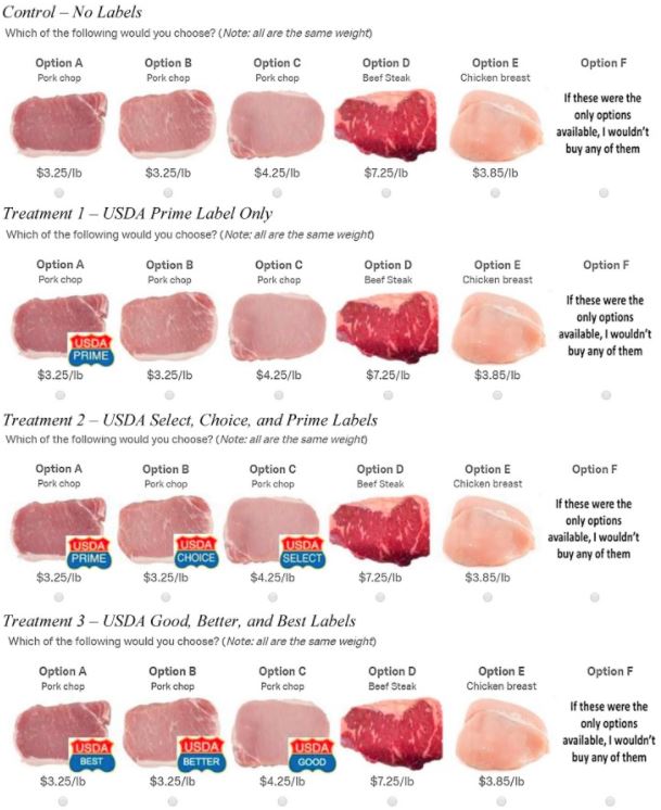
We surveyed about 2,000 consumers for the analysis reported in the Food Policy paper.  We were mainly interested in how consumers' choices between pork (and other meat) products varied with the color of the pork and whether and which kinds of labels were present.  Consumers were randomly assigned to a control (with no labels) or one of several treatment groups that utilized different labeling systems.  Below shows a particular choice question used in the various treatments.  

pork_1.JPG

We use the choices consumers made in these treatments to back out consumers' willingness-to-pay, but even more importantly, the probability a consumer buys any type of pork and the expected revenue from pork.  For the economists out there, I'll note that we also have some methodological innovation.  Rather than just looking at the probability of buying a type of pork at a given set of prices, we also invert the equations to look at the equilibrium price of pork at a given quantity of different types of pork (this is important because in the short run, pork producers can't easily produce a larger amount of higher quality pork).

So, what did we find?

pork_wtp.JPG

We find: 

In the absence of a cue in the “no labels” control, on average, participants do not differentiate among the three quality levels [or pork colors]. There is no significant difference in average WTP [willingness-to-pay] for the three different colored chops. This is consistent with industry interest in adding quality labels to facilitate further separation of pork quality by consumers. The introduction of a single Prime label for the highest quality chop in Treatment 1 results in a significant increase in the WTP for the chop that would carry the highest quality grade; however, there is a significant reduction in WTP for the lower quality chops that did not carry labels in this treatment.  ... When all pork products have grade labels, there is a significant premium for higher vs. lower quality pork and total pork sales rise, as do expected revenues. This can be seen in [the figure] as the mean WTP estimates for all pork qualities lie above those in the control condition with no labels.

We go on to show there is significant heterogeneity in consumer preferences.  We find that 28% to 40%, depending on the labeling condition, of consumers prefer white pork to red pork.  

From the conclusions: 

The choice experiment data analysis suggests that a USDA grade using Prime, Choice, and Select or Good, Better, Best labels would be most likely to increase expected pork revenue and the probability of purchasing pork. Additional important opportunities are present within this strategy. Foremost is that even with quality labels on the pork chops, a significant fraction of consumers preferred lower quality than Prime even when the three quality products were priced the same. Such consumers either do not understand the quality grade rankings of Prime, Choice, and Select (though results were similar for Best, Better, Good, which should be less prone to confusion), or this group of consumers were ignoring the quality grade labels and relying on product color to influence their choices. A possible response would be to segment consumers and to use the grading system only on those consumers who prefer red chops. Segmentation could be done by exploring preferences across states, institutions, income categories, ethnicity, and by export market. Despite the possibility for segmentation, however, we show, that if all qualities are present, only labeling the highest quality is likely to reduce total pork sales and revenue

As this piece in the Federal Register indicates, the USDA Agricultural Marketing Service is seeking public comment on the usefulness of such a labeling system.  Maybe one day in the future you will see new pork quality grade labels in the grocery store.  

Impacts of health information on perceived taste and affordability

The journal Food Quality and Preference just released a new paper I co-authored with Jisung Jo, a former student who now works at the Korea Maritime Institute.

Here is the motivation for the work:

One of the key mechanisms policy makers have utilized to encourage healthier eating is the provision of information via nutritional labels. However, research has shown that the provision of health information does not necessarily increase consumption of healthy foods ... A possible reason for the largely ineffectual impact of nutritional labeling might be because health information not only updates consumers’ health perceptions but also affects other perceptions, such as taste and affordability, which are the primary drivers of consumer purchase behavior

In other words, if you see a new labeling indicating a food is healthier than you previously thought, do you now think it will be less tasty?  Or more expensive?  

To explore this issue, we surveyed consumers in three different countries (US, China, and Korea).  We showed consumers a picture of a food item and asked them to rate the item, on simple scales, in terms of perceived taste, health, affordability, and purchase intention.  We did this for 60 diverse food items. Then, the ratings of all 60 foods was repeated after the subjects had received information about each food item’s healthiness, which was conveyed via a "traffic light" labeling system (green=healthy, yellow=medium healthiness, red=unhealthy).   Here's an example of one of the questions asked before and after the information:

jisungFQP1.JPG

Unsurprisingly, the provision of "green" labels tended to increased perceived healthiness and the provision of "red" labels tended to reduce perceived healthiness.  Of more interest is how these labels affected perceptions of taste, affordability, and ultimately purchase intentions.  

Unexpectedly, we found that providing information that a food was healthier than people previously thought tended to increase perceived taste.  People also tended to think items that are less healthy than previously thought will ultimately be less expensive.

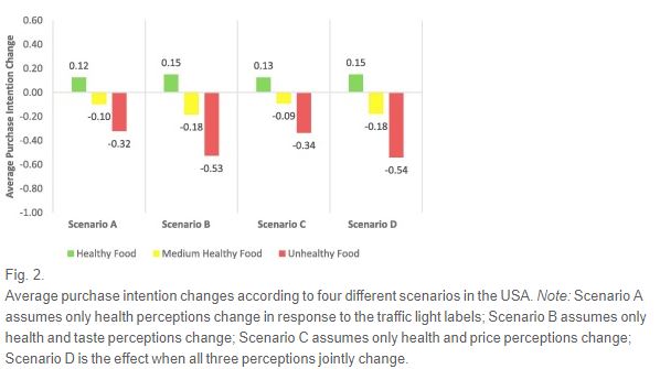
We created the following graph to look at how projected changes in purchase intentions (after provision of health information) would change if one ignores the fact that health information also affects perceived taste and affordability.

jisungFQP2.JPG
Across all scenarios and in all three countries, we find that negative health information has the biggest effects on purchase intention changes. Intriguingly, the average purchase intention in scenario B is larger than that in scenario A. The values for scenario D are the same as the actual average of purchase intention (since they are just the model evaluated at the mean effect changes of all variables included in the model). Comparing the purchase intention changes as one moves from scenario A to D shows the effect of ignoring integrated health-taste-affordability perceptions.

Overall, this research underscores the need to understand how labels which convey health information might also alter other perceptions related to taste and affordability.